

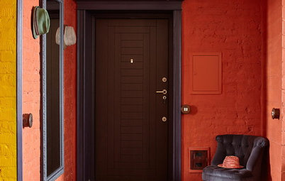
8 Mesmerising Colour Palettes for Living Rooms
Lovely living rooms don't just happen by accident – a little colour knowhow can go a long way if you know how to apply it

Perfecting the mood of a living room is easy when you know which colour pairings are most likely to be harmonious. Whether it’s the serene side or the funky end of design you’re after, these combinations will be positively magnetic.
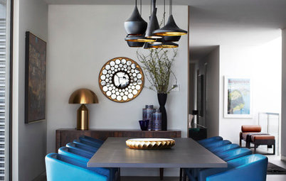
2. Turquoise and brown
It may seem like an unlikely match, but this bright turquoise works beautifully with a rich, chocolate brown.
GET THE LOOK: Be sure to contrast a floral or patterned fabric in one colour (turquoise or brown – it doesn’t matter which) against the plain backdrop of the other. Opting for two plains together risks looking dull instead of desirable.
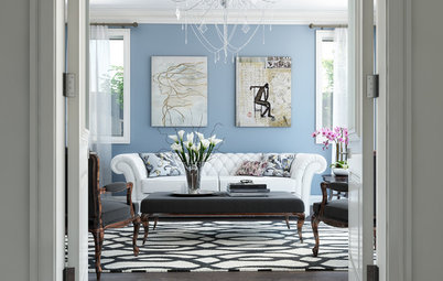
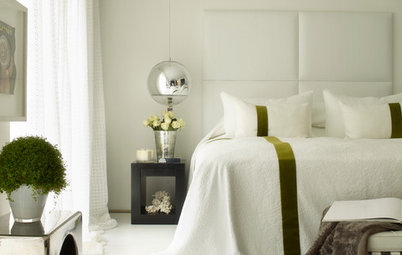
3. Pink and grey
Staging a rosy pink like this in its best light is most effectively done when set against a grown-up shade like grey or even black. Frame it against white and it risks looking too pretty – perfect for a girl’s bedroom, but not usually the look to strive for in a living room.
GET THE LOOK: There’s no need to get rid of the white entirely – used judiciously, it can make a room look fresh and inviting. The window trim and some of the accessories in this room are good examples of using white to your advantage. Having a dog with movie-star good looks is also helpful.
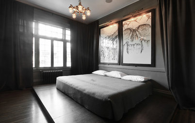
4. Russet and slate
Something calming, warm and welcoming happens when you combine reddish-russet and handsome shades of slate, all on the same colour-value scale. In other words, if you squint your eyes or take a black-and-white photo of the room, there is little to part the hues.
GET THE LOOK: This sumptuous colour palette can be given a luxe twist with the addition of some metallic and reflective accessories. The gold mirror, armchair and cushions give this room some necessary bling.
5. Lime with muted grey
Some colour theorists consider grey the pure neutral, and this makes it the perfect choice to pair with bright or even fluorescent accents. Pull out lime highlights in lamps, light fittings, cushions and tabletop accessories.
GET THE LOOK: With so many shades of grey from which to choose, it can be tricky to know which one is going to work best at your house. The only way forward is through good old trial and error. Sample pots are well worth it – be sure to paint large areas of wall and watch how the colour shifts during the course of the day. You might love it in the bright morning sunlight, but by nightfall the colour can transform the room into a different mood entirely.
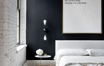
6. Mid-tones and black
Demure greys merge with soft browns and even dusty greens in this elegant living room. These mid-tone lovelies soften the stark contrast of matt black (a shade cruelly labelled by some as a non-colour). The look is easy on the eye and hotel-room dreamy.
GET THE LOOK: Pair shiny black and glass surfaces with luxurious fabrics in soft mid-tones. Bringing the tone down in a room can be a good thing if you’re seeking a refined ambience in your living room.
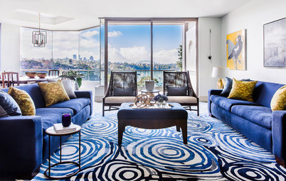
7. Sky blue and deep pink
Working with two vibrant colours can have surprisingly invigorating results when you are consistent with the tones. Walls this blue pick up a lot of light and are a dominant force in a room, but you can bend the brightness to whichever end of style you prefer. It could happily go cliché coastal, or work up into something worthy of a pretty English cottage.
GET THE LOOK: It’s fine to go a little crazy with pattern and colour, but the key to carrying off a look like this is tempering the impact with some natural timber and white.
8. Classic blue and white
Blue and white is a well-worn combo that’s fresh and lively when it’s done right. This is a palette best spoken through mixed patterns and aligned alongside neutrals.
GET THE LOOK: Make it all about accents and clusters of blue-and-white delight against a minimalist and contemporary backdrop. That way, the potential cliché becomes a charming old friend you’re relieved to see again.
WE’D LOVE TO KNOW…
Which colour palette do you dream of for your living room? Do you dare to try it? Share your thoughts in the comments section below.
MORE
Dare to be Different: Colours Combos That Break the Rules
Mood-Boosting Colours for Your Home
Mix Master: How to Clash Prints and Patterns Like a Pro
5 Trend-Setting Colour Palettes for Your Home


Sponsored

Sponsored
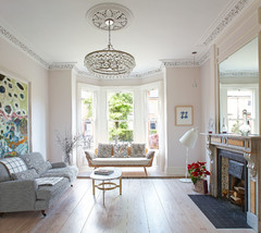
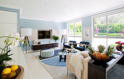
This living room is alive with light – the perfect setting for an artful composition of gentle chartreuse and soothing blues.
GET THE LOOK: Set these delicate hues against fresh white curtains and pale-toned furniture to make them pop. Marry smooth leather with sumptuous velvet and other texture-rich fabrics for maximum appeal.