


A Masterful Balance of Colour and Light in a Knockdown-Rebuild
Demolishing a dated 1950s cottage allowed its owners to craft their dream family home from the ground up
Georgia Madden
14 November 2019
In this Q&A series, we turn the spotlight on one thought-provoking renovation or redesign each week. Here, Romaine Alwill, director at Alwill Interiors, reveals how she and her team transformed a blank canvas of a home with four bedrooms and three bathrooms into a chic and thoroughly contemporary family abode in Sydney, NSW.
Images by Chris Warnes
Answers by Romaine Alwill, director at Alwill Interiors
Who lives here: A couple with two daughters
Location: Balgowlah, NSW
Interior designer: Lucy Bugden, Alwill Interiors
Joinery: Timberline Joinery (responsible for the joinery in the master walk-in wardrobe and three bathrooms)
Answers by Romaine Alwill, director at Alwill Interiors
Who lives here: A couple with two daughters
Location: Balgowlah, NSW
Interior designer: Lucy Bugden, Alwill Interiors
Joinery: Timberline Joinery (responsible for the joinery in the master walk-in wardrobe and three bathrooms)
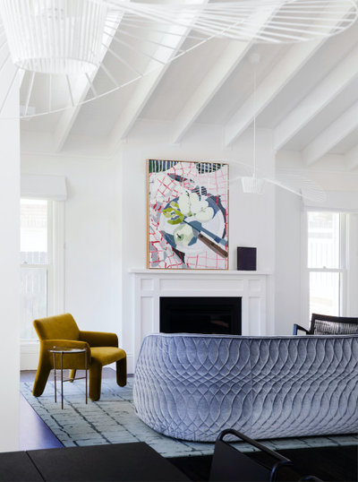
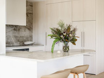
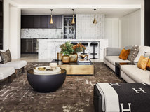
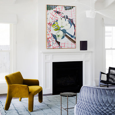
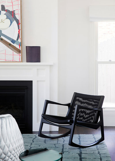
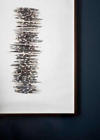
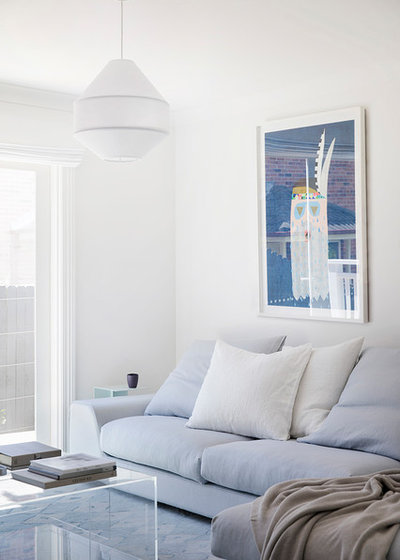
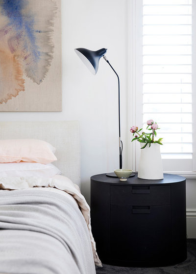
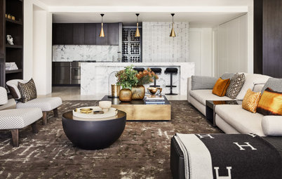
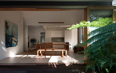
The main living room; artwork: ‘Oh You Pretty Things (David Bowie)’ by Zoe Young
Gained
Gained
- Better space planning.
- Improved functionality.
- Enhanced natural light.
- A fresh interiors palette.
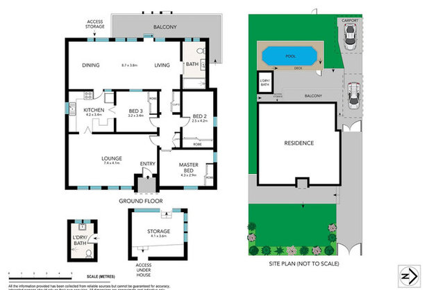
The original floor plan
What was the house like originally?
A tired and outdated single-storey 1950s cottage with three bedrooms and 1.5 bathrooms. The cottage was knocked down to make way for a new two-storey house.
What was the house like originally?
A tired and outdated single-storey 1950s cottage with three bedrooms and 1.5 bathrooms. The cottage was knocked down to make way for a new two-storey house.
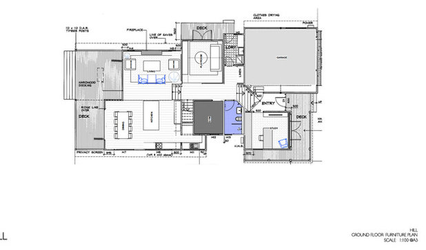
The ground-floor plan after works
What wasn’t working for the owners about the cottage?
It was old and tired and didn’t meet the needs of the family.
What wasn’t working for the owners about the cottage?
It was old and tired and didn’t meet the needs of the family.
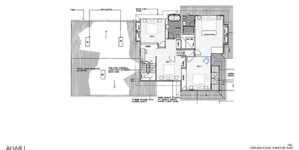
The first-floor plan after works
What were the client’s must-haves?
What were the client’s must-haves?
- A new kitchen.
- Light-filled spaces.
- All the bedrooms on one level.
What exactly did you do?
- Designed new interior finishes.
- Selected new fixtures.
- Chose new paint colours.
- Introduced new furnishings and accessories.
Artwork by Tracey Deep
How would you describe this project?
It was a major renovation, built from the ground up, with an interior fit-out and refurnishing.
How would you describe this project?
It was a major renovation, built from the ground up, with an interior fit-out and refurnishing.
The playroom/media room; artwork: ‘Soothsayer’ by Lisa Lapointe
What problem or constraint did this project address?
The limitations were really derived from the architecture. The ceilings were low in sections and services were located in unusual places.
What problem or constraint did this project address?
The limitations were really derived from the architecture. The ceilings were low in sections and services were located in unusual places.
How does the new work address these problems or constraints?
The home is much better set up for a family now. It’s still in the same great area near schools and shops as it was before, but it now feels light, fresh and open.
The raked cathedral ceiling in the main living room really contributes to the airy feel.
The home is much better set up for a family now. It’s still in the same great area near schools and shops as it was before, but it now feels light, fresh and open.
The raked cathedral ceiling in the main living room really contributes to the airy feel.
What challenges did you have to work around?
Dealing with lots of different contractors and keeping communication seamless was tricky.
Dealing with lots of different contractors and keeping communication seamless was tricky.
Tell us about the colour palette and fabrics
We really didn’t want this home to feel like any one style – particularly not overly Hamptons, which is a look we feel is over-referenced in Sydney. We wanted this house to feel more eclectic, both in colour and style, and to have its own language.
Really, we could have taken this house in any direction. When selecting new interior finishes for a project, we usually have a strong respect for what is going on with the architecture and the client’s style, but in this instance both triggers were fairly open. That’s why I call it ‘Chameleon House’.
We love how you’ve balanced rich colours with plenty of white – what was your thinking?
Balance was important here, but we wanted to keep the whole look light and uncontrived.
Balance was important here, but we wanted to keep the whole look light and uncontrived.
The new study
Why do you think the new design works so well?
The way the spaces are organised now makes the home work well for a family. There are two to three separate living spaces, the bedrooms are all on one level, and the main living room has a lovely connection to the backyard.
Why do you think the new design works so well?
The way the spaces are organised now makes the home work well for a family. There are two to three separate living spaces, the bedrooms are all on one level, and the main living room has a lovely connection to the backyard.
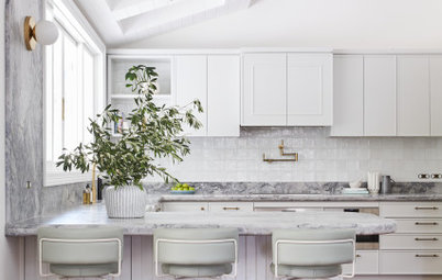
Key features
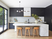
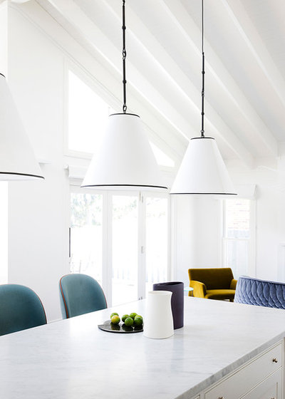
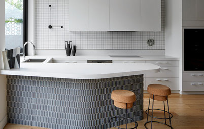
- Cathedral ceiling to kitchen/living area.
- Natural light.
- A beautiful balance of white and colour.
- Exquisite detailing, including lighting.
Interior materials palette
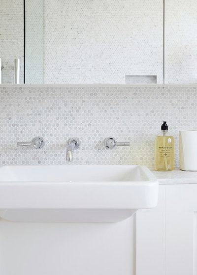
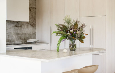
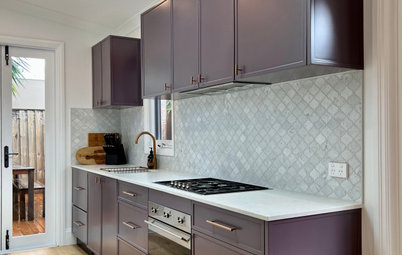
- Carrara marble to kitchen benchtop.
- Carrara marble penny-round tiles to main bathroom wall.
- Carrara marble square-mosaic tiles to powder-room floor and walls.
- Aren Bianco raw-sawn limestone tiles to main bathroom floor from Onsite Supply & Design.
- Ralph Lauren toile wallpaper to powder room from Radford Furnishings.
- Tamino polyamide carpet in Graphite to bedrooms from Whitecliffe Imports.
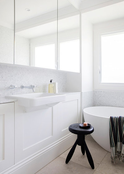
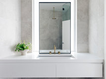
The main bathroom
Fixtures and furniture
Fixtures and furniture
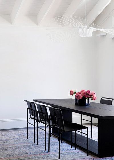
- A trio of Tigger Hall Design Visual Comfort Goodman Medium hanging pendants with paper shades in the kitchen.
- Living Edge Delta V pendant light.
- Petite Friture Vertigo pendant lights in dining room.
- Anibou ClassiCon Roquebrune Eileen Gray chairs in dining room.
- B&B Italia Maxalto Argo dining table.
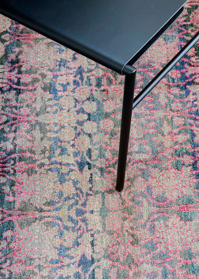
- Robyn Cosgrove one-off hand-knotted silk rug to dining room.
The main bathroom
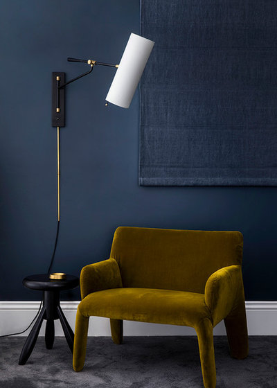
- Robyn Cosgrove Going Up wool-and-silk rug in Oasis Blue to living room.
- Hub Furniture Molteni & C Glove Up Armchairs in mustard by Patricia Urquiola.
- ClassiCon Euvira rocking chair.
- Hub Furniture Moroso Redondo sofa by Patricia Urquiola.
- Jardan Vista sofa to playroom/media room.
- Specified Store Nana Perspex coffee table to playroom/media room.
- Coco-Flip Mayu pendant to playroom/media room.
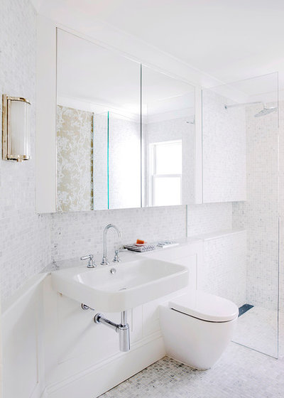
The powder room
Paint colours
Your turn
Do you love what the designer has done here as much as we do? Tell us in the Comments, like this story, save the images and join the conversation.
More
Seeking inspiration for your own renovation? Don’t miss A Poky and Uninspiring ’90s Brick House Grows Up
Paint colours
- Dulux Natural White used throughout (apart from study).
- Dulux Metalise to study walls.
Your turn
Do you love what the designer has done here as much as we do? Tell us in the Comments, like this story, save the images and join the conversation.
More
Seeking inspiration for your own renovation? Don’t miss A Poky and Uninspiring ’90s Brick House Grows Up
What are you working on?

Related Stories
Popular Houzz Series
A Dated Country Home in a Kiwifruit Orchard Made Modern
When their grown-up sons moved out, these NZ homeowners gave their much-loved country home a chic, modern makeover
Full Story
Renovating
An Inspired Solution for a Dark & Disjointed Californian Bungalow
See how an architect opened up a light-starved, closed-in Melbourne home, and connected it with the neighbouring park
Full Story
Popular Houzz Series
Before & After: A Leaky, Falling-Down Victorian Terrace Reborn
See how a small Melbourne terrace, untouched for over 100 years, was remade into a functional home for a modern family
Full Story
Before & After
Before & After: From 'White Box' to Luxe, Layered Apartment
Quiet luxury was the goal for the redesign of this Sydney waterfront apartment – see how the designer achieved it
Full Story
Popular Houzz Series
A Sweet Balmain Cottage Sure to Capture Your Heart
With an extension underway, this cottage was ready for a new decorative scheme that would bring old and new together
Full Story
Before & After
Before & After: A Cheap & Cheerful Makeover of a 1980s Caravan
Armed with an AU$1500 budget, a Melbourne couple rolled up their sleeves and transformed a caravan in just three months
Full Story
Projects Born on Houzz
Before & After: A Light-Drenched Home in the Heart of Coogee
This breezy family home in one of Sydney's beachside suburbs is the essence of relaxed Australian coastal style
Full Story
Interior Design
A Grand Federation Home Comes of Age for a Busy Young Family
See how a revamped layout, custom joinery and luxe touches transformed a dated heritage home in Sydney
Full Story
Architecture
From Tired 100-Year-Old Beach Cottage to Lush, Private Oasis
Encircled by beautiful gardens, this renovated weatherboard cottage in Sydney is all about indoor-outdoor connection
Full Story
Bathroom Renovations
Before & After: A Clunky & Dated Victorian Terrace Reborn
Rising damp, sagging floors and a dysfunctional layout were just some of the challenges this tired terrace offered up
Full Story
attractive, classy but not pretentious
Yes, very clean, minimalist with a classic but retro edge. Distinctively Australian style - such a pity that a beautiful clean aesthetic somehow always leaves me cold. More an art gallery than hope for me. Shame, as my husband loves that aesthetic. A lovely renovation though, I particularly like the depth of colour in the study - inky blue. Fab!