

Before & After: A Kitchen & Dining Area Made Lighter & Brighter
Flipping the floor plan made a small kitchen and large dining area into two far more suitably sized rooms
Vanessa Walker
27 July 2020
Houzz Australia & New Zealand Editor-in-Chief
In a Q&A format, we talk to the designers – and examine the creative thinking – behind some of Houzz’s most loveable rooms.
Images by Pablo Veiga
Styling by Yael Stern
Answers by architect Ciara Tapia of Blue Tea Kitchens and Bathrooms
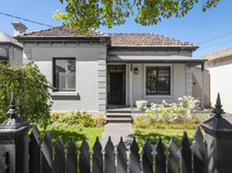
Who lives here: A couple and their two young children
Location: Clovelly, NSW
Room purpose: A kitchen and dining area
Budget: $65,000 for the kitchen and dining area
Styling by Yael Stern
Answers by architect Ciara Tapia of Blue Tea Kitchens and Bathrooms
Who lives here: A couple and their two young children
Location: Clovelly, NSW
Room purpose: A kitchen and dining area
Budget: $65,000 for the kitchen and dining area
Brief
The client wanted a functional yet sophisticated kitchen.
Dreaming of a new kitchen? Find an interior designer near you on Houzz to make your vision a reality
The client wanted a functional yet sophisticated kitchen.
Dreaming of a new kitchen? Find an interior designer near you on Houzz to make your vision a reality
As distinct from the client’s old kitchen, it had to be functional and practical.
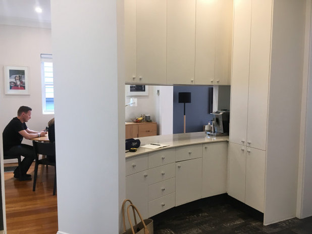
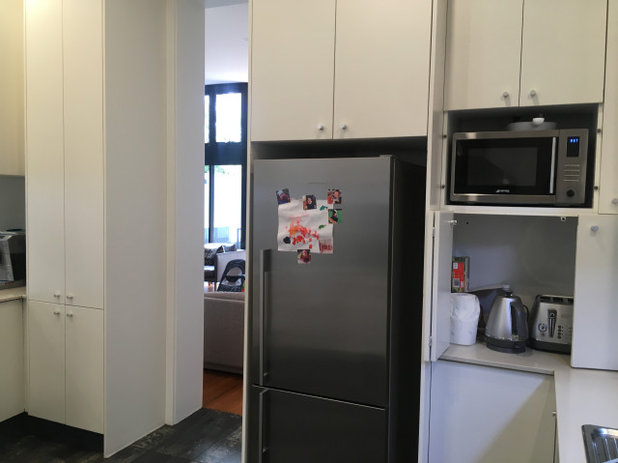
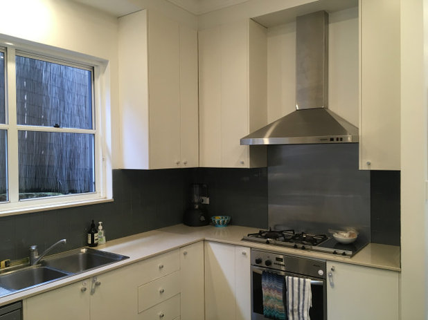
The kitchen before works
What did you do?
Looking at the overall space we were going to work with, we realised the current layout had a lot of area that was not reaching its full potential.
The curved island blocked the flow of space into the living room and also created a visual barrier between the kitchen, dining and living area. This did not work for a family with two small children needing to be watched all the time.
By reviewing the clean lines of connectivity to the main rooms I found that the existing kitchen area was too small and the casual dining space too large.
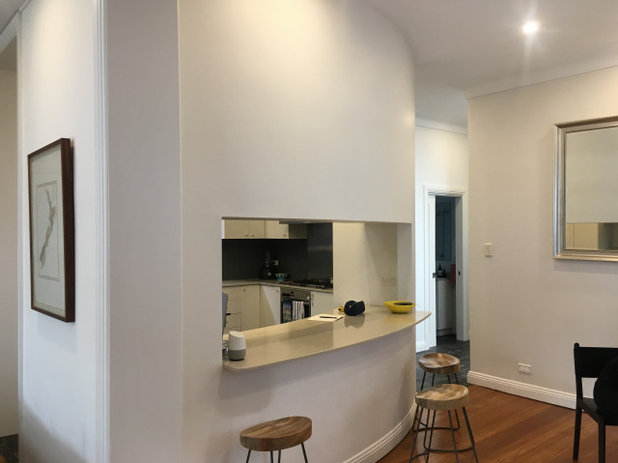
The dining area before works
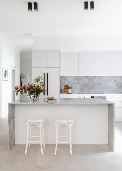
We decided to flip the location of the existing kitchen to where the dining space was. It was a larger area so the layout became more functional. It also had better natural light.
We decided to flip the location of the existing kitchen to where the dining space was. It was a larger area so the layout became more functional. It also had better natural light.
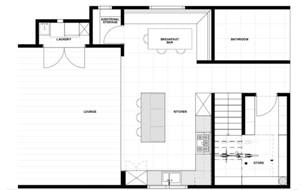
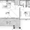
The new floor plan
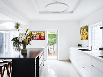
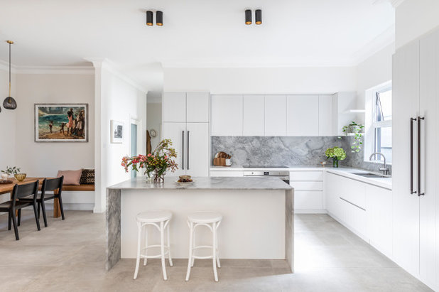
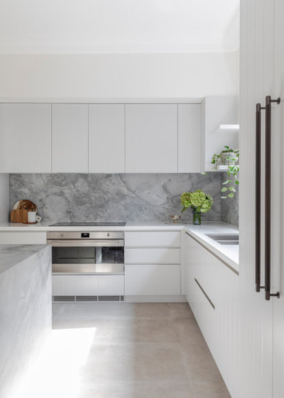
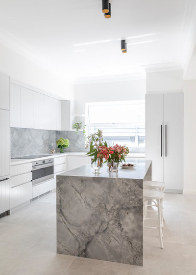
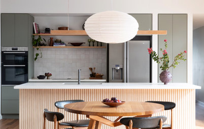
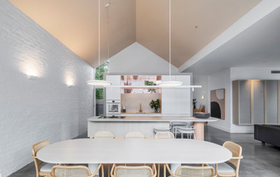
By flipping the spaces we got a much larger kitchen, which was perfect for a family and an even better breakfast bar. These spaces now overlap but also connect directly with the living area and formal dining, flowing on to the garden. The house has the sensation that it has doubled in size.
By flipping the spaces we got a much larger kitchen, which was perfect for a family and an even better breakfast bar. These spaces now overlap but also connect directly with the living area and formal dining, flowing on to the garden. The house has the sensation that it has doubled in size.
Key design aspects
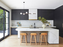
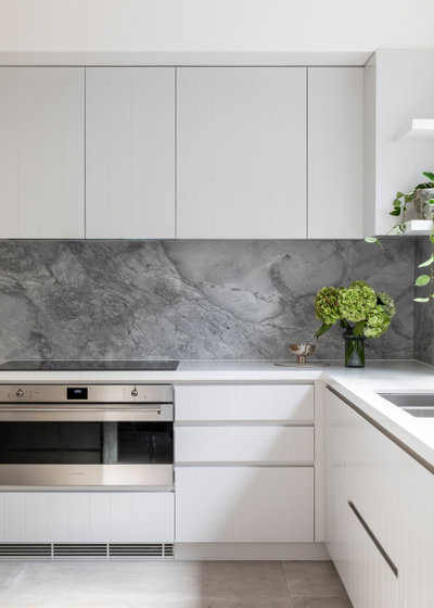
Colour palette: Whites, neutrals and feature marble in super white honed dolomite.
Colour palette: Whites, neutrals and feature marble in super white honed dolomite.
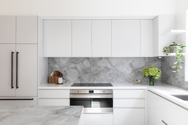
Materials palette: V-groove panels, natural stone, steel (used on the door hardware), concrete (used in the floor tiles), and leather (in the upholstered cushions).
Key pieces of furniture/fittings:
- Ceiling-mounted lights from Studio Italia.
- Barstools from GlobeWest.
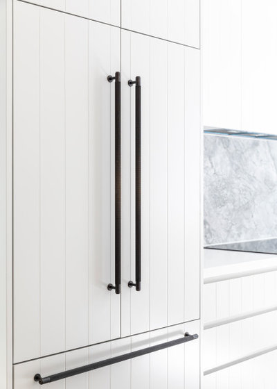
- Buster and Punch cabinet handles from Spark & Burnish Hardware.
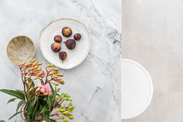
- Super white honed dolomite on the benchtop.
The kitchen before works
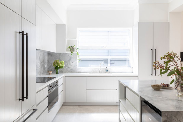
The kitchen now speaks to the living space, formal dining and outdoor area rather than being tucked away in a dark corner.
The kitchen now speaks to the living space, formal dining and outdoor area rather than being tucked away in a dark corner.
Challenges worked around
It was mainly to do with structure. We had to remove a column that was hidden in the existing island structure.
We replaced this with a beam that spanned to the other columns on either side of the room.
It was mainly to do with structure. We had to remove a column that was hidden in the existing island structure.
We replaced this with a beam that spanned to the other columns on either side of the room.
Why do you think this room works?
The client now has a living space that the family can be in all together, whether it’s in the kitchen, breakfast bar, living area, dining space or outdoors.
Your turn
Which idea would you steal from this space? Tell us in the Comments below. And don’t forget to save your favourite images for inspiration, like this story and join the conversation.
More
Want more great kitchen makeovers? Take a look at our last Before & After: A Tiny Apartment Kitchen Packed With Charm

What are you working on?

Related Stories
Kitchens
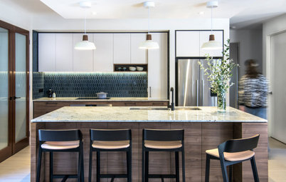
A Kitchen That Uses Special Elements to Punch Above Its Weight
This couple wanted a well-designed kitchen that incorporated their pre-bought furniture; this designer delivered
Full Story
Kitchens
An Interplay of Light, Dark & Colour Creates a Striking Kitchen
All-white joinery, floors and walls is foiled by a handsome island bench and contemporary artworks in this handy kitchen
Full Story
Kitchens
Before & After: A Beachy Sydney Kitchen Sans the Coastal Cliché
A fresh materials palette gives a sense of place, while avoiding style stereotypes, to uplift this timeless new kitchen
Full Story
Kitchens
Before & After: A Penthouse Kitchen High on Glamour & Substance
This NZ penthouse kitchen needed to open up to the views and adjacent dining area. The designer served up that and more
Full Story
Projects Born on Houzz
Before & After: An Open-Plan Kitchen Goes from Boring to Boss
After scouting Houzz for designers, this couple found the right match in a local designer who transformed their space
Full Story
Kitchens
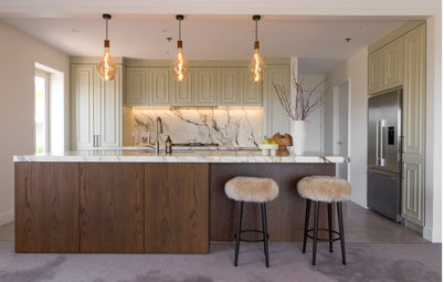
Before & After: A Cathedral-Like Kitchen With Soft Texture & Tone
High ceilings, curves, fluted features and beautiful tactile details elevate this white kitchen into the stratosphere
Full Story

Kitchens
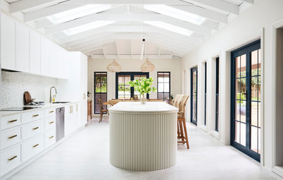
Before & After: A Scandi-Style Kitchen in NZ That's Light & Airy
See this sweet, bright kitchen and dining space in Wellington, which had environmental concerns at the heart of its plan
Full Story
Kitchens
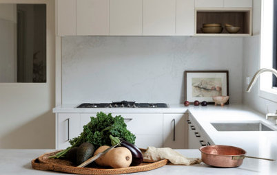
Before & After: A Quietly Quality Kitchen That Kept Its Layout
The layout couldn't be changed, but a clever approach to storage and colour transformed this Melbourne kitchen
Full Story
Projects Born on Houzz
Room of the Week: A Reader's Bathroom Inspired by Houzz
When you're planning a new bathroom, where do you look for ideas? Houzz, of course! See how this reader did it
Full Story
Kitchens
Room of the Week: A Scandi Kitchen That Doubles as a Workspace
Pared-back lines, a clay-coloured ceiling and a cooking/storage 'pod' star in this designer's family kitchen/work zone
Full Story
Can't appreciate it as much when the before and after photos are not taken at the same angle.
I think the kitchen is lovely. Was just appreciating that the family chose not to have the same old trio of glass pendants in the kitchen that you see in so many renovations. Bet those lights are super practical for food prep!
It would have been good to see a photo of the dining area