


Before & After: A Modern Monochrome Kitchen for a Young Family
Changing this kitchen from a U-shape to an L-shape opened up the entire space visually and practically
Vanessa Walker
2 August 2021
Houzz Australia & New Zealand Editor-in-Chief
In a Q&A format, we talk to the designers – and examine the creative thinking – behind some of Houzz’s most loveable rooms.
Images by Joe Cheng
Answers by Teresa Perng, owner and creative director of TP Interiors
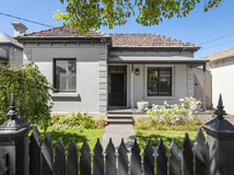
Who lives here: A young couple and their baby
Location: Cremorne, Victoria
Room purpose and size: A 10-square-metre kitchen
Approximate budget: $25,000 to $30,000
Answers by Teresa Perng, owner and creative director of TP Interiors
Who lives here: A young couple and their baby
Location: Cremorne, Victoria
Room purpose and size: A 10-square-metre kitchen
Approximate budget: $25,000 to $30,000
The brief
A modern, monochrome kitchen to complement the timber.
A modern, monochrome kitchen to complement the timber.
Before Photo
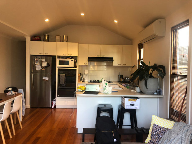
The U-shaped kitchen before works
Want to transform your kitchen from ‘before’ to ‘after’? Find a specialised kitchen designer on Houzz near you
Want to transform your kitchen from ‘before’ to ‘after’? Find a specialised kitchen designer on Houzz near you
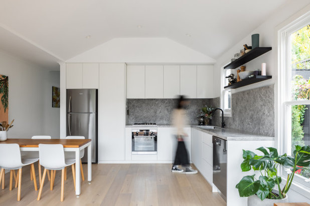
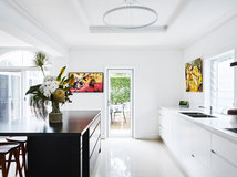
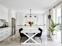
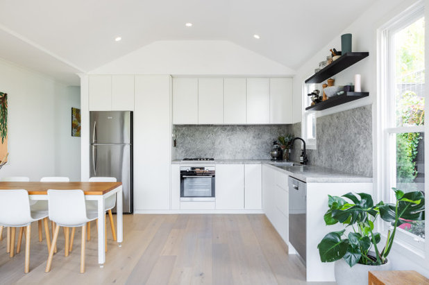
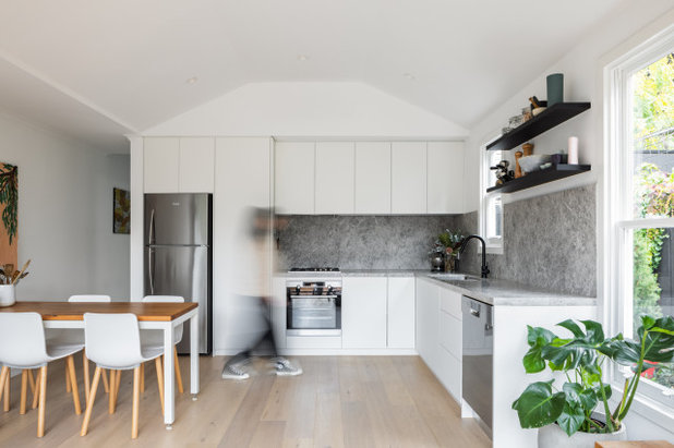
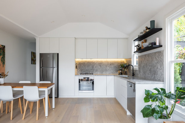
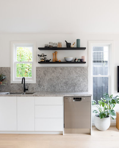
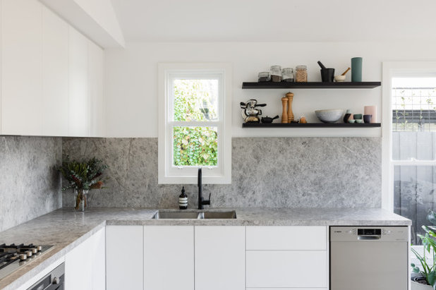
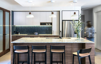
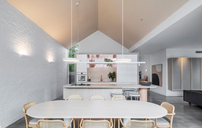
The L-shaped kitchen after works
Starting point
The client wanted to simplify the layout from a U-shape to an L-shape. This was the main starting point for the kitchen.
Starting point
The client wanted to simplify the layout from a U-shape to an L-shape. This was the main starting point for the kitchen.
Key design aspects
Colour palette:
Materials palette:
Colour palette:
- Black and white (monochrome).
- Timber.
Materials palette:
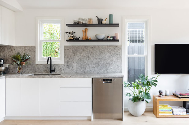
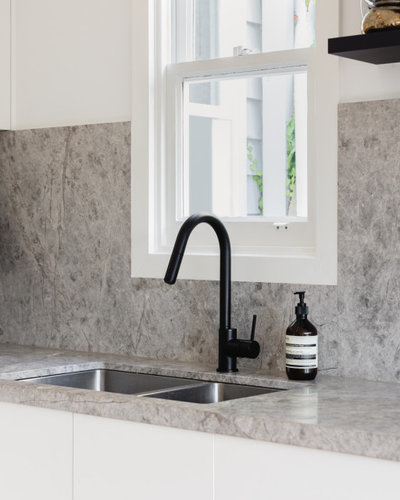
- New Grey Tundra stone benchtop and splashback from Signorino Tile Gallery.
- Polaris white laminate cabinets from Abet Laminati.
- Pale Oak timber flooring from Woodcut.
Key pieces of furniture/fittings:
- Mizu Drift Gooseneck Pull-Out Mixer Tap in Matt Black from Reece.
- Furniture is the client’s own.
Before Photo
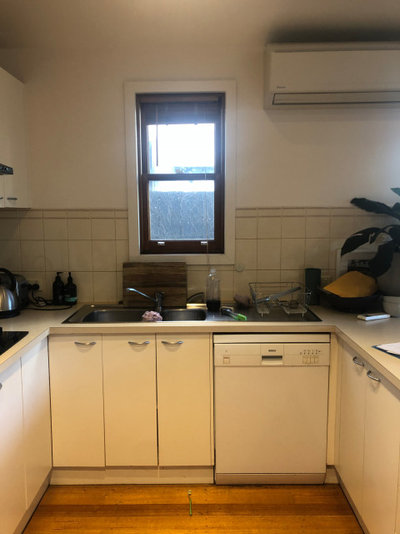
The kitchen before works
Thinking behind the arrangement of furniture/fixtures
The initial kitchen layout was U-shaped and used up more room than needed in an open-plan space. The new kitchen stops short at the window to improve the flow of the room and achieve a more practical layout.
Browse more beautifully designed L-shaped Australian kitchens
The initial kitchen layout was U-shaped and used up more room than needed in an open-plan space. The new kitchen stops short at the window to improve the flow of the room and achieve a more practical layout.
Browse more beautifully designed L-shaped Australian kitchens
What challenges did you work around?
Ensuring enough storage was key and selecting the right laminate that doesn’t show fingerprints.
Ensuring enough storage was key and selecting the right laminate that doesn’t show fingerprints.
Before Photo
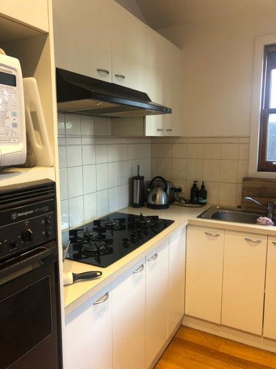
The kitchen before works
Why do you think this room works?
Working with a minimal palette, the grey stone is the hero feature, adding texture and complexity through its materiality. Black floating shelves and black tapware contrast well against the grey stone and seamless white joinery.
The new layout connects well with the open-plan dining and living spaces, making it easier for the family to move around. It also means that the parents can watch over their baby while cooking.
Your turn
What do you like about this kitchen? Tell us in the Comments below. And don’t forget to save your favourite images for inspiration, like this story and join the conversation.
More
Craving more great interior transformations? Take a look at this Before & After: A Stark Living Area Made Warm & Welcoming
Related Stories
Kitchens
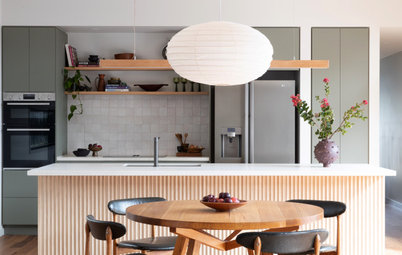
A Kitchen That Uses Special Elements to Punch Above Its Weight
This couple wanted a well-designed kitchen that incorporated their pre-bought furniture; this designer delivered
Full Story
Kitchens
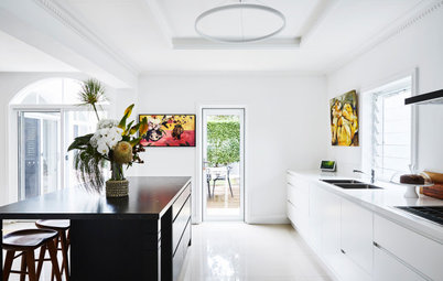
An Interplay of Light, Dark & Colour Creates a Striking Kitchen
All-white joinery, floors and walls is foiled by a handsome island bench and contemporary artworks in this handy kitchen
Full Story
Kitchens
Before & After: A Beachy Sydney Kitchen Sans the Coastal Cliché
A fresh materials palette gives a sense of place, while avoiding style stereotypes, to uplift this timeless new kitchen
Full Story
Kitchens
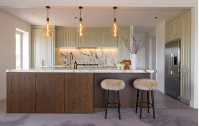
Before & After: A Penthouse Kitchen High on Glamour & Substance
This NZ penthouse kitchen needed to open up to the views and adjacent dining area. The designer served up that and more
Full Story
Projects Born on Houzz
Before & After: An Open-Plan Kitchen Goes from Boring to Boss
After scouting Houzz for designers, this couple found the right match in a local designer who transformed their space
Full Story
Kitchens
Before & After: A Cathedral-Like Kitchen With Soft Texture & Tone
High ceilings, curves, fluted features and beautiful tactile details elevate this white kitchen into the stratosphere
Full Story

Kitchens
Before & After: A Scandi-Style Kitchen in NZ That's Light & Airy
See this sweet, bright kitchen and dining space in Wellington, which had environmental concerns at the heart of its plan
Full Story
Kitchens
Before & After: A Quietly Quality Kitchen That Kept Its Layout
The layout couldn't be changed, but a clever approach to storage and colour transformed this Melbourne kitchen
Full Story
Projects Born on Houzz
Room of the Week: A Reader's Bathroom Inspired by Houzz
When you're planning a new bathroom, where do you look for ideas? Houzz, of course! See how this reader did it
Full Story
Kitchens
Room of the Week: A Scandi Kitchen That Doubles as a Workspace
Pared-back lines, a clay-coloured ceiling and a cooking/storage 'pod' star in this designer's family kitchen/work zone
Full Story
What colour white was used in the cabinetry in the kitchen, this looks timeless
Hi Louise, thank you for your enquiry. White cabinets are from Abet Laminati's Polaris range in the beautiful 2904 White.
@HU-655902520 Logically, makes sense. However visually I think the dishwasher looks better at the end.