

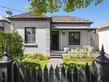


Before & After: Punchy Patterns Bring a Drab Front Room to Life
The delightful new scheme in a makeover of this Victorian home's front room is a lesson in combining colour and pattern
Georgia Madden
16 December 2019
In a Q&A format, we talk to the designers – and examine the creative thinking – behind some of Houzz’s most loveable rooms.
Images by Tom Ferguson
Interior design by Sonia Warner and Jacinta Woods at Woods & Warner
Answers by Jacinta Woods
Who lives here: A family with two young children
Location: Millers Point, NSW
Room purpose and size: A living room and adjoining dining room, together measuring approximately 40 square metres. The family uses the space to watch television, for the children to play, and for more formal entertaining on weekends
Budget: Approximately $120,000
Where did most of the budget go: On the cabinetry
How did you use Houzz: The clients showed us a few images from Houzz to communicate their brief
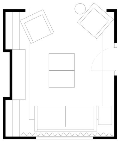
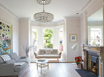
The new living-room layout
What was your brief?
The clients couldn’t pinpoint exactly what wasn’t working about the room. They just felt it lacked colour and energy.
The brief was to bring back the charm and make the two adjoining rooms feel family friendly while retaining their heritage features.
Need help bringing your scheme together? Find a local interior designer on Houzz to help you create a scheme you’ll love
The new combined living/dining room
What wasn’t working for the clients about the space originally?
There was no storage and it was lacking in personality.
What wasn’t working for the clients about the space originally?
There was no storage and it was lacking in personality.
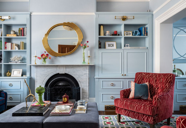
The living room after works. New custom joinery provides ample space to conceal toys, the television and sound system, and even some kitchen items
What were the client’s must-haves?
What were the client’s must-haves?
- Storage for the children’s toys and books.
- A grown-up feel to the space while also being family friendly.
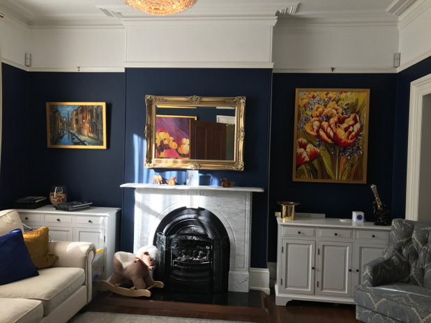
The living room before works
What was the room like originally?
Dark and dull with insufficient storage.
What state was it in when you came onboard?
The area was clean and well-maintained, and had been renovated a few years ago. However, a lack of storage and lighting, and incorrect furniture and window-treatment selection made it feel boring and lifeless.
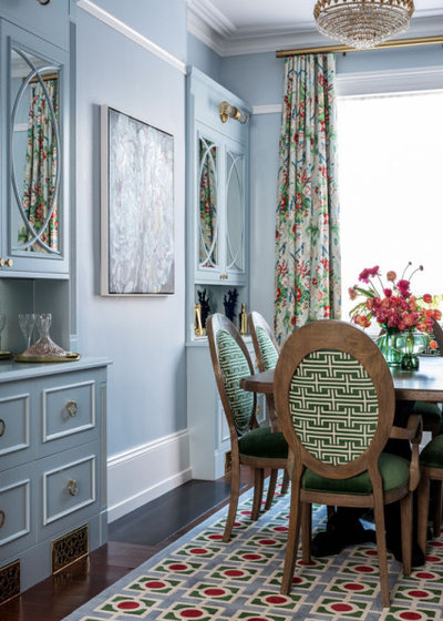
What was your starting point?
The dining table and chairs, which worked so well in the space but required a new lease on life. The design of the chairs was fabulous, however the original neutral canvas fabric felt underwhelming in the space. We kept the chairs in the new scheme and had them reupholstered.
Their Hollywood regency style, combined with the rooms’ beautiful historical architecture, suggested a fairly traditional design for the new scheme, but modernised with colour.
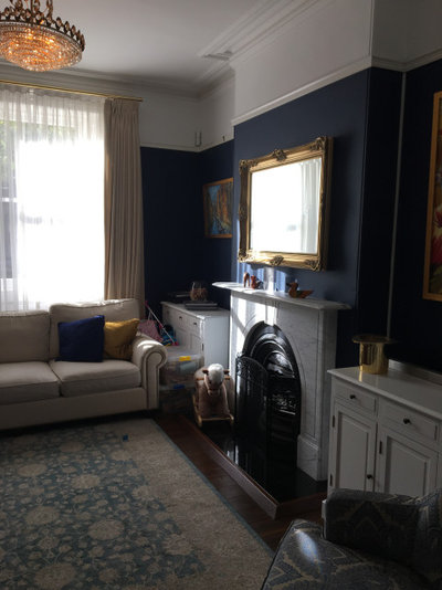
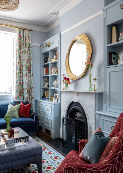
The fireplace before works. The chandelier, seen above, had been recently purchased by the client and was integrated into the new scheme
What exactly did you do?
What exactly did you do?
- Restored the original fireplace, cornices and ceilings.
- Lowered the fireplace and put in a new hearth to sit flush with the floor.
- Specified custom, built-in joinery.
- Reupholstered the dining chairs and armchairs.
- Stained the legs of the armchairs to match the dining table.
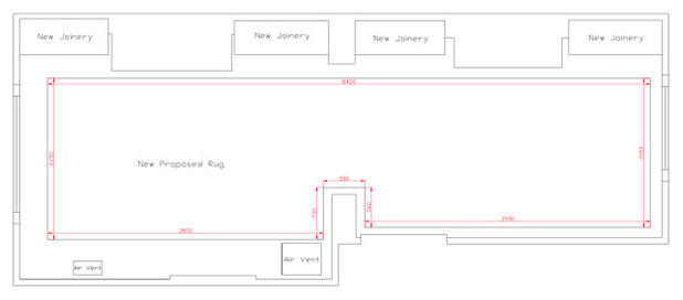
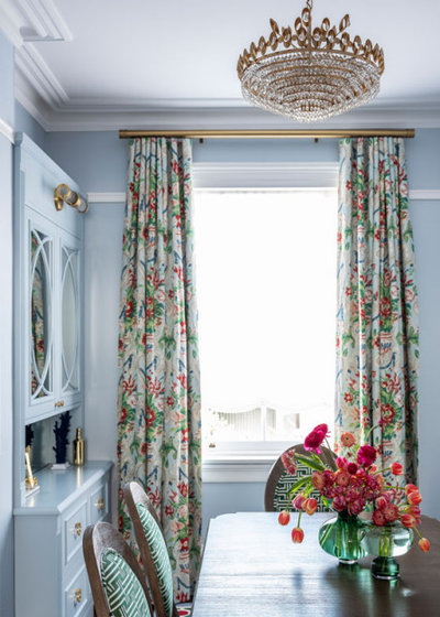
- Specified a new custom rug to run the full length of the two rooms.
- Selected new paint.
- Specified new wallpaper.
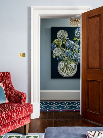
- Chose new interior doors.
- Specified new curtains and Roman blinds.
- Selected a new sofa and coffee table.
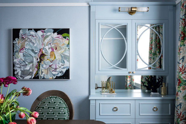
- Included new accessories, such as the mirror above the fireplace and the floor lamp.
The armchairs were reupholstered to give them a fresh new look
What was your thinking behind the arrangement of furniture?
Limited floor space, and the fact that there needed to be access between the living and dining zones, meant the furniture plan was fairly restricted.
What was your thinking behind the arrangement of furniture?
Limited floor space, and the fact that there needed to be access between the living and dining zones, meant the furniture plan was fairly restricted.
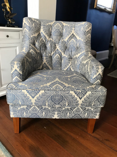
The original upholstered armchair
What challenges did you work around?
The original wallpaper that we had ordered, which was matched to the joinery colour, turned out to be faulty, and the supplier couldn’t provide a replacement.
Sparkk came to the rescue and printed us the perfect paper to match our joinery. The setback was only a week, but it was touch-and-go there for a while.
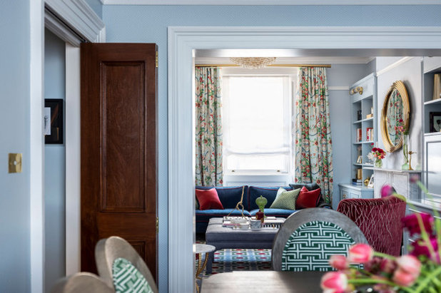
Generous built-in joinery now provides ample storage
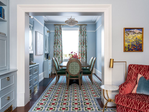
What does the new colour palette consist of?
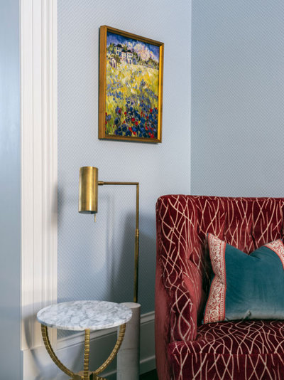
Soft French blue, grass green and cherry red.
What does the new colour palette consist of?
Soft French blue, grass green and cherry red.
The original living-room storage
Which aspect was the client most surprised about?
Their initial hesitation was around the fact that the design might be too overwhelming. They were surprised at how the space could feel so calm and comfortable with this amount of colour and pattern in it.
Which aspect was the client most surprised about?
Their initial hesitation was around the fact that the design might be too overwhelming. They were surprised at how the space could feel so calm and comfortable with this amount of colour and pattern in it.
This rug from Designer Rugs was custom-designed to run the full length of the two rooms in order to visually integrate the spaces
Why do you think the room works so well?
It is peaceful yet playful, formal yet inviting, and it responds so well to our client’s original brief. We have injected colour without detracting from the beauty of the home’s architecture.
Why do you think the room works so well?
It is peaceful yet playful, formal yet inviting, and it responds so well to our client’s original brief. We have injected colour without detracting from the beauty of the home’s architecture.
Key design aspects
- Taubmans Forever More paint.
- Cabinetry designed by Instyle Design Interiors.
- Designer Rugs custom rug.
- Sparkk wallpaper.
- Arthur G sofa covered in Pepe Peñalver Block 14 velvet in Colour 14 from Elliott Clarke with contrasting red piping.
- Curtains in Schumacher Aylesbury Vase linen in Aqua.
- Armchair upholstered in Kravet Lee Jofa Julianne velvet in Rose.
- Dining chairs upholstered in JF Fabrics Hicken 76 rayon/cotton/poly mix in Green (backs) and Schumacher Antique Strie Velvet in Emerald (seats).
- 1stdibs pendant light.
- Regency Distribution wall lights and Cesario mirror.
- Cromwell side table.
- Bloomingdale’s floor lamp.
- Artwork on dining room wall: Waterdrops on Peonies Fleur oil on canvas by Helena McConochie.
- Artwork on hallway wall (seen through doorway): Evie oil and acrylic on canvas by Felicia Aroney.
Your turn
Do you love this scheme as much as we do? Tell us in the Comments, like this story, save the images and join the conversation.
More
Keen to peek inside another well-designed home? Don’t miss An Interior Designer’s Step-by-Step Sophisticated Home Makeover
Do you love this scheme as much as we do? Tell us in the Comments, like this story, save the images and join the conversation.
More
Keen to peek inside another well-designed home? Don’t miss An Interior Designer’s Step-by-Step Sophisticated Home Makeover

Related Stories
Kitchens
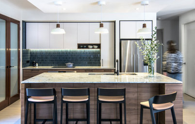
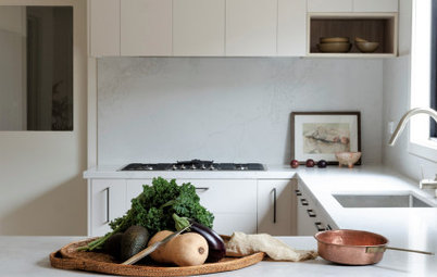
A Kitchen That Uses Special Elements to Punch Above Its Weight
This couple wanted a well-designed kitchen that incorporated their pre-bought furniture; this designer delivered
Full Story
Kitchens
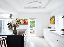
An Interplay of Light, Dark & Colour Creates a Striking Kitchen
All-white joinery, floors and walls is foiled by a handsome island bench and contemporary artworks in this handy kitchen
Full Story
Kitchens
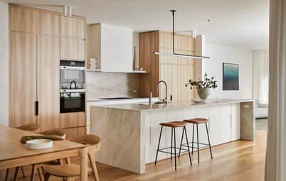
Before & After: A Beachy Sydney Kitchen Sans the Coastal Cliché
A fresh materials palette gives a sense of place, while avoiding style stereotypes, to uplift this timeless new kitchen
Full Story
Kitchens
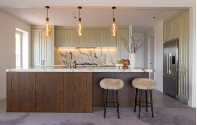
Before & After: A Penthouse Kitchen High on Glamour & Substance
This NZ penthouse kitchen needed to open up to the views and adjacent dining area. The designer served up that and more
Full Story
Projects Born on Houzz
Before & After: An Open-Plan Kitchen Goes from Boring to Boss
After scouting Houzz for designers, this couple found the right match in a local designer who transformed their space
Full Story
Kitchens
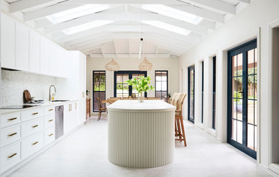
Before & After: A Cathedral-Like Kitchen With Soft Texture & Tone
High ceilings, curves, fluted features and beautiful tactile details elevate this white kitchen into the stratosphere
Full Story

Kitchens
Before & After: A Scandi-Style Kitchen in NZ That's Light & Airy
See this sweet, bright kitchen and dining space in Wellington, which had environmental concerns at the heart of its plan
Full Story
Kitchens
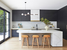
Before & After: A Quietly Quality Kitchen That Kept Its Layout
The layout couldn't be changed, but a clever approach to storage and colour transformed this Melbourne kitchen
Full Story
Projects Born on Houzz
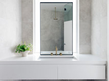
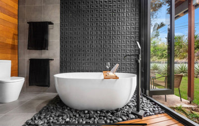
Room of the Week: A Reader's Bathroom Inspired by Houzz
When you're planning a new bathroom, where do you look for ideas? Houzz, of course! See how this reader did it
Full Story
Kitchens
Room of the Week: A Scandi Kitchen That Doubles as a Workspace
Pared-back lines, a clay-coloured ceiling and a cooking/storage 'pod' star in this designer's family kitchen/work zone
Full Story
Just lovely, delightful practical and not fussy. Luv the fresh curtains. Lots of inspiration here..
Interesting to see the difference a wall colour can do, especially when it is the main affair. From cluttered & busy, with a feeling of being cramped to spaciousness, lightness & elegance. Very pleasing!
This is a great example on what fabrics you can choose with an unlimited budget (relatively, given the scope of this project)