


British Houzz: A Victorian Ballroom Grows Into a Modern Apartment
What was once a grand space for stately balls and parties has been turned into a comfortable family home made for entertaining
Amanda Pollard
19 September 2016
Senior Editor at Houzz UK and Ireland. Journalist and editor specialising in interiors and architecture.
Senior Editor at Houzz UK and Ireland. Journalist and editor specialising in interiors... More
When the owners of this London apartment contacted designer Kia Stanford, their property had seen better days. Following its heyday as a grand Victorian ballroom, the property had hardly been touched since the 1980s. “It was in a bad state of repair, with wasted space and dingy lighting,” explains Stanford. The clients wanted to bring back its original beauty and create a comfortable home they could share with friends.
Who lives here: A professional couple
Location: Earl’s Court, London, UK
Property: A flat on the first floor of a period building
Size: 1 bedroom, 1 bathroom
Designer: Kia Stanford of Kia Designs
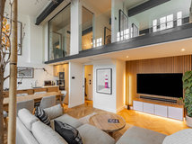
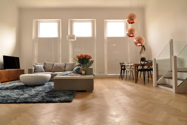
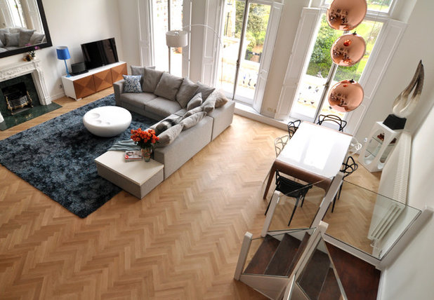
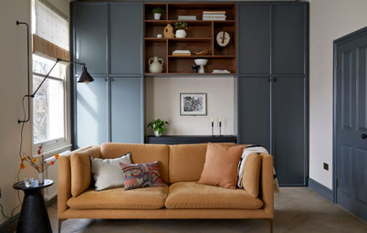
The floor and colour scheme were the starting points for the flat’s design. The space is so large that panels of normal wood flooring could have looked too short and messy. “My clients were keen to try herringbone parquet,” says designer Kia Stanford, “but they weren’t sure how it would look.” They found a manufacturer who supplied the right-sized blocks, and the result is wonderfully soft and elegant.
Stanford chose a colour scheme of blues and coppers. The tones add a warm element to the otherwise minimalist space.
Sofa: BoConcept; rug: Stepevi; Copper lights: Tom Dixon
Location: Earl’s Court, London, UK
Property: A flat on the first floor of a period building
Size: 1 bedroom, 1 bathroom
Designer: Kia Stanford of Kia Designs
The floor and colour scheme were the starting points for the flat’s design. The space is so large that panels of normal wood flooring could have looked too short and messy. “My clients were keen to try herringbone parquet,” says designer Kia Stanford, “but they weren’t sure how it would look.” They found a manufacturer who supplied the right-sized blocks, and the result is wonderfully soft and elegant.
Stanford chose a colour scheme of blues and coppers. The tones add a warm element to the otherwise minimalist space.
Sofa: BoConcept; rug: Stepevi; Copper lights: Tom Dixon
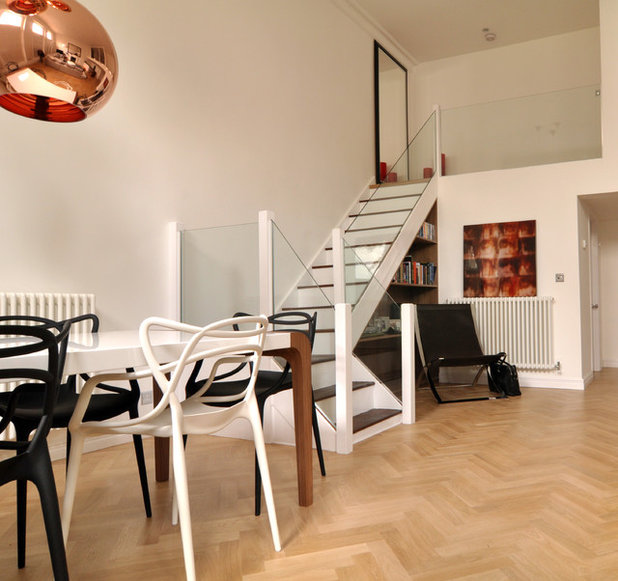
Stanford and her team had planned to rip out the original staircase and start again. However, it proved more cost-effective to revamp what was already there.
They added a dark stain to the wooden treads and painted the risers and sides white. They then brushed a layer of clear varnish over it all to prevent damage. The banister was replaced by reinforced glass panels all the way up and along the mezzanine landing. “It completely transformed the staircase,” enthuses Stanford.
They added a dark stain to the wooden treads and painted the risers and sides white. They then brushed a layer of clear varnish over it all to prevent damage. The banister was replaced by reinforced glass panels all the way up and along the mezzanine landing. “It completely transformed the staircase,” enthuses Stanford.
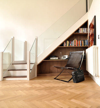
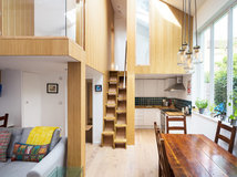
The space below the stairs had previously been boarded up. “We wanted to make more use of this area,” Stanford tells me. She designed a triangular bookcase and small desk in walnut. It fits perfectly into the space and makes a feature of it without being too complicated.
The artwork propped on the radiator is made from metal, so won’t be damaged by the heat.
Chair: Andrew Martin
The artwork propped on the radiator is made from metal, so won’t be damaged by the heat.
Chair: Andrew Martin
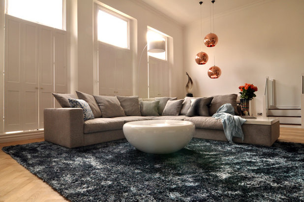
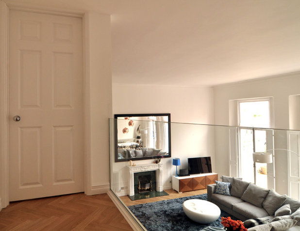
The sofa needed to be huge in order to occupy its space in the room, so Stanford and the owners chose this large, comfortable corner sofa, which zones the living area. The cotton-mix fabric and ample cushions make it a cosy spot in which to relax, while the rug adds another element of comfort.
There are four or five different tones of blue in the rug, which changes colour as you move around the room. “As the rest of the apartment is very slick and modern, adding texture with the rug, and the sculpture in the corner, gives the space more warmth and interest,” explains Stanford.
There are four or five different tones of blue in the rug, which changes colour as you move around the room. “As the rest of the apartment is very slick and modern, adding texture with the rug, and the sculpture in the corner, gives the space more warmth and interest,” explains Stanford.
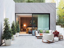
The shutters and French windows that look out on to the square below were already in place. “It was nice to be able to restore and keep them,” says Stanford.
The dining table, with walnut legs and a high-gloss surface, is surrounded by classic Philippe Starck Masters chairs. Above are three beautiful copper lights that add glamour to the room and work well with the warm colour scheme.
Masters dining chairs: Philippe Starck
The dining table, with walnut legs and a high-gloss surface, is surrounded by classic Philippe Starck Masters chairs. Above are three beautiful copper lights that add glamour to the room and work well with the warm colour scheme.
Masters dining chairs: Philippe Starck
The TV cabinet in the far corner was made by an Italian company. Stanford wanted to add a variety of woods to the apartment, so she chose cherry for the cabinet’s doors. The wood’s diagonal grains complement the parquet flooring beautifully.
The stone mantelpiece was restored and a gas fire fitted inside. Above is a huge mirror that ties in with the proportions of the sofa. “It proved very difficult to put up,” laughs Stanford.
The stone mantelpiece was restored and a gas fire fitted inside. Above is a huge mirror that ties in with the proportions of the sofa. “It proved very difficult to put up,” laughs Stanford.
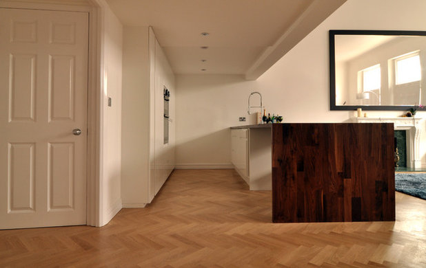
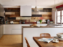
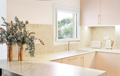
One of the biggest challenges was the kitchen area, as the difference in ceiling heights required careful planning. The owners had been struggling with the proportions, and how to bridge the gap between the two areas.
Stanford used the whole of the back wall for storage, with two separate pantry areas and built-in appliances. The walnut breakfast bar and wooden stools bring the room into the living area and make it a sociable place to cook.
Stanford used the whole of the back wall for storage, with two separate pantry areas and built-in appliances. The walnut breakfast bar and wooden stools bring the room into the living area and make it a sociable place to cook.
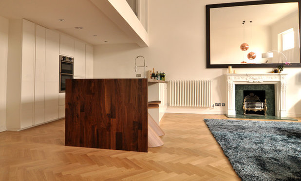
At the far end of the breakfast bar is storage that can be accessed from the living room side. It’s a fantastic feature for entertaining, as it allows the owners to grab a glass or a drink for their guests with ease.
On the other side are the dishwasher, sink and stove, as well as a pull-out drawer that houses the bins. Storage is vital in an open space like this, as you can’t just shut things away in another room, so keeping the bins tucked away is a great option.
On the other side are the dishwasher, sink and stove, as well as a pull-out drawer that houses the bins. Storage is vital in an open space like this, as you can’t just shut things away in another room, so keeping the bins tucked away is a great option.
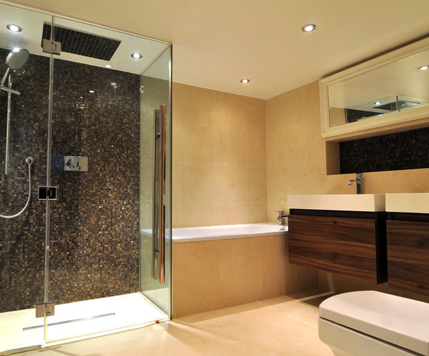
The owners were keen to have a separate shower, so they decided to make this the main focus of the bathroom. Stanford had a bespoke shower door designed to fit the space, and covered the back wall with gorgeous marble mosaics. The rest of the room is very simple, with warm colours that give it a spa-like feel.
Stanford rearranged the layout to fit in a bath and twin basins. The tiles are porcelain and easy to keep clean, while the vanity unit drawers are made from dark walnut. The recessed shelf is a good place to put toiletries and keep them away from the basin.
Stanford rearranged the layout to fit in a bath and twin basins. The tiles are porcelain and easy to keep clean, while the vanity unit drawers are made from dark walnut. The recessed shelf is a good place to put toiletries and keep them away from the basin.
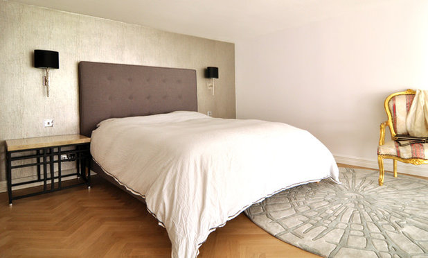
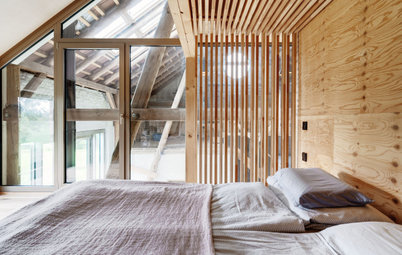
The bedroom is a calm retreat, clear of all distractions. Behind the bed is a cracked plaster wall-covering with a metallic finish. Stanford complemented the shiny wall with a bedhead of soft linen.
The space was quite tight, so Stanford chose wall lights rather than table lamps. They create an open feel and don’t waste space on the table tops.
The owners’ chair works perfectly here as a place to sit and put on shoes without crumpling a freshly made bed. The circular rug adds a cosy feel and softens some of the hard edges.
TELL US
What do you think of this reinvented apartment? Share your thoughts in the Comments below.

Related Stories
Houzz Tours
France Houzz: A New Island Home With an Old Soul
Check out this young family's welcoming and characterful French island home on Île d’Yeu, which embraces local style
Full Story
Houzz Tours
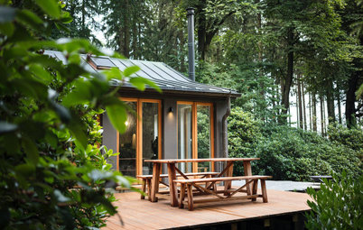
Germany Houzz: A Small Cabin Transformed Into a Forest Retreat
In this secluded area in the Taunus mountains of Germany, a family enjoys their weekends in 29 square metres of space
Full Story
Houzz TV
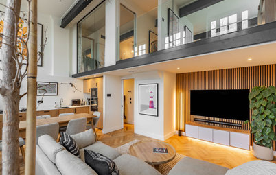
London Houzz: Tour a Contemporary Loft in an Old Victorian School
Watch and read how a design firm updated this light and airy apartment in an old block with sleek style and warm touches
Full Story
Garden Design
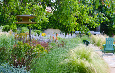
Spain Garden Tour: A Mediterranean Makeover With Colour & Texture
Once neglected, this naturalistic garden is now a series of outdoor rooms with idyllic spots to swim, dine and relax
Full Story
Houzz Tours
Berlin Houzz: A Touch of Japanese Forest Bathing in a German Home
Beloved memories of Japan come to life with the renovation of this 120-square-metre apartment in Berlin, Germany
Full Story
Houzz Tours
London Houzz: Daring Colour & Texture Transform a Victorian Home
By Kate Burt
The busy owners of this terrace sought help to design outside their decor comfort zone – the result is a cool classic
Full Story
Houzz Tours
Germany Houzz: Creating Summer & Winter Homes in a Converted Barn
One barn, two homes – see how architects designed separate zones for summer and winter living in an old country barn
Full Story
Houzz Tours
Before & After: Finding the Perfect Pink in a Barcelona Kitchen
Barely-there pink acts as a warm neutral in a new open-plan Spanish kitchen, replacing dark cabinets and drab finishes
Full Story
Houzz Tours
Before & After: Colour Blocking & Pattern Nod to Nature in Rome
Move and upsize or stay and renovate? This young family chose the latter in their small Italian apartment – here's why
Full Story
Houzz Tours
Barcelona Houzz: Style, Sustainability and Pattern in a Tiny Flat
Part-renovation, part-restoration, the owners of this Spanish apartment balanced historical style with forward thinking
Full Story
That floor! To die for.
Stunning.
My only reservation is around the glass banister. In keeping with the grand, ballroom style space, I would have gone for something more ornate - which still could be achieved on a budget.