
Decorating
Decorate With Pink Without Going Into Shock
Forget every stereotype associated with pink and be surprised by its stylish diversity

Pink as a decorating hue can be rather divisive – after all, few other colours can set a tone quite so specifically in its myriad shades. If ‘feminine’ or ‘romantic’ themes aren’t really your thing, then you might naturally shy away from a rose-tinted interior; but the beauty of pink, from the most vibrant fuchsia to a delicate pastel, is that it can be used as a bold accent tone or a surprising neutral to flatter any interior style. Not convinced? Read on – there isn’t a girlie room in sight.
Add a pop
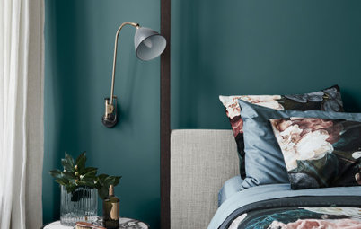
Can you think of a better way to perk up a grey bathroom than with a bubblegum pink heater? Looking at this picture, I can’t. Surprising details like this put the ‘fun’ into ‘functional’ and make a playful addition to a utilitarian space.
Pepper the room with small touches of pink – a towel here, a cup there – for consistency, and perhaps some unexpected art for contrast.
Plump for punchy
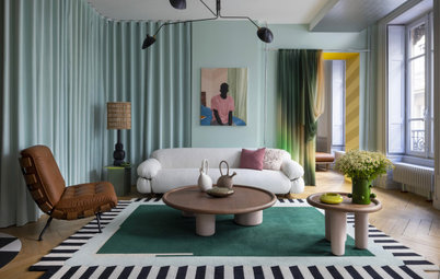
If you’re feeling a bit bolder about embracing pink, several pieces of furniture in a punchy hue can transform a sparsely decorated space. Keeping the rest of the decor in this room clean and minimalist lets the pink speak for itself without being overpowering.
Complementary tones are key – the cool greys and whites are a great canvas for the blue-toned pinks in this room. For a warmer-toned palette of creams or browns, try coral or peachier shades of pink.
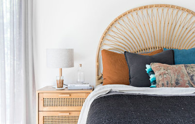
Work in a detail
In such a small space, one bright feature is all that’s needed to add interest and liven up the theme. Lamps are the perfect accessory for a little bolthole like this, especially when the rest of the colour scheme is monochrome. An ornate rug is the perfect understated accessory to tie the whole look together.
In such a small space, one bright feature is all that’s needed to add interest and liven up the theme. Lamps are the perfect accessory for a little bolthole like this, especially when the rest of the colour scheme is monochrome. An ornate rug is the perfect understated accessory to tie the whole look together.
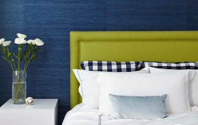
Have a grown-up crush
A plush pink sofa might sound saccharine, but the crushed velvet fabric and classic, masculine style make this piece an opulent and striking addition to an otherwise sombre interior. It works particularly well here because of the matching grey chesterfield sofa, which pulls its fuchsia counterpart into the rest of the scheme.
A plush pink sofa might sound saccharine, but the crushed velvet fabric and classic, masculine style make this piece an opulent and striking addition to an otherwise sombre interior. It works particularly well here because of the matching grey chesterfield sofa, which pulls its fuchsia counterpart into the rest of the scheme.
Enliven all white
An all-white interior, particularly in a kitchen, walks the fine line between pristine and sterile. Add a few bursts of pink, however, and the area is transformed into a bright and friendly room that doubles as a social space.
A bold colour, such as hot pink, can be kept to a minimum: treating it as an accessory, limited to splashback, rug, seating and flowers, will mean it acts as an anchor for other brights and avoids overwhelming the decor.
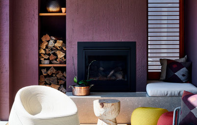
Go gothic-lite
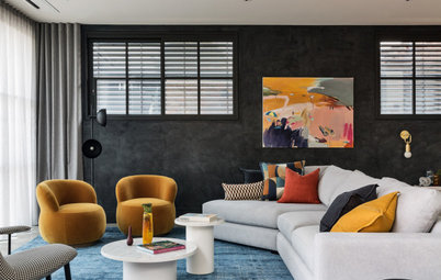
This room is a masterclass in confident colour schemes: black and yellow offset the pink armchair, and the colourful French chandelier picks up the brights, while dark accessories turn down the overall volume. In another, more neutral, setting the ornate style and vivid pink of the armchair might have appeared garish, but here it blends seamlessly into the room’s bold style.
This room is a masterclass in confident colour schemes: black and yellow offset the pink armchair, and the colourful French chandelier picks up the brights, while dark accessories turn down the overall volume. In another, more neutral, setting the ornate style and vivid pink of the armchair might have appeared garish, but here it blends seamlessly into the room’s bold style.
Enjoy gilt-y pleasures
Versailles meets Rajasthan in this opulent, rose-hued interior. While pink is a bold colour choice for walls, the deep, saturated shade replete with plentiful gold detail makes for a deeply decadent canvas. Dark wooden furniture and framed black and white images are perfect accompaniments that keep the colour scheme quiet and classy.
Versailles meets Rajasthan in this opulent, rose-hued interior. While pink is a bold colour choice for walls, the deep, saturated shade replete with plentiful gold detail makes for a deeply decadent canvas. Dark wooden furniture and framed black and white images are perfect accompaniments that keep the colour scheme quiet and classy.
Opt for playful
In a child’s room, pink doesn’t have to equal girlie. A happy cacophony of brights, seen here, is punctuated by just a couple of well-chosen pink items. There’s nothing matchy-matchy about this room – instead, it reflects the personality of the little person who lives in it, with just a touch of pink.
Why all children should be surrounded by colour
Keep it elegant
Bedrooms don’t get much prettier than this. Delicate touches of pink, found only in the tea-rose-hued love seat and plum-blossom-print wallpaper, lend just the right amount of romance to the elegant design. The pink also stops the room from looking too beige, while a consistent theme across furniture and soft furnishings ensures the decor blends seamlessly.
TELL US
Have you given pink a non-traditional twist in your home? We’d love to see your photos and hear your tips in the Comments section.
MORE
Embrace Your Love of Pink … You Know You Want To
Are the Pastel Tides Turning on the Pink Sink?
How to Decorate With Pink (and Make a Space Look Grown-Up, Not Girly)

Sponsored
Sponsored
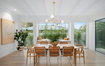
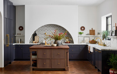
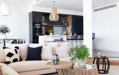
As much as we love beige and grey, we’re always on the lookout for a universally flattering alternative. Pink might not come to mind, but this pastel shade perfectly complements a neutral scheme while giving it a surprising lift. Nothing about this decor screams ‘pink’, so the next time you want to brighten an understated palette, powder pink might just be the answer.