
Decorating

Decorating With Beige in a World Gone Grey
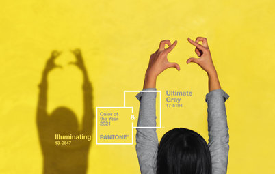
Grey, the ‘it’ neutral of recent years, has left beige in the shade, but is it time to revisit this easy-on-the-eye wall colour?

The grey bandwagon has been rolling along for a few years now, and many interiors have succumbed to the cool elegance and versatility of the grey spectrum. Beige as our pet neutral got left behind sometime after its ’90s heyday, but some designers believe beige-based neutrals are sticking their heads above the parapet. If you have stayed staunchly on the beige team, but feel your decor could do with an update, take a look at how to give beige 21st-century charisma.
Champion a chameleon
Beige is basically light brown. With such wide parameters, it’s open to interpretation: to some, it’s as light as off-white; to others it goes all the way up to an earthy mid-tone. It covers the spectrum of creamy/warm to sandy/earthy, depending on the undertones. The colour commonly has a yellow or pink base, adjusted with other pigments in an infinite variety of combinations. Beige has many aliases – think ecru, buttermilk, biscuit, oatmeal, vanilla, almond, cafe au lait, camel, flax, sand, string, straw, dune, ivory, eggshell or chamois.
How paint names influence your choices
Once upon a beige
While grey has been a strong performer for quite a while, and has knocked a lot of other neutrals out of the ring, some have never strayed from the beige path. Judith Briggs from Colour Consultants Australia and author of Bye Bye Bland, says, “Many people are still in the beige phase that was fashionable before grey. I’ve worked on several new houses recently that need a contemporary feel injected into their all-beige colour schemes.”
While grey has been a strong performer for quite a while, and has knocked a lot of other neutrals out of the ring, some have never strayed from the beige path. Judith Briggs from Colour Consultants Australia and author of Bye Bye Bland, says, “Many people are still in the beige phase that was fashionable before grey. I’ve worked on several new houses recently that need a contemporary feel injected into their all-beige colour schemes.”
Invite today’s colours in
Invite energy and character into a beige palette with modern colours trending towards bold and saturated. Also keep in mind that neutrals have complex undertones. Briggs says the way to get beige wrong is to choose paint colours and furnishings in shades of beige that have clashing undertones. To identify the subtle nuances of beige, talk to your paint specialist, arm yourself with fabric swatches and samples of timber when you go paint shopping, read these expert tips on testing paint colours, or play it safe by enlisting the help of a colour consultant.
TIP: Brush-Out Boards from Inspirations Paint take the pain out of colour testing. You can order 400 x 400-millimetre boards that have a similar texture to a wall, painted with two coats of your test colours. They save you the trouble of having to patch test directly on the wall, and you can order them online.
Pair beige with browns
Briggs believes beige worked well when we had a lot of browns in our decor. “Creating a successful scheme is tricky as you need a variety of tonal differences and deep timber tones to carry it off,” she says. This room works a beige palette with tonal contrasts and rich mellow browns for a layered and eclectic look and turns the ‘beige is boring’ complaint on its head.
Briggs believes beige worked well when we had a lot of browns in our decor. “Creating a successful scheme is tricky as you need a variety of tonal differences and deep timber tones to carry it off,” she says. This room works a beige palette with tonal contrasts and rich mellow browns for a layered and eclectic look and turns the ‘beige is boring’ complaint on its head.
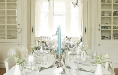
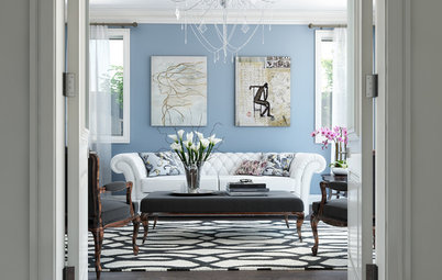
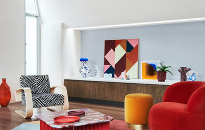
Add black and white
A sure-fire way to pick up a dated beige palette is to add contrast with black and touches of warm white. Bold, contemporary fabrics and wall treatments give it an elegant, modern edge. If black and white is too stark for you, try an alternative dark that still delivers a distinctive contrast.
A sure-fire way to pick up a dated beige palette is to add contrast with black and touches of warm white. Bold, contemporary fabrics and wall treatments give it an elegant, modern edge. If black and white is too stark for you, try an alternative dark that still delivers a distinctive contrast.
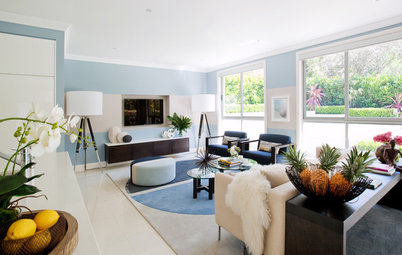
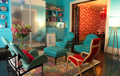
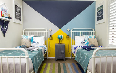
Blend beige with blues
With the warmth of brown and the coolness of white, beige is quite a docile neutral that borrows cool or warm tones from surrounding colours, so you don’t have to stick to warmer colours to tease out its subtleties. Inky blues, rich amethyst and peacock turquoises are up-to-the-minute colours that add instant luxury.
With the warmth of brown and the coolness of white, beige is quite a docile neutral that borrows cool or warm tones from surrounding colours, so you don’t have to stick to warmer colours to tease out its subtleties. Inky blues, rich amethyst and peacock turquoises are up-to-the-minute colours that add instant luxury.
Unite beige with other neutrals
Colour blocking is a stylish way to combine beige with other neutrals: elegant combinations are charcoal and buttermilk, a pearly beige with graphite, or creamy beige with grey and taupe. It’s a confident and very contemporary look that taps into the trend for organic, natural shades that look fantastic with timber.
Turn beige walls from bland to beautiful
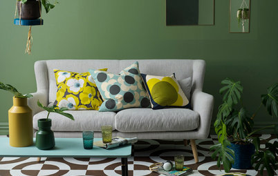
Pep up beige with brights
Vikki Montalban of VM Design believes beige’s versatility is a strong asset. “Grey has its place, but I’m not keen on grey without the balance of a warmer colour or texture. The same applies to beige. For a basic to suit all styles, it’s hard to beat a warm neutral (my name for beige) linen sofa. I’ve teamed beige sofas with beachy brights, highlights of white and pale aqua, and navy. My favourite look is with chocolate leather cushions. That’s four different looks with the same warm, neutral base.”
Vikki Montalban of VM Design believes beige’s versatility is a strong asset. “Grey has its place, but I’m not keen on grey without the balance of a warmer colour or texture. The same applies to beige. For a basic to suit all styles, it’s hard to beat a warm neutral (my name for beige) linen sofa. I’ve teamed beige sofas with beachy brights, highlights of white and pale aqua, and navy. My favourite look is with chocolate leather cushions. That’s four different looks with the same warm, neutral base.”
Team beige with warm whites
Sunshine Coast interior designer Carole Tretheway of Carole Tretheway Design agrees that people are leaning more towards the warmer beige-y neutrals. “They provide a beautiful envelope or backdrop for interior furnishings or landscaping to the exterior. I like to enhance the neutral colour with one of the ‘warm whites’, such as Dulux’s ‘Antique White USA‘ or ‘Vivid White‘, or Resene’s ‘Alabaster‘.
Sunshine Coast interior designer Carole Tretheway of Carole Tretheway Design agrees that people are leaning more towards the warmer beige-y neutrals. “They provide a beautiful envelope or backdrop for interior furnishings or landscaping to the exterior. I like to enhance the neutral colour with one of the ‘warm whites’, such as Dulux’s ‘Antique White USA‘ or ‘Vivid White‘, or Resene’s ‘Alabaster‘.
Tap into texture
Dig deep for textural contrasts with an earthy edge when beige is your background envelope. Briggs recommends a variety of textures to stop it from falling flat. Pair it with tactile creamy caramel, chestnut or chocolate leather, bronze and golden metallics, velvets, natural linen and a combination of hard and soft, glossy and matt accessories and fabrics.
You can see the difference texture makes in this Paris apartment. It should look dated, with its subtle monochromatic beige palette, but the rich textural contrasts make it chic and classic.
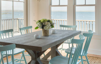
Maybe because it has a touch of remembered homes, beige and slightly shabby knock-about holiday homes seem to fit together. Weathered, faded textures add to the sense of nostalgia that beige can bring on. White with sandy beiges and textures borrowed from nature have casual, unfussy appeal. Beach salvage, found objects, bleached timber and pre-loved rugs and furniture, freshened with indoor greenery in plants and eclectic fabrics, is a timeless look that has withstood the fashion for grey.
Popular beiges
Dulux’s top-selling neutrals still include old faithful ‘Hog Bristle’, ‘Ecru’, a light coffee, and the simply named ‘Warm Neutral’. Beiges feature in Resene’s top neutrals too, with variants of ‘Tea’, ‘Spanish White’ and ‘Thorndon Cream’ – a cooler creamy neutral with a green hint.
Dulux’s top-selling neutrals still include old faithful ‘Hog Bristle’, ‘Ecru’, a light coffee, and the simply named ‘Warm Neutral’. Beiges feature in Resene’s top neutrals too, with variants of ‘Tea’, ‘Spanish White’ and ‘Thorndon Cream’ – a cooler creamy neutral with a green hint.
And in the grey corner…
Colour consultant and interior designer from csd colour style design Debb Hawkins says the majority of her clients are still enjoying greys. “Although there are some truly lovely beige colour options around, which we will undoubtedly see more of in future, I don’t think we’ll grow tired of the new grey palettes for a very long time,” she says.
Colour consultant and interior designer from csd colour style design Debb Hawkins says the majority of her clients are still enjoying greys. “Although there are some truly lovely beige colour options around, which we will undoubtedly see more of in future, I don’t think we’ll grow tired of the new grey palettes for a very long time,” she says.
The flexibility of grey shades gets Hawkins’ vote – and those of her clients – over what she sees as less versatile beige tones. Grey can be warm or cool, with bases of blue, green, red, purple or yellow, according to the colour expert. “These have the capacity to support a wide spectrum of style choices, from minimalist monochromatic palettes to the often intricate and eclectic colour blends found in more traditional homes,” she says. Hawkins adds that greys work well with timber, look great with both highly polished and more rustic metals, and can highlight the natural tones of a textured rug or wall hanging. “They also love a green plant or two, and let the right white take centre stage.”
Briggs weighs in again, saying some people are tired of grey, but this may be because it has been misused. “But I don’t believe we’ll return to beige anytime soon,” she adds. “Admittedly an all-grey scheme can be very boring and cold, like a note of music played over and over, but it’s meant to be used with colour.” Like Hawkins, Briggs is a fan of the versatility of grey and how it quietly supports other colours, allowing them to take centre stage.
Cuddle up to warmer greys
Some of our experts say grey hasn’t been knocked from its perch yet, and there’s a definite trend towards the warmer shades. Of the greys that are getting a big tick of approval from clients, Hawkins cites Haymes’ ‘Smudge Grey’, ‘White Tea’ and ‘Smoke Signal’, and Dulux’s ‘Dieskau’ and ‘Silkwort’. “The all-out favourite is a warm grey from Murobond called ‘Cracker’,” she says.
Some of our experts say grey hasn’t been knocked from its perch yet, and there’s a definite trend towards the warmer shades. Of the greys that are getting a big tick of approval from clients, Hawkins cites Haymes’ ‘Smudge Grey’, ‘White Tea’ and ‘Smoke Signal’, and Dulux’s ‘Dieskau’ and ‘Silkwort’. “The all-out favourite is a warm grey from Murobond called ‘Cracker’,” she says.
What’s with ‘greige’?
A neutral that’s winning votes is ‘greige’, basically a warm grey or a cool beige – beige loses some of its warmth and cools towards grey, but not all the way. It has a foot in each camp and so is a very easy neutral to live with. At the lighter end, it’s placid and organic, in darker tones it packs a stylish punch. Check out some greiges among Dulux’s ‘Perfectly Greige’, Taubmans’ ‘Stonehenge Greige’ and Resene’s ‘Triple Rakaia’.
TELL US
How do you feel about beige? Have you fallen in love with grey or would you consider bringing back beige? Share your thoughts in the Comments section.
MORE
Browse more decorating stories about colour


Sponsored
Sponsored
Why is beige a five-letter word to so many people? Cries of ‘Boring!’ and ‘Drab!’ are heard from the anti-beige brigade. Beige is often disowned as so last century, even though we loved it to bits back then. A beige-based scheme can lack spark, just as grey can if mismanaged. If your knee-jerk reaction to beige is ‘Ugh!’, or something similar, you may be missing out on what this quiet achiever can accomplish.
It can be soothing, sophisticated, flattering, rich and mellow, formal or casual, and a perfect launching pad for bolder decor choices. It is also never clinical or cold, an accusation often levelled at grey.