


Houzz Tour: A Century-Old Townhouse Gets a Fresh, Modern Update
This two-level apartment is now bathed in natural light and warmth, thanks to clever design and lots of vintage charm
Kathleen McCleary
3 January 2017
Houzz Contributor. I'm a journalist, author, editor, and teacher who loves houses so much that I wrote my first novel about a woman's obsession with her house. In addition to my three novels, my work has appeared in Parade, The New York Times, The Washington Post, and other publications. I wrote a biweekly column about interior design for HGTV.com for several years; one of those columns (about my 1950's chartreuse-tiled bathroom) inspired the series "Bad, bad baths." I live in northern Virginia with my husband and try to entice my college-age daughters home as often as possible.
Houzz Contributor. I'm a journalist, author, editor, and teacher who loves houses... More
Redesigning the top two floors of an early 1900s classic brownstone in Brooklyn, New York, quickly became a problem-solving exercise for architect Jeff Etelamaki. There were plenty of problems to solve, including a desire for abundant natural light in a building without windows on two sides, a fairly limited budget and the challenge of creating a main living space on the top floor. Not to mention how to get to that top floor in a way that felt natural and not like a hike up never-ending staircases.
Photos by Mikiko Kikuyama
Houzz at a Glance
Who lives here: A digital media professional and a costume designer
Location: Brooklyn, New York, USA
Size: 139 square metres; 3 bedrooms, 3 bathrooms
Designer: Jeff Etelamaki of Etelamaki Architecture
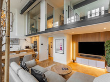
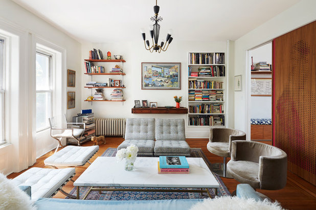
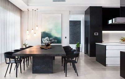
Etelamaki found creative, eclectic solutions for this flat. For natural light, he gutted the top floor and put in two skylights, then created an open kitchen, dining and living area, seen here, with varied ceiling heights to add a sense of cosiness. To save money, he left the middle floor mostly intact, but did a fair amount of renovation on the bathrooms. Then he moved the stairs – which had gone up one side of the house, across a room and up the other side – stacking them in the middle of the house.
Now the clients can walk in from an entry on the front of the townhouse (the ground floor is a rental unit) and up to their duplex via open stairs and a stairwell flooded with light from the top floor.
The design process is one of “constant evolution,” Etelamaki says. He compares it to jazz. “You have the music, but you have to be able to improvise and to be unafraid to deviate from the original plan if something comes up, whether it’s my idea or the clients’.”
In the living area, Etelamaki retained some of the character of the original building, such as mouldings and window casings, while adding built-in bookshelves and a home bar. He patched and refinished the original oak flooring.
Chandelier: vintage
Houzz at a Glance
Who lives here: A digital media professional and a costume designer
Location: Brooklyn, New York, USA
Size: 139 square metres; 3 bedrooms, 3 bathrooms
Designer: Jeff Etelamaki of Etelamaki Architecture
Etelamaki found creative, eclectic solutions for this flat. For natural light, he gutted the top floor and put in two skylights, then created an open kitchen, dining and living area, seen here, with varied ceiling heights to add a sense of cosiness. To save money, he left the middle floor mostly intact, but did a fair amount of renovation on the bathrooms. Then he moved the stairs – which had gone up one side of the house, across a room and up the other side – stacking them in the middle of the house.
Now the clients can walk in from an entry on the front of the townhouse (the ground floor is a rental unit) and up to their duplex via open stairs and a stairwell flooded with light from the top floor.
The design process is one of “constant evolution,” Etelamaki says. He compares it to jazz. “You have the music, but you have to be able to improvise and to be unafraid to deviate from the original plan if something comes up, whether it’s my idea or the clients’.”
In the living area, Etelamaki retained some of the character of the original building, such as mouldings and window casings, while adding built-in bookshelves and a home bar. He patched and refinished the original oak flooring.
Chandelier: vintage
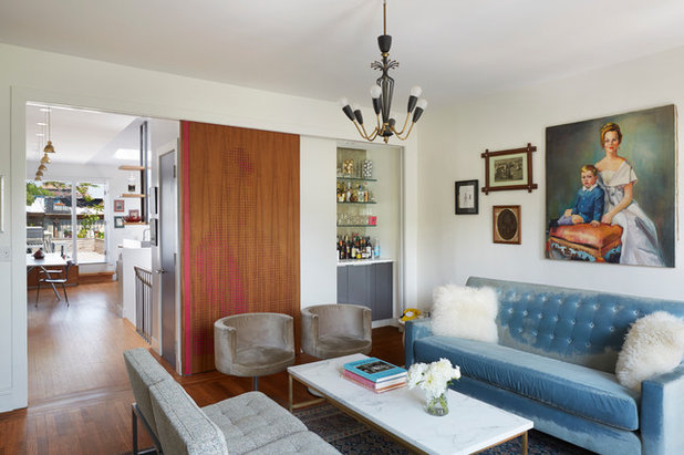
The living room opens to the dining and kitchen area via a large sliding door. The door can slide all the way to the left to close off the room, or all the way to the right to conceal the bar. The clients like the option of using this space as a guest room sometimes, and the door provides the necessary privacy.
The clients wanted their main living area, on the top floor, to maximise the natural light. This was accomplished through skylights and the addition of a glass door at the back of the area by the kitchen. The couple purchased the blue sofa years ago at a furniture shop that’s since gone out of business. A leftover piece of marble from a friend’s home renovation provided the top for the coffee table. The base was custom-made.
The clients wanted their main living area, on the top floor, to maximise the natural light. This was accomplished through skylights and the addition of a glass door at the back of the area by the kitchen. The couple purchased the blue sofa years ago at a furniture shop that’s since gone out of business. A leftover piece of marble from a friend’s home renovation provided the top for the coffee table. The base was custom-made.
The architect originally designed the sliding door as a plain, flat panel, but quickly realised that “rather than having a big red door there we should give it some texture so it wasn’t just a slab of colour,” he says.
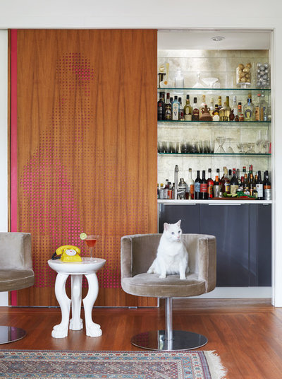
He asked the clients, a costume designer and her husband, who works in media and has a background in theatre, for a design meaningful to them. The wife brought Etelamaki a photo of a woman in an elaborate Victorian gown. He digitised and enlarged the photo and pixelated it, then had the pattern cut into a piece of teak plywood with a laser cutter. The teak overlays the red door, so the pattern is visible. After living with it for a while, though, Etelamaki says, the clients may paint the red portion behind the teak yellow or gold to provide more contrast, so the design stands out more.
Otis, the cat, sits on one of a pair of grey swivel chairs that were in the office of the father of one of the clients when she was growing up.
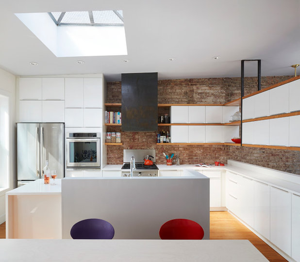
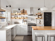
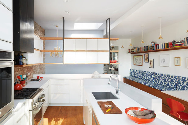
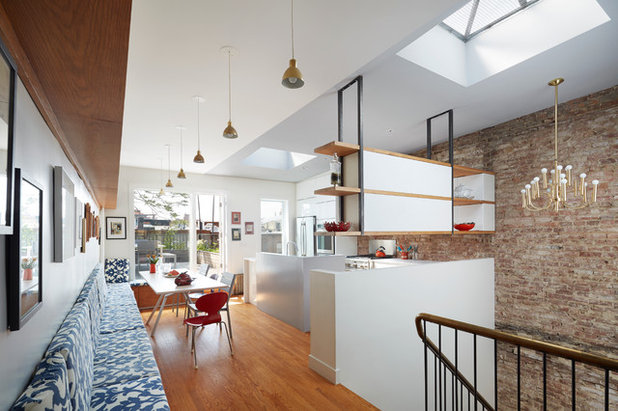
The two new skylights – one over the kitchen, one over the stairwell – flood the top and lower floors with light. The brick walls are original to the house. The cabinets are from Ikea and the benchtops are Caesarstone. The range hood is custom-made.
Appliances: GE
Appliances: GE
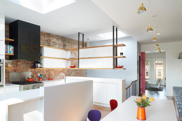
The clients wanted the kitchen to be open and functional. “They’re actually pretty involved cooks,” Etelamaki says. “They needed storage, but they wanted to keep the entire top floor as open as possible.” Suspended shelves solve the problem, providing storage without blocking light.
Etelamaki created definition between the functional side of the kitchen and the stairs and eating area by lowering the ceiling. “Sometimes, if you blow out every wall and make a big open area, there’s no definition of space,” he says. The varying ceiling heights follow a line lengthways down the middle, dividing the space in half. The ceiling over the kitchen and stairs follows the slope of the roof; the ceiling over the dining banquette is flat.
Etelamaki created definition between the functional side of the kitchen and the stairs and eating area by lowering the ceiling. “Sometimes, if you blow out every wall and make a big open area, there’s no definition of space,” he says. The varying ceiling heights follow a line lengthways down the middle, dividing the space in half. The ceiling over the kitchen and stairs follows the slope of the roof; the ceiling over the dining banquette is flat.
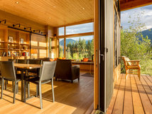
The clients like to entertain, including hosting an annual New Year’s Eve dinner party that requires lots of seating. The long banquette fits the bill.
The change in ceiling heights in the kitchen and dining area wasn’t part of the original plan. “Only after standing in the space did it come to me that it made sense,” Etelamaki says.
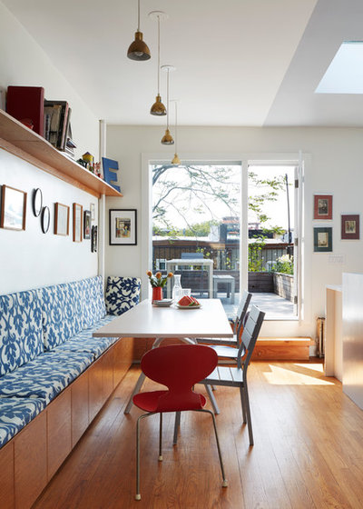
Pendant lights continue down the entire length of the space, giving an authentic banquet-table feel for large dinner parties. The clients found the lights online. Ready-made cushions, also bought online, provide comfortable seating along the banquette. Vintage Danish chairs surround the custom-made dining table.
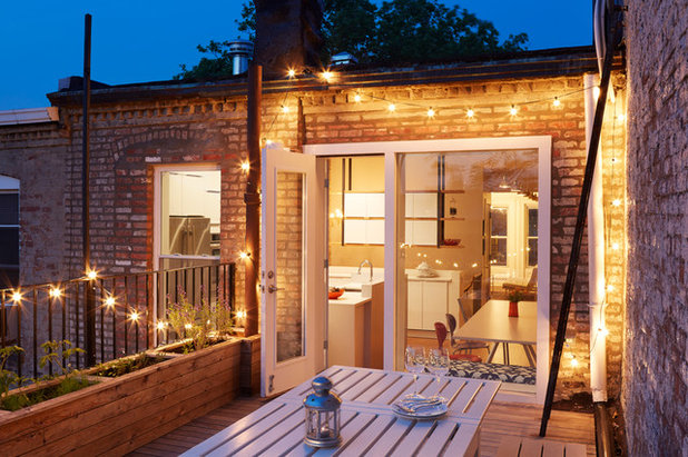
The architect built a new deck on top of an existing roof, then combined two windows to create a large door and window opening that would provide more natural light for the top floor.
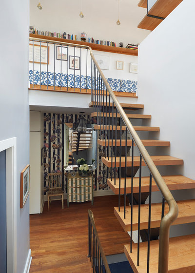
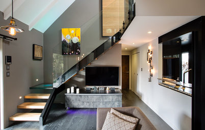
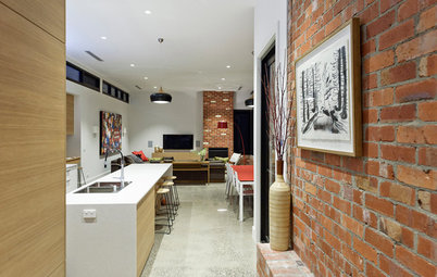
Visitors enter from the street-level door and climb the blue stairs to this second-floor landing, which acts as the entry hall to the couple’s duplex. The hall includes a mix of patterns and colours.
The new staircase to the top-floor living, kitchen and dining areas includes pine treads, steel banisters and a bronze handrail. The open stairwell allows the pattern of the dining banquette to become part of the lower floor’s aesthetic too.
The new staircase to the top-floor living, kitchen and dining areas includes pine treads, steel banisters and a bronze handrail. The open stairwell allows the pattern of the dining banquette to become part of the lower floor’s aesthetic too.
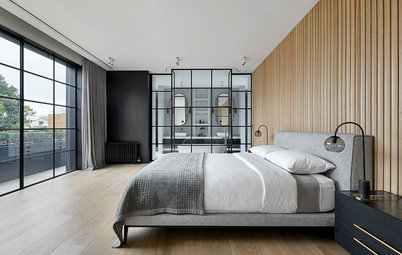
The hall also includes a vintage chandelier and splashes of bold colour. Light from the top-floor skylight over the stairwell draws the eye upward. This floor includes a master bedroom and bathroom, a small nursery, an office and guest room and a cloakroom. The red door leads to the master bedroom.
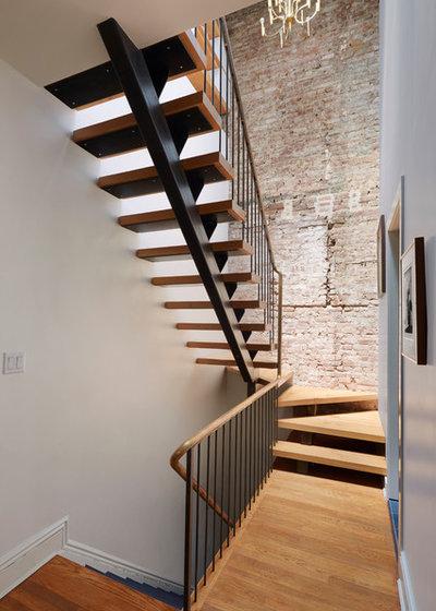
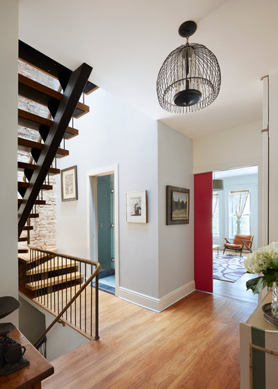
Etelamaki left the brick wall exposed, a decision he made during construction. “I felt the space needed some texture,” he says.
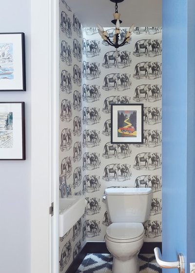
A desire for a more efficient use of space drove the design of the powder room on the second floor.
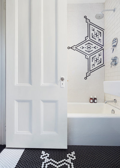
Etelamaki gutted the master bathroom, replaced the tub and installed new tiles and fixtures. The clients originally wanted plain white metro and hexagonal tiles, but “a plain white bathroom wouldn’t fit their personalities”, Etelamaki says.
TELL US
What do you like about this home? Share your thoughts in the Comments below.
TELL US
What do you like about this home? Share your thoughts in the Comments below.

Related Stories
Trade Shows
Building a Future: A Program For Change
By Houzz AU
Australia's leading construction, architecture and infrastructure show opens next week... we preview what's on offer
Full Story
Most Popular
Best of the Week: 28 Amazing Australian Homes
Building or renovating? Here's a smorgasbord of some of the incredible homes by Houzz pros to whet your appetite
Full Story
Stickybeak Of The Week
Stickybeak: A Controversial Welcome for a Contemporary Home
Meet the brave new home that breaks the rules, and read the story of how the design came to fruition
Full Story
Stickybeak Of The Week
Stickybeak of the Week: A Home Fit for Multi-Generational Guests
By Pia Sinha
Despite the challenge of an extensive brief, this new home meets every expectation, for family and visitors alike
Full Story
Kitchens
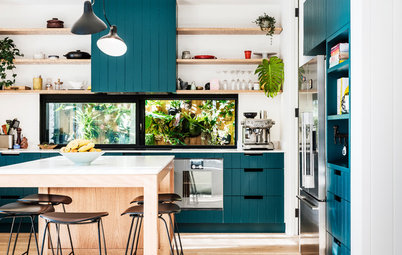
Room of the Week: Classic Colours Make a Contemporary Kitchen
Although designed to highlight the view to the wine room, this kitchen can't help but shine like a jewel
Full Story
Stickybeak Of The Week
Stickybeak of the Week: A Contemporary Family Home... on a Slope
By Pia Sinha
This modern East Fremantle home presented both build and design challenges. See the clever ways these were overcome
Full Story
Flooring
How Do I... Choose a Timber Floor?
Are you in the market for a new timber floor? Read our expert guide to choosing the perfect style to suit your needs
Full Story
Beach Homes
My Houzz: A Sophisticated Beach Shack for Laid-Back Entertaining
This semi-retired teacher and her husband have created a casual beachside haven for super-sized family get-togethers
Full Story
New Zealand Homes
Houzz Tour: Steampunk Style in the Suburbs
A daring duo throws caution to the wind to revamp their '80s Auckland home with flair
Full Story
Houzz Tours
Houzz Tour: Historic Home Meets Contemporary Open-Plan Living
A 1920s Melbourne house gets a harmonious modern extension
Full Story
Definitely one of my favourites. It looks loved!
Very cool. Looks like a fabulous place to live with a relaxed yet sophisticated vibe.
That staircase! And love the elephants too.
Hey, Kathleen! Thanks for sharing! The deck on top of the roof is such a great idea. The brick wall also gives the space an industrial feel, but it isn't overwhelming. Nice!