Houzz Tours

Houzz Tour: A Traditional Worker's Cottage Gets a Modern Extension
Rigorous spatial planning and creative materiality bring a traditional cottage face-to-face with the Australian outdoors

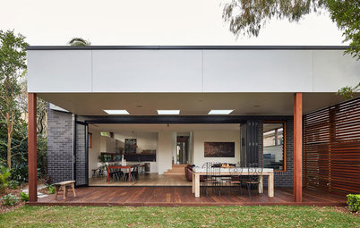
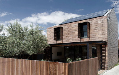
On the hunt for much-needed additional living space and the desire to establish a greater connection to the outdoors, John and Janene contacted carterwilliamson architects to create a modern extension to their modest worker’s cottage in Sydney’s inner west. While the front of the house remains true to its traditional roots, the back tells a whole new story altogether. In fact, the result is so bold and surprising, the owners could feel as though they have two entirely different houses depending on whether they enter their home from the front or the back. It’s a highly original and successful renovation that goes to prove that traditional and modern can do amazing things together.
Houzz at a Glance
Who lives here: John and Janene and their three children
Location: Wareemba, Sydney
Size: 169 square metres (4 bedrooms, 2 bathrooms)
Houzz at a Glance
Who lives here: John and Janene and their three children
Location: Wareemba, Sydney
Size: 169 square metres (4 bedrooms, 2 bathrooms)
“The client brief was simple,” says carterwilliamson founder and director, Shaun Carter. ”We were asked to enlarge the footprint of a Federation, workman’s cottage in Wareemba to include two additional bedrooms and a living space, commensurate with the scale and proportion of a four-bedroom house.”
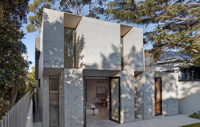
However, what the architects brought to the brief was the transformation of an essentially English model of development into a spacious, context-appropriate scheme that responds to the temperate Australian climate and our distinctly ‘outdoorsy’ lifestyle.
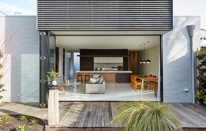
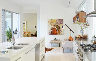
To achieve their objectives, carterwilliamson removed the dark, cramped and confused planning of the rear lean-to roofs, stitching the original house to the new extension via a light, thin circulation zone, which opens into a generous kitchen and entertainment space.
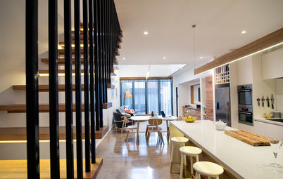
“The new open-plan living areas centralised the services, allowing the house to open and embrace the landscape,” adds Carter, “while the stair, located across the plan, connects the house vertically, maximising spatial efficiency.”
The upper floor is quieter and more enclosed, designed for sleeping. It houses two bedrooms, a new family bathroom and squeezes in a little deck,
the creative use of potentially wasted space at the bridge between the old and new house.
More: Hidden Treasures: 12 Things to Do With Wasted Space Around the House
the creative use of potentially wasted space at the bridge between the old and new house.
More: Hidden Treasures: 12 Things to Do With Wasted Space Around the House
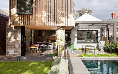
The team also integrated a small courtyard into the middle of the extension.
“The courtyard allows the house to breathe, through cleverly positioned window openings and louvres, which also scoop light deep into the interiors,” explains Carter.
The hanging stair in the living room is also one of the architect’s favourite architectural features.
"It is beautiful and practical and hangs like a sculptural chandelier, spatially dividing the plan without visually disconnecting the living and dining space," Carter explains.
“The curved, timber-lined ceiling above the stair also provides a moment of surprise and delight, offsetting the cool colours used elsewhere in the house through the use of warm, honey-coloured ply.”
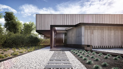
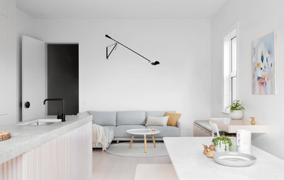
As expected, the overall material palette is equally context-appropriate. Bold use of FC-sheet external cladding, a cast concrete floor and a timber structure extend and underscore the simplicity of the original house while setting the tone for carterwilliamson’s crafty addition.
"The biggest challenge on this home was negotiating the tight budget whilst fulfilling the client brief," explains Carter.
“However, we love how much has been achieved on a tight budget, through rigorous spatial planning and creative materiality.”

Sponsored
Sponsored