Houzz Tours

Houzz Tour: Adelaide Bluestone Cottage Turns to Face the Street
Rethinking the floorplan of a broken-down 1880s cottage made the most sense in this clever renovation

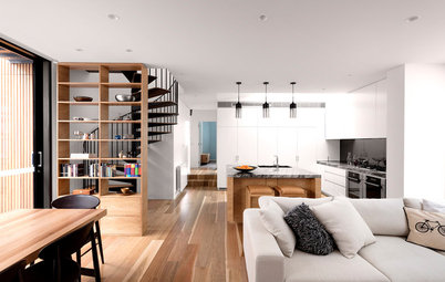
In traditional homes, the front door opens to reveal a long hallway with rooms branching off on either side. Not so for this renovated 19th century cottage. Grieve Gillett Dimitty Andersen Architects gutted the dilapidated cottage and added a contrasting zinc-clad extension. Now, the front door opens to reveal the kitchen, dining and living areas, connecting these areas to the street, while the rear addition houses a study and bedroom. It’s the perfect set-up to take advantage of the sun, and to give the homeowner everything he was looking for in a forever home.
Lance had been looking for the right house to buy for about seven years when he came upon the 1880s bluestone cottage in Norwood, an Adelaide suburb a few kilometres from the CBD. The only problem? It was dilapidated and riddled with salt damp to the point that he couldn’t move in.
But the house also presented a blank slate for him to create a home suited to his needs, and that of his cat, Harriet, of course.
But the house also presented a blank slate for him to create a home suited to his needs, and that of his cat, Harriet, of course.
Lance worked closely with Tom Doull and Dimitty Andersen on the design. He admires the Modernist Connecticut houses of the ’40s and ’50s, so wanted to bring the same use of timber, stone and verticality to his own house.
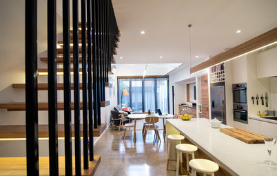
The existing cottage was completely gutted to make way for the new kitchen/dining and living areas, an under-floor cellar, and a library, and that contemporary zinc-clad extension.
The existing cottage was completely gutted to make way for the new kitchen/dining and living areas, an under-floor cellar, and a library, and that contemporary zinc-clad extension.
The design is deceptively simple, with storage built in to walls to make each room feel clean and spacious.
Andersen says the smaller rooms of the original cottage were rationalised to create a large open-plan volume containing the public zones of the house. The flowing interior facilitates social interaction and flexible entertaining options.
Two large plinths were introduced to order the space and contain functional elements such as the stairs down to the cellar and the fireplace.
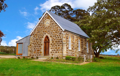
Prior to renovation, the sagging verandah roof was in serious need of some TLC.
The architects completely restored the front verandah and designed the front fence to facilitate a connection between the house and people passing by on the street.
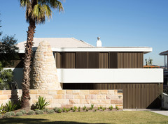
The house is located on a prominent corner allotment. The perimeter fence was designed to facilitate vision through the corner and in doing so has returned an original 1880s facade to the streetscape.
The site was compact – it had already been subdivided at the back – a fact that presented the architects with the biggest challenge of the project. Building to the boundary was the only solution.
The clients’ desire for open plan living areas and spaces that flow into each other lead to the conceptual response that was to ‘gut’ the entire inside of the cottage to create a single large volume to work in. “From here we were able to retain some walls and essential chimney supports as the new layout evolved,” says Andersen.
The addition’s pinstriped facade complements the colours in the bluestone of the original home without replicating it. “The scale of the new building does not apologise for its newness but rather stands proud adjacent to its restored companion,” Andersen says.
“We love it when people ask us if we used a shipping container for the addition,” she adds. “It has happened a few times now and for some reason it is a nice feeling; I think it’s to do with the achievement of a type of ‘familiar’ industrial aesthetic, not a show off.”
“We love it when people ask us if we used a shipping container for the addition,” she adds. “It has happened a few times now and for some reason it is a nice feeling; I think it’s to do with the achievement of a type of ‘familiar’ industrial aesthetic, not a show off.”
The external shade can be opened or closed at will, which was not as straightforward a feat as you would imagine. “The cables produced too much force to anchor into the bluestone wall,” explains Andersen. “In consultation with the builder, we anchored them into the recessed top flange of the lintel for the big opening, removing the horizontal load from the stonework.”
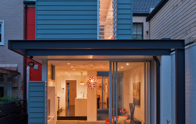
A new doorway carved into the exterior wall made way for sliding glass doors to connect the kitchen/dining with the outdoors and to flood this area in natural light.
A new doorway carved into the exterior wall made way for sliding glass doors to connect the kitchen/dining with the outdoors and to flood this area in natural light.
The extension connects to the original cottage via a low breezeway, which allows for a clear understanding of the scales and forms of the two buildings originating from different eras.
Concealed doors are integrated into the breezeway wall.
Concealed doors are integrated into the breezeway wall.
Lance, pictured here, says he wanted a house that turned its face to the street – the reason the public areas ended up in the original house. He decided early on not to design a house with its resale value in mind, but to satisfy his own wants and needs. “There is no next house for me,” he says.
The study opens to the patio and views of the street. The bedroom is located behind the study and has a wall of glass to bring in natural light. External louvres can be closed for protection against the northern sun when needed.
The homeowner loves to read, and in the winter this north-facing room he calls the library is a nice place to sit. The library doubles as a guestroom when needed; a recessed curtain hidden in the fireplace plinth can be pulled across for privacy.
Rug: Terrace Floors; Coco pendant
Rug: Terrace Floors; Coco pendant
The front door opens to the living/dining area.
The kitchen plinth is timber veneer in ‘Blackbean’.
Armchair: Alvar Aalto; Harper and Sandilands floorboards in Royal Oak: Terrace Floors
Armchair: Alvar Aalto; Harper and Sandilands floorboards in Royal Oak: Terrace Floors
Pendant lights: Fred International; downlights: Euroluce
This 1930s lean to on the side of the house was demolished as part of the project.
The interior looks dramatically different post-renovation.
Yellow cabinetry makes a colourful statement inside, and is clearly visible from the patio.
Push-to-open cabinet doors maintain clean lines in the minimalist open-plan kitchen/dining/living area.
A new skylight, side window and glass doors that lead out onto the patio allow maximum light to penetrate.
The kitchen has been designed to enable whoever is preparing food to also talk to guests, whether they are inside or outside.
External lights: Delta Light
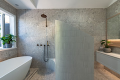
The bathroom has an internal wall of glass that opens to a small garden. It reminds Lance of the times he spent in Queensland, where outdoor showers were more common.
Tapware: Vola
Tapware: Vola
The bathroom is monolithic in its surface materials creating the feel of an existing cave-like volume with its own courtyard.
Carrara marble mosaic tiles: Academy Tiles
The house is organised into private and public zones. “Patterned simple geometries with strategically placed openings and courtyards create a series of private sanctuaries nestled into the sheltered canyon created by the neighbouring two-storey building,” Andersen says.
Silvergull granite paving: Allstone
Silvergull granite paving: Allstone
The scale of the zinc clad extension is tall but not overbearing to the original
cottage. “The form is simple and monumental in the way it fills the site to the rear of the allotment,” Andersen says. “The detailing is purposefully uncluttered to emphasise the inherent material beauty of the zinc cladding. This has allowed for a clear re-contextualising of
the original cottage against a ‘pinstriped’ backdrop.”
Who lives here: Single professional Lance and his cat, Harriet
Location: Norwood, South Australia
Size: 1 bedroom, study, library, living/dining/kitchen, 1 bathroom, cellar