


Houzz Tour: Bondi Terrace Reno Captures Light
This once dark terrace has been transformed to bask in Sydney's natural light, while also claiming space and privacy for its young owner
Annie Thornton
9 May 2014
Houzz Editorial Staff
Walls make a room, but this terrace house at Sydney’s Bondi Beach shows how light and framed views define a space.
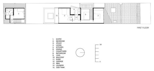
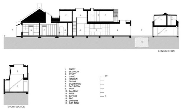
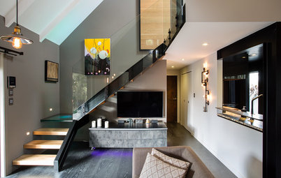
When architect Matt Fearns of Fearns Studio was confronted with a lack of privacy and natural light in a narrow Victorian terrace house, he resolved both issues by confining most sources of natural light to the ceilings. Like moths to a flame, in this house you can’t help but go toward the light.
Houzz at a Glance
Who lives here: A young man who shares his home with friends and flatmates
Location: Bondi Beach, Sydney, New South Wales
Size: 260 square metres
Year renovated: 2012; originally built in 1890
Photography by Tom Ferguson
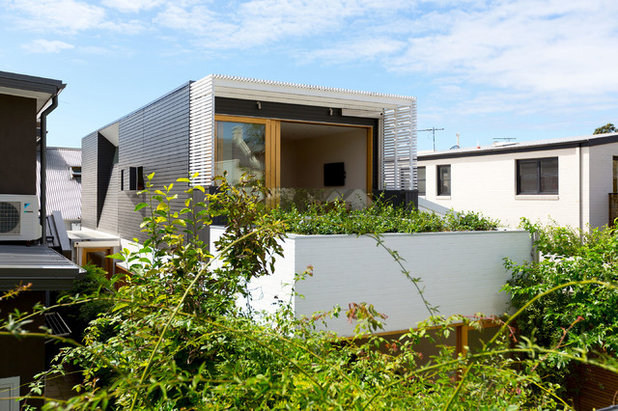
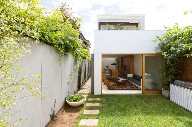
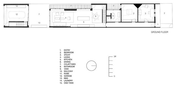
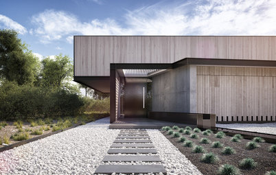
The home was built in 1890, and various renovations were done over the years. It’s one house in a row of four. As it sits on a 6-metre-wide lot, it’s apparent that privacy – for both the homeowner and the neighbours – was a primary issue.
The back deck, shown here, projects off the master bedroom.
The back deck, shown here, projects off the master bedroom.
Fearns resolved privacy by designing the home like a tube. “The purpose of the tube idea was simply to direct views from the house away from neighbouring properties by placing openings only at the ends,” he says. “I wanted to leave the side elevations largely clear of windows to declutter them, as well as eliminate the overlooking impacts.”
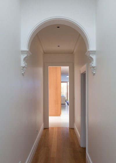
Though this was primarily a contemporary renovation, the home shows its age through subtle details such as this archway and the floorboards.
Fearns brought sunlight to central areas of the first floor with multiple skylights. The natural light works as a push-pull tool: the dark, compressed hallway pushes you towards the glowing light at the end of the tunnel. (Or the light pulls you towards it, depending on your outlook).
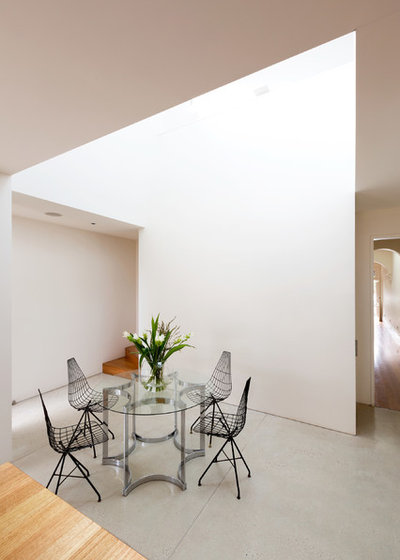
In the dining-kitchen area, the void (as Fearns calls it) brings light from the roof down to the first floor. The skylight is roughly the size of a queen bed and is central to the design of the house. In addition to illuminating the space, the light creates permeable boundaries that define the eating space within the open floor plan.
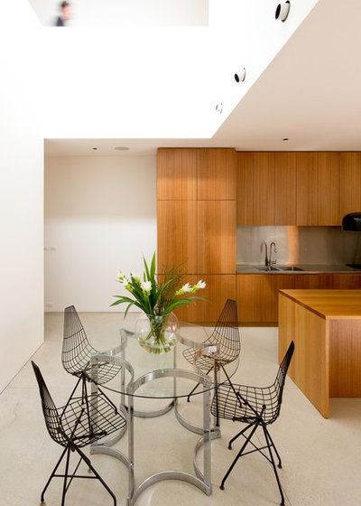
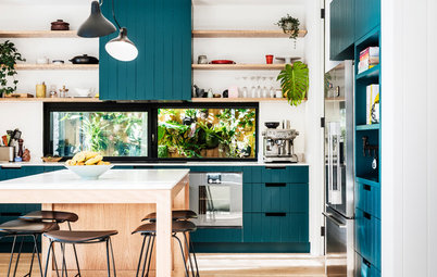
Vintage dining chairs by Australian-American sculptor Clement Meadmore and a vintage dining table by Alessandro Albrizzi disrupt the otherwise linear language of the kitchen.
The dining area connects to the kitchen – the heart of the house, as Fearns calls it. “It’s set between the lounge and dining areas to be a hub for both,” he says. Though oversized and solidly built, the Tasmanian oak island and cupboards inhabit the room, rather than dominate it. Fearns detailed the kitchen features to “look like items sitting in the space, rather than elements which the space has been built around,” he says.
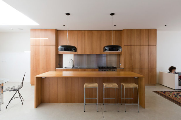
Pendant lights: Smithfield S Pendant Light, Flos; wire bar stools: vintage Clement Meadmore
Pendant lights: Smithfield S Pendant Light, Flos; wire bar stools: vintage Clement Meadmore
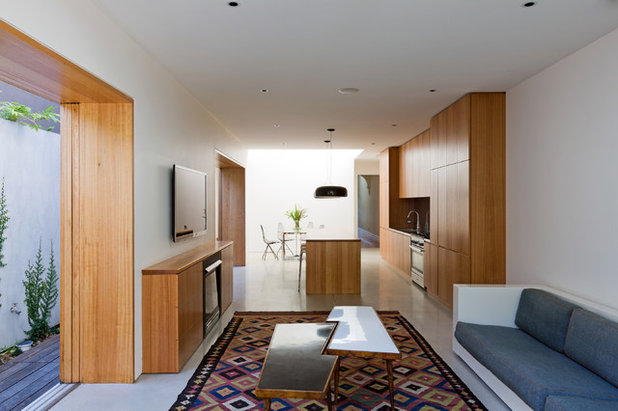
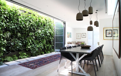
The living area rounds out the great room. It can be difficult to create intimate spaces in open plans, but Fearns employed various techniques to bring the home down to human scale. “In this case, the rhythm of solids and voids [walls and glazing] primarily helps create a sense of smaller spaces within the open plan,” he explains. The walls and door frame various areas of the great room, suggesting how to furnish and lay out the space.
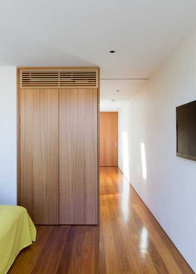
The materials and finishes developed as the project progressed. “The palette in the end was limited and simple and comprised mainly of clear sealed hardwood doors, windows, flooring and joinery – almost all Tasmanian oak with some blackbutt,” Fearns says. Polished concrete floors connect all the spaces in the great room.
The materials and finishes developed as the project progressed. “The palette in the end was limited and simple and comprised mainly of clear sealed hardwood doors, windows, flooring and joinery – almost all Tasmanian oak with some blackbutt,” Fearns says. Polished concrete floors connect all the spaces in the great room.
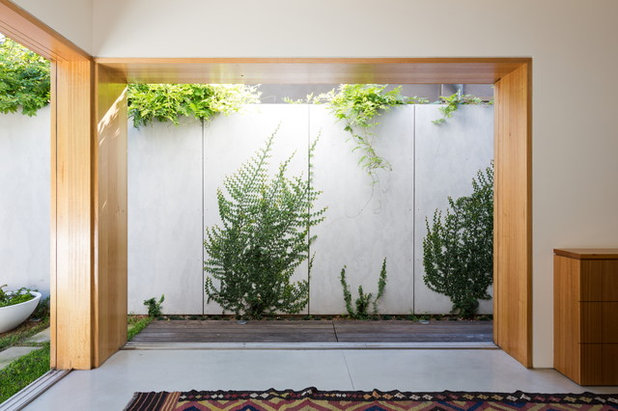
Large windows look out to touches of welcome greenery.
Deep door frames capture exterior moments like paintings. Light and shadow play animates the bare walls.
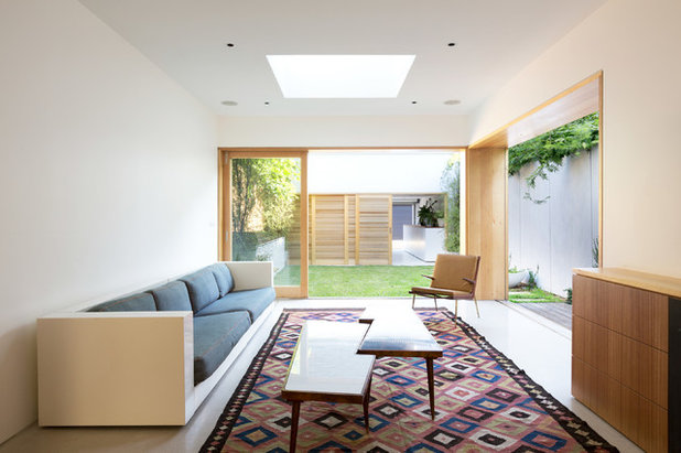
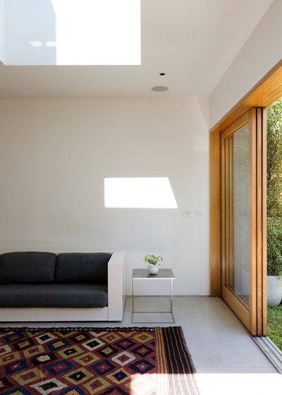
The ground level is broken up into various zones that can be opened or closed off to maximise flow, while always maintaining strong visual connections between spaces. “When doors are open, the rear portion of the site effectively can become a single open space – albeit modulated by various smaller areas within it,” Fearns says. A skylight directs more sunlight into the living room.
Coffee tables: vintage Paul Kafka; sofa: Jetset Lounge, Very Tidy; rug: Turkish kilim
Coffee tables: vintage Paul Kafka; sofa: Jetset Lounge, Very Tidy; rug: Turkish kilim
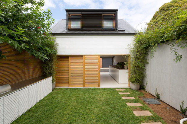
A garage and guesthouse loft are nestled into the back of the block. Tasmanian oak doors slide open, connecting the garage, landscape and main house seamlessly. The same polished concrete floors used in the main house continue in the garage.
The sliding doors in the main living room are hardwood, with bottom rolling hardware and low-e glazing.
“The reveals are about 76cm deep on the side elevation, because the doors are mounted externally,” Fearns says.
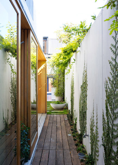
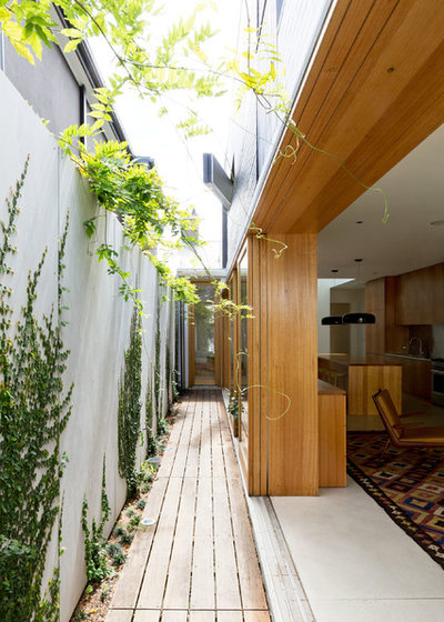
A narrow deck runs much of the length of the house.
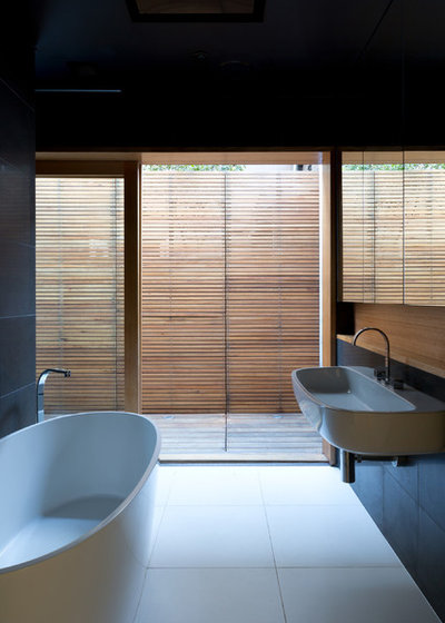
Smaller rooms on the first floor open up on to the deck, including this bathroom. The sliding glass door provides natural light and an outdoor connection. (This part of the path is closed off and private).
Sink: Duravit; freestanding bathtub: quartz, Villeroy & Boch; wall tile: honed basalt
Sink: Duravit; freestanding bathtub: quartz, Villeroy & Boch; wall tile: honed basalt
The master bedroom and bathroom are upstairs.
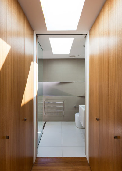
Unlke the first-floor bathroom, the master bath couldn’t have a sliding glass door to connect it to outside. “I didn’t want a window there to keep the side clear, so I convinced the owner to have a hatch,” says Fearns. After trying out various mechanisms, they ended up using a heavy floor-spring pivot that works like a friction hinge.
With the natural light from the skylight, the pivot window isn’t necessary, but Fearns has discovered its other charms. “From the bathroom, it also manages to frame a very small view of mature planting on the rear lane, so it’s a nice space to use,” he says. It also “adds a sense of oddity to the side elevation. People have to look twice to figure out what it’s doing.”
With the natural light from the skylight, the pivot window isn’t necessary, but Fearns has discovered its other charms. “From the bathroom, it also manages to frame a very small view of mature planting on the rear lane, so it’s a nice space to use,” he says. It also “adds a sense of oddity to the side elevation. People have to look twice to figure out what it’s doing.”

What are you working on?

Related Stories
Trade Shows
Building a Future: A Program For Change
By Houzz AU
Australia's leading construction, architecture and infrastructure show opens next week... we preview what's on offer
Full Story
Most Popular
Best of the Week: 28 Amazing Australian Homes
Building or renovating? Here's a smorgasbord of some of the incredible homes by Houzz pros to whet your appetite
Full Story
Stickybeak Of The Week
Stickybeak: A Controversial Welcome for a Contemporary Home
Meet the brave new home that breaks the rules, and read the story of how the design came to fruition
Full Story
Stickybeak Of The Week
Stickybeak of the Week: A Home Fit for Multi-Generational Guests
By Pia Sinha
Despite the challenge of an extensive brief, this new home meets every expectation, for family and visitors alike
Full Story
Kitchens
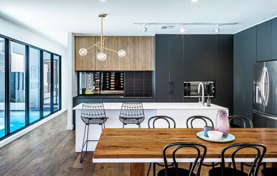
Room of the Week: Classic Colours Make a Contemporary Kitchen
Although designed to highlight the view to the wine room, this kitchen can't help but shine like a jewel
Full Story
Stickybeak Of The Week
Stickybeak of the Week: A Contemporary Family Home... on a Slope
By Pia Sinha
This modern East Fremantle home presented both build and design challenges. See the clever ways these were overcome
Full Story
Flooring
How Do I... Choose a Timber Floor?
Are you in the market for a new timber floor? Read our expert guide to choosing the perfect style to suit your needs
Full Story
Beach Homes
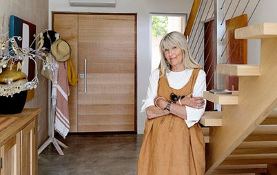
My Houzz: A Sophisticated Beach Shack for Laid-Back Entertaining
This semi-retired teacher and her husband have created a casual beachside haven for super-sized family get-togethers
Full Story
New Zealand Homes
Houzz Tour: Steampunk Style in the Suburbs
A daring duo throws caution to the wind to revamp their '80s Auckland home with flair
Full Story
Houzz Tours
Houzz Tour: Historic Home Meets Contemporary Open-Plan Living
A 1920s Melbourne house gets a harmonious modern extension
Full Story
Impressive! They've fit so much into such a small space. Love the upstairs deck and the generous use of skylights.
Love the depth of the side wall and how the doors slide along to disappear within the facade. Beautiful detail
The minimalist design is cool, but very cold and empty. I think some abstract art prints, or photography of some kind on the walls would really set this space off. But, the way it is now, it also looks like someone just started moving in, and are not finished deocrating, or they are depressed.