


How to Be Truly Confident With Colour
Be brave and unleash a little colour into your home, with help from an interior design expert
Jessica Prince-Montague
23 October 2017
By Jessica Prince-Montague. Houzz Contributor. Sydney-based freelance editor and journalist with 10 years experience working in the fashion and lifestyle domain. Passionate about beautiful design and unique interiors (especially if wallpaper and chandeliers are involved). Finds inspiration from travel, particularly the rooms of beautiful boutique hotels.
By Jessica Prince-Montague. Houzz Contributor. Sydney-based freelance editor and... More
Fancy a flash of fluoro here, a dash of indigo there, or a smattering of sunflower yellow – just because you can? There’s no reason why you shouldn’t experiment (and thrive) with bold colour in your home. Except for one small thing: it’s hugely intimidating and frankly, scares the living Pantone out of you.
Thankfully, colour-phobes, you are not alone. Melbourne interior designer Sally Klopper says people are easily daunted by non-neutral shades and assumes this can only come from lack of experience and a desire to cling to safer (and let’s face it, more mundane) options. “It’s really all about experimenting, trial and error and having fun,” she says. “Confidence in colour will evolve over time. The key is to be brave, and begin somewhere because once you start, your curiosity will guide you.”
Naturally, Klopper says introducing a bold colour (or three) into your interiors has the power to transform the space and control the mood. But there are other benefits, too. “It has been well documented particular colours have an impact on us,” she says. “We all have shades that we warm to or know make us happy or inspired. So trust your instincts and get started.”
Here are her handy hints on how to go from novice to master in just a few brushstrokes by decorating your home with bold colours.
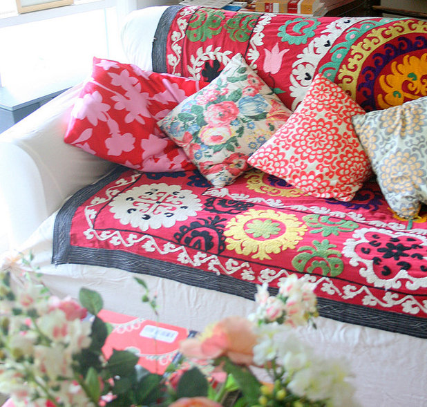
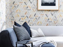
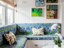
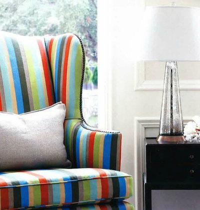
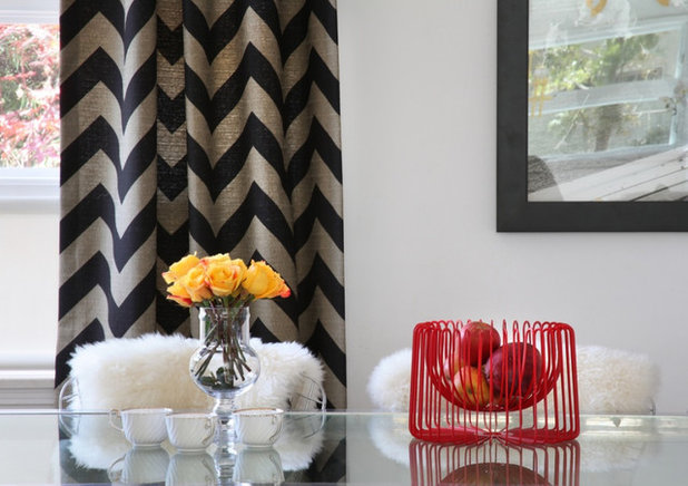
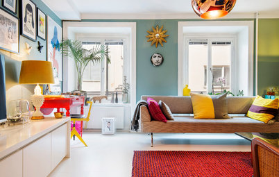
In your living room
“A gorgeous coloured throw over a monochromatic sofa is an easy addition which you can update over time,” says Klopper.
“A gorgeous coloured throw over a monochromatic sofa is an easy addition which you can update over time,” says Klopper.
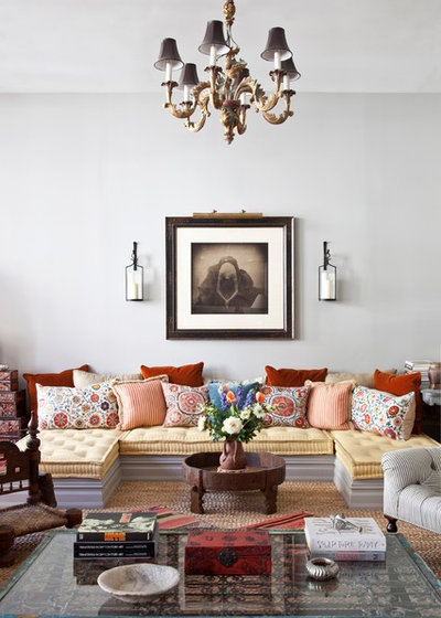
“Always consider your accessories collectively and have your throw and scatter cushions working harmoniously.”
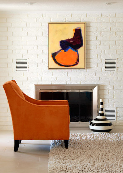
“As your confidence grows, try introducing an accent chair (or couch) to add a bit more interest.”
See more examples of how to use bold colours
See more examples of how to use bold colours
Alternatively, opt for a statement rug that serves as an anchoring artwork for the room.
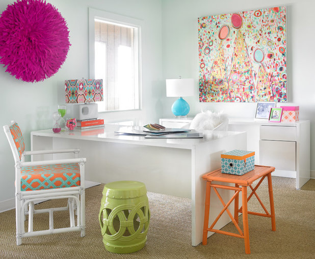
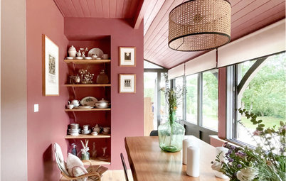
In your home office
The number-one rule for this room? It’s all about accessories, says Klopper.
The number-one rule for this room? It’s all about accessories, says Klopper.
“This space should inspire as well as serve you, so you need to aim for gorgeous andfunctional pieces.”
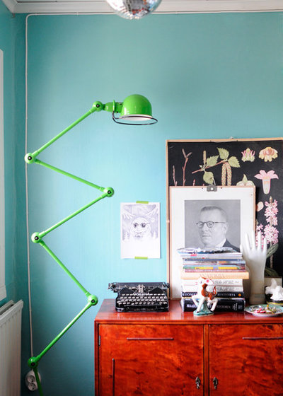
Klopper particularly loves a Jieldé lamp (pictured) because it comes in a host rainbow of brights to match any personality.
She’s also a huge fan of adding fluoro agate bookends onto a shelf or desk.
She’s also a huge fan of adding fluoro agate bookends onto a shelf or desk.
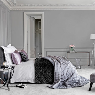
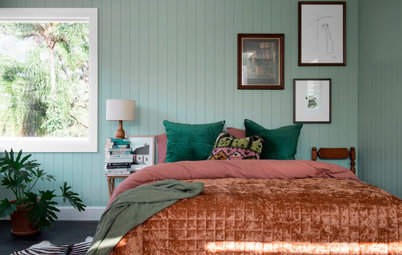
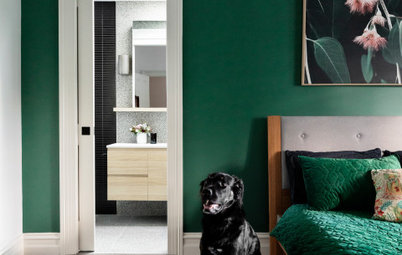
In your bedroom
“This is the space where you can be softer and more tonal,” says Klopper. She suggests experimenting with bed linen, particularly muted flax linen sheets you can mix and match.
“This is the space where you can be softer and more tonal,” says Klopper. She suggests experimenting with bed linen, particularly muted flax linen sheets you can mix and match.
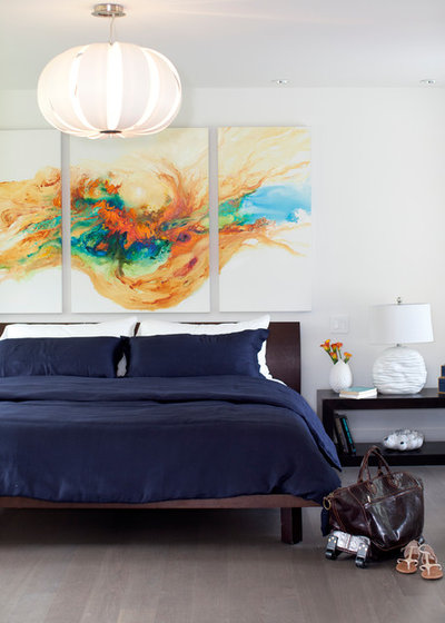
“Alternatively, above your bed is the perfect placement for artwork,” she says.
Dos and Don’ts of Displaying Artwork in a Master Bedroom
Dos and Don’ts of Displaying Artwork in a Master Bedroom
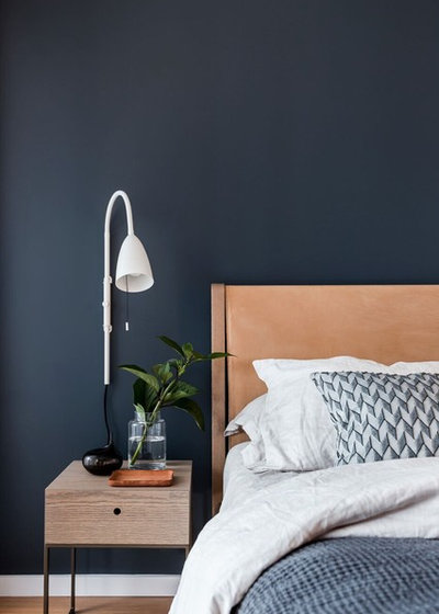
Just make sure you go for something free-flowing and in a mixture of complementary shades.
If neither of those take your fancy, you could always place a colourful chair in the corner for an instant colour update.
In your kitchen
“Get started here with a fresh and fun fruit bowl,” says Klopper. Take it a step further by adding a contrasting posie of your favourite flowers.
“Get started here with a fresh and fun fruit bowl,” says Klopper. Take it a step further by adding a contrasting posie of your favourite flowers.
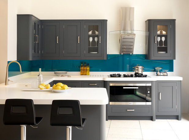
A bright splashback against all-white benchtops is a relatively small colour decision that makes a huge impact.

And remember, you can always go for cheery hues in this area too.
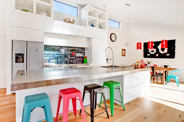
Meanwhile, Crayola-coloured stools represent what playing with different shades is all about: fun.
A Buyer’s Guide to Kitchen Stools
A Buyer’s Guide to Kitchen Stools
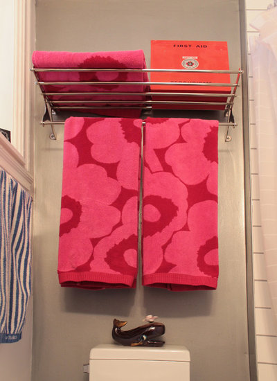
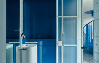
In your bathroom
“Charismatic bath towels are an easy baby step to bring some bang to your bathroom,” says Klopper. She particularly loves designs from Marimekko and Florence Broadhurst…
“Charismatic bath towels are an easy baby step to bring some bang to your bathroom,” says Klopper. She particularly loves designs from Marimekko and Florence Broadhurst…
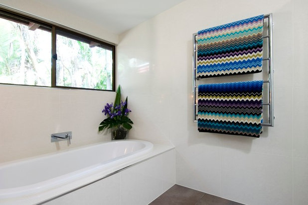
… not to mention Missoni which always brings a bit of zigzag magic where required.
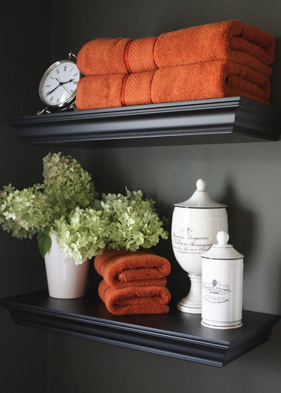
Plain towels can also make a world of difference when they are in contrast to the wall colour.
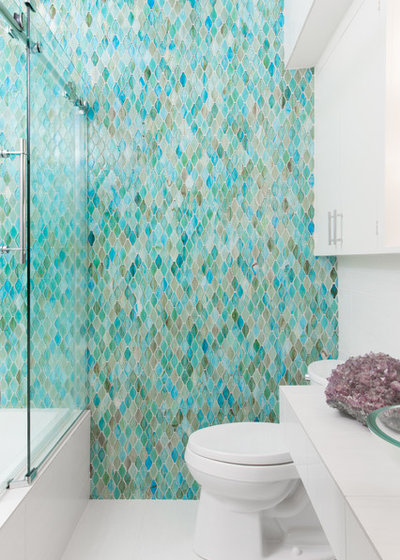
The next step up is experimenting with coloured tiles. Either light…
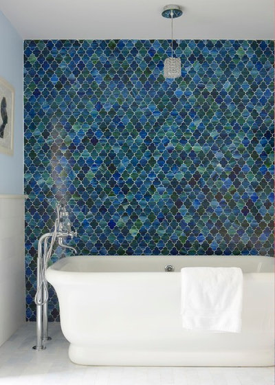
…or dark.
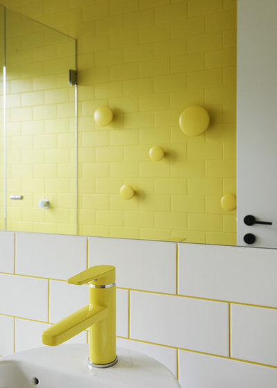
“Once you’re feeling even braver, check out coloured tapware,” says Klopper.
Decorate With Pink Without Going Into Shock
Decorate With Pink Without Going Into Shock
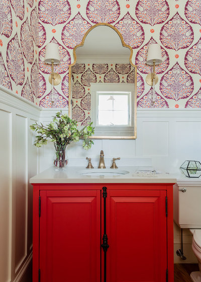
One step further again: bold and bright vanities that provide instant punch.
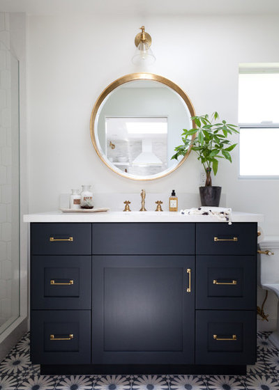
Or darker shades that bring gravitas to your bathroom.
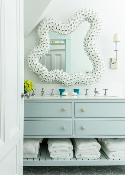
For coastal homes, muted vanities work wonders.
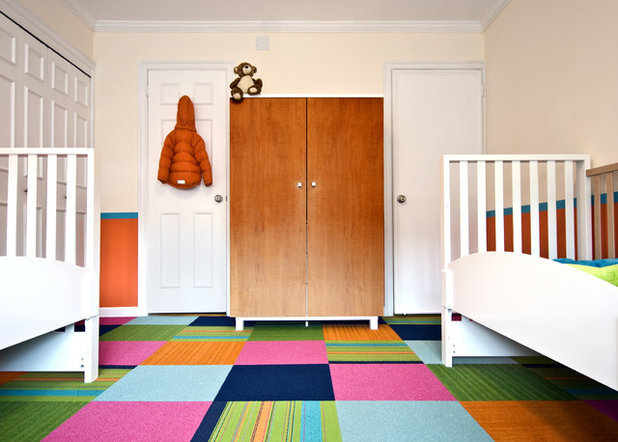
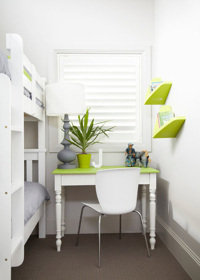
In your kids’ room
If there’s anywhere in your home where colour belongs, it’s here.
If there’s anywhere in your home where colour belongs, it’s here.
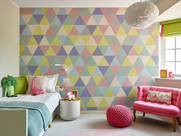
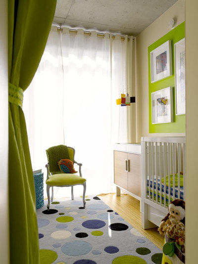
If you have a specific theme for a nursery, make sure the colour is equally matched. Here we see subtle, but effective use of a shade.
See more colourful kids’ spaces
See more colourful kids’ spaces
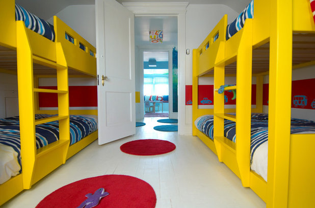
The alternative is playing with primary colours in a big, bold way. This look can be pulled off by paring it back with an otherwise all-white palette.
Tell us
If you enjoyed this story, like it, bookmark it, save the photos and share your thoughts below. Join the conversation.
More
Read more stories about decorating with colour
Tell us
If you enjoyed this story, like it, bookmark it, save the photos and share your thoughts below. Join the conversation.
More
Read more stories about decorating with colour


Related Stories
Paint
How to Choose Your Perfect Paint Colours
By Erin Carlyle
Three USA designers share tips to pinpoint your style and mine memories to find the right paint palette for your home
Full Story
Renovating Advice
How to Choose Your Wall Colour to Complement Floors and Furniture
Which colour should I paint my room to suit the flooring and furniture? We've all asked it – and here are the answers
Full Story
Most Popular
How to Pick the Right Paint Colours for Your Federation House
By Joanna Tovia
Roof colour, wall materials and emerging trends all come into play for Federation paint schemes that work
Full Story
Colourful Homes
Suffering From White-Wall Syndrome? How to Add Colour Confidently
White walls are great... until they stop being inspiring. Five paint colour experts share how to transition to colour
Full Story
Expert Opinion
An Interior Designer Reveals How to Mix Colours and Make it Work
By tidgboutique
Don’t want to confine yourself to neutrals but lack the confidence to embrace colours? We have you covered
Full Story
Made Local
Made Local: How Dulux Colour Trends Are Born
Ever wondered how Dulux sees into the future to know the colours we'll be coveting in the year ahead? Here, we find out
Full Story
Interior Design
20 Honey-Hued Interiors That'll Make You Melt
Our coffee-break escape offers you five minutes' worth of images to inspire and delight. Jump right in...
Full Story
Awards
Paintbrushes Poised! 2023 Dulux Colour Awards Finalists Are In
Looking for interesting ways to add colour at home? Check out these shortlisted projects in the 2023 Dulux Colour Awards
Full Story
Picture Perfect
31 Great Ways With Colour for Every Room in Your Home
Our coffee-break escape offers you five minutes' worth of images to inspire and delight. Jump right in...
Full Story
Trade Shows
What Colours Will We Want in 2023? Maison & Objet Reveals All
By Claire Tardy
Nuanced jade, soft pinks and beiges, and blocks of purples and oranges offer colourful salves to troubled times
Full Story
I've been offline for a long while...needing to tend to health matters and get a new knee and new teeth...( would you believe they lost my dentures in the hospital ?! Ben back and forth getting new ones...and I loved the ones I had since they mad me look younger...ehem!)
Back to the daily chores and things and doing knee exercises to be flexible enough to drive...Oh my what an ordeal is the advancement of time and not being able to climb a ladder to hang new curtains...I really could do with a new atmosphere in my bedroom. I miss my colour excursions!
Has anybody in Australia been watching a TV programme called THE BLOCK where ordinary couples are chosen to renovate derelict weatherboard houses inside and out? Some of them had never done any kind of renovating and they'.ve produced amazing little homes. Of course its a Competition and the prize money is well earned. My main gripe is that nobody so far has made use of COLOUR in a bold, creative way. Seems the designers of today...at least here in the land of OZ, are afraid of colour...everything is muted and on a background of greys and there's a wide use of black for cupboards and kitchen benches and tiles...can't believe it except to concede that the homes need to appeal to a wide spectrum of buyers...they all go up for auction at the end of the Competition. True, the black accents when positioned well do make for a luxury feel...neverthelss, whole walls of en trend black? MMMmmm, I think it would get depresing after a while.
At my place I want new carpets. My walls are all natural solid timber, the house about 100 yrs old and its out of the question ( despite my relationship with colour) to paint the walls. Makes it difficult choosing floorcoverings. My last excursion saw me, in desperation, go for polished floorboards....looks nice but in the winter its cold- feeling and cold looking. RED goes well with natural timber as does ROYAL BLUE and emerald GREEN...and I've considered SISAL and SEA GRASS...but can't make up my mind. More difficult when all the floorcovering places display every version of grey and beige imaginable...not one of them born of an admixture of complementary colours that complement natural timber....and...worst of all, every one of the shades is "muted" ( to use a kind word) with admixtures of black...so all the soft beiges are, to my eyes, dull and dirty-looking. Am looking for a honey-beige over which I'll have some colourful SCATTER RUGS....SOUND NICE? Well it would be perfect if only I could find that elusive, ALIVE and vibrating honey-beige that has a ZING instead of a BLERK ! Any carpet stockist got any idea please? More frustrating being unable to walk around the shops.
Hi ladyrob
I feel your pain (knees and colour ones). Have you thought about lovely Persian style rugs? IKEA has some beauties as very reasonable (not specialist importers type) prices. I've got several from different places, but a particular one we bought at ikea about 10 years ago, a genuine Iranian, still looks like new. They have such great vibrancy and each one is individual. Good luck with choosing. Sue
So great to see an article about using bold and bright colours in interior design. I have said that people are frightened of colour for years. I certainly am not and my house looks like a riot of colour (a bit like my artworks).