


How to Get Your Ceiling Paint Colour Right
Struggling to choose a ceiling colour? Here’s how to tweak the shade of your ceiling paint to get the result you want
tidgboutique
16 June 2021
Toronto Interior Design Group is a trusted one-stop-shop residential interior design concierge boutique-style firm crafting timeless interiors.
Toronto Interior Design Group is a trusted one-stop-shop residential interior design... More
There’s definitely not just one way to paint a ceiling. Even if you favour classic white, there are as many subtle shades to choose from for your ceiling as there are for your walls. And if you overlook these options, you might make a mistake that stays with you for years. Here are some tips for choosing a ceiling paint colour that will best coordinate with your interior, whether you want your ceiling to blend in, coordinate or contrast with your walls.
1. White ceilings
A crisp white paint is probably the most popular option for ceilings, and it’s not a bad safe-bet choice. But painting your ceiling white isn’t always as simple as buying a few cans of untinted paint and calling it a day.
A crisp white paint is probably the most popular option for ceilings, and it’s not a bad safe-bet choice. But painting your ceiling white isn’t always as simple as buying a few cans of untinted paint and calling it a day.
In spaces that have bright white walls with no obvious undertones, a similarly untinted white for the ceiling can work well to give a sense of gallery-like seamlessness.
However, if your walls aren’t pure white, you should consider how the tones of the two surfaces will look next to each other – and whether your ceiling paint should be matching, contrasting or somewhere in between.
However, if your walls aren’t pure white, you should consider how the tones of the two surfaces will look next to each other – and whether your ceiling paint should be matching, contrasting or somewhere in between.
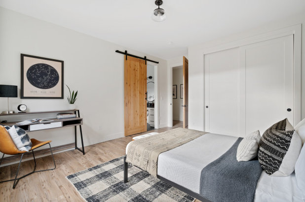
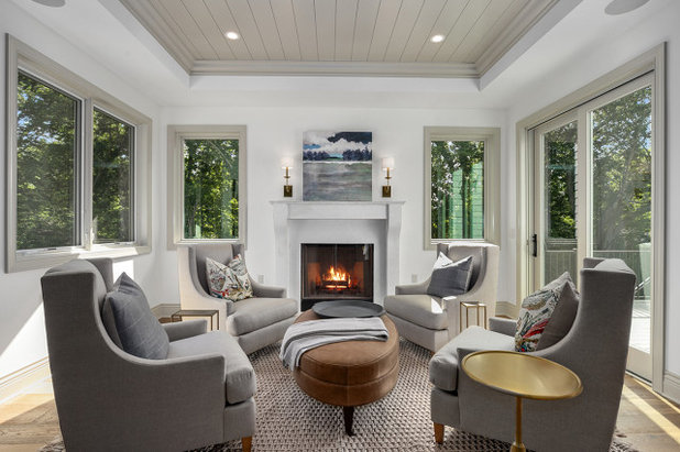
2. Ceilings that match the walls
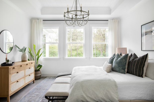
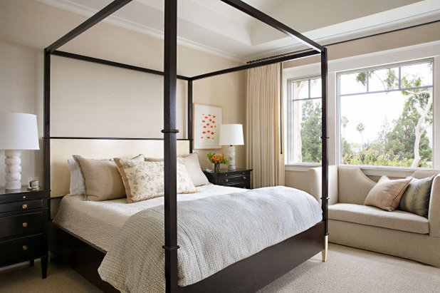
If you’re using an off-white or an otherwise very pale colour for the walls, the simplest solution is to use the same colour on the ceiling. In this example, you can see that the walls and ceiling are all the same off-white shade, carrying just a hint of creamy warmth.
Repainting your home? Find an experienced painter near you on Houzz for expert colour advice
Using one shade for the walls and the ceiling de-emphasises the points where different surfaces meet and puts the visual emphasis on other features such as furnishings, architectural elements and art.
This holds true even if there are bright white mouldings breaking up the walls and ceiling. The ceiling still blends away and the eye is better able to take in the mouldings, such as skirting boards and cornices.
Overall, using the same pale neutral shade for the walls and ceiling gives a welcoming sense of serenity, especially when used throughout the entire home for continuity.
Overall, using the same pale neutral shade for the walls and ceiling gives a welcoming sense of serenity, especially when used throughout the entire home for continuity.
However, the richer the colour you choose, the more it can begin to shrink the space when applied to the ceiling. If you have a tall room or want the space to feel cosy, this isn’t a bad thing. But if you’re going darker with your walls or if your wall hue isn’t neutral, you may want to consider some other options.
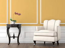
3. Ceilings tinted to coordinate with the walls
Whether you’re using a rich neutral or a bright hue, you can make sure the ceiling colour coordinates well by tinting it with just a little bit of the wall colour. For example, if you’re using a rich buttery cream for the walls, choose a ceiling white that’s tinted with just a bit of the same yellowy undertone.
There are a few ways to approach this. One involves your painter pouring a little bit of your wall paint into a can of white ceiling paint and using this as the new tinted shade.
With this method, however, you can’t easily predict how the shade will turn out, and it can take a lot of remixing to get it right.
You’ll also never be able to get a second can of the exact same shade, either for future touch-ups or because you ran out of the first batch partway through painting – you’ll always need to get the paint matched and mixed.
You’ll also never be able to get a second can of the exact same shade, either for future touch-ups or because you ran out of the first batch partway through painting – you’ll always need to get the paint matched and mixed.
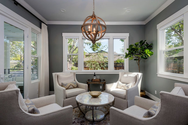
The better option is to choose a pale colour from the same family, often the palest option on the paint swatch card. If you choose what’s essentially just a much lighter shade of your wall hue, you’ll be virtually guaranteed to get a coordinated look.
For bold colours, you may not be able to simply choose an off-white from the same paint swatch card. But you can speak with a decorator or experienced professional at your local paint store to create a custom formulation based on the tints going into your wall hue.
This way the formula will be recorded and you’ll be able to recreate it. And if you swatch it at home and decide it doesn’t work, it can be adjusted much more easily than a DIY concoction.
This way the formula will be recorded and you’ll be able to recreate it. And if you swatch it at home and decide it doesn’t work, it can be adjusted much more easily than a DIY concoction.
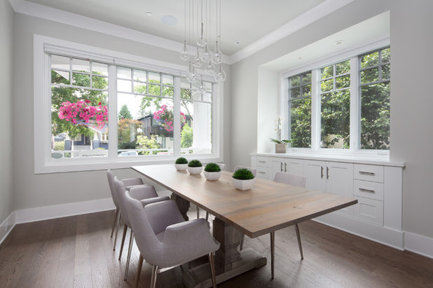
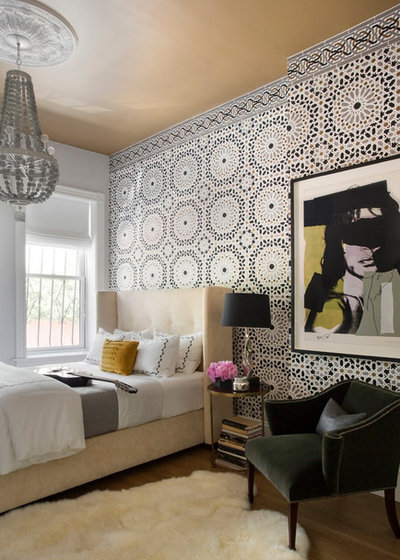
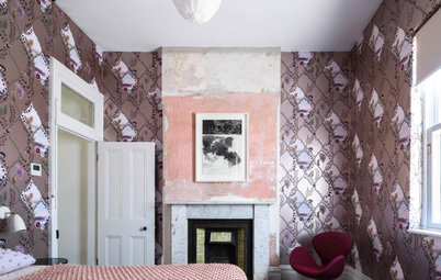
4. Ceilings darker than the walls
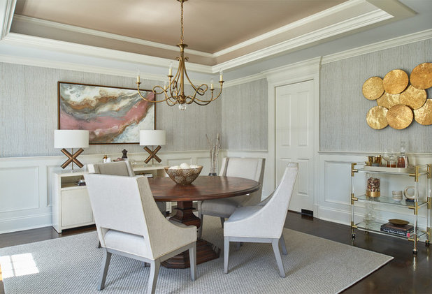
The idea of tinting paints to match can work in reverse as well. In this dining room, the dark paint treatment in the ceiling cove highlights the architecture and makes the room feel more intimate.
But this accent shade wasn’t chosen at random. The hue carries similar tones to ones found in the wallpaper, as well as the white trim colour of the doors and mouldings. The slightly warm trim shade harks back to the same colour family as the ceiling, so no features clash.
Contrasting the walls in darkness, but not in colour undertone, creates a very liveable effect. For this reason, a neutral grey is a great choice for anyone who likes the idea of doing a dark ceiling but doesn’t want to take a big colour risk (especially in an area that isn’t as easy to repaint as a typical wall).
Unfortunately, a truly neutral grey can be tricky to choose in the store. Often colours will look a bit purple, blue or brown when applied at home. For this reason, it’s always wise to choose a few options and swatch them at home, or order large colour swatches to see the colour at a better scale before committing.
Browse more living spaces on Houzz for inspiration
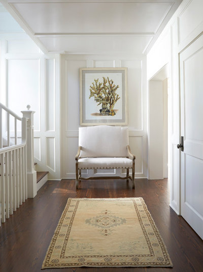
5. Ceilings as a true accent
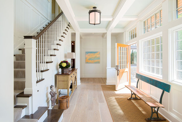
Of course, sometimes a ceiling can be beautiful in a hue that completely contrasts with the walls. The entrance shown here has an icy pale blue in the ceiling coves and a white for the walls, so they certainly don’t match. Coordinating colours like this isn’t an exact science, but you can use several approaches to help.
One is to swatch all of the colours being considered together as stripes on a long plank to see how shades look next to each other. Starting with a recommended pairing from a paint line can help, but seeing the hues at home in your ambient light will reveal how they look together in real life.
A second tip is to pick up the ceiling hue from another accent you already have in a room. Here, the ceiling colour repeats one of the colours in the wall treatment.
You could also look to fabrics or art to find a shade to replicate. Just keep in mind that this hue will be in an attention-grabbing spot when on the ceiling, so choose the most neutral shade in the inspiration piece to keep the room looking put-together rather than loud.
You could also look to fabrics or art to find a shade to replicate. Just keep in mind that this hue will be in an attention-grabbing spot when on the ceiling, so choose the most neutral shade in the inspiration piece to keep the room looking put-together rather than loud.
6. Crisp white ceilings for contrast
While we’re talking about contrasting ceilings, let’s go back to where we started: pure white. In spaces with a lot of fresh white in other elements, such as white linens or other accents, a pure white ceiling can be perfect, despite not ‘matching’ the wall tone.
While we’re talking about contrasting ceilings, let’s go back to where we started: pure white. In spaces with a lot of fresh white in other elements, such as white linens or other accents, a pure white ceiling can be perfect, despite not ‘matching’ the wall tone.
In this example, you can see how the faintly beige wall and bright white ceiling contrast. This makes the wall colour stand out more and gives a sense of freshness that works well to bring a contemporary edge to this traditional home.
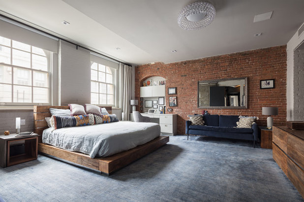
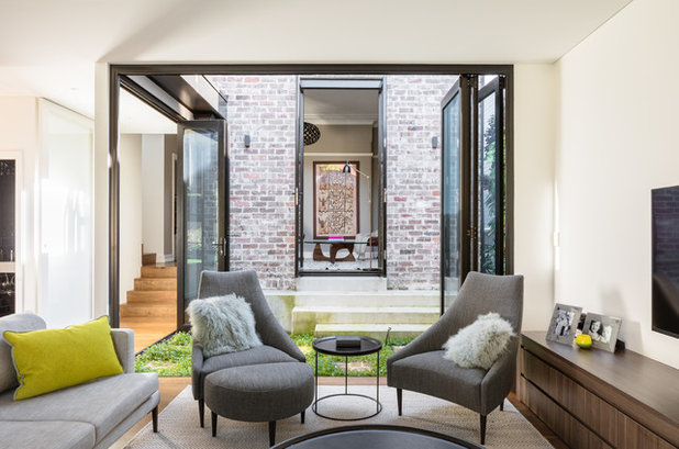
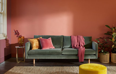
A purely white ceiling works well in a space that has a mix of both warm and cool neutrals (like the ruddy brick, warm wood and cool-toned sofa upholstery shown here). The white acts as a middle ground between the diverse tones.
3 questions to ask your design professional before you paint
3 questions to ask your design professional before you paint
- What finish of paint will you use? (There are options that can highlight, others that can mask, so this is important to know.)
- Will you also paint the cornices and ceiling rose? If yes, what colour and finish?
- What is the desired feel you wish to give my space? (Cosy means a darker colour, airy generally means a lighter colour.)
Your turn
What colour is your ceiling paint? Tell us in the Comments below – especially if it’s not white! And while you’re at it, like this story, save the images for inspiration and join the conversation.
More
Need more paint inspiration? You’ll love these 5 Calming Paint Colour Palettes for Living Spaces and Kitchens

Related Stories
Colour
How to Choose Your Perfect Paint Colours
By Erin Carlyle
Three USA designers share tips to pinpoint your style and mine memories to find the right paint palette for your home
Full Story
DIY
Different Strokes: Get a Grip on the Best Paintbrush for the Job
By Janet Dunn
Ensure your next DIY paint project gives you a result to make a pro proud by choosing the right tools for the job
Full Story
Architecture
A Designer's Masterclass on Stripping a Home Back to Its Bones
This bakery conversion in Sydney mixes original industrial features and hand-crafted elements, combined with love
Full Story

Most Popular
28 Examples of the Beauty of Dark Walls
Our coffee-break escape offers you five minutes' worth of images to inspire and delight. Jump right in...
Full Story
Decorating Ideas
Before & After: A Fast, Easy Update to a Child's Room With Paint
See how a stylist used paint and layers of luscious textures to add instant warmth and cosiness to a child's room
Full Story
Picture Perfect
21 Clever Paint Ideas From Around the World
Our coffee-break escape offers you five minutes' worth of images to inspire and delight. Jump right in...
Full Story
Colour
How to Find the Paint Colours Seen in a Photo on Houzz
Do you often see photos on Houzz and fall in love with the colours shown? Here's how to find a matching paint shade
Full Story
Trends
6 Top Paint Colour Trends For 2020
If you're looking to refresh your home, these are the hottest colour palettes you need to know about, say the experts
Full Story

Exteriors
5 Fabulous Exterior Paint Ideas (That Aren't All About Grey)
Colour your world with these bright ideas for fantastic facades
Full Story
What about ceilings that meet the walls in various heights, like attic spaces? Where do you break the color or are these better painted all the same? Is there a way to make the room feel bigger or taller?
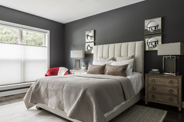
Such a great article and so informative! Paint is tricky so these tips are awesome. Thank you so much for including us. Project: Port Streets | Newport Beach. *Bedroom paint color is Dunn Edward's in Whisper White.
I've noticed that when the ceiling is the same color as an area rug below, it creates an up and down eye movement that gives the illusion of height.
Alternatively, if the color chosen for the walls gets gradually lighter as it goes up: wainscoting to upper wall to crown moulding, to ceiling, to ceiling inset... It's a very natural and calming feeling, like when I step into a forest glade. The effect is especially calming in blue for me.
I just wondered if anyone else experienced those sensations.