


How to Work With Pantone's Colours of 2016
For the first time since its inception, Pantone has chosen two defining colours for 2016. Here are some tips to help you make them work
Jacquelene Symond
9 December 2015
Houzz Australia Contributor. Architectural Colour Consultant, Trainer, Writer and PostGrad Psychology student
Houzz Australia Contributor. Architectural Colour Consultant, Trainer, Writer and... More
Opting for not one but two hues for their trending colours for 2016, Pantone had every intention of making a statement, both politically and artistically. The combination of a soft purplish-blue shade, Serenity (the ‘boy’ shade) and the blush pink Rose Quartz (the ‘girl’ shade) is a nod to the gender blur we’re experiencing in fashion, which has also influenced other areas of design. Plus, as predicted, they’re both calm, harmonious hues, something we definitely we need in current times.
As Leatrice Eiseman, executive director of the Pantone Color Institute says: “Rose Quartz and Serenity demonstrate an inherent balance between a warmer embracing rose tone and the cooler tranquil blue, reflecting connection and wellness as well as a soothing sense of order and peace.”
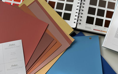
This pair of shades is definitely a bold move away from the greys, whites and strong colours that have dominated Pantone’s trend predictions for the last ten or so years. If you’re considering bringing this softer palette into your home, here are some foolproof rules to follow to ensure you make the look work for you.
As Leatrice Eiseman, executive director of the Pantone Color Institute says: “Rose Quartz and Serenity demonstrate an inherent balance between a warmer embracing rose tone and the cooler tranquil blue, reflecting connection and wellness as well as a soothing sense of order and peace.”
This pair of shades is definitely a bold move away from the greys, whites and strong colours that have dominated Pantone’s trend predictions for the last ten or so years. If you’re considering bringing this softer palette into your home, here are some foolproof rules to follow to ensure you make the look work for you.
DO consider the effect both colours have
Before choosing where and how to use Pantone’s colour/s of the year for 2016, consider the psychological effect each shade will have on the occupants of your home.
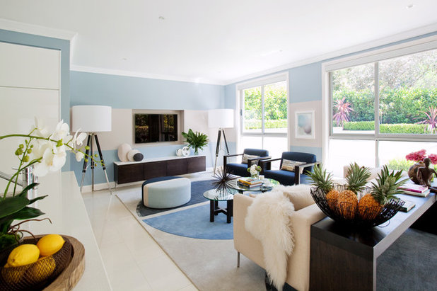
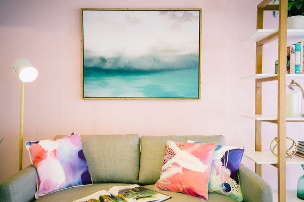
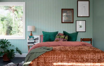
Both of these colours are intended to encourage a calm atmosphere in any space – Rose Quartz is a feminine and romantic colour that Pantone believes conveys compassion and a sense of composure; ‘Serenity’ is a light, weightless and airy shade, likened to the expanse of a clear blue sky.
Since they both have calming intentions, try to use this to your advantage, opting to use these shades in relaxation and respite zones, like bedrooms and living rooms.
Before choosing where and how to use Pantone’s colour/s of the year for 2016, consider the psychological effect each shade will have on the occupants of your home.
Both of these colours are intended to encourage a calm atmosphere in any space – Rose Quartz is a feminine and romantic colour that Pantone believes conveys compassion and a sense of composure; ‘Serenity’ is a light, weightless and airy shade, likened to the expanse of a clear blue sky.
Since they both have calming intentions, try to use this to your advantage, opting to use these shades in relaxation and respite zones, like bedrooms and living rooms.
DON’T pay attention to stereotypes
Having lived through the ‘80s with my blue and white bedroom and pastel pink clothing and lipstick, I understand it would be easy for the modern decorator to decide against using these colours. The last time we saw dusty pink and pale blue combined would have been 25 years ago, along with preppy styles and chintz.
Soft pastels were a popular choice in the ’80s; they really were everywhere. So, for those that lived through that decade, you may find the colour combination and the throwback to pastels a little dated and somewhat off-putting. It doesn’t have to be though, if you stick to the following guidelines.
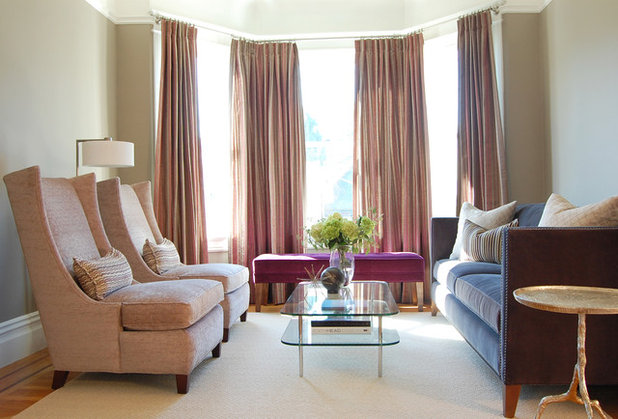
DO choose the right colours to pair them with
Serenity and Rose Quartz are intended to be used together, “with the whole greater than its individual parts”. Pantone says they’re perfect for both soft or hard surface materials, in all types of finishes.
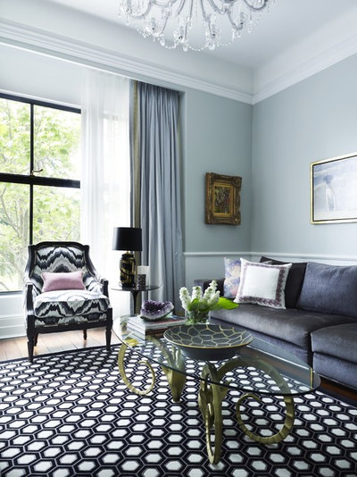
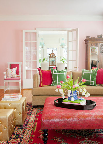
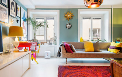
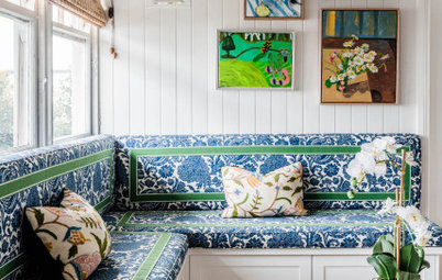
Try pairing this combo with greys, whites, black, yellow, gold or other mid tones including green and purple. Or add a splash of silver or hot brights to liven things up. Alternatively, bring some drama and depth into the space with a darker hue such as navy, black or a rich brown.
Play with cushions, throws, candles and other accessories. Alternatively, if it’s within your budget, think about buying a statement piece, re-covering a sofa or armchair or even splashing out on some new curtains.
Serenity and Rose Quartz are intended to be used together, “with the whole greater than its individual parts”. Pantone says they’re perfect for both soft or hard surface materials, in all types of finishes.
Try pairing this combo with greys, whites, black, yellow, gold or other mid tones including green and purple. Or add a splash of silver or hot brights to liven things up. Alternatively, bring some drama and depth into the space with a darker hue such as navy, black or a rich brown.
Play with cushions, throws, candles and other accessories. Alternatively, if it’s within your budget, think about buying a statement piece, re-covering a sofa or armchair or even splashing out on some new curtains.
DON’T go overboard
You may laugh and think that’s ridiculous, but speaking from personal experience, it’s far from impossible to do. I once rented an apartment where the owner had painted every room – including doors, architraves and skirting boards – a pale blue/grey with dark grey carpets. Thankfully, I was lucky enough to have some large pieces of art to provide variety, preventing that feeling of peace from turning into gloom and depression.
It’s all about balance; so even if you do fall madly in love with Rose Quartz, Serenity or both and decide to start painting your walls with them, don’t go overboard and make sure you provide some colour variety with soft furnishings and accessories.
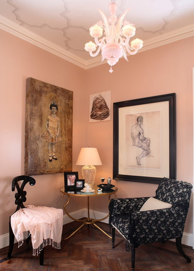
DO get the tone right
If you do decide on using this colour combination, ensure Rose Quartz is more on the subdued or peachy side. This will prevent it from looking like a little girl’s space. Likewise, look for a warmer or smoky blue when choosing Serenity, to keep the space looking more sophisticated and mature.
If you do decide on using this colour combination, ensure Rose Quartz is more on the subdued or peachy side. This will prevent it from looking like a little girl’s space. Likewise, look for a warmer or smoky blue when choosing Serenity, to keep the space looking more sophisticated and mature.
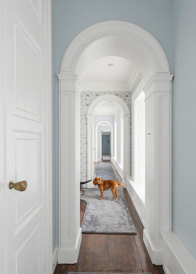
DON’T use in long corridors and narrow hallways
Be careful painting long corridors and hallways in either of these colours. As pale blue is less advancing it may make the corridor or hallway feel like it goes on forever. Whereas blush pink, if not handled carefully, can be intimidating and inhibiting in a closed-in area. Try adding a neutral or white shade to help direct people through the space.
Be careful painting long corridors and hallways in either of these colours. As pale blue is less advancing it may make the corridor or hallway feel like it goes on forever. Whereas blush pink, if not handled carefully, can be intimidating and inhibiting in a closed-in area. Try adding a neutral or white shade to help direct people through the space.
DON’T use them just because they’re on trend
Although trends have a place within the zeitgeist of the time, if Rose Quartz or Serenity are not your colour cup of tea, don’t use them! Your personal relationship with colours is of utmost importance within your own living space, as it’s here that you get to express your individual colour and style needs, and you must feel comfortable with your choices.
However … DO use them if you really like them
They say a change is as good as holiday and Pantone have definitely ushered in a major change this year. If you like them, embrace them, as being new and different they will certainly get your creative juices flowing.
And if you’re more comfortable just using only one of these shades, remember it’s your space. So choose your preferred shade and pair it with the colours already suggested, depending on the mood and overall style you wish to create.
And finally … have fun!
Remember it’s your space and you and your family need to live in it. Rose Quartz and Serenity are definitely soothing colours, and it’s a big move away from what we’ve been used to since the turn of the century. But with the stresses of the modern day all around us, maybe it is time to start injecting a little more of the colours that soothe and calm into our living spaces, and as a result, we may soothe and calm ourselves.
Find an interior designer in your area

What are you working on?


Related Stories
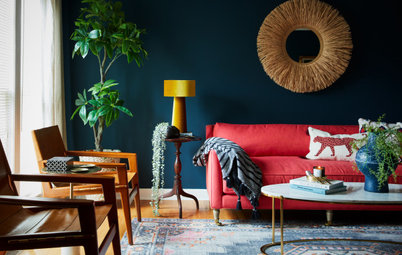
Paint
How to Choose Your Perfect Paint Colours
By Erin Carlyle
Three USA designers share tips to pinpoint your style and mine memories to find the right paint palette for your home
Full Story
Renovating Advice
How to Choose Your Wall Colour to Complement Floors and Furniture
Which colour should I paint my room to suit the flooring and furniture? We've all asked it – and here are the answers
Full Story
Most Popular
How to Pick the Right Paint Colours for Your Federation House
By Joanna Tovia
Roof colour, wall materials and emerging trends all come into play for Federation paint schemes that work
Full Story
Colourful Homes
Suffering From White-Wall Syndrome? How to Add Colour Confidently
White walls are great... until they stop being inspiring. Five paint colour experts share how to transition to colour
Full Story
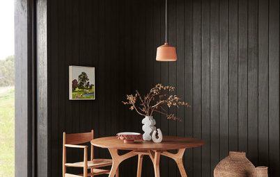
Expert Opinion
An Interior Designer Reveals How to Mix Colours and Make it Work
By tidgboutique
Don’t want to confine yourself to neutrals but lack the confidence to embrace colours? We have you covered
Full Story
Made Local
Made Local: How Dulux Colour Trends Are Born
Ever wondered how Dulux sees into the future to know the colours we'll be coveting in the year ahead? Here, we find out
Full Story
Houzz Tours
Queensland Houzz: A Cute Cottage Awash With Colour and Pattern
Bold colour, quirky prints and an abundance of art transformed this 1920s cottage into an inviting and relaxing gem
Full Story
Houzz Tours
My Houzz: A Moody, Modernised Home in Melbourne Regains its Charm
The original beauty of this Californian bungalow was lost to unsympathetic updates – see how a designer brought it back
Full Story
Interior Design
20 Honey-Hued Interiors That'll Make You Melt
Our coffee-break escape offers you five minutes' worth of images to inspire and delight. Jump right in...
Full Story
Awards
Paintbrushes Poised! 2023 Dulux Colour Awards Finalists Are In
Looking for interesting ways to add colour at home? Check out these shortlisted projects in the 2023 Dulux Colour Awards
Full Story
They didn't really choose a 'boy' shade and a 'girl' shade ???? As the PM of Canada said - 'It's 2016!' Pantone color choosers, you have lost all credbility . . .
Grreat!