
Inspiration Alert: Dulux Colour Awards 2020 Winners Announced
Looking for colour ideas for your home? You're in luck, the Dulux Colour Awards 2020 winners are full of inspiration

Whites and neutrals might be the safe options, but sometimes we crave a bit of colour. If you’re itching to add some heavenly hues to your home, prepare to be inspired. The Dulux Colour Awards 2020 winners have just been revealed, showcasing the most cutting-edge and creative use of colour across six categories of architecture and design.
Now in its 34th year, the prestigious awards attracted over 450 entries from Australia and New Zealand. “The level of sophistication, creativity and masterful use of colour continues to rise each year,” says Andrea Lucena-Orr, Dulux colour and communications manager. “Architects and designers are becoming increasingly bold and adept at employing paint as an integral element in the design of both internal and external spaces and this is evident across all the winning projects.” So grab a cuppa and prepare to take notes for your upcoming renovation or home makeover!
Now in its 34th year, the prestigious awards attracted over 450 entries from Australia and New Zealand. “The level of sophistication, creativity and masterful use of colour continues to rise each year,” says Andrea Lucena-Orr, Dulux colour and communications manager. “Architects and designers are becoming increasingly bold and adept at employing paint as an integral element in the design of both internal and external spaces and this is evident across all the winning projects.” So grab a cuppa and prepare to take notes for your upcoming renovation or home makeover!
Site observations of the existing and remnant laneways and walls of the VCA campus revealed spaces for display, murals, posters and art. The new faccade was designed to reflect and reinforce this unique creative character and was inspired by the strong legacy of artistic expression on-campus, including a huge abstract Ash Keating mural and a vibrant striated Edmond and Corrigan facade, both next door.
Using these site cues, six key colours emerged, with another eight intermediate colours added between. These combinations, both at the scale of the wall and at the scale of the panel, transition between subdued and intensely coloured moments, while obscuring the reading of repeated panels.
The faccade uses vibrant colours to blur between individual coloured battens and the whole facade as a single composition: the same tension as between a brush stroke and a painting. Becoming a civic mural, the facade contributes to the urban activation of the interior campus block and affirms its specific civic-arts identity through creativity and colour.
Judges’ notes: Ambitious in its conception and labour-intensive in its realisation, this project stood out from the start. As an end-of-trip destination with bike storage and change rooms, its program is utilitarian, yet the architects approached it as an opportunity for broader engagement with the surrounding elements.
It is a credit to them that they conceived of such a complex palette, comprising no less than 14 Dulux hues, and executed it so successfully.
The random, pixelated effect of the thousands of painted battens is intricate like a woven textile, ever-changing under different light conditions to draw one into the space. We are in awe of the outcome.
Inspired to introduce colour to your home? Find an architect near you on Houzz and make it happen
GRAND PRIX WINNER NEW ZEALAND, AND COMMERCIAL AND MULTI-RESIDENTIAL EXTERIOR COMMENDATION
Project: Rangiora Social Housing Development
Location: Rangiora, New Zealand
Architect: Rohan Collett Architects
Photos: Dennis Radermacher at Lightforge Photography
Architects’ notes: The Rangiora Social Housing project involved redeveloping an existing site and replacing nine 1950s state houses with twenty-eight one-bedroom units. It is the largest redevelopment undertaken by Housing New Zealand in North Canterbury as part of its commitment to modernise and increase social housing in the community.
Single persons over the age of 55 were the primary demographic for this project. The key design intent was to revive and destigmatise medium-density social-housing developments by creating contemporary homes that integrate harmoniously with their low-density residential surroundings. Colour played a significant role in achieving this.
A consistent colour palette was chosen to achieve a high degree of coherence to acknowledge the civic importance of the site and inspire a shared sense of identity among residents. But it was used with purposeful irregularity to avoid a visual result stigmatised by uniformity.
A variety of colours were employed to encourage visual integration with the wider residential area, by helping it take on the appearance of a private rather than a public scheme. The colours were specifically selected for their positive impact on the proposed occupancy demographic, based on research, as well as for their enduring modern aesthetic and to encourage easy navigation through the site.
The design was informed by the local architectural vernacular, scale and materiality. The response was a modern interpretation of the brick and painted weatherboard houses synonymous with the area. The palette included enough colour contrasts to avoid monotony, but tonally, the colours were similar – slightly muted and natural.
The units at both entrances were painted white to retain a visual dialogue with nearby local landmarks. The other boundary units were painted in a variety of block colours to reduce the perception of the overall scale to that of the surrounding houses.
The colours inspire positive psychological responses within the target demographic: Pioneer Red is visually stimulating, New Denim Blue is relaxing and serene, Desert Sand is warm and secure, and Titania is clean and bright. Collectively, this palette is modern, enduring, and aesthetically appealing, prompting a sense of pride and ownership among occupants.
Judges’ notes: The uniformity and blandness that plagues much of the social-housing genre has been cleverly avoided in this highly considered multi-residential project for individuals over 55.
With colour as a key tool, individual homes have been given unique identities, while still visually integrating into the surrounding area as a whole. Colour has also been employed as a navigational device across the site.
But it is the fine balance between cohesion and what the architect describes as “purposeful irregularity” in the application of the palette across the 28 units that is to be commended: there is just enough similarity in the hues of the facades for the village to identify as a whole and just enough individuality for it not to slip into bland uniformity.
This is a genre-busting project, worthy of high praise.
RESIDENTIAL INTERIOR WINNER
Project: Perfect Storm
Location: NSW
Interior design: Killing Matt Woods
Builder: Green Anvil Co
Specialist paint finisher: Set For Art
Photos: Katherine Lu
Interior designer’s notes: Dubbed “the concrete bunker” for its deliberate use of applied finishes and rejection of ornamentation, this apartment was conceived as an intimate yet utilitarian environment. Inspired by Brutalism and the local warehouse vernacular, extruded geometries and moody tones result in a minimalist and precise interior.
The project brief called for the redesign of an inner-city warehouse conversion for a couple seeking a minimalist lifestyle with an interior to match. The clients, who work in design-related disciplines, sought to shed their home of unimportant accumulation and create a space free of clutter and visual pollution. Conceived of as a “concrete bunker”, the shell of the apartment has been informed by the designer’s penchant for Brutalist architecture.
The principle intent was the creation of a pared-back, geometric interior and a celebration of the neighbourhood’s industrial heritage. The loft is flooded with light from a full-height glazed wall, counter balancing the interior mood, which is intentionally dark and brooding.
This interior eschews the cliched industrial warehouse aesthetic and ubiquitous Sydney design approach (read: natural/seaside/light, bright and airy), offering a fresh yet site-specific take on the warehouse-conversion category.
Great lengths were taken to synthesise client direction and the specificity of the brief with a bold design approach. As a result, dematerialisation is at the core of the concept, and all elements have been reduced to their bare essentials, resulting in a utilitarian, cave-like sanctuary that is also intimate, light-filled and homely.
Given the project context of a residential warehouse conversion, it would have been natural to emulate any of the well-articulated examples in the genre. However, the designer has chosen to ignore the whims of trend, opting for a unique approach that perfectly underscores the client’s vision.
Judges’ comments: Avoiding the ubiquitous industrial cliche, this warehouse renovation is instead a Brutalist-inspired marvel. Its minimalism and clean, clutter-free aesthetic signals a commitment to the vision by both the client and the design team.
See more stunning Australian bedrooms on Houzz
See more stunning Australian bedrooms on Houzz
The use of a single colour and finish, with the appearance of concrete on all painted surfaces has a surprisingly warm cocooning effect, which is amplified by the soft curve where walls meet ceilings. It is utilitarian chic at its best – intimate, moody, balanced – and awarded for its simplicity and singularity.
RESIDENTIAL INTERIOR COMMENDATION
Project: Ruckers Hill House
Location: Victoria
Architect: Studio Bright
Photos: Rory Gardiner
Architects’ notes: A prominent, corner-sited Edwardian on the crest of Ruckers Hill has been restored and enlarged with new living spaces in a separate rear garden pavilion. Pushing the new addition to the back of this site allows the northern sun to fill the pool and garden, but also allows a streetscape expression that is contemporary and street-tough, while a little bit Edwardian in spirit.
The siting decisions manifest as a house with a two-part nature: one a personal retreat and the other more civically engaged with an eye on the street and the far horizon. The new pavilion expands the nuanced living possibilities and is filled with warm, neutral-toned materials and colours, whereas the period house celebrates its heritage and detail and is picked out in colour throughout.
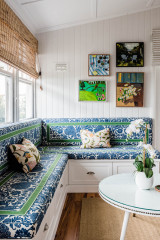
The house offers traditional room proportions and fenestration ideally suited to bedrooms – the architectural equivalent of comfort food. New functional elements like wardrobes and hand basins are detailed as items of furniture, brightly coloured and contemporary, the distinction between new and old held in sharp contrast.
Colour palettes differentiate rooms as personally belonging. ‘Richmond Tigers’ yellow is for the avid footballer; green backgrounds is for a collection of adolescent detritus: a skateboard, posters and guitars; and a powder blue brings out the girlish personality of its occupant.
The main bedroom is a retreat as well as a realisation of our client’s eclectic taste – awash in hues of pink, with complementary green wardrobes and side tables, plush maroon carpet underfoot, but always with a deference to its period context.
The main bedroom is a retreat as well as a realisation of our client’s eclectic taste – awash in hues of pink, with complementary green wardrobes and side tables, plush maroon carpet underfoot, but always with a deference to its period context.
Judges’ comments: At first sight, the unashamed distinction between old and new in this period-home refurbishment and new addition is striking for its balance. Upon closer inspection, the embrace of individuality and its expression in saturated colour are equally remarkable elements of this project.
Palettes have been devised to reflect the personal nuances of each room’s main occupant: the yellow of a beloved football team, a powder blue for its subtle femininity, and greens as backdrops for teen paraphernalia. The main bedroom incorporates its owner’s eclecticism in contrasting pinks and greens.
It is a unique palette that has driven design decisions and been cleverly employed to distinguish between the old and new architectural components, as well as the unique personalities within.
SINGLE RESIDENTIAL EXTERIOR WINNER
Project: Casaurina House
Location: NSW
Architect: Vokes and Peters
Photos: Christopher Frederick Jones
Architects’ notes: Casuarina House is a new family home in a coastal subdivision in northern NSW. The house was the last lot to be developed in a quiet cul-de-sac, located a few streets from the ocean.
The design of the house is intended to promote an outdoor lifestyle and connect the occupants with the coastal setting. With this in mind, much of the site was given over to the garden, resulting in a large outdoor open space. A low wall at the street frontage ensures that views of the garden can also be enjoyed by the rest of the neighbourhood.
The building is composed of two principle materials: red-painted timber and brickwork. Masonry elements make up the base of the building and extend out into the garden as walls, seating and ground surfaces.
Dulux Capsicum Red was selected for the exterior of the building. The striking red tone was intended to offset the light, sand-coloured brickwork and to contrast with the green tones of the native foliage.
In the direct sun, the red paintwork is bright and defiantly modern; in shadow, the same colour appears deep and moody, almost black. This was a perfect choice for a structure wrapped in timber-batten screening, as it moderates the abundance of light for the private interior spaces.
Judges’ notes: Impactful in its simplicity, this new family home responds to its coastal setting by promoting an outdoor lifestyle and facilitating an easy flow between inside and out. Its Dulux Capsicum Red-painted external timbers and the sandy brickwork and masonry elements are perfectly balanced and contrast strikingly with the native foliage.
Described by the architects as bright and defiantly modern when hit by the direct sun, the statement red exterior becomes subdued and moody when shaded, transforming the architectural expression from day to night.
Overall, this is a bold design of unwavering commitment that exudes warmth and depth through colour and texture.
SINGLE RESIDENTIAL EXTERIOR COMMENDATION
Project: Split House
Location: Auckland, New Zealand
Architect: Pac Studio
Photos: Simon Devitt
Architects’ notes: Colour has always been used in New Zealand residential architecture as a way of distinguishing the crafted elements of a home from the fundamental structure behind it. The villas of suburban Auckland are crying out to be painted in colours that highlight their often-ornate detailing. But as these heritage structures are added to and altered to provide contemporary living spaces, the new components have struggled to deal with how colour can not only enliven the exterior of a house, but also create unique spatial and optical effects.
In this design, we employed a strategy of highlighting key openings within the walls of the building with joinery frames painted in rich Dulux Kakanui. These openings were set over neutral walls in Dulux Narrow Neck for the new portion of the house and Dulux Narrow Neck Double for the heritage fabric. Joinery sashes were picked out in warm and buttery Dulux White Starlight Quarter.
Across the rear of the house, two sculptural shading screens diffuse the top edge of the house as it meets the sky.
These screens were painstakingly manufactured with a gradient of splay-cut boards, each painted with a Dulux Kakanui wedge along its cut face. This creates an effect where the building discloses its highlighted colour as one walks from one side of the garden to the other.
From the east the screen looks to be entirely painted in Dulux Narrow Neck to match the wall below, but as one comes around to the west, with the light of the setting sun, Dulux Kakanui is revealed in ever-expanding flicks of warmth.
The result is an exterior that finds joy in its balance of bold and neutral colours.
Judges’ comments: This heritage villa in Auckland has been enlivened with colour in playful yet deliberate fashion. Announcing its revitalisation to the street, the villa’s front door and windows have been highlighted in a rich red that appears again in the shading screens across the back of the house. Here, the strategy has been to paint only the cut face of the vertical timbers, creating an optical illusion or sequence of disclosure as one moves across the site.
It is an innovative and well-executed play of bold and neutral colour that surprises and delights.
It is an innovative and well-executed play of bold and neutral colour that surprises and delights.
Your turn
What do you think of this year’s winners – do you have a favourite? Tell us in the Comments below. And don’t forget to save your favourite images for inspiration, like this story and join the conversation.
More
Want to see more homes with colour? Take a look at Colour Cure: A Bright & Cheery Extension for a Family of Four

Sponsored
Sponsored
Project: UOM Southbank – End of Trip
Location: Victoria
Architect: Searle x Waldron Architecture
Photos: John Gollings
Architects’ notes: UOM Southbank – End of Trip is part of a wider development plan for a transforming educational precinct with both contemporary and heritage architecture. The project considers how its key programs of bicycle storage and change rooms can be activated through a new faccade strategy that is only revealed as you enter the campus. The demolition of the adjacent building to make way for the new park created an opportunity for a new coloured-edge condition to result from a subtraction from the existing heritage industrial building.
This ‘carved’ edge engages with Linear Park and provides intermittent screened and framed views into the end-of-trip facilities and cafe, creating an animated walkway of over 18,000 painted timber-batten linings in 14 Dulux colours, divided over 14 different prefabricated panel types.