
Japanese Houzz: Indoor and Outdoor Living, Balanced Harmoniously
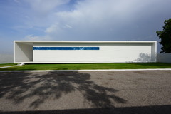
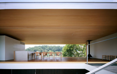
The sheltered terrace integrated into this home's design pulls in breezes and light, while carefully guarding the privacy of its occupants

This contemporary house is located in central Tokyo in a residential neighbourhood and is surrounded by other houses (though the west side of the property now contains a parking area). At just over 70 square metres, the property is only slightly larger than the area zoning minimum, and about half of it is divided into a garage and terrace. The owners’ greatest wish was for lots of outdoor space, and the architect created a strikingly original solution.
The terrace space brings the sunlight and the breeze into the living space – two elements that can be hard to come by with city living. However, at the same time, the larger the terrace, the smaller the indoor living space. The architect, Takuro Yamamoto, confronted this dilemma together with the owners to come up with this innovative solution.
“Our design method places equal value both on inside and outside spaces,” Yamamoto says. “The couple desired a certain lifestyle, so they had a different perspective from that of the designer and builder, but we were all moving in the same basic direction. I think this is a big reason why they hired me as the architect. The battle between the inside and outside continued down to the bitter end, and I did a study on a 1:50 metre scale.”
The terrace is 17.8 square metres, and the roof is about 5 metres high. The safety railings are made of wire to preserve the sense of openness. If you sit down on the red cedar deck, your view broadens even further and, though you’re still technically ‘outside’, the sense of privacy is very strong.
Even when looking up at the house from the road on the north side, the edge of the deck is nearly 3.9 metres high – higher than the first floors of the neighbouring houses, preserving the inhabitants’ all-important privacy.
Even when looking up at the house from the road on the north side, the edge of the deck is nearly 3.9 metres high – higher than the first floors of the neighbouring houses, preserving the inhabitants’ all-important privacy.
The biggest question was how to lay out the necessary living space in only half the building’s total volume. To avoid construction restrictions limiting the height of the eaves, the house could be no taller than 9 metres. It also needed to be set back from the property lines, and from the road in front. However, Yamamoto had already taken these conditions into account.
“Before I became an independent architect, I worked at an agency that designed a lot of small houses, and I had experience overseeing a site
that was only 15.5 square metres. After becoming an independent, I continued planning for properties that had room to spare, but I always preferred designing urban-style homes,” he explains.
Considering the layout from bottom to top, Yamamoto put the ground floor as far underground as would be allowed without it being considered a basement, and sited the toilet, bathroom and bedrooms down there.
Upstairs, the first floor is a combination kitchen, dining and living space. Above this is the couple’s bedroom and study. Aside from this third storey, the house hides another little secret that can’t be seen from the outside – a tiny extra room. Between the ground and first floors, there’s a storage space with a round window overlooking the atrium-style entrance hall.
Upstairs, the first floor is a combination kitchen, dining and living space. Above this is the couple’s bedroom and study. Aside from this third storey, the house hides another little secret that can’t be seen from the outside – a tiny extra room. Between the ground and first floors, there’s a storage space with a round window overlooking the atrium-style entrance hall.
The door to the storage space is halfway up the stairs. If you push in part of the storage drawer staircase, a ‘secret door’ appears.
Because the ceiling is less than 1.4 metres high, the law does not consider it an extra floor. Items can be stored here to open up space in the rest of the house.
The house is filled with design features that open up the space. The metal struts beneath the floor were reinforced, and part of the wooden floorboards were shored up with metal to keep the beams narrower and cut down on the thickness of the floor. Thus, the rooms have higher ceilings, which give a light and airy look to the entire building, including the terrace.
“Another theme of this design was to create a building that looks like three storeys from the outside and in the eyes of the law, but manages to sneak in a fourth floor,” Yamamoto says.
“Another theme of this design was to create a building that looks like three storeys from the outside and in the eyes of the law, but manages to sneak in a fourth floor,” Yamamoto says.
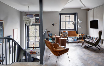
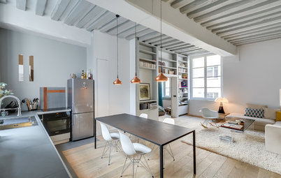
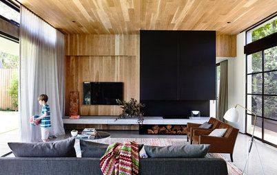
If you throw the bi-folding glass doors wide open, the living space flows seamlessly into the outdoors. The herringbone floor adds to the synergistic effect, as the pattern is orientated so as to draw the eye towards the outdoors.
“Along with the large terrace, the owners requested a new house that would preserve the feel of an old house. They imagined something like a Parisian apartment. Together, we selected materials that would age naturally and give the house flavour. The outside walls may look cold in photographs, but the surface is covered in slightly rough mortar, which creates an overall feeling of warmth,” Yamamoto says.
“Along with the large terrace, the owners requested a new house that would preserve the feel of an old house. They imagined something like a Parisian apartment. Together, we selected materials that would age naturally and give the house flavour. The outside walls may look cold in photographs, but the surface is covered in slightly rough mortar, which creates an overall feeling of warmth,” Yamamoto says.
The owners took great care in choosing the living room sofa, which is upholstered in antiqued leather. The low shelf surrounding the floor is contiguous with the steps leading upstairs, but it also serves as a TV cabinet, a bench for the dining area, and a table at the perfect height for someone sitting on the floor.
The dining table is made from lauan plywood, stained a dark colour to balance harmoniously with the tones of the chairs and flooring. A portion of the round table edge was cut off to provide easy access for guests sitting on the bench.
Yamamoto also designed the pendant lamp hanging over the dining area. He calls this simple pendant an ‘Adamski’; it’s nothing more than aluminium from a DIY shop, rounded, topped with a cookie-cutter tube, and painted white.
Yamamoto is an architect who creates interiors suited to all kinds of spaces. The combination nameplate and letterbox sunk into the wall next to the front door is the design of one of Yamamoto’s trained apprentices.
The cubic door handle on the bathroom is also an original design, handcrafted from wood, as is the door latch. “Metal handles wouldn’t fit with the atmosphere the couple wanted,” Yamamoto says.
To soften the cold feeling of the metal, the light switches were also painted white, creating a uniform look.
To soften the cold feeling of the metal, the light switches were also painted white, creating a uniform look.
This is the second floor bedroom. The door handle is conspicuously low for the size of the door, but this was a conscious decision to position it ergonomically. The couple themselves may be the only ones who notice these tiny design details, but the designer feels they give the entire home a feeling of human warmth.
“We succeeded in designing a home that ties together outdoor and indoor spaces in luxurious, equal balance. It’s an urban dream house,” Yamamoto says.
Some have hailed this house as the quintessence of Japanese minimalist living. But isn’t that description missing something? Because, to borrow a phrase from Mies van der Rohe, “God is in the details.”
TELL US
What do you think of this home and its secluded terrace? Share your thoughts in the Comments below.

Sponsored
Who lives here: A couple in their 30s
Location: Tokyo, Japan
Architect: Takuro Yamamoto
Size: Just over 70 square metres
Completed: April 2015
In Japanese architecture, the sunny south side of detached homes is often entirely given over to a terrace. However, in this case, the south side directly bordered the wall of the next house, so a terrace wouldn’t have worked here.
Based on the owners’ wishes for outdoor space, the architect proposed setting the house over to one side of the property, with a broad, north-south ‘passage’ on the other. The passage makes up half the volume of the home – an unusually generous allocation, but it allowed the part of the property with the most sunlight to be made into a terrace.