


Looking Up: More Space, Light and Flow for a Cramped Sydney Semi
A cleverly designed first-floor addition gave this small, narrow home all the extra space and light the owners craved
Georgia Madden
14 January 2022
In this Q&A series, we turn the spotlight on one thought-provoking renovation each week. Here, Neche Page, building designer and director at LivingLot, shares the journey of renovating and extending a compact and awkwardly laid out Sydney semi for a family of four.
Images by Louise Wellington
Answers by Neche Page, building designer and director at LivingLot.
Who lives here: A couple with two children
Location: Mosman, NSW
Number of bedrooms and bathrooms originally: Three bedrooms, one bathroom
Number of bedrooms and bathrooms after works: Four bedrooms, two bathrooms and one powder room
How many levels before works: One
How many levels after works: Two
Size of the house before works: 112 square metres
Size of the house after works: 166 square metres
Buiding designer and interior designer: Neche Page, building designer at LivingLot (the client also helped with the finishes and selections)
Builder: Richards Building Co
Styling: Jessica Bellef
How did Houzz help with this project?
The client was a referral through the builders, Richards Building Co. We used Houzz to find inspirational images alongside other online resources.
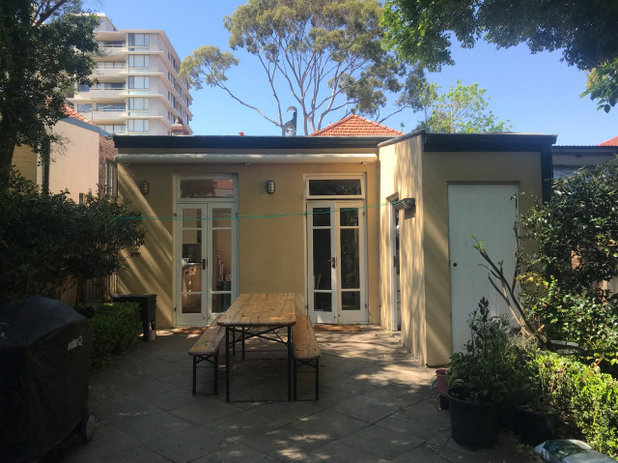
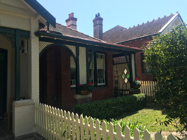
The rear of the house before works.
What was the house like originally?
A single-storey 1920s Federation brick semi with a rear lean-to.
Need more room? Find a building designer near you on Houzz
What was the house like originally?
A single-storey 1920s Federation brick semi with a rear lean-to.
Need more room? Find a building designer near you on Houzz
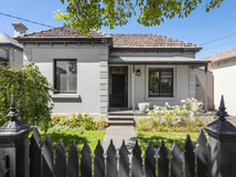
The facade before works.
What wasn’t working for the owners?
The existing layout was disconnected, with two bedrooms at the front of the house, followed by the living area, a family bathroom, dining room and then the third bedroom adjacent to the kitchen.
Natural light into the core of the home was limited, as was access to the rear patio, which was via the third bedroom or through the galley kitchen.
The laundry was located in an attached shed, accessible from the outdoors only.
Storage was also extremely limited. The existing attic storage space was only accessible by a drop-down ladder stair from the ground floor, which made storing larger items challenging.
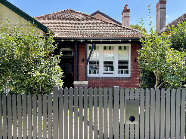
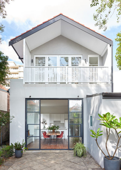
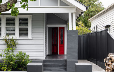
The facade after works.
What state was the house in when you came onboard?
Liveable and in a good condition. But the layout was disconnected and space was limited.
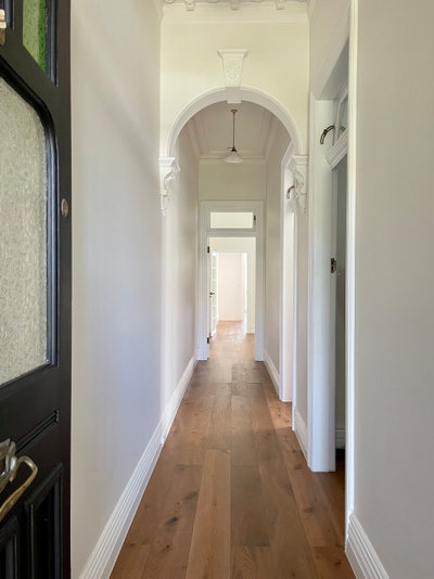
The original front half of the house containing two bedrooms, the entrance hall and living area were in good condition with period features, which we retained.
The original family bathroom was poorly laid out with a semi-recessed corner spa bath dominating the floor space and creating a trip hazard. Storage and circulation in the rest of the bathroom were limited.
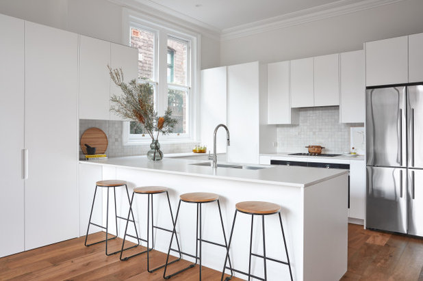
The existing kitchen was tired and dated.
The front-boundary fences were dilapidated and some of the timber on the front-entrance balcony had rotted through.
What state was the house in when you came onboard?
Liveable and in a good condition. But the layout was disconnected and space was limited.
The original front half of the house containing two bedrooms, the entrance hall and living area were in good condition with period features, which we retained.
The original family bathroom was poorly laid out with a semi-recessed corner spa bath dominating the floor space and creating a trip hazard. Storage and circulation in the rest of the bathroom were limited.
The existing kitchen was tired and dated.
The front-boundary fences were dilapidated and some of the timber on the front-entrance balcony had rotted through.
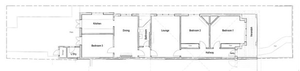
The floor plan before works.
What was the client’s brief?
What was the client’s brief?
- Increase the internal living space.
- Create an open-plan living area.
- Improve the layout and flow at the rear of the home.
- Add an extra bedroom and bathroom.
- Take advantage of the outlook from the new upper storey.
- Add a multipurpose spare room that could double as an office or second living room.
- Increase storage.
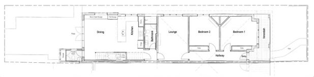
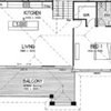
The ground-floor plan after works.
What was gained with the renovation?
What was gained with the renovation?
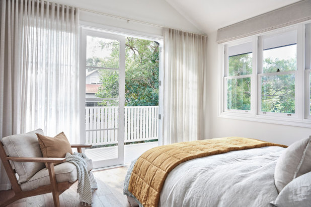
- A new first-floor addition with two bedrooms, including a main bedroom with a walk-through wardrobe, ensuite and balcony; and a multipurpose study/spare room/media room.
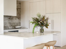
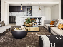
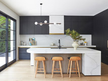
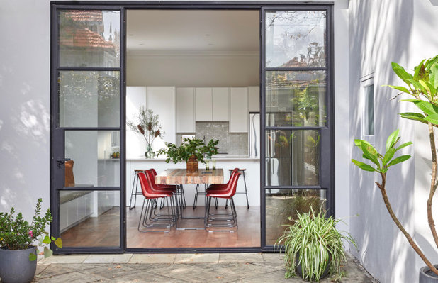
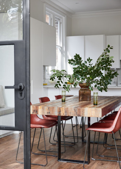
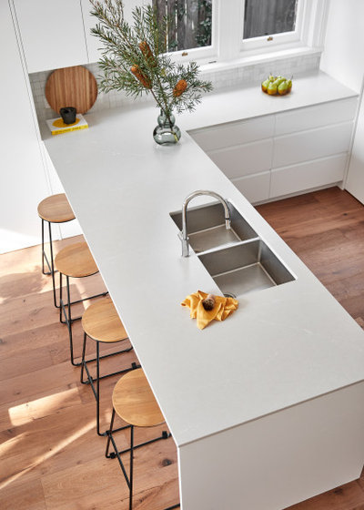
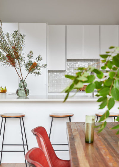
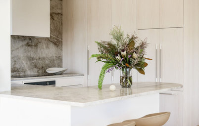
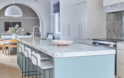
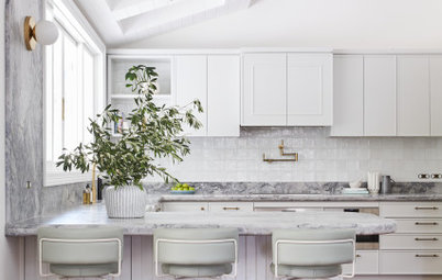
- A new open-plan living/dining/kitchen area, with improved access to the rear patio.
- A new powder room.
- A renovated family bathroom.
- A new laundry under the stairs to the first floor.
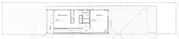
The new first-floor plan.
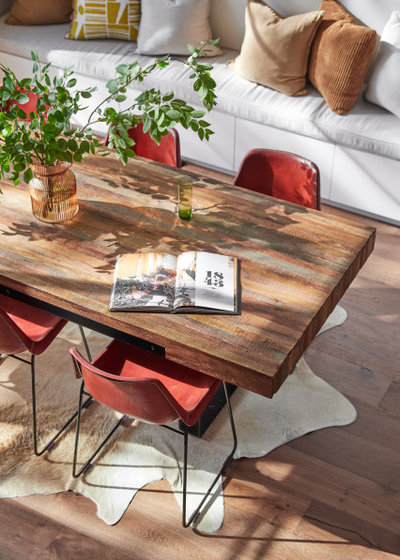
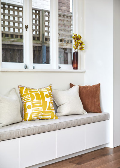
- New storage to the living area, including a built-in bench seat.
- New timber flooring throughout to tie the old and new parts of the house together.
- A new boundary fence and privacy screen at the front of the house.
- Repairs and repainting.
What exactly did you do?
- Improved access to the attic storage space by adding a full-size access door on the new first floor.
- Removed walls from three existing rooms to create one large open-plan living area at the rear of the home with a new kitchen and dining area and stairs to access level one.
- Raised the ceiling height in the rear lean-to (now the new open-plan area) to match the original part of the home.
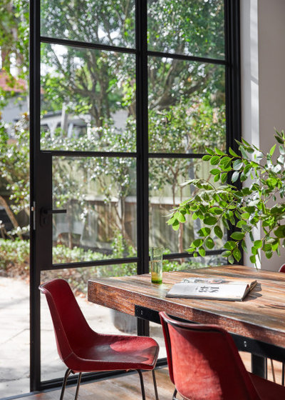
- Added large steel-framed doors to connect the area with the rear patio and bring in more natural light.
- Converted the outdoor attached shed into a powder room accessible from the open-plan living area.
- Created a concealed laundry under the new stairs.
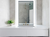
- Renovated the existing family bathroom to modernise it and improve the layout.
- Added a bench seat and tall cupboard storage in the dining room.
Where did most of the budget go?
The materials and the structure required to create the upper-floor addition.
Where did you splash out?
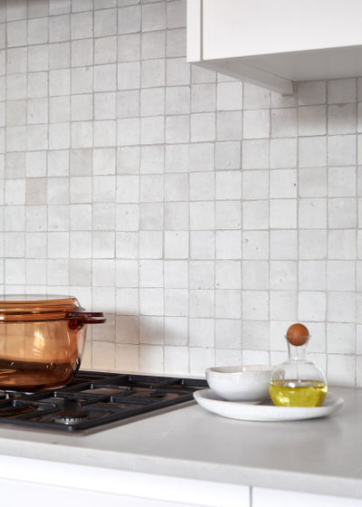
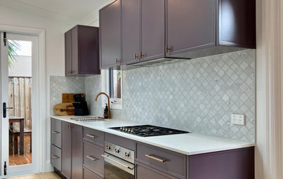
The steel doors and handmade tiles to the kitchen splashback.
See more stunning Australian kitchens on Houzz
The materials and the structure required to create the upper-floor addition.
Where did you splash out?
The steel doors and handmade tiles to the kitchen splashback.
See more stunning Australian kitchens on Houzz
Where did you save?
- We retained the external footprint on the ground floor. The lean-to walls were double brick so we were able to build them up to increase the ceiling height and meet the new upper-storey addition.
- Lightweight timber-framed construction was used for the upper-storey addition to minimise engineering requirements and structural load on the existing ground floor.
- We made a careful selection of materials and finishes within a specific price range.
What was your thinking behind the layout?
The width of the building footprint for the upper-storey addition was limited by planning-control setbacks, so the layout was carefully designed to limit any dead hall space. Both areas are accessed via a central landing at the top of the stairs. The main bedroom’s dressing area doubles as walk-through access to the ensuite.
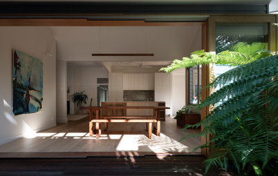
The open-plan layout on the ground floor provides a generous space for the family to spend time together, with more natural light than before and direct access to the rear patio.
The width of the building footprint for the upper-storey addition was limited by planning-control setbacks, so the layout was carefully designed to limit any dead hall space. Both areas are accessed via a central landing at the top of the stairs. The main bedroom’s dressing area doubles as walk-through access to the ensuite.
The open-plan layout on the ground floor provides a generous space for the family to spend time together, with more natural light than before and direct access to the rear patio.
What was your thinking behind the colour and materials palette?
The material and colour selections were centred around the client’s desire for a minimalist palette of fresh neutral tones with a warm and welcoming feel.
The material and colour selections were centred around the client’s desire for a minimalist palette of fresh neutral tones with a warm and welcoming feel.
How do the new works sit beside the older part of the home?
The design and materials were selected to be sympathetic and tie in with the original home.
The design and materials were selected to be sympathetic and tie in with the original home.
What challenges did you face?
The site is reasonably narrow, which limited our design layout options somewhat.
Extra precautions were required during construction to protect the adjoining semi and ensure fire-rating requirements were achieved.
The site is reasonably narrow, which limited our design layout options somewhat.
Extra precautions were required during construction to protect the adjoining semi and ensure fire-rating requirements were achieved.
What are the defining features of the house now?
- Three-metre-high steel doors that lead out to the patio.
- Increased natural light to the rear of the home through the open-plan design and raised ceilings.
- The vaulted ceiling upstairs and the balcony off the main bedroom, both of which help make the space feel larger than it is (pictured below).
- The staircase, which filters natural light from the window and skylight above down through the open treads.
- The fresh neutral palette, complemented with warm rustic tones throughout.
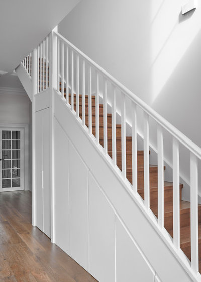
A new laundry, plus a mini freezer and extra storage are concealed under the stairs.
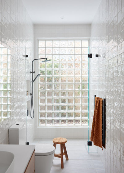
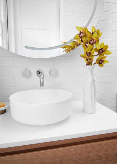
The main family bathroom downstairs.
Tell us about the glass bricks
These were were existing. We decided to keep them to save on cost and reduce waste. Functionally, they were performing well, providing ample natural light while retaining privacy.
The builder blasted away the old grout and they came up like new. We selected a square wall tile to complement the square shape of the glass blocks.
The palette in the main family bathroom echoes the colour and material palettes in the rest of the house.
Why do you think the house works so well now?
- The open-plan layout on the ground floor provides a generous space for the family to spend time together, with more natural light and direct access to the rear patio.
- The upper-floor addition has created a parents’ retreat with a much-needed extra bathroom.
- Coherent colours and finishes give the home a consistent look and feel.
- The rear half of the home now matches the quality of the original part of the house.
- The materials (roof tiles, timber windows and doors) and selections tie back to the original Federation home.
- The new walls, floors and roof are fully insulted to assist with thermal and acoustic control.
- An operable skylight on the upstairs landing acts as a heat exhaust in summer to assist with ventilation and passive cooling.
- There is now adequate storage throughout and easy access to the sizeable attic storage space.
- The laundry is more functional and accessible.
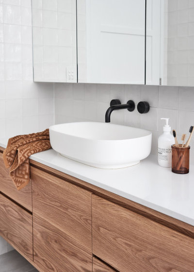
The new ensuite.
Colour and Materials Palettes
Interior palette
Colour and Materials Palettes
Interior palette
- Oak flooring.
- Corinthian Doors Moda interior doors.
- Sydney Steel Windows and Doors steel doors.
- Velux skylights.
- Silestone by Cosentino in Desert Silver with a Suede finish to the kitchen benchtops.
- Zellige tiles to the kitchen splashback.
- Caesarstone Pure White to the bathroom-vanity benchtops.
- Earp Bros Nazari Casablanca Brillo wall tiles.
- Tiles by Kate floor tiles to bathrooms.
- Terracotta roof tiles.
Fixtures and fittings
- Franke Verona pull-out kitchen mixer in chrome.
- Reece bathroom fixtures.
- Cabinets, doors, architraves, skirtings and trims painted in Dulux Lexicon Quarter.
- Walls in Dulux Natural White.
- Exterior rendered walls in Dulux Dieskau Double Strength.
- Fascia boards and gutters in Colorbond Monument.
- Exterior frames, architraves, trims, rear balcony balustrade and privacy screen in Dulux Lexicon Quarter.
Your turn
Do you love this renovation as much as we do? Tell us your favourite features in the Comments below. And don’t forget to save these images, like this story and join the conversation.
More
Want more clever renovations? Don’t miss this Project of the Week: A Colourful, Top-to-Toe Renovation of a Run-Down Sydney Terrace
Related Stories
Popular Houzz Series
A Dated Country Home in a Kiwifruit Orchard Made Modern
When their grown-up sons moved out, these NZ homeowners gave their much-loved country home a chic, modern makeover
Full Story
Renovating
An Inspired Solution for a Dark & Disjointed Californian Bungalow
See how an architect opened up a light-starved, closed-in Melbourne home, and connected it with the neighbouring park
Full Story
Popular Houzz Series
Before & After: A Leaky, Falling-Down Victorian Terrace Reborn
See how a small Melbourne terrace, untouched for over 100 years, was remade into a functional home for a modern family
Full Story
Before & After
Before & After: From 'White Box' to Luxe, Layered Apartment
Quiet luxury was the goal for the redesign of this Sydney waterfront apartment – see how the designer achieved it
Full Story
Popular Houzz Series
A Sweet Balmain Cottage Sure to Capture Your Heart
With an extension underway, this cottage was ready for a new decorative scheme that would bring old and new together
Full Story
Before & After
Before & After: A Cheap & Cheerful Makeover of a 1980s Caravan
Armed with an AU$1500 budget, a Melbourne couple rolled up their sleeves and transformed a caravan in just three months
Full Story
Projects Born on Houzz
Before & After: A Light-Drenched Home in the Heart of Coogee
This breezy family home in one of Sydney's beachside suburbs is the essence of relaxed Australian coastal style
Full Story
Interior Design
A Grand Federation Home Comes of Age for a Busy Young Family
See how a revamped layout, custom joinery and luxe touches transformed a dated heritage home in Sydney
Full Story
Architecture
From Tired 100-Year-Old Beach Cottage to Lush, Private Oasis
Encircled by beautiful gardens, this renovated weatherboard cottage in Sydney is all about indoor-outdoor connection
Full Story
Bathroom Renovations
Before & After: A Clunky & Dated Victorian Terrace Reborn
Rising damp, sagging floors and a dysfunctional layout were just some of the challenges this tired terrace offered up
Full Story
Gorgeous!
What was the approx cost per square meter for this lovely addition.
Looks fantastic! Where did you get your family bathroom vanity from?