

Lyon Houzz Tour: Striking Blue Apartment Packed With Personality
A quirky spin on classical style and themed rooms that transport the observer to Japan or Spain set this home apart
Agnès Carpentier
17 June 2018
This couple of real estate professionals bought their own home in the heart Lyon, France, on the third floor of a beautiful 19th-century building. Stretching from street front to courtyard, it overlooks the central Place des Terreaux and is just 200 metres from the town hall. Though the home was rundown and in need of a makeover when the couple first saw it, they were hooked by its ideal location and Haussmannian style, with high ceilings, oak floors, wainscotting and a fireplace. They asked Marie-Anne Chapel, an experienced architect keen on antiques, high-end decor and unusual interiors, to redistribute its classical layout while adding style and a bit of wow factor.
Before Photo
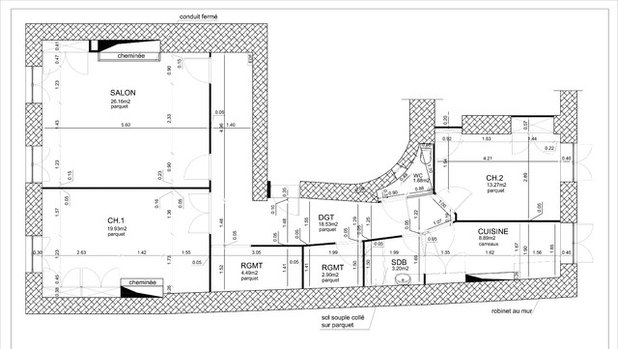
Original floor plan. Counterclockwise from entrance: hallway, living room, room 1, storage room, storage room, storage room, bathroom, kitchen, room 2, washroom.
Houzz at a Glance
Who lives here: A couple of real estate professionals
Location: Downtown Lyon, France
Size: 95 square metres
Architect: Marie-Anne Chapel of UNE Architecte
Budget: 100,000 euros (AU$153,800), including all aspects of the decor, excluding tax
Duration of work: Five months; completed in June 2017
Before
“This four-room apartment bore the marks of history along its lengthy hallway,” says Chapel. As you can see in this picture of the original plan, the apartment had originally been arranged around a large hallway that reached a dead end at the living room wall. This old-fashioned layout included two huge storage rooms (marked RGMT on the plan), a very small bathroom and a large enclosed kitchen at the back of the apartment. It was impractical, with lots of wasted space.
“When this bourgeois building was built, an entire floor would have been occupied by a single apartment. It had a typical French layout defined by the exterior walls of the building. The owners moved through the living areas, while the staff used the hallways. Here, the original apartment was divided in two, which is why part of the hallway looks like it leads nowhere,” says Chapel.
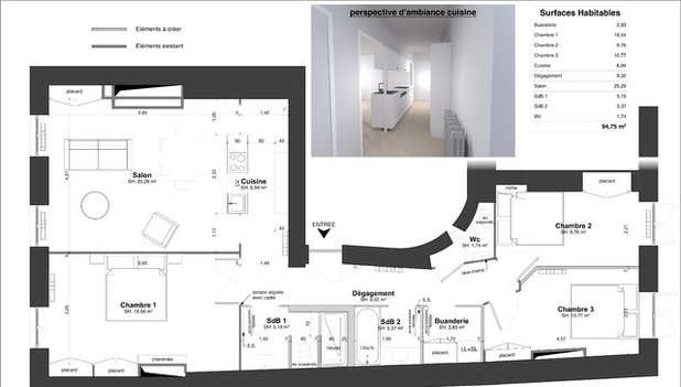
New floor plan. Counterclockwise from top entrance: hallway, living room-kitchen, room 1, bathroom1, bathroom 2, utility room, room 3, room 2, washroom.
After
The owners wanted the final layout to have three bedrooms, two bathrooms, a laundry room and an open living room-kitchen in order to make it both more contemporary and better suited to a family. They also wanted to arrange the rooms in such a way that this four-bedroom apartment could be split into two units in future.
The owners love to travel and collect beautiful things, so they were looking for something extraordinary in their decor. They wanted to rediscover the Haussmannian style while at the same time venturing out of overused classicism.
The extent of the work to be done was why the couple turned to Chapel, an experienced architect who knows building regulations well. “As soon as you get your hands on an old building from the 19th century, you have to realise that all the partitions are partially load-bearing and require reinforcement,” says Chapel. “Moreover, in anticipation of splitting the apartment further in the future, it was necessary to install a SAD 200 dividing wall [light grey in the plan; this wall architecture, developed by Placostil, provides thermal and acoustic insulation and fire barriers between divided areas], separate these partitions from the floors in compliance with fire-safety standards, and create two independent networks for water and electricity. We also built a second bathroom with separate drainage and sewerage systems.”
Photos by Thomas Marquez
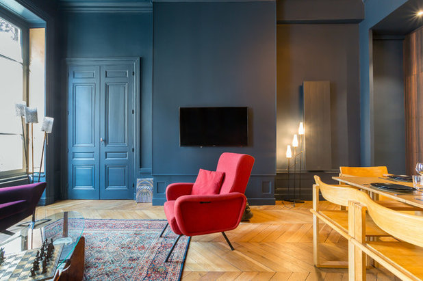
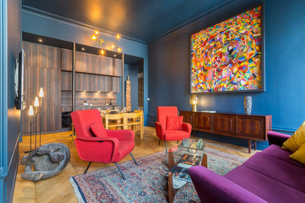
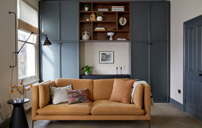
The most beautiful room in the apartment is undoubtedly the 25-square-metre living room with its high ceiling, large period windows, chevron-patterned oak floor and panelled double doors. This is the room that sold the owners on the apartment.
As experienced real estate professionals, the owners have well-honed tastes, and were certain they did not want a fully classical space. They were all for taking a design risk.
Although the living room faces north (in the northern hemisphere), Chapel suggested repainting the walls and even the ceiling teal. It was a great choice, and a visually striking element. “We chose the colour by process of elimination. As we did not want [it to feel like] a white freezer, it had to be either a warm colour, red or eggplant, which we did not pick in the end, or a cool colour. So we went for ‘Hague Blue’ by Farrow & Ball, a deep blue that contrasts the original honey-coloured wood floor well,” says Chapel.
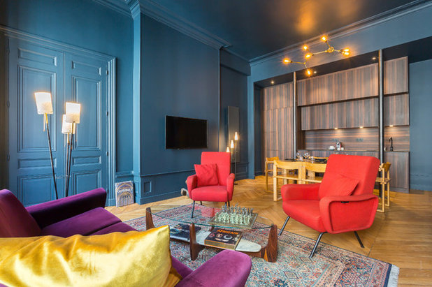
They went bargain hunting for bright furniture to make up for light lost through the dark walls. The owners have a predilection for vintage, especially mid-century Scandinavian, furniture.
On the other hand, they selected radiators that wouldn’t attract to much attention. Electric models with charcoal-coloured steel fronts were chosen to sit discreetly on the wall. “The owners approved of these models, because they can be controlled remotely through a smartphone, which is convenient when you travel a lot,” she says.
On the other hand, they selected radiators that wouldn’t attract to much attention. Electric models with charcoal-coloured steel fronts were chosen to sit discreetly on the wall. “The owners approved of these models, because they can be controlled remotely through a smartphone, which is convenient when you travel a lot,” she says.
An antique rug, which was also a bargain find, cleverly echoes all of the colours in the room and defines the living area.
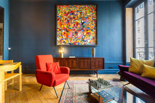
The sideboard is a Danish-made model in Brazilian rosewood, found at Danke Galerie in Lyon. The large colourful painting was hung above to draw attention to it. “It comes from a stockpile of pieces that I bought at a studio liquidation. I resell these pieces to my clients,” the architect says.
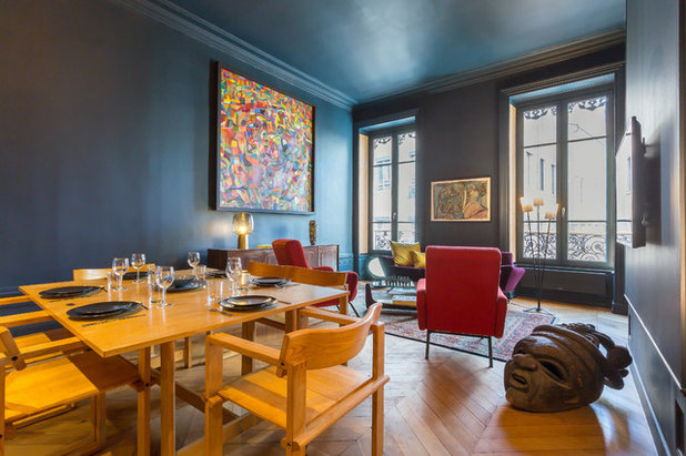
Chapel, who has a passion for art, also found this wooden head at a secondhand market. “It was carved in the ’80s and comes from Papua New Guinea,” she says.
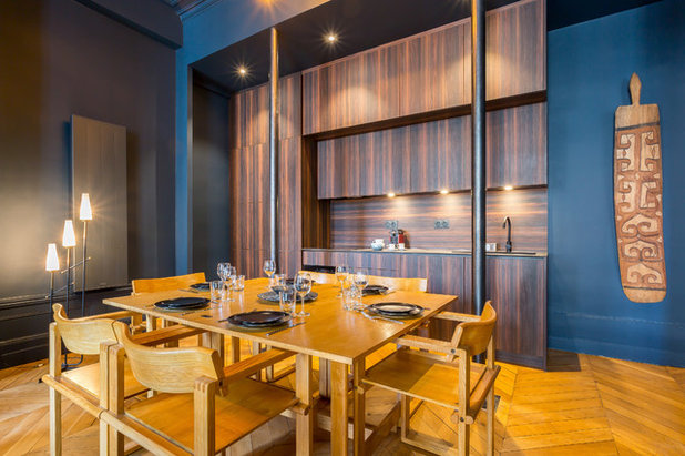
The owners decided to move the kitchen into what had previously been the dead end of the hallway, and to connect it to the living room to create a contemporary living area. The space once occupied by the kitchen was converted into a third bedroom. The hallway partition was torn down and replaced with painted steel columns for support.
But what finish would work for a kitchen in a dark blue space? “A white kitchen would have been too commonplace, while oak cabinets would have given the room an overly classical look,” says Chapel. A dark tone was chosen “to create an unusual, luxurious look.” The owners completely agreed and chose a burnt-pine laminate finish by Egger.
But what finish would work for a kitchen in a dark blue space? “A white kitchen would have been too commonplace, while oak cabinets would have given the room an overly classical look,” says Chapel. A dark tone was chosen “to create an unusual, luxurious look.” The owners completely agreed and chose a burnt-pine laminate finish by Egger.
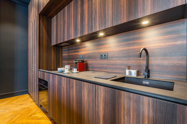
The architect oriented the wood grain of the cupboard finishes vertically, to emphasise the height of the ceiling, while the splashback was oriented horizontally to soften the effect. The very thin benchtop is made of high-pressure laminate.
The dining room furniture was bought secondhand from a private individual.
The dining room furniture was bought secondhand from a private individual.
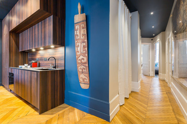
Next to the kitchen hangs a shield from Oceania. “It was part of the owners’ collection and fits here perfectly,” says Chapel.
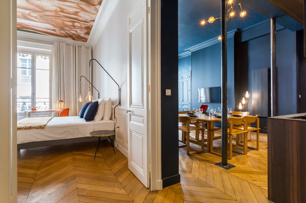
Load-bearing steel columns now stand where the partition once was. They lend the kitchen a bit of an Art Nouveau-brasserie flair.
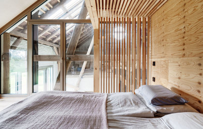
The master bedroom adjoins the living room. The owners had an idea for how to make their Haussmannian bedroom unique: a painted ceiling. This quirky addition to a traditional flat was realised using very modern techniques. The starting point was a figure study by Pierre Puvis de Chavannes — incidentally, a Lyon native. They resized it on a computer to fit the exact dimensions of the ceiling. Finally, a digital print was made on several strips of non-woven wallpaper, which were then glued onto the ceiling.
The master bedroom adjoins the living room. The owners had an idea for how to make their Haussmannian bedroom unique: a painted ceiling. This quirky addition to a traditional flat was realised using very modern techniques. The starting point was a figure study by Pierre Puvis de Chavannes — incidentally, a Lyon native. They resized it on a computer to fit the exact dimensions of the ceiling. Finally, a digital print was made on several strips of non-woven wallpaper, which were then glued onto the ceiling.
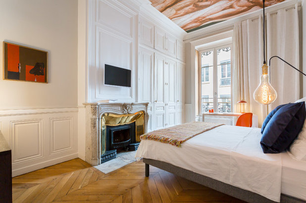
The panelled wardrobe doors and the Carrara marble fireplace with its brass frame were already there, and only needed to be freshened up. The oak floor was sanded and covered in a matt varnish from Bona.
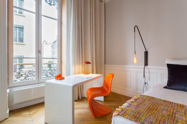
The owners are fond of the ’50s bedside table they found at a junk shop, which is made of gilded Murano glass (visible in the first bedroom photo). Their favourite pieces, however, are the wall lamps on either side of the bed. The owner got them from his brother Frédéric, a lighting designer, who made them in his workshop, Llume Studio, in Nantes, in western France.
Table lamp: Zara Home
Table lamp: Zara Home
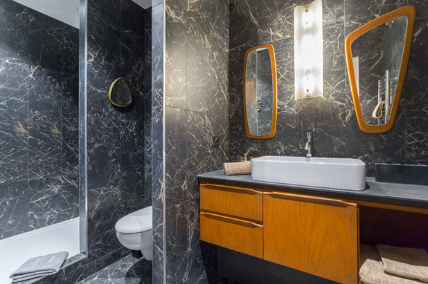
A bathroom with a shower now takes the place of one of the original storage rooms off the hallway. To give it a luxurious touch, it was finished with marble-look porcelain stoneware by Marazzi. In keeping with the vintage theme, the vanity is made of a ’50s teak sideboard they found while bargain hunting, with its legs removed. The mirrors and wall lamp were found at the Puces de Lyon secondhand market.
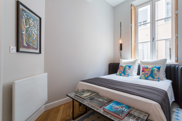
This side of the hallway originally ended in a bedroom and a kitchen. The latter was converted into a second bedroom. “We moved the partition wall to resize the rooms and have a second bedroom with the correct dimensions,” the architect says.
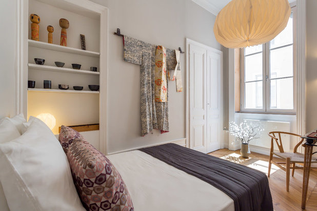
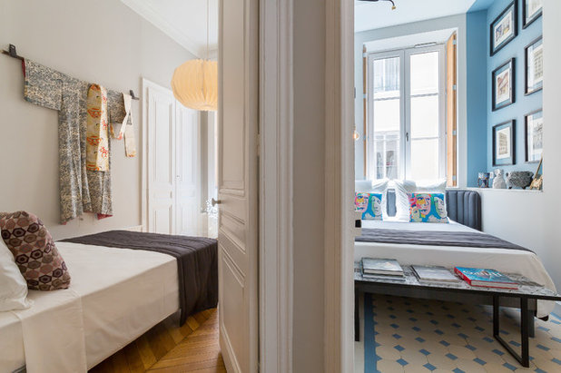
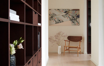
The owners love travelling, and wanted to make their bedrooms feel like sightseeing tours. This one was inspired by Japanese style, in a white, black and wood palette. “I recently brought some vintage kimonos back from a trip, and I gave the owners one. It now dominates the wall, hanging from a piece of bamboo from my patio,” says Chapel.
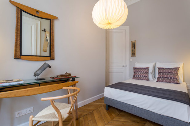
A console table, found at Puces de Lyon, is accompanied by a mirror that recalls the shape of entrances to Shinto shrines. It was adorned with an old Japanese roof tile and is accompanied by a Hans Wegner chair.
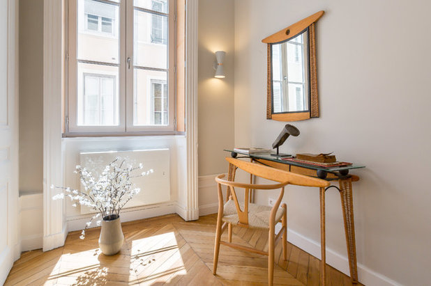
A paper lampshade and a vase with cherry blossoms complete the decor.
The adjoining bedroom was originally the kitchen. “We wanted to keep traces of the history of the apartment. One can still see the place where the cement tiles of what was once the kitchen meet the wood floor of the Japanese room,” the architect says.
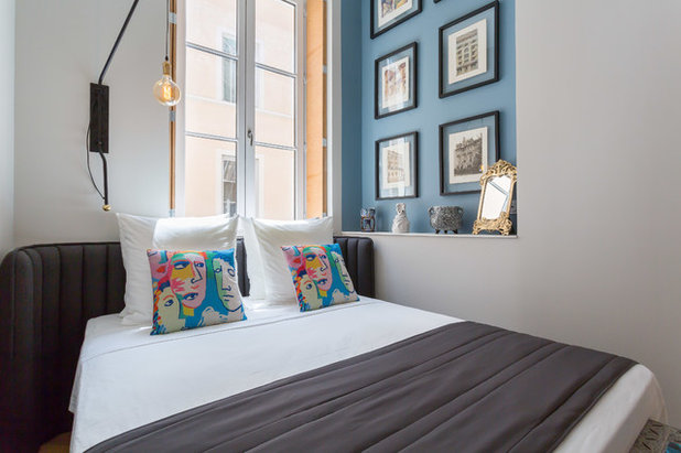
The room has undergone quite a transformation. “It’s the Gaudí bedroom, as [the owners] christened it, recalling their favourite architect,” says Chapel.
The interior shutters that are characteristic of traditional Lyonese architecture were missing in this room. They were reconstructed more cheaply in birch plywood.
The interior shutters that are characteristic of traditional Lyonese architecture were missing in this room. They were reconstructed more cheaply in birch plywood.
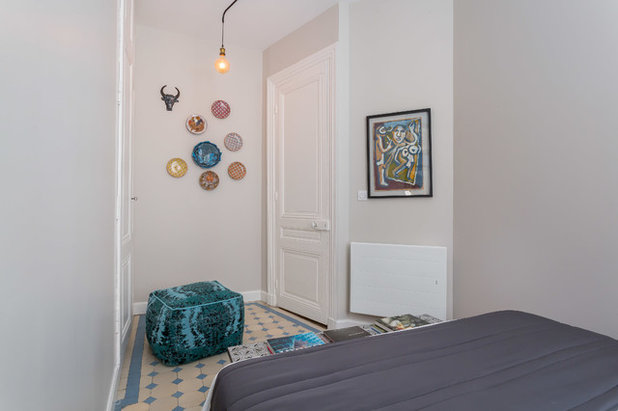
To connect the Gaudí-inspired Spanish metaphor with Art Nouveau style, they placed a vintage drawing, a cow’s head and a collection of plates on the wall – all in modernist style from the same period. The cement tiles, which also fit the theme, do not disappoint.
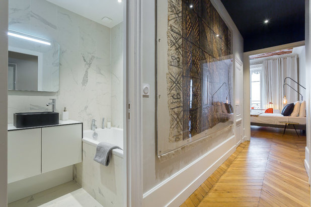
A piece of art hangs in the hallway between these two bedrooms and their closest bathroom. “This is a Kanak blanket made of vegetable fibers that had already belonged to the owner. As it is very old and fragile, in order to hang it I made a burlap support with a fringe on the bottom. Then I protected it with Plexiglas,” the architect says.
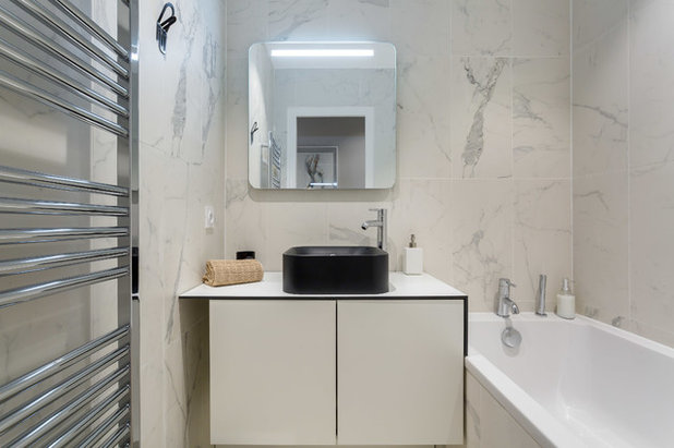
This bathroom has a different decorative register from the first. “We wanted it to be just as luxurious as the other, but totally different,” says Chapel. “We used the same white tiles, and I had the vanity made of Trespa panels, a siding generally used on decorative building facades.”
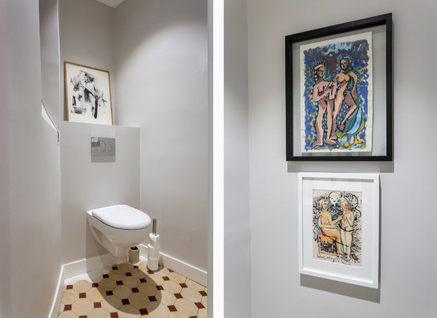
The toilet still has the original floor tiles, one of the few parts of the apartment that were in good condition. Three paintings, selected by the architect, add an artistic touch.
Tell us
What do you love about this home? Tell us in the Comments below. And don’t forget to save your favourite images, save the story, and join in the conversation.
More
Keen on outstanding design? Check out last week’s Stickybeak of the Week: Award-Winning Home for a Private Couple
Tell us
What do you love about this home? Tell us in the Comments below. And don’t forget to save your favourite images, save the story, and join in the conversation.
More
Keen on outstanding design? Check out last week’s Stickybeak of the Week: Award-Winning Home for a Private Couple
Related Stories
Houzz Tours
France Houzz: A New Island Home With an Old Soul
Check out this young family's welcoming and characterful French island home on Île d’Yeu, which embraces local style
Full Story
Houzz Tours
Germany Houzz: A Small Cabin Transformed Into a Forest Retreat
In this secluded area in the Taunus mountains of Germany, a family enjoys their weekends in 29 square metres of space
Full Story
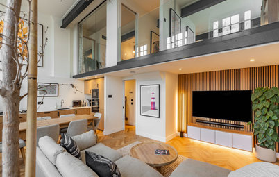
Houzz TV
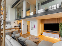
London Houzz: Tour a Contemporary Loft in an Old Victorian School
Watch and read how a design firm updated this light and airy apartment in an old block with sleek style and warm touches
Full Story
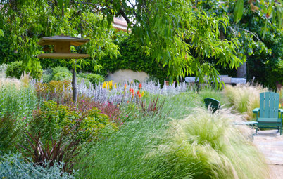
Garden Design
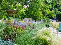
Spain Garden Tour: A Mediterranean Makeover With Colour & Texture
Once neglected, this naturalistic garden is now a series of outdoor rooms with idyllic spots to swim, dine and relax
Full Story
Houzz Tours
Berlin Houzz: A Touch of Japanese Forest Bathing in a German Home
Beloved memories of Japan come to life with the renovation of this 120-square-metre apartment in Berlin, Germany
Full Story
Houzz Tours
London Houzz: Daring Colour & Texture Transform a Victorian Home
By Kate Burt
The busy owners of this terrace sought help to design outside their decor comfort zone – the result is a cool classic
Full Story
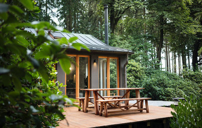
Houzz Tours
Germany Houzz: Creating Summer & Winter Homes in a Converted Barn
One barn, two homes – see how architects designed separate zones for summer and winter living in an old country barn
Full Story
Houzz Tours
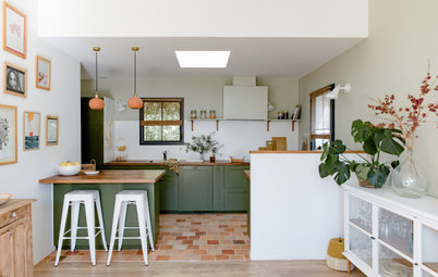
Before & After: Finding the Perfect Pink in a Barcelona Kitchen
Barely-there pink acts as a warm neutral in a new open-plan Spanish kitchen, replacing dark cabinets and drab finishes
Full Story
Houzz Tours
Before & After: Colour Blocking & Pattern Nod to Nature in Rome
Move and upsize or stay and renovate? This young family chose the latter in their small Italian apartment – here's why
Full Story
Houzz Tours
Barcelona Houzz: Style, Sustainability and Pattern in a Tiny Flat
Part-renovation, part-restoration, the owners of this Spanish apartment balanced historical style with forward thinking
Full Story
Well done to the owners for going full out with this. Love the colours, uniqueness and the art.
Absolutely stunning. I’m totally and utterly inspired.