


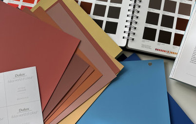
From Europe: The Top 4 Trending Colour Palettes for 2022
The Houzz France editorial team gives us the rundown on the key colour schemes at the Maison & Objet trade fair
Claire Tardy
6 April 2022
Rédactrice en chef et éditrice pour Houzz France. Journaliste spécialisée dans la rénovation.
Rédactrice en chef et éditrice pour Houzz France. Journaliste spécialisée dans la... More
The iconic Maison & Objet decor and design fair (Paris, France; March 24–28) took place at the start of spring for the first time this year, having been postponed from its usual January date due to COVID-19 restrictions. This year, interiors professionals gathered in the halls of the Paris Nord Villepinte exhibition centre in the mild Parisian air. The Houzz France editorial team was on site to survey brands and industry suppliers’ offerings and glean the trends and new products that are slated to make up the interiors of tomorrow.
We begin with the four most popular palettes this year. Moving away from uniform and monochrome decor, combinations of contrasting shades are bringing some fun into interiors.
We begin with the four most popular palettes this year. Moving away from uniform and monochrome decor, combinations of contrasting shades are bringing some fun into interiors.
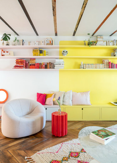
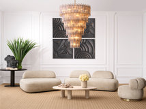
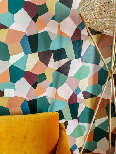
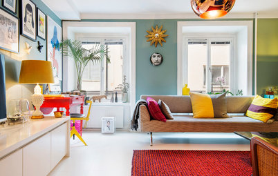
1. The Pop Palette
The first palette that caught our eye at Maison & Objet was without a doubt inspired by pop culture. A wave of nostalgia that plunges us back in the ’70s and ’80s has influenced decor, as well as furniture and a variety of finishes.
Yellow. Easy to spot, this palette brings bright and tart colours. Yellow, which has been forgotten a little over the last few years, makes a marked return with sunny, almost fluorescent shades.
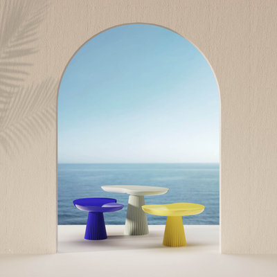
Mira side tables by Thomas Dariel at Maison & Objet.
Klein blue. Pop style is also famous for playing up contrasts and daring combinations of vibrant colours. Therefore yellow, however radiant, is readily combined with shades as present and pronounced as Klein or electric blues.
Do you love designer spaces? Find an interior designer you can trust on Houzz.
Pouenat at Maison & Objet.
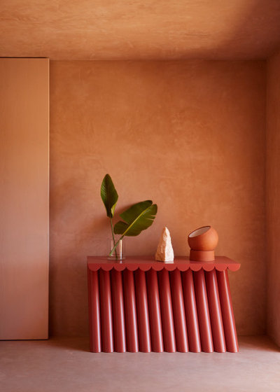
Blood red. Red has become one of the protagonists of designers’ contrasts. After first making a timid appearance at the September 2021 edition of Maison & Objet, it is now a marked presence in this year’s palettes.
Blood red. Red has become one of the protagonists of designers’ contrasts. After first making a timid appearance at the September 2021 edition of Maison & Objet, it is now a marked presence in this year’s palettes.
Mauve. We should have known. Pantone selected ‘Very Peri’, a periwinkle with a violet undertone, for its colour of the year for 2022. Mauves are also increasingly present in this year’s collections. Never used alone, they also mix well with other vivid shades, such as orange or yellow, to create pop decor worthy of the name.
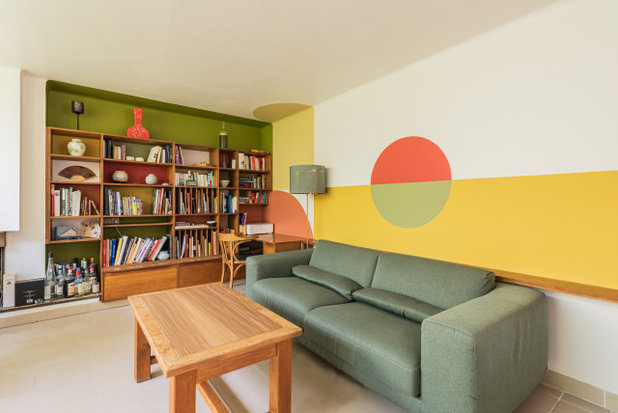
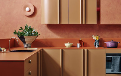
Orange. Nostalgia for the ’70s has already come up in this pop palette, but it is even more evident in compositions that mix khaki and burnt orange. The latter creates a lasting retro ambience associated with second-hand furniture and iconic design pieces.
Also noteworthy is the way these shades are combined in geometric colour blocks with simple contours.
Also noteworthy is the way these shades are combined in geometric colour blocks with simple contours.
Popus stand at Maison & Objet Mars 2022.
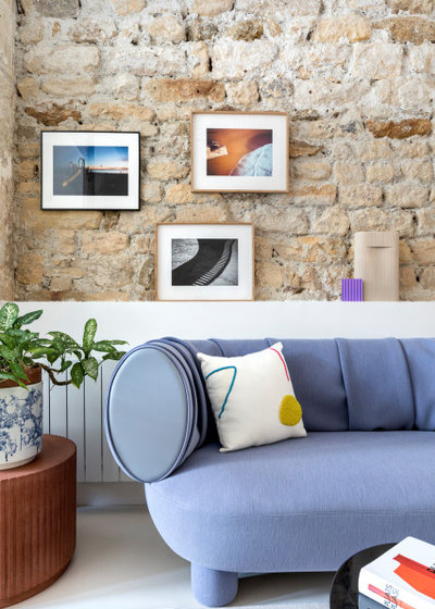
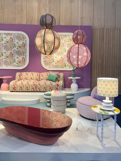
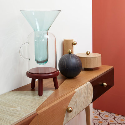
2. The Pastel Palette
“Starting from this season, there is a notable increase in pastel colours, in particular [on the] mauve to violet [spectrum],” trend setter Elizabeth Leriche said in her interview with Houzz. Our trips through the Villpinte exhibition centre confirm the pronounced presence of pastel tones this year.
Violet. Violet is everywhere among the new products on the stands this year, like a vernal iteration of the aforementioned mauve. It is also used in contrasting palettes alongside pinks and pastel yellows, but this time much more softly.
Green. Pinks and purples are perfectly matched with all possible pastel greens. Celadon, lime and sage are the big winners in this chromatic spectrum.
Browse stunning living spaces by Australian designers
Browse stunning living spaces by Australian designers
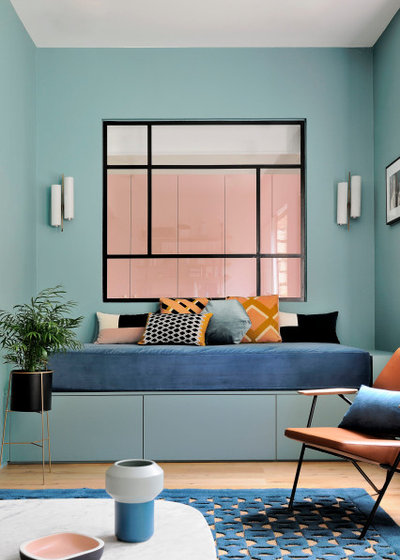
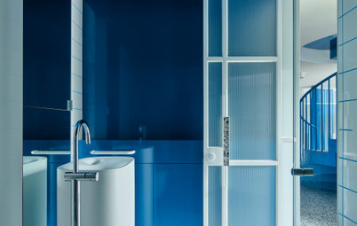
Blue. The French favourite par excellence, blue works to soothe this pastel palette even more. We saw it especially in icy shades like azure or sky blue.
Ginger & Jagger at Maison & Objet.
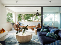
3. The Natural Palette
Not surprisingly, we are still drawn to nature. Botanical and earthy colours continue to be some of the most requested palettes in interiors, as manufacturers are clearly aware.
3. The Natural Palette
Not surprisingly, we are still drawn to nature. Botanical and earthy colours continue to be some of the most requested palettes in interiors, as manufacturers are clearly aware.
Maison Dada at Maison & Objet.
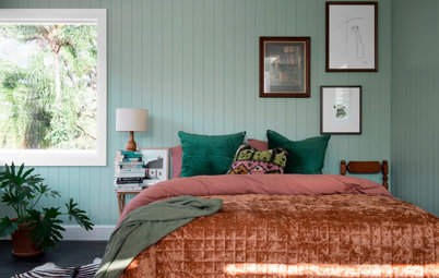
Ochre and terra cotta. This palette is notable for combinations of earthy tones, such as different shades of ochre or terra cotta, which have been favourites in interiors for many years.
Ochre and terra cotta. This palette is notable for combinations of earthy tones, such as different shades of ochre or terra cotta, which have been favourites in interiors for many years.
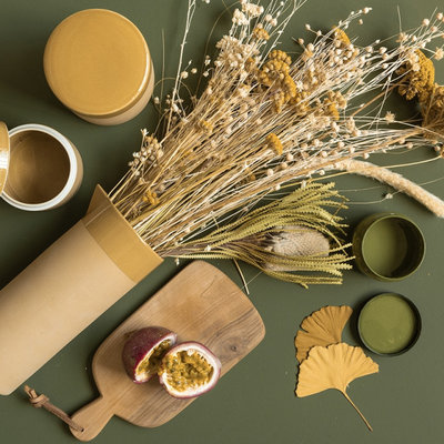
Khaki. Natural though this palette may be, it also plays with the contrasts that are so on trend this year. So, earth tones are perfectly matched with botanical greens such as moss, sage, fir or lichen.
Beiges and browns. As though to soften the marriage of contrasts, sand, brown and beige tones insert themselves perfectly between two bold colours. They are the final aspect of this palette, a nod to the natural materials that have seduced so much of the decor world at the moment. They are likewise soothing in these troubling times.
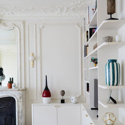
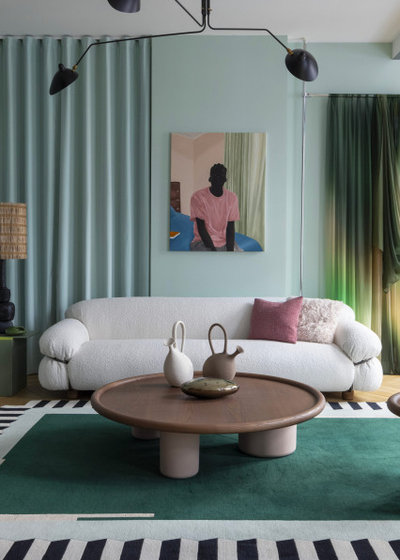
4. The Neutral Palette
Refined, comforting decor in dark colours and neutral materials is everywhere in the design world at the moment. It is therefore not surprising that the final palette we spotted at the fair is made up of neutral and pleasant tones that lend themselves to a timeless ambiance.
Refined, comforting decor in dark colours and neutral materials is everywhere in the design world at the moment. It is therefore not surprising that the final palette we spotted at the fair is made up of neutral and pleasant tones that lend themselves to a timeless ambiance.
Hotel - Hall 7 Signature at Maison & Objet.
White. Thus, white was more present this year than in the last few editions of Maison & Objet. Matched with camaïeux of other neutral tones or in blocks next to bright colours, white was used widely in the new collections.
White. Thus, white was more present this year than in the last few editions of Maison & Objet. Matched with camaïeux of other neutral tones or in blocks next to bright colours, white was used widely in the new collections.
Ecru. Alongside white, we notice another spectrum revolving around ecru, which gives a bit more depth in refined decor. It works well as a base for natural materials and fibres.
Your turn
Which of these palettes appeals to you the most? Tell us in the Comments below, like this story, save the images, and join the conversation.
More
Do you want more Maison & Objet news? Read Maison & Objet: Elizabeth Leriche on This Year’s Design Trends
Which of these palettes appeals to you the most? Tell us in the Comments below, like this story, save the images, and join the conversation.
More
Do you want more Maison & Objet news? Read Maison & Objet: Elizabeth Leriche on This Year’s Design Trends

Related Stories
Paint
How to Choose Your Perfect Paint Colours
By Erin Carlyle
Three USA designers share tips to pinpoint your style and mine memories to find the right paint palette for your home
Full Story
Renovating Advice
How to Choose Your Wall Colour to Complement Floors and Furniture
Which colour should I paint my room to suit the flooring and furniture? We've all asked it – and here are the answers
Full Story
Most Popular
How to Pick the Right Paint Colours for Your Federation House
By Joanna Tovia
Roof colour, wall materials and emerging trends all come into play for Federation paint schemes that work
Full Story
Colourful Homes
Suffering From White-Wall Syndrome? How to Add Colour Confidently
White walls are great... until they stop being inspiring. Five paint colour experts share how to transition to colour
Full Story
Expert Opinion
An Interior Designer Reveals How to Mix Colours and Make it Work
By tidgboutique
Don’t want to confine yourself to neutrals but lack the confidence to embrace colours? We have you covered
Full Story
Made Local
Made Local: How Dulux Colour Trends Are Born
Ever wondered how Dulux sees into the future to know the colours we'll be coveting in the year ahead? Here, we find out
Full Story
Houzz Tours
Queensland Houzz: A Cute Cottage Awash With Colour and Pattern
Bold colour, quirky prints and an abundance of art transformed this 1920s cottage into an inviting and relaxing gem
Full Story
Houzz Tours
My Houzz: A Moody, Modernised Home in Melbourne Regains its Charm
The original beauty of this Californian bungalow was lost to unsympathetic updates – see how a designer brought it back
Full Story
Interior Design
20 Honey-Hued Interiors That'll Make You Melt
Our coffee-break escape offers you five minutes' worth of images to inspire and delight. Jump right in...
Full Story
Awards
Paintbrushes Poised! 2023 Dulux Colour Awards Finalists Are In
Looking for interesting ways to add colour at home? Check out these shortlisted projects in the 2023 Dulux Colour Awards
Full Story
I LOVE IT ALL! And, yes, I grew up in the 70's. I love that another generation can enjoy these styles too.
Ecru. So serene.
Blush pink with various soft greens and terra cotta. Yummy