
Decorating

Meet Greenery, Pantone’s 2017 Colour of the Year
It's going to be easy being green in 2017 with this nature-inspired hue

Whether you like this shade of green or not, Pantone’s Colour of the Year for 2017, Greenery, is a welcomed symbol of renewal and hope coming on the heels of 2016’s topsy-turviness.
Hot or not? Vote in our poll.
Hot or not? Vote in our poll.
This vegetal green shade works great in this eat-in kitchen with light-hued wood, and accents of black and white. It evokes good health and freshness.
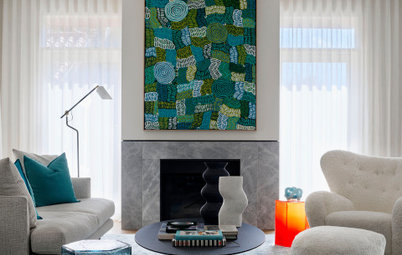
In this dining room, yellow-green contrasts beautifully with the deep peacock blue and other jewel tones for a bold yet sophisticated look.
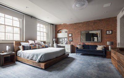
For a more subdued yet still fresh bedroom, work it with neutrals for that resort look.
‘Greenery’ is quite versatile as a pop of colour, too. Use it on anchor pieces of furniture such as the four-poster bed and couch here.
Or use in a feature wall to make a small space feel fresh and bright.
If you prefer less of it, try introducing this shade as an accent colour. This Japanese drum table complements the Moroccan-inspired blue rug beautifully.
Feeling bold? You can even use it in graduated shades for a statement-making exterior!
TELL US
Do you give this green a thumbs up or a thumbs down? Tell us how you feel about Pantone’s Colour of the Year 2017 in the Comments below.
More decorating trends 2017
TELL US
Do you give this green a thumbs up or a thumbs down? Tell us how you feel about Pantone’s Colour of the Year 2017 in the Comments below.
More decorating trends 2017

Sponsored
Sponsored
Find inspiration on how to use this zesty, yellow-green shade below.
Where do colour trends come from?