
Moscow Houzz Tour: Pattern Play and Materials in a Maverick Home
In this Russian apartment, a pared-back palette of wood, tiles and glass is arranged for maximum sensory impact

The interior of this couple’s apartment in Moscow, Russia, brings together texture, light, graphic elements and clean lines borrowed from Scandinavian design. The result is a pared-back style that is big on pattern and sensory impact, and uses stark contrasts of materials to distinguish and embellish different areas and their functions.
Apartment floor plan
The apartment had a relatively open layout when the owners moved in. Other than the bathrooms, the entire apartment was classed as ‘liveable space’ under Russian law, with no designated storage areas or hallways. Because of this, there was no legal way for the designers to re-allocate the functions of these rooms or enlarge any areas.
The apartment had a relatively open layout when the owners moved in. Other than the bathrooms, the entire apartment was classed as ‘liveable space’ under Russian law, with no designated storage areas or hallways. Because of this, there was no legal way for the designers to re-allocate the functions of these rooms or enlarge any areas.
In the end, they divided the available floor space into a kitchen/dining/living room, a bedroom, an office and a spectacular entrance. They also added a laundry with a pantry. One of the owners’ must-haves was a home that looked spotless and was easy to clean.
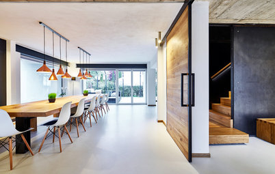
The entrance is marked by a white cube that creates a striking first impression and, again, makes cleaning the space a quick task. To achieve this optical effect, the designers cut large porcelain-stoneware tiles into fingers and arranged them in a pattern of squares.
The white cube offers a stark contrast to the warm finish of the neighbouring areas and emphasises the graphic-design quality of the apartment’s interior, where clean lines dominate.
The white cube offers a stark contrast to the warm finish of the neighbouring areas and emphasises the graphic-design quality of the apartment’s interior, where clean lines dominate.
The living area is raised from the entrance by two steps – a detail that helps contain dirt and demarcate the space. The couple who live here like an orderly home, so the designers paid special attention to storage. A large cupboard in the hall has a coloured interior for a pop of something different.
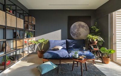
Both the walls and the floor in the hall and living room were finished with Brazilian-teak engineered floorboards. The owners chose this timber for its unusual texture and reddish hue. “Russian wood species, no matter how much you stain them, never get so bright,” says Georgy Kozlov, a designer on the project. “And besides, they fade in the sun.”
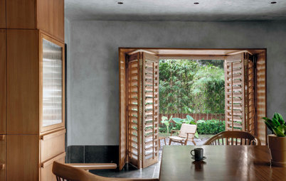
The owners had requested additional seating as they entertain often, so the designers created a bench seat in the bay window from the same wood. The design also conceals the heaters with openings for convection. The Corian windowsill has subtle openings as well.
Yellow accents echo the storage cupboard in the hall through the Muuto pouf, while touches of soft pink are introduced through the Gubi floor lamp and soft furnishings.
Yellow accents echo the storage cupboard in the hall through the Muuto pouf, while touches of soft pink are introduced through the Gubi floor lamp and soft furnishings.
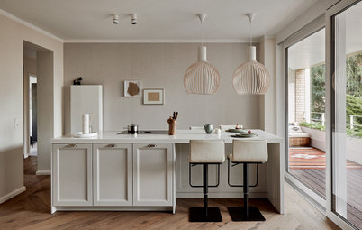
The kitchen is slightly recessed into a niche, with a red-glass splashback that frames the utilitarian space. The colour was chosen to match a luxury lipstick.
“We searched for the right wine colour for a long time but didn’t find anything suitable on the RAL scale,” says designer Albina Shorina of the European colour-matching system.
“All the options they had seemed too bright or too pale. Then I saw a lipstick that was the perfect colour, and that was my guide when we were trying out the samples.”
A four-metre-long hallway leads from the living room to the bedroom. To keep it bright, the architects installed a glass office wall housed in white partitions that echo the surrounding walls. And for continuity of materials, a pendant light from LZF complements the timber floor.
The room currently doubles as a guest bedroom. The owners may use it as a nursery in the future, in which case they will add a curtain for privacy.
The room currently doubles as a guest bedroom. The owners may use it as a nursery in the future, in which case they will add a curtain for privacy.
Many items, such as the easy shelving system that hails from Sweden, are from Scandinavian factories. “Here, we loved these kinds of shelving units only in the Soviet years, while the Scandinavians still produce these tidy and practical items,” says Shorina.
More wood paneling features on the bedroom wall. Here, the designers used different materials for the headboard and floor: on the wall they went for a nut wood with a starker grain arranged in a chevron pattern for a nice decorative accent.
A walk-in wardrobe leads to the bathroom. Its tinted glass fronts conceal its contents almost entirely, leaving only the outlines visible.
A walk-in wardrobe leads to the bathroom. Its tinted glass fronts conceal its contents almost entirely, leaving only the outlines visible.
The designers went for a ‘mirror-on-mirror’ effect in the ensuite bathroom: one mirror stretches from the vanity all the way up to the ceiling, while an overlapping mirror extends horizontally along the entire vanity.
Guests are sometimes a little dazed by the 3D tile pattern, but the owners like this unique feature. This colourful accent is calmed with white subway tiles on the adjacent walls.
These were offset by a quarter-brick from those above and below, for a twist on the usual half-offset brick pattern.
These were offset by a quarter-brick from those above and below, for a twist on the usual half-offset brick pattern.
In the guest bathroom, the designers reprised the technique they used in the entryway: the white shower was fitted into the space as a tiled box that stands out from the beige-green tiles in the rest of the room. The owners insisted on creating this contrast here as a point of difference.
Tell us
What do you love most about this home? Tell us in the Comments, like and share this story, save your favourite images, and join the conversation.
More
Craving more patterned interiors? Don’t miss last week’s Russian Houzz Tour: How a Small Studio Apartment Gained a Bedroom
Tell us
What do you love most about this home? Tell us in the Comments, like and share this story, save your favourite images, and join the conversation.
More
Craving more patterned interiors? Don’t miss last week’s Russian Houzz Tour: How a Small Studio Apartment Gained a Bedroom


Sponsored

Sponsored
Houzz at a Glance
Who lives here: A young couple
Location: Moscow, Russia
Size: About 130 square metres
Designers: Albina Shorina and Georgy Kozlov of Domestic Studio, Moscow, Russia
As well as achieving a visual wow-factor, the apartment is also made for comfortable living. Warm wood and carefully selected Scandinavian decor from both iconic and less well-known designers make for a cosy home.