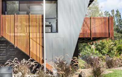
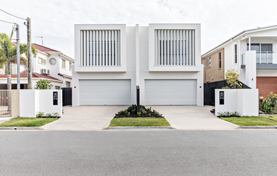
Narrow Home? The Design Tricks You Need to Know About
In the first of a two-part series, two designers reveal the techniques they used to enhance space in narrow homes

Not sure what to with your slender site? Pick up tips from the experts here as an architect and interior designer reveal the specific techniques they employed to boost light, flow and a sense of spaciousness in their narrow home projects.
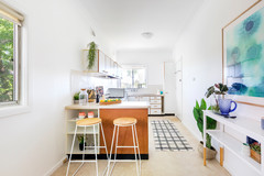
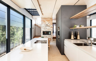
The kitchen island is a slender 800 centimetres wide – just wide enough for a sink and cupboards on either side, but small enough that it doesn’t overwhelm the compact kitchen.
We also opened up the end part of the island bench and introduced a trestle-shaped leg to add to the sense of openness and allow for some seating.
The trestle is reflected in a mirror to the end of the under-bench joinery so they appear as two trestles, further opening up the space.
We also opened up the end part of the island bench and introduced a trestle-shaped leg to add to the sense of openness and allow for some seating.
The trestle is reflected in a mirror to the end of the under-bench joinery so they appear as two trestles, further opening up the space.
Integrating the appliances, such as the dishwasher here, keeps the joinery looking seamless with no intrusions into the planes and geometry of the kitchen.
Reducing the visual clutter of appliances and bulky handles also helps remove the feeling of being in a tight space.
Not sure what to do with your skinny site? Find a local architect on Houzz and chat through the possibilities
Reducing the visual clutter of appliances and bulky handles also helps remove the feeling of being in a tight space.
Not sure what to do with your skinny site? Find a local architect on Houzz and chat through the possibilities
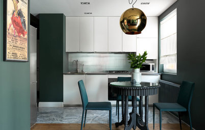
White is always a good colour to open up a room. We added handmade tiles at the end of the room to introduce some movement to the space.
The timber warms up the space and the black exhaust-fan joinery echoes the black in the oven and cooktop.
We kept the end free from overhead cupboards to increase the spacious feel, using just timber shelves for storage.
The timber warms up the space and the black exhaust-fan joinery echoes the black in the oven and cooktop.
We kept the end free from overhead cupboards to increase the spacious feel, using just timber shelves for storage.
We used bird-beak openings on all the under-bench drawers and joinery throughout the kitchen. This drives a line around the room just below the benchtops, without adding the visual clutter of handles.
We then added simple 25-millimetre-diameter finger holes to the bi-fold cupboard doors.
We then added simple 25-millimetre-diameter finger holes to the bi-fold cupboard doors.
Images: Simon Whitbread Photography
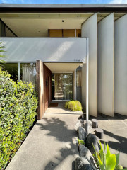
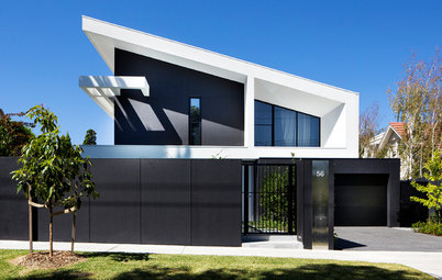
2. Commentator: Carolyn Miles, architect and co-director at Watershed Design
Location: Fairlight, NSW
Approximate width: Most of the house is five metres wide with an extra 1.2 metres at the entry and staircase
Who lives here: A family
Describe the house: One of a pair of semi-detached townhouse-style houses
Beds and baths: Four bedrooms, three bathrooms
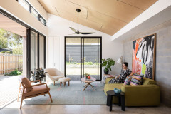
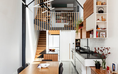
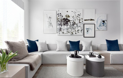
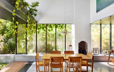
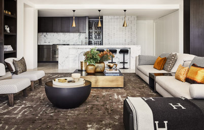
We created a double-height living space to accentuate the vertical dimension, making the home feel spacious despite having a restricted width.
We paid careful attention to window placement and design to achieve light-filled and well-ventilated spaces.
Browse more stunning images of Australian living rooms on Houzz
We paid careful attention to window placement and design to achieve light-filled and well-ventilated spaces.
Browse more stunning images of Australian living rooms on Houzz
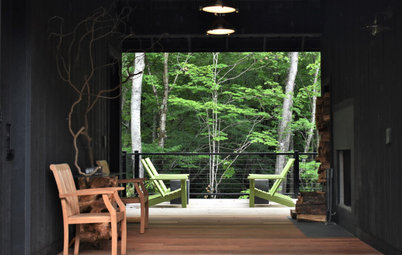
There is a bedroom/study on the mezzanine level. Bi-fold louvres can be closed or folded right back to give the options of privacy or connection with the living space below.
Using the concrete plinth as the first step in the staircase gives a streamlined appearance. The timber-lined ceiling accentuates the verticality of the space, giving a dynamic feel. The black pendant lights and fireplace flue further emphasise the verticality, while adding structure and definition to the space.
Clerestory windows wash light over the ceiling, helping to make it feel bright and airy. A limited material and colour palette gives cohesion and helps provide a feeling of spaciousness.
We like using black window frames because they tend to disappear more than lighter-coloured ones and bring focus to the landscape beyond.
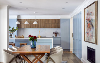
We specified Talostone Carrara Gioia to the benchtops, which are light and bounce light around the room.
A small trick was adding a mirror in the recess above the overhead cabinets to reflect the ceiling and make the room appear wider.
We used the same timber on the island front and sides, flooring and overhead cabinetry to simplify the palette and give a floating feel to the island.
Floor-to-ceiling louvre windows maximise light and ventilation in the compact space. The windows look out to large trees in the neighbouring reserve, adding another dimension to the room. They also assist with cross-ventilation as the north-facing widows are on the adjacent wall.
We used a Stoke Escea gas fireplace and built it into a painted brick surround to match the two-storey wall behind. It sits on a concrete plinth that runs the length of the living space and also forms the landing to the staircase, which leads to the upper floor. This makes for a streamlined look, integrating the staircase with the kitchen joinery and plinth.
The full-height windows emphasise the volume of the space, reducing the feeling of being restricted in width. The high-level windows have an opening panel, which is electrically operated, to vent hot air from the space.
Your turn
What’s the best technique you’ve used in a narrow site? Tell us in the Comments below, like this story, save the images for inspiration, and join the conversation.
More
Looking for more expert renovating or building advice? Don’t miss this story – Architects’ Secrets: 4 Genius Design Solutions for Narrow Homes
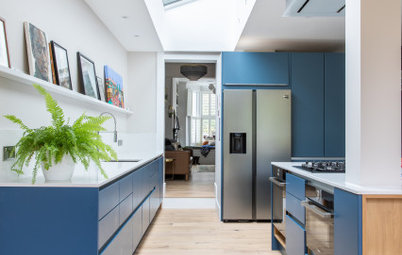
Location: Parkville, Victoria
Approximate width of kitchen: Four metres
Who lives here: A family
Describe the house: A single-fronted single-story Victorian terrace
Beds and baths: Three bedrooms and two bathrooms
To address the narrowness of the kitchen, we located the kitchen alongside the garden to add light and give the impression of a larger space.
We also kept the joinery at a lower height than the ceiling so you could see beyond to the adjacent stairs, which adds a feeling of space beyond the kitchen and again increases the sense of the volume.