


Perfect Pairs: 8 Colour Palettes That Won't Let You Down
Can't decide on a colour scheme? These foolproof choices feel both timeless and fresh
Lisa Frederick
15 May 2014
Houzz Contributor. After journalism school, I fell into decorating media and immediately discovered a new passion. An Atlanta native, I spent several years as an editor for Atlanta Homes & Lifestyles magazine before making the leap to national publications and websites such as Houzz, Better Homes and Gardens and Southern Accents. I live in Birmingham, Alabama, with my husband and son, who’ve gotten used to coming home and finding the furniture rearranged. When I'm not dragging case goods across the floor, I enjoy good food and wine, college football, music of all kinds, and traveling.
Houzz Contributor. After journalism school, I fell into decorating media and immediately... More
I have a love-hate relationship with paint swatches. Thumbing through racks of them at my local home improvement centre gives me a jolt of excitement and a frisson of panic. The sheer volume of potential palettes overwhelms me. Citron and turquoise? Eggplant and khaki? Kelly green and daffodil yellow? ‘Forget it’, I inevitably conclude. ‘I’ll just paint everything white.’
Lately, though, I’ve decided to take it easy on myself. Instead of doing laps around the colour wheel or settling for neutrals, I’m narrowing my options down to simple, classic palettes that are practically impossible to mess up. If, like me, you find yourself feeling somewhat paralysed by the possibilities, take a look at these eight schemes for inspiration.
Lately, though, I’ve decided to take it easy on myself. Instead of doing laps around the colour wheel or settling for neutrals, I’m narrowing my options down to simple, classic palettes that are practically impossible to mess up. If, like me, you find yourself feeling somewhat paralysed by the possibilities, take a look at these eight schemes for inspiration.
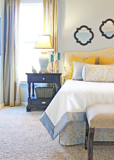
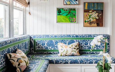
1. Yellow and blue
Like salt and pepper or toast and jam, these hues make a perfect pair. It’s hard to find two shades of either one that don’t work together; as primary colours, they share an uncomplicated, elementary quality that keeps them in sync. Most people think of yellow and blue as traditional, and they are, but you can spin them into transitional or contemporary territory by choosing tailored lines and subtle patterns like the ones shown here.
Like salt and pepper or toast and jam, these hues make a perfect pair. It’s hard to find two shades of either one that don’t work together; as primary colours, they share an uncomplicated, elementary quality that keeps them in sync. Most people think of yellow and blue as traditional, and they are, but you can spin them into transitional or contemporary territory by choosing tailored lines and subtle patterns like the ones shown here.
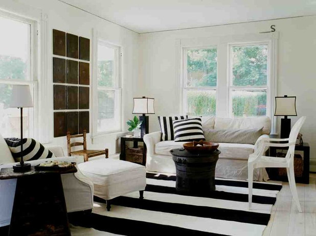
2. Black and white
Need I even mention this one? It’s dramatic, sophisticated and as classic as you can get. In any room, in any amount, it’s absolutely fail-safe and you can mix in dabs of whatever accent colour appeals to you. Click here to see this palette carried throughout an entire home.
Need I even mention this one? It’s dramatic, sophisticated and as classic as you can get. In any room, in any amount, it’s absolutely fail-safe and you can mix in dabs of whatever accent colour appeals to you. Click here to see this palette carried throughout an entire home.
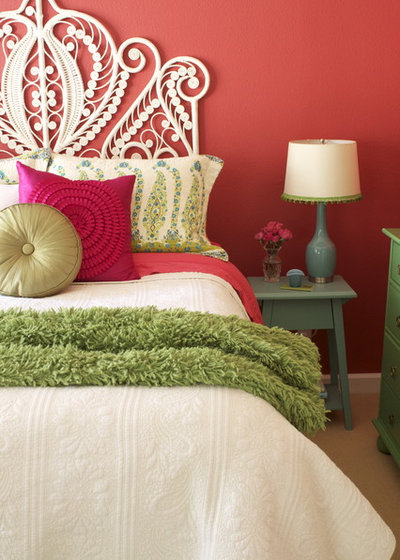
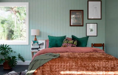
3. Pink and green
Why does this perennially preppy combo strike such a chord? Well, think about nature; pink flowers atop green stems, blooming from shrubbery, surrounded by foliage. If you want to make pink and green appear subdued, try layering two or three saturated, slightly dirty shades of each colour, as shown in this bedroom.
Why does this perennially preppy combo strike such a chord? Well, think about nature; pink flowers atop green stems, blooming from shrubbery, surrounded by foliage. If you want to make pink and green appear subdued, try layering two or three saturated, slightly dirty shades of each colour, as shown in this bedroom.

4. Navy and white
A starched white shirt covered by a navy blazer never goes out of style and neither does a navy and white room. With this pairing, it’s easy to default to the nautical approach (stripes, boats, white linens). But this living space turns convention on its ear; navy walls set off by crisp white millwork and a painted coffee table, with an oversized rug that ties the scene together.
A starched white shirt covered by a navy blazer never goes out of style and neither does a navy and white room. With this pairing, it’s easy to default to the nautical approach (stripes, boats, white linens). But this living space turns convention on its ear; navy walls set off by crisp white millwork and a painted coffee table, with an oversized rug that ties the scene together.
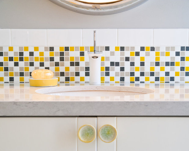
5. Yellow and grey
Like the odd couple of the colour spectrum, these two hues couldn’t be more different, yet they complement each other perfectly. Ebullient yellow helps sombre grey to lighten up, while grey calms yellow down and keeps it from bubbling over. It’s a win-win arrangement.
Like the odd couple of the colour spectrum, these two hues couldn’t be more different, yet they complement each other perfectly. Ebullient yellow helps sombre grey to lighten up, while grey calms yellow down and keeps it from bubbling over. It’s a win-win arrangement.
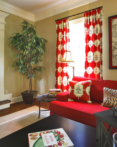
6. Red and beige
This combination bears a certain similarity to yellow and grey; one has a big personality, while the other is more reticent. What makes them such natural partners is the warm undertones they share. Temper a bold stroke of red with a swathe of beige to create a rich and inviting but mellow space.
This combination bears a certain similarity to yellow and grey; one has a big personality, while the other is more reticent. What makes them such natural partners is the warm undertones they share. Temper a bold stroke of red with a swathe of beige to create a rich and inviting but mellow space.
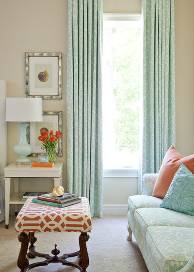
7. Orange and blue
They’re opposites on the colour wheel and paradoxically that means they go together well. If you can’t abide the thought of a vibrant tangerine and cobalt room, go quieter. This serene living area is awash in pale turquoise and soft coral; diluted versions of orange and blue that make no less of an impact for their restraint.
They’re opposites on the colour wheel and paradoxically that means they go together well. If you can’t abide the thought of a vibrant tangerine and cobalt room, go quieter. This serene living area is awash in pale turquoise and soft coral; diluted versions of orange and blue that make no less of an impact for their restraint.
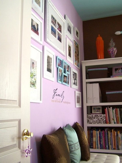
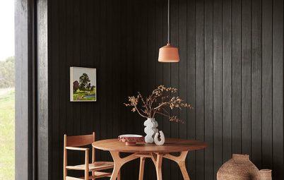
8. Chocolate and lavender
‘Really?’ you’re thinking. Yes, really. Sweet, pale purple and rich chocolate bring out the best in each other. The key is to keep the lavender from getting too bright; a chalky pastel shade works best and looks luminous against deep brown. A lavender feature wall was all this cosy space needed to bring it to life.
TELL US
What’s your favourite duo, and how have you used it? Let us know in the comments section below.


Related Stories
Paint
How to Choose Your Perfect Paint Colours
By Erin Carlyle
Three USA designers share tips to pinpoint your style and mine memories to find the right paint palette for your home
Full Story
Renovating Advice
How to Choose Your Wall Colour to Complement Floors and Furniture
Which colour should I paint my room to suit the flooring and furniture? We've all asked it – and here are the answers
Full Story

Most Popular
How to Pick the Right Paint Colours for Your Federation House
By Joanna Tovia
Roof colour, wall materials and emerging trends all come into play for Federation paint schemes that work
Full Story
Colourful Homes
Suffering From White-Wall Syndrome? How to Add Colour Confidently
White walls are great... until they stop being inspiring. Five paint colour experts share how to transition to colour
Full Story
Expert Opinion
An Interior Designer Reveals How to Mix Colours and Make it Work
By tidgboutique
Don’t want to confine yourself to neutrals but lack the confidence to embrace colours? We have you covered
Full Story
Made Local
Made Local: How Dulux Colour Trends Are Born
Ever wondered how Dulux sees into the future to know the colours we'll be coveting in the year ahead? Here, we find out
Full Story
Houzz Tours
Queensland Houzz: A Cute Cottage Awash With Colour and Pattern
Bold colour, quirky prints and an abundance of art transformed this 1920s cottage into an inviting and relaxing gem
Full Story

Houzz Tours
My Houzz: A Moody, Modernised Home in Melbourne Regains its Charm
The original beauty of this Californian bungalow was lost to unsympathetic updates – see how a designer brought it back
Full Story
Interior Design
20 Honey-Hued Interiors That'll Make You Melt
Our coffee-break escape offers you five minutes' worth of images to inspire and delight. Jump right in...
Full Story

Awards
Paintbrushes Poised! 2023 Dulux Colour Awards Finalists Are In
Looking for interesting ways to add colour at home? Check out these shortlisted projects in the 2023 Dulux Colour Awards
Full Story
I painted one wall in my living room and my kitchen Olive Branch Green. The rest of the rooms surrounding it are painted Bavarian Cream. I have Burgandy leather furniture. It looks really good, but I am tired of the yellowish cream color on the other walls...What other colors could I paint the main walls? My house faces north and south.