Decorating

Perfect Palettes: How to Choose the Right Colour Combination
Colour specialists and interior design experts share their tips for creating the perfect palette for your home

There’s little doubt that colour is a powerful decorating tool. It works at an architectural level to define and link spaces, and highlight the interesting details of your home. It tricks the eyes and the mind, making spaces appear either open and airy, or cosy and intimate. Colour also works on an emotive level, creating mood and atmosphere. It can be sophisticated, uplifting, sombre or vibrant. Creating a colour palette for your home, then, is often a highly personal task.
According to the experts, decorating with colour is all about intuition, imagination – and some knowledge of colour theory. Here, Wendy Rennie, Colour Consultant with Haymes Paint, interior designer Lisa Burdus, and principal of Colour Consultants Australia Judith Briggs, talk practical strategies and ideas for building a colour palette you’ll love to live with.
According to the experts, decorating with colour is all about intuition, imagination – and some knowledge of colour theory. Here, Wendy Rennie, Colour Consultant with Haymes Paint, interior designer Lisa Burdus, and principal of Colour Consultants Australia Judith Briggs, talk practical strategies and ideas for building a colour palette you’ll love to live with.
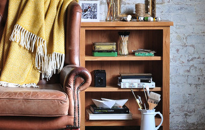
Next, think about the decorative pieces that will be taking centre stage in the room – artworks, patterned fabrics, decorative rugs, collections of objects from your travels – all the items that you love looking at every day. You can draw inspiration for colour and mood from these items.
“Wall colour is a backdrop to everything else that’s going on, whether it’s the furniture, the art, the view, the feel,” Burdus says. “These are the focal points; it’s all about what you want people to see when they walk in the door. You want your paint colours to accentuate all the other items that
you have.”
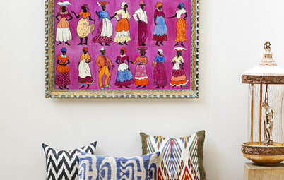
Briggs agrees: “An artwork, for example, will have its own colour palette,” she says. “Pick out three or four colours and use those as the basis for your scheme. That will then make the artwork stand out because the room is reflecting part of that artwork.”
This living room illustrates the concept well – note how the wall, cushions and accessories pick up on the blues and oranges used in the painting. The overall effect is harmonious and puts the spotlight on the painting.
See more spaces designed for art lovers
This living room illustrates the concept well – note how the wall, cushions and accessories pick up on the blues and oranges used in the painting. The overall effect is harmonious and puts the spotlight on the painting.
See more spaces designed for art lovers
Tip: Colour inspiration can come from outside the home as well. Here are some places to look:
- Nature – your view, the countryside, a spring garden in bloom, the sky, the coast.
- The seasons – think lush greens for spring, russet golds for autumn.
- Your travels – e.g. terracottas and yellows of Italianate villas, crisp whites and blues of the Greek islands, tropical brights of the Pacific Islands.
- Picture galleries on Houzz and interiors magazines.
- Paint charts – colour experts at the major paint companies group each season’s newest shades into palettes. These can be an invaluable resource.
Combining colours successfully
When pulling a colour palette together, a basic understanding of colour theory can help. On one side of the colour wheel we find warm colours: yellows, oranges and reds. Opposite are the blue-based cool colours, which include blue, purple and blue-greens.
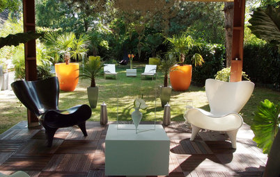
To create a harmoniously coordinated palette, choose colours that sit beside each other on the colour wheel, such as the rich red, orange and yellow that feature in this sitting room.
Don’t be an interiors chromophobe!
When pulling a colour palette together, a basic understanding of colour theory can help. On one side of the colour wheel we find warm colours: yellows, oranges and reds. Opposite are the blue-based cool colours, which include blue, purple and blue-greens.
To create a harmoniously coordinated palette, choose colours that sit beside each other on the colour wheel, such as the rich red, orange and yellow that feature in this sitting room.
Don’t be an interiors chromophobe!
If you’re more adventurous and want to add vibrancy with pops of colour, choose a complementary scheme, i.e. pick colours that sit opposite each other on the colour wheel, such as the blues and yellows accenting this bedroom. Complementary colours will look dramatic and lively, without clashing.
Tip: Warm colours tend to make small rooms appear smaller. Cool colours appear to recede, and will make a room look larger.
Tip: Warm colours tend to make small rooms appear smaller. Cool colours appear to recede, and will make a room look larger.
The importance of undertones
Once you’ve selected the bolder colours you’d like to use in your home, anchor them together with neutrals that have a subtle undertone of the same colour and colour temperature. “That’s the key to linking all colours, to make sure that the undertone of one works with the undertone of the other one,” Briggs says.
Tip: Not sure how to identify the undertone? “The only way you can properly discover a neutral’s undertone is by comparing it with the purest version of the same type of neutral,” Briggs says. “So if it’s a white, compare it to a paint such as Dulux ‘Vivid White’.
It helps to look at the colour outside, as sunlight will usually reveal the undertone.”
How many colours can you use in a palette?
While there’s no magic number or formula for creating the ideal colour palette, Briggs says three to five colours will produce a good result. “But that’s not to say you don’t use different tones of the same colour as well,” she adds. “The more tones you have of the same colour, the more interesting the whole colour scheme becomes.”
While there’s no magic number or formula for creating the ideal colour palette, Briggs says three to five colours will produce a good result. “But that’s not to say you don’t use different tones of the same colour as well,” she adds. “The more tones you have of the same colour, the more interesting the whole colour scheme becomes.”
Rennie says that it’s not always about the number of colours used, but the way they’re all tied together. This living room features nine colours from the Haymes Paint ‘Strata’ palette. Can you spot them all? They’re all tonally similar, which means that when brought together they build depth and interest without looking overtly colourful.
Get the right proportions
When it comes to making colour work, the division of labour is important. “You need different proportions of each colour to make it interesting,” Briggs says. “It’s like the golden mean, which is sort of the 60/40 break up in nature, that is always a good guideline.
“You have one main colour, which is usually your neutral, and this is applied to 60 per cent of the space. Then you do another 20 per cent in a contrasting or complementary colour, and then break it down to make up the different proportions, roughly 10 per cent each in accents.”
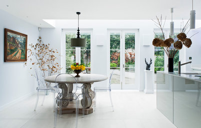
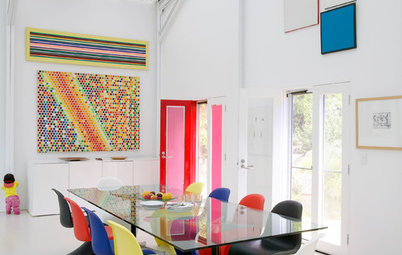
See more beautiful dining rooms
When it comes to making colour work, the division of labour is important. “You need different proportions of each colour to make it interesting,” Briggs says. “It’s like the golden mean, which is sort of the 60/40 break up in nature, that is always a good guideline.
“You have one main colour, which is usually your neutral, and this is applied to 60 per cent of the space. Then you do another 20 per cent in a contrasting or complementary colour, and then break it down to make up the different proportions, roughly 10 per cent each in accents.”
See more beautiful dining rooms
Creating a sense of flow
So what if you’d like to use different colours in different rooms? There are no rules to say it can’t be done, but there are ‘right’ ways to do it. Burdus suggests painting all the public areas of the house – the entryway, hallways, kitchen and family room – the same colour, and then introducing different colours in the bedrooms.
Briggs says that this is most easily achieved in older houses, which, thanks to their high-ceilinged rooms and generous architectural detailing, can take a diverse colour palette without looking bitty. “But you do need to link it together with the trim colour,” she adds. “Choose something that works with all the colours that you’re going to use, and follow that through on all the skirting boards, doors, and window frames,” she says.
Another way to use different colours in different rooms without creating a jarring effect is to choose colours of the same saturation levels. Rennie says the Haymes Paint’s ‘Blended Neutrals’ palette, which is a selection of neutrals in which the undertones are highlighted, was developed with this concept in mind. “These colours can be scattered through the house and every room can look quite different, but because they’re all similar in saturation they feel alike.”
Using multiple shades of a single colour is perhaps the most sophisticated way to manipulate the mood and personality of different rooms while maintaining an elegant, cohesive feel through the home.
“Because we’re now so used to open plan and our living areas are often really big spaces, we’ve lost some of the intimacy we used to have,” Rennie says. “So it’s often a good idea to use darker and lighter variations of a colour to define and identify spaces according to the way they’re used.
“For example you might want to make the living room feel cosier than the open-plan kitchen and dining. So you’d use a darker version of your wall colour to create a more intimate feel.” This strategy has been put to use in this inner-city Perth home. The kitchen is light, bright and airy with pale grey walls, while a deeper shade features on the living room walls.
Three fail-safe colour palettes
It’s not easy to suggest all-rounder colour palettes that will suit every home. There are so many variables at play – the style of your home, its location, your lifestyle and personal preferences. However, if you’re stuck for inspiration, these suggestions from Rennie are a good starting point.
Her first recommendation is black and white. She says this classic colour combination works well both externally and internally. It’s bold and graphic yet minimalistic, and its inherent simplicity means it’s hard to get wrong. The white base-black accent pictured here is sharp and sophisticated. For an edgier, more contemporary feel, play around with the proportions; dress a wall or two in black and pick out the architectural details in white.
Optimal colours for each room of the house
Rennie says a monochromatic grey scheme, built from different strengths of the same shade of grey, is also a great fail-safe option: it’s timeless and sophisticated, and can be adapted to suit most spaces. Take it down to near-white and all the way up to charcoal.
Grey is a versatile and diverse colour, and because it can feature either warm or cool undertones, it can be co-ordinated to the colour of your floors and other existing architectural features.
Grey is a versatile and diverse colour, and because it can feature either warm or cool undertones, it can be co-ordinated to the colour of your floors and other existing architectural features.
Rennie’s third recommendation is a palette of bold naturals. “This is a harmonious approach, where the colours are all related although they feel quite different.” Combine colours inspired by nature – deep buff and warm brown, forest greens, steely grey-blue. Make it work by using one shade for the walls and introduce the other colours on furniture and accessories.
Your say
Did you enjoy this story? Tell us in the Comments section below, or simply like, share or bookmark it. Join the conversation!
More
Read more stories about colour
Your say
Did you enjoy this story? Tell us in the Comments section below, or simply like, share or bookmark it. Join the conversation!
More
Read more stories about colour

Sponsored
Sponsored
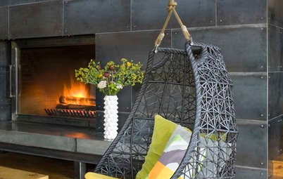
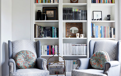
The colour palette is not just about paint, it includes the colours of the floor, furniture and fabrics, window coverings, wallpaper and accessories. The first step in putting together a colour palette is to look at the base elements of the room that can’t be altered. “The first question we ask when we’re working with clients is what’s staying and what’s going,” Rennie says. “We’ve got to factor that into the overall scheme.”
This includes the colour of the flooring, architectural features such as aluminium window joinery, fireplace surrounds, exposed brickwork as well as any other permanent fixtures. If they’re part of the room, they’ll need to tie in with your new colour scheme.
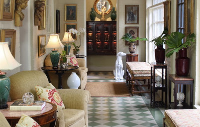
In this formal sitting room, the colour scheme radiates outwards from the beautiful charcoal-coloured mantelpiece.