Popular Houzz Series
Popular Houzz Series
Appears in
See also
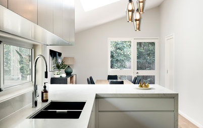
Fun HouzzFrom The ProsHouzz Around The WorldProject Of The WeekStickybeak Of The WeekQuizzesCreatives At HomeAt Home With...Best Of The WeekRoom Of The WeekDesigner Profiles3 Things I Wish My Clients KnewHow Do I...Buyer's GuidesExpert EyeInnovation AlertSo Your Style Is...Spotted!Picture PerfectBefore & AfterBudget BreakdownHome TimeMade Local
Room Of The Week
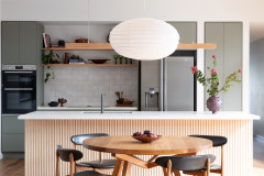
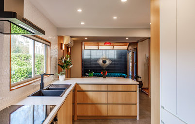
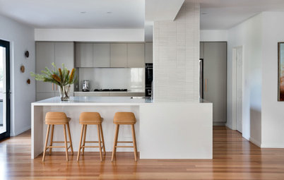
Room of the Week: A Curvaceous Mid-Century Kitchen in Timber
Clever tweaks and thoughtful alignments made the most of this mid-century kitchen renovation

In a Q&A format, we talk to the designers – and examine the creative thinking – behind some of Houzz’s most loveable rooms.
Background
The clients are people who like to cook and entertain for family and friends without any fuss or ceremony. The original kitchen layout was proving to be something of a straitjacket for the owners, although their love of the home’s overall mid-century style never wavered.
So, they cast about for someone to help them realise a better arrangement and invited a kitchen designer to come up with some ideas. Unfortunately, however, they were a little underwhelmed.
Frustrated, they found some online design software and started to dabble with some layout concepts. What they soon discovered however, is that the ideas came freely but resolving them all into a functional layout proved harder.
Around that time, someone suggested Space Craft Joinery. What we discovered was a lovely couple, who – despite both being very busy with kids and careers – invested all the time we asked for to evolve the brief that would help transform their living spaces.
Brief
In their own words, what the client wanted was, “a design that addressed the functional and aesthetic constraints” of the space as well as a “finished product that would complement and build on the overall aesthetic of the home”.
They wanted the kitchen to fit softly within its surrounds and not feel at odds with the period aspect of the home. That said, they were also open to something different, quirky and inviting, which the whole family could enjoy.
Early on, we suggested something curvy and their faces lit up. The creative juices were really starting to flow.
The kitchen before works
Starting point
The first challenge to be resolved was that the original kitchen was U-shaped. The one advantage of that was the fact it offered lots of bench space. The trade off, however, was that it also brought people into a dead-end zone – both traffic-wise and creatively.
Starting point
The first challenge to be resolved was that the original kitchen was U-shaped. The one advantage of that was the fact it offered lots of bench space. The trade off, however, was that it also brought people into a dead-end zone – both traffic-wise and creatively.
Thinking behind the arrangement of furniture/fixtures
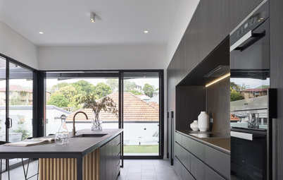
Our idea was to block off an unnecessary external doorway, which uncorked the genie: this simple change not only opened up the internal traffic flow but allowed us to extend the length of the kitchen and benchtops. It also made way for a servery window and a barbecue directly outside.
Due to the lack of wall space, by the time the fridge went in place there was only one spot for the range hood. So we made a feature of range hood. We lined up the top of the range hood with the top of the window to save it from being overpowering.
Blocking up an existing doorway allowed for extra bench space, which was one of the client’s requests. We then used two different Caesarstone colours, one for the benchtop, and another lighter shade for the back wall and splashback. This subtly introduces earthy tones.
The next problem was that the wall behind the fridge concealed a stairwell. That meant we had a very shallow wall, which governed the ultimate depth of the cabinets. To compensate, we built a wall of cupboards all the way to the top of the tall ceilings.
What informed your choice of materials?
The anchor for the whole design is that tall wall, with its vast store of cabinetry fronted in Ebony Traceless Laminate: this fingerprint-proof finish ensures it will always look great without too much effort. (Using a standard melamine or two-pack polyurethane finish in such a dark tone might look great in a showroom, but would very soon prove hard to live with, especially with sticky little fingers.)
This is where – if you look carefully – you’ll also find the black oven and microwave tower, within easy reach of the benchtop to ensure sufficient landing space.
To offset all that ebony and contrast with the joinery, we chose Dulux Lexicon two-pack paint for the rest of the island, which reflects the play of natural light coming in from the east-facing window during the day. For night time or on darker days, LED lighting is mounted under the rangehood as well as directly over the island.
For durability, the benches were all topped in Caesarstone (with a matt finish) to complement the earthy vibe that pervades the space, but in two different shades. The idea behind using Caesarstone for the splashback, instead of the usual tiles, was to lessen the textural competition for the range hood above it.
The end of the island bench contains a stealthily hidden drinks cabinet
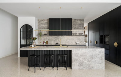
Remember those curves we all got excited about? Well, not only did we use one curve to soften the edge of the benchtop leading into the dining area, which helps make the space look bigger, we also mirrored that on the range hood to create a symmetrical visual link.
Remember those curves we all got excited about? Well, not only did we use one curve to soften the edge of the benchtop leading into the dining area, which helps make the space look bigger, we also mirrored that on the range hood to create a symmetrical visual link.
What must truly stand out to the casual observer, however, above all else is the timber slats that feature on the island bench and range hood. Not only does the perpendicular profile add a strong textural element, but the warmth of Tasmanian oak also adds to the otherwise unapologetically monochromatic palette.
The last thing we wanted to do was clutter that look with handles, so we devised a reverse-bevel finger-pull used throughout instead.
Aside from this, timber was used sparingly so as not to compete with the existing floorboards, architraves, window frames and door frames.
The last thing we wanted to do was clutter that look with handles, so we devised a reverse-bevel finger-pull used throughout instead.
Aside from this, timber was used sparingly so as not to compete with the existing floorboards, architraves, window frames and door frames.
Key design aspects
Colour palette: Monochromatic with timber, black laminate, grey/concrete-look stone benchtops, and white doors and drawer faces.
Colour palette: Monochromatic with timber, black laminate, grey/concrete-look stone benchtops, and white doors and drawer faces.
Materials palette:
- Earthy tones with natural elements. Textural elements were important, which is evidenced in the timber ribbing.
- Design of the soft curve of the island visually softened the footprint of the kitchen within the space and created flow in the walkway between zones.
- This curve was visually linked to the curve of the range hood block.
Key pieces of furniture/fittings:
- Caesarstone Rugged Concrete to island benchtop.
- Caesarstone Airy Concrete to benchtop and splashback on back wall.
- Timber island facing joinery in Tasmanian oak.
- Dulux Lexicon to remainder of island cabinetry.
- Oliveri Vilo pull-out mixer tap.
- Ebony Traceless Laminate on back wall.
Why do you think this room works?
It is in keeping with period of the home but with a modern twist. It is timelessly modern because the timber links to existing details in the home.
It is in keeping with period of the home but with a modern twist. It is timelessly modern because the timber links to existing details in the home.
The floor plan
Your turn
What do you love about this kitchen? Tell us in the Comments below. And don’t forget to save your favourite images, like this story and join the conversation.
More
Craving more great interiors? Take a look at our previous Room of the Week: An Eclectic Kitchen With Colourful Touches
Your turn
What do you love about this kitchen? Tell us in the Comments below. And don’t forget to save your favourite images, like this story and join the conversation.
More
Craving more great interiors? Take a look at our previous Room of the Week: An Eclectic Kitchen With Colourful Touches
Styling by Emily O’Brien
Answers by Nathan Wundersitz, founder and design director of Space Craft Joinery
Who lives here: A family with three children
Location: Hawthorn, SA
Room purpose: Kitchen, living area, dining space and servery through to an outdoor entertaining area and barbecue
Budget: $65,000 including appliances
Find a joinery designer and cabinet maker near you on Houzz to give your home a fresh new look