


Room of the Week: A Modern Kitchen With a Dash of Old-World Charm
An all-white kitchen is elevated to something truly special with sumptuous natural materials and a hidden surprise
Georgia Madden
8 February 2019
In a Q&A format, we talk to the designers – and examine the creative thinking – behind some of Houzz’s most loveable rooms.
Images by Boston Parker
Answers and kitchen design by Chris Ruffé, director at Bondi Kitchens
Interior design by Louisa Shipman at Shipman Interiors
Who lives here: A couple with two teenagers
Location: Riverview, NSW
Room purpose and size: A family kitchen measuring approximately 18 square metres
Answers and kitchen design by Chris Ruffé, director at Bondi Kitchens
Interior design by Louisa Shipman at Shipman Interiors
Who lives here: A couple with two teenagers
Location: Riverview, NSW
Room purpose and size: A family kitchen measuring approximately 18 square metres
Brief
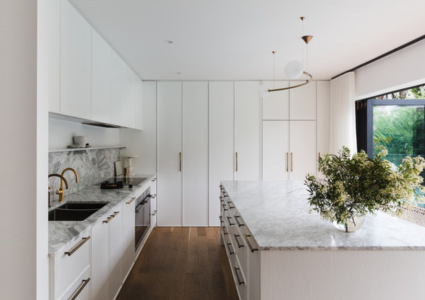
To design a timeless, serene and elegant look with a hint of old-world European luxury. The clients sought a simple colour palette and a layering of tactile materials that created depth and harmony.
Given this is a kitchen in a family home, functionality was important. The space needed to work hard, with easy access to items and no overly complicated details. The new central kitchen island needed to have ample space around it to let family members circulate around the kitchen with ease. A pantry nook was specified to provide a functional yet beautiful separate work space.
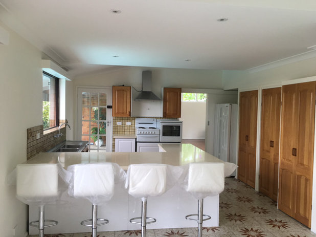
The kitchen before works
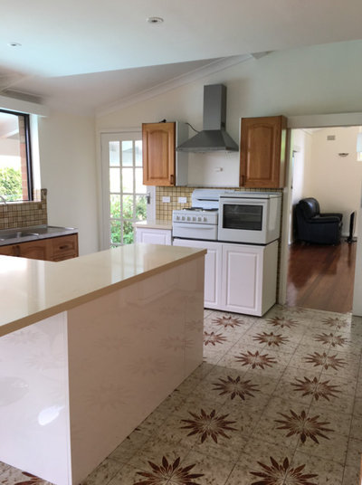
The kitchen before works
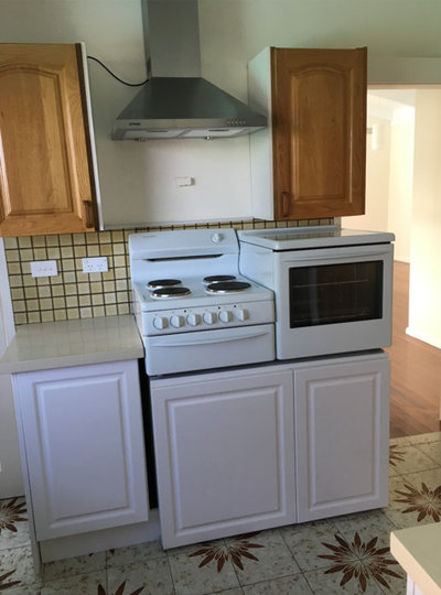
The kitchen before works
Starting point
The main objective was to utilise the natural light coming in through huge bi-fold glass doors that span the full length of the room and open onto the pool area. Getting the layout right was imperative to achieving the right flow in the room.
The main objective was to utilise the natural light coming in through huge bi-fold glass doors that span the full length of the room and open onto the pool area. Getting the layout right was imperative to achieving the right flow in the room.
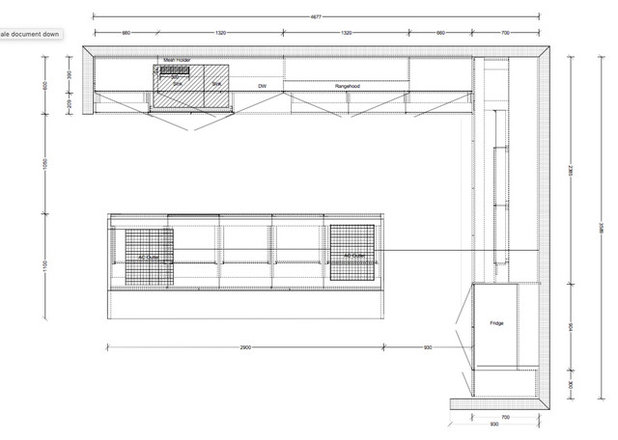
The floor plan
Key design aspects
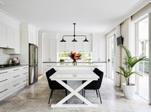
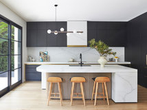
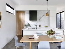
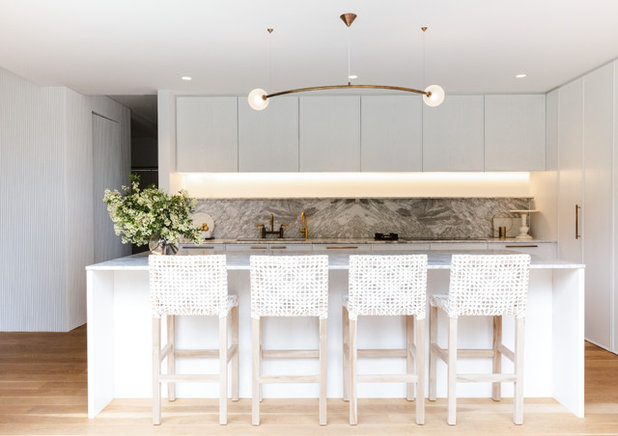
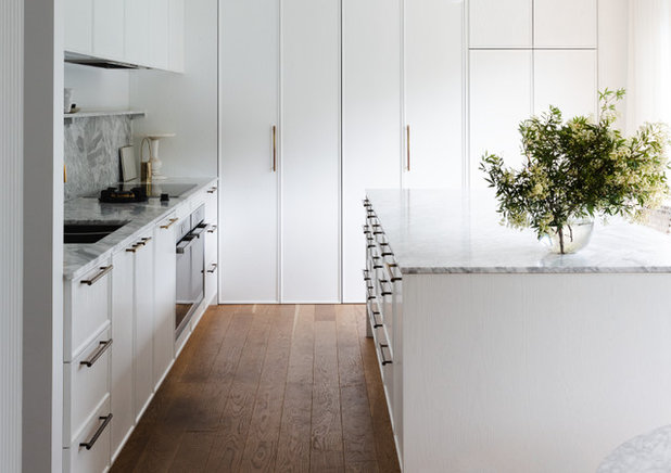
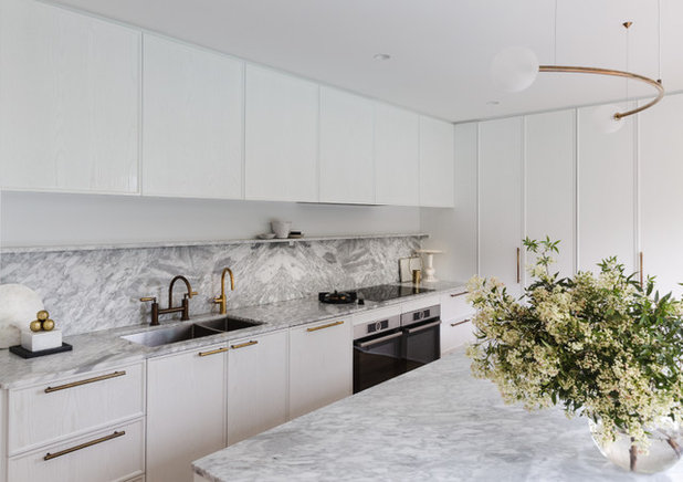
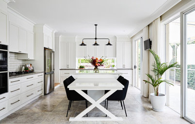
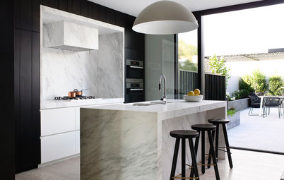
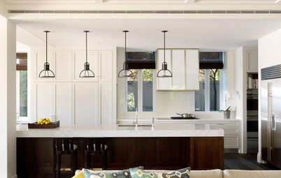
Colour palette: White and pale grey with brass accents. Layering tactile materials allowed us to create depth within the predominantly white colour scheme.
Colour palette: White and pale grey with brass accents. Layering tactile materials allowed us to create depth within the predominantly white colour scheme.
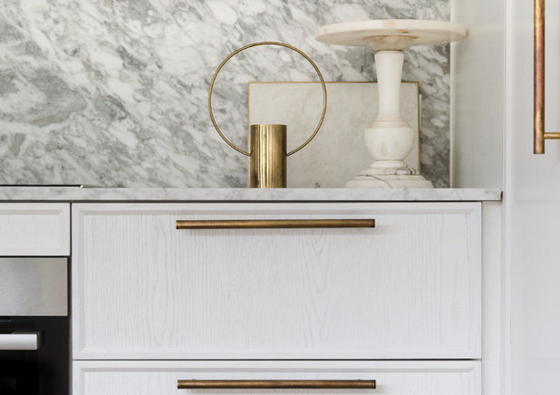
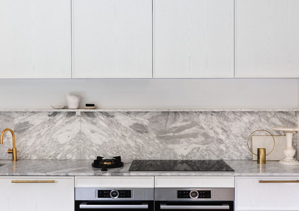
Materials palette: CDK Stone Bianco Gioia 20-millimetre leather-finish marble (a leathered finish has a slightly textured surface, like leather) on the benchtops, splashback and integrated shelf. Skheme Piccolo Carrara mosaic tiles in the pantry nook splashback. Briggs Veneers American Oak veneer cabinetry with a two-pack polyurethane painted satin finish in Dulux White on White. Hettich Wingline bi-fold doors to the pantry nook. The cabinetry edging is solid American oak.
Key pieces of furniture/fittings: Brass handles from Mother Of Pearl & Sons Trading. Oddments pendant light in brass and frosted glass from Volker Haug. Icon aged brass tap from Astra Walker. Pitt Cooking floating cooktop burner. Sweni bar stools from Uniqwa Furniture.
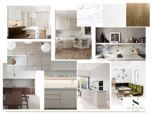
The mood board
Thinking behind the arrangement of furniture/fixtures
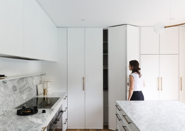
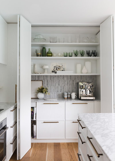
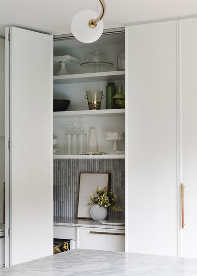
The inclusion of a pantry nook made the kitchen feel larger by allowing this work station to be concealed when not in use. It provides plenty of extra space for storage and an additional food-preparation zone. It can be hidden away when desired behind Hettich Wingline bi-fold doors.
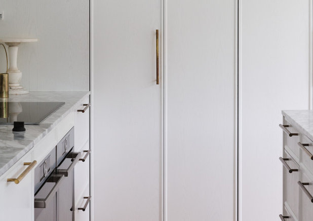
The dishwasher and fridge are concealed behind cupboard doors for a seamless look.
The inclusion of a pantry nook made the kitchen feel larger by allowing this work station to be concealed when not in use. It provides plenty of extra space for storage and an additional food-preparation zone. It can be hidden away when desired behind Hettich Wingline bi-fold doors.
The dishwasher and fridge are concealed behind cupboard doors for a seamless look.
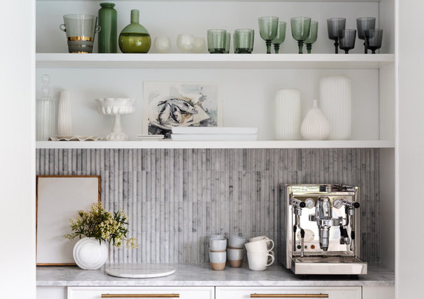
The pantry nook is far more than an appliance cupboard – it’s an extra work station complete with internal lighting, power outlets, a luxurious stone benchtop, and it has space for food preparation and storage. It is located close to the fridge and island bench for ease of use and to contain traffic to the one area.
Challenges you worked around
None.
None.
Why do you think this room works?
The proportions – the size and layout of the island paired with the full-height joinery make the space grand and generous, and together they create a cohesive feel.
The materials, colour and texture selection also adds to the simple yet luxurious ambiance. There are just two main materials used here – stone and American Oak. However, the grain in both the marble and the timber create an elegant, contemporary and timeless feel.
Tell us
What’s your favourite feature in this kitchen? Tell us in the Comments below. And don’t forget to save your favourite images, like and save this story, and join the conversation.
More
Itching to see more stunning interiors? Take a look at last week’s Room of the Week: A Small, Modern Bathroom in Charcoal and White

What are you working on?
Related Stories
Most Popular
Renovation Insight: How to Choose a Kitchen Designer
The right designer can bring your dream kitchen to life – three kitchen designers reveal where to look and what to ask
Full Story
Kitchen Expert Advice
7 Common Kitchen Design Challenges & How Experts Get Around Them
From bad layouts to poor storage, here are seven issues pros come up against (and overcome) in clients' kitchen renos
Full Story
Kitchens
A Good Fit: 10 Questions to Ask a Potential Kitchen Designer
By lwkkitchens
A good designer knows which questions to ask about your kitchen project. But what should you ask them before you sign?
Full Story
Most Popular
8 Dos and Don'ts for a Well-Functioning Butler's Pantry
Having a little help behind the scenes is key to a pristine kitchen – here's how to create a functional butler's pantry
Full Story
Most Popular
Key Measurements to Consider When Designing the Perfect Kitchen Island
By Anne Ellard
Discover the correctly proportioned kitchen island bench dimensions so your space works as well as it can
Full Story
Kitchen Renovations
10 Times You Should Hire a Kitchen Designer
These specialists can solve layout issues, save costs, update an older space and create custom design details
Full Story
Popular Houzz Series
How Practical Is... Handleless Joinery?
Handleless joinery is popular in modern homes. But how suitable are cupboards that can only be opened with a touch?
Full Story
Renovation Guides
Room by Room: Experts on Ways to Avoid Common Renovation Blunders
From the kitchen to the garden, and all areas in between, experts identify common mistakes and share priceless insights
Full Story
Most Popular
From Planning to Pendants: Kitchen Lighting Essentials
By Joanna Tovia
This valuable guide will give you all you need to know about choosing kitchen lighting for fabulous form and function
Full Story
Kitchen Renovations
A Kitchen That Uses Special Elements to Punch Above Its Weight
This couple wanted a well-designed kitchen that incorporated their pre-bought furniture; this designer delivered
Full Story
Are there two ovens under a cooktop? If so what sizes did you use? Struggling with this at the moment with our kitchen and getting advice that isn’t practical for us (smaller cooktop). Thanks so much and all looks amazing!!!
Hi Tayla, there are 2 x 60cm ovens under the induction cooktop and single pitt gas hob. I have found over the years that a single 60cm oven just isn't enough if you like to entertain and have 4 or more in your household. There are some great 90cm ovens on the market as well but in this kitchen being able to have two ovens was ideal as they balance out the induction and gas top. Bonus is you can bake dessert at the same time you are baking a meal and not have cross contamination of flavours.