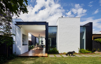
Project Of The Week
Renovating
Popular Houzz Series
Popular Houzz Series
Appears in
See also
Fun HouzzFrom The ProsHouzz Around The WorldProject Of The WeekStickybeak Of The WeekQuizzesCreatives At HomeAt Home With...Best Of The WeekRoom Of The WeekDesigner Profiles3 Things I Wish My Clients KnewHow Do I...Buyer's GuidesExpert EyeInnovation AlertSo Your Style Is...Spotted!Picture PerfectBefore & AfterBudget BreakdownHome TimeMade Local
From Shabby to Chic: An Unbelievable Makeover of a ’90s Extension
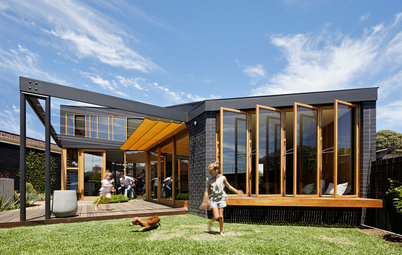
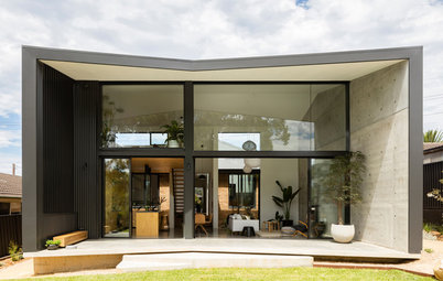
A dreary ’90s extension to a period home is unrecognisable after a major renovation and new on-trend finishes

In this Q&A series, we turn the spotlight on one thought-provoking renovation or extension each week. Here, Aydan Doherty, building designer and director at AD Design Develop, reveals how he reworked a poorly laid-out four-bedroom, two-bathroom 1930s Californian bungalow with a tired 1990s extension. The result is this sophisticated and contemporary family home in Melbourne, Victoria, with seamless indoor-outdoor flow.
Artwork: ‘Home Sweet Home’ by Struan Hopwood
Gained
Gained
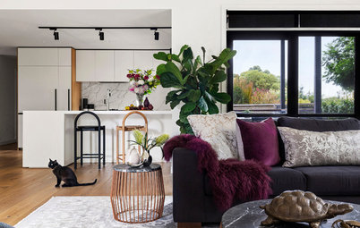
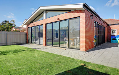
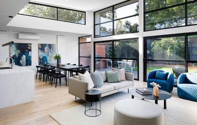
- A spacious new, open-plan kitchen/dining/living area that opens onto a new alfresco entertaining space.
- A new outdoor living space that includes a kitchen, living area and dining space.
- A large new bathroom.
- A new laundry that doubles as a butler’s pantry.
- A new second living area.
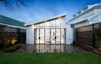
The 1990s rear extension before works
What was the house like originally?
A four-bedroom, two-bathroom 1930s Californian bungalow.
What state of repair was it in?
It was liveable, but didn’t function well for a family.
Find a building designer on Houzz to help with your renovation project
What was the house like originally?
A four-bedroom, two-bathroom 1930s Californian bungalow.
What state of repair was it in?
It was liveable, but didn’t function well for a family.
Find a building designer on Houzz to help with your renovation project
What wasn’t working for the client about the original house?
The poor layout and positioning of the kitchen, the wasted space in the back hallway, the too-small bathroom and the closed-in patio.
The poor layout and positioning of the kitchen, the wasted space in the back hallway, the too-small bathroom and the closed-in patio.
What was your brief?
To improve the functionality and flow of the dwelling. The layout was quite dysfunctional, with the kitchen and living area in the centre of the house, and the bathroom at the rear and opening onto the backyard.
The purpose of the project was not to extend, but to work within the existing space to make the home suit the needs of a young family.
What were the client’s must-haves?
- A functional kitchen.
- Plenty of natural light.
What did you do with the original ’90s extension?
We kept it. Retaining the structure kept costs down and meant the owners didn’t over capitalise on the build. The ’90s extension had plenty of space as well as two bedrooms in the upstairs section.
We kept it. Retaining the structure kept costs down and meant the owners didn’t over capitalise on the build. The ’90s extension had plenty of space as well as two bedrooms in the upstairs section.
The original ground-floor plan
What exactly did you do?
What exactly did you do?
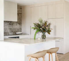
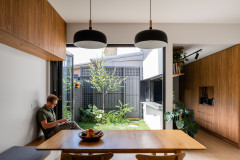
- Converted the space that originally housed the laundry, powder room and bathroom at the rear of the house into a new kitchen/living/dining area.
- Removed the large, load-bearing wall at the rear of the house to create a large, open-plan space.
- Removed some windows in the existing living room.
- Rotated the original living area.
- Turned the original dining room into a second living area.
- Added new steel-framed doors to the alfresco area.
- Replaced the old pergola and concrete pavers with a modern outdoor entertaining area.
- Installed a new bathroom and laundry in the space that was previously the kitchen.
The new ground-floor plan
What problems or limitations did this project address?
Improving the home’s functionality, boosting natural light and making the space feel bigger without touching the existing footprint. We had to make the client’s needs work at no cost to the surrounding spaces.
Improving the home’s functionality, boosting natural light and making the space feel bigger without touching the existing footprint. We had to make the client’s needs work at no cost to the surrounding spaces.
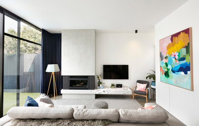
We adore the black built-in cabinetry in the kitchen and living room – tell us about it
The feature paneling in the kitchen and living areas adds a sense of sophistication. This was not a big space, so we needed to make a statement in the kitchen in a way that could be integrated with the living area.
The feature paneling in the kitchen and living areas adds a sense of sophistication. This was not a big space, so we needed to make a statement in the kitchen in a way that could be integrated with the living area.
Artwork: ‘Heavenly Divine’ by Struan Hopwood
How does the new work address the problems or limitations identified above?
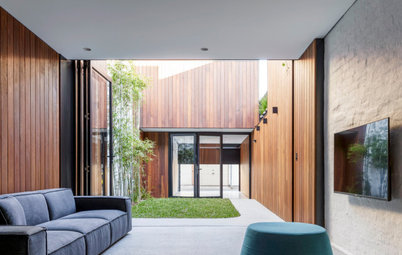
We were able to overcome these challenges by designing an open-plan kitchen/dining/living area that opens up to a large outdoor alfresco area. Not only does this make the area feel more dynamic and vibrant, it’s also a far more practical arrangement for a family.
We were able to overcome these challenges by designing an open-plan kitchen/dining/living area that opens up to a large outdoor alfresco area. Not only does this make the area feel more dynamic and vibrant, it’s also a far more practical arrangement for a family.
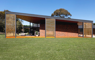
Steel-framed doors open to a new alfresco area
What was your thinking behind the new outdoor area?
The new, covered alfresco area can be used year-round. It has a functional kitchen, living area and dining area, which substantially increases the client’s usable living and entertaining space. Covering the area and adding an outdoor fireplace means it can be used year-round.
The new, covered alfresco area can be used year-round. It has a functional kitchen, living area and dining area, which substantially increases the client’s usable living and entertaining space. Covering the area and adding an outdoor fireplace means it can be used year-round.
The cosy new outdoor fireplace
Why do you think this project works so well?
Because we were able to work within the existing space to create an area that not only functions well, but also feels like a brand-new addition. The aim was to create a contemporary and functional space with a sleek and modern style for a young family, and we believe that was achieved.
Because we were able to work within the existing space to create an area that not only functions well, but also feels like a brand-new addition. The aim was to create a contemporary and functional space with a sleek and modern style for a young family, and we believe that was achieved.
What are the key features of this project?
- A practical layout.
- A good sense of flow.
- The new alfresco area connects seamlessly to the indoor space, creating the illusion that the indoor living area is bigger than it actually is.
- Textured and layered finishes create a sophisticated feel.
Interior materials palette
Interior fixtures and fittings
- Polytec Tempest Woodgrain to the cabinetry.
- Caesarstone Turbine Grey to benchtops in the kitchen, living area and laundry.
- Artedomus mosaic tiles on walls in the bathroom and laundry.
- National Tiles porcelain tiles on bathroom floors.
- Tongue n Groove timber flooring.
- Dulux Lexicon Quarter used in the new rooms.
- Dulux Snow Season used in the bedrooms (not shown).
Interior fixtures and fittings
- Vine & Vault Custom Cellars custom steel windows.
- Sneddons fireplace.
- Miele appliances.
- Meir tapware.
- About Space Lighting pendants above kitchen island.
Exterior materials palette
- Bluestone pavers.
- Bagged render over recycled red bricks.
- Dulux Terrace White on weatherboards.
- Dulux Monument on roof and gutters.
- Feast Watson Black Japan timber stain.
Your turn
Has this clever redesign given you some ideas for your own renovation? Tell us in the Comments, like this story, save the images and join the conversation.
More
Want more renovating ideas? Don’t miss this Project of the Week: A Humble Beach Cottage on a Slope is Reimagined For Modern Living
Has this clever redesign given you some ideas for your own renovation? Tell us in the Comments, like this story, save the images and join the conversation.
More
Want more renovating ideas? Don’t miss this Project of the Week: A Humble Beach Cottage on a Slope is Reimagined For Modern Living

Sponsored
Sponsored
Answers by Aydan Doherty, building designer and director at AD Design Develop
Who lives here: A couple with two young children and several pets
Location: West Footscray, Victoria
Size: The house is 164 square metres (there was no change to the size after works), and the new alfresco area measures 42 square metres
Budget: Around $300,000
Building designer: Aydan Doherty at AD Design Develop
Builder: Sanctum Homes
Structural Engineer: John Kotowsky J and Associates
Landscape design and construction: Petstra Gardens
Land surveyor: Adept Surveys
Building surveyor: Red Textas