


Spotted! Pastels and Black Having Allsorts of Fun
Feeling like you're on a sugar crash? Take some of the sweetness out of pastel interiors with contrasting black accents
Laura Wheat
16 May 2016
Houzz UK Contributor. Freelance Journalist and interiors obsessive, newly ensconced in a handsome Edwardian semi on top of a hill.
Houzz UK Contributor. Freelance Journalist and interiors obsessive, newly ensconced... More
If you’ve tended to steer clear of pastel colours, believing them to be too saccharine for your tastes, it could be time to think again. When balanced with purposeful black accents, pale, sugared almond shades feel fresh and contemporary.
The secret to success when using pastel shades is an effective use of contrast: incorporate black elements in a way that best allows the other colours in the scheme to shine. This might mean only using a very small amount of black in a graphic or sculptural shape, or being bold with a larger area of colour, but using it in a softer texture. These 10 simple ideas should give you some food for thought (and apologies all round if the food in question is ice cream!).
The secret to success when using pastel shades is an effective use of contrast: incorporate black elements in a way that best allows the other colours in the scheme to shine. This might mean only using a very small amount of black in a graphic or sculptural shape, or being bold with a larger area of colour, but using it in a softer texture. These 10 simple ideas should give you some food for thought (and apologies all round if the food in question is ice cream!).
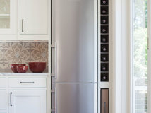
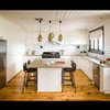
1. Ditch the white goods
Coloured appliances are having a moment, but if you don’t feel confident choosing a bold shade for your priciest purchases, why not try classic black? It’s easy to keep clean, quick to coordinate and can give a mint-green kitchen oodles of adult appeal.
Coloured appliances are having a moment, but if you don’t feel confident choosing a bold shade for your priciest purchases, why not try classic black? It’s easy to keep clean, quick to coordinate and can give a mint-green kitchen oodles of adult appeal.
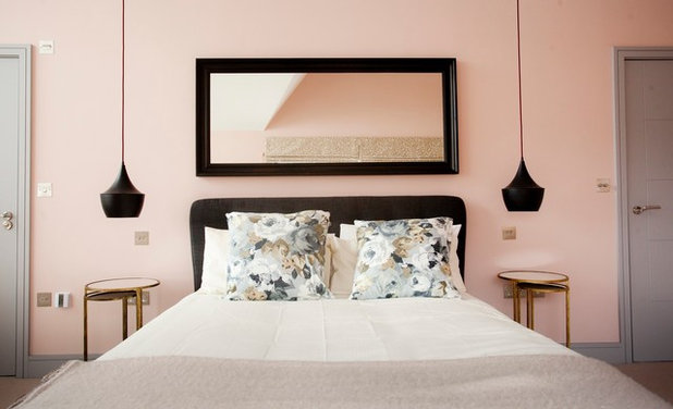
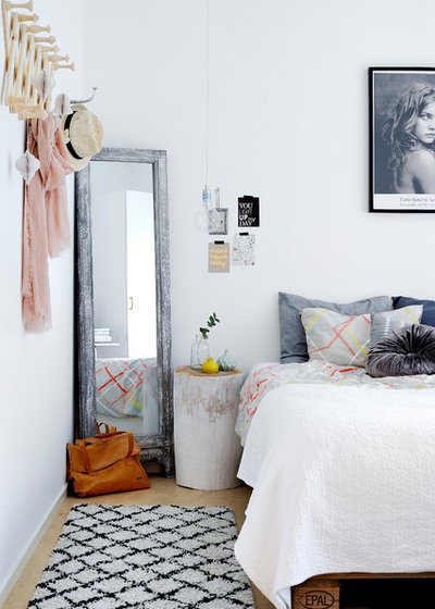
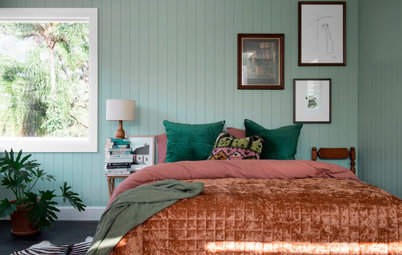
2. Skip the sugar
Use graphic black accents to punctuate pretty pastels and floral prints, preventing them from becoming too sickly sweet. In this bedroom, a coordinating lamp or mirror has been swapped in favour of more striking designs in dramatic jet black.
What works best with black?
Use graphic black accents to punctuate pretty pastels and floral prints, preventing them from becoming too sickly sweet. In this bedroom, a coordinating lamp or mirror has been swapped in favour of more striking designs in dramatic jet black.
What works best with black?
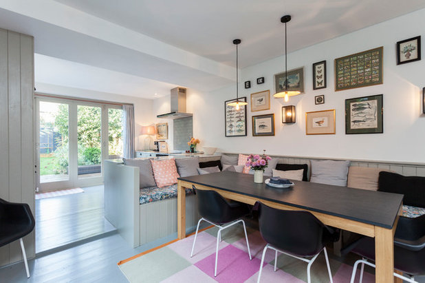
3. Add some edge
Introducing pale greys and pistachio greens will help to prevent an overload of sweet shades in spaces where balance is important. This eclectic dining area has an abundance of pastel colours, but also incorporates grey, black and biscuit tones in the cushions to help tone it down, while the robust plastic chairs add a masculine edge.
Introducing pale greys and pistachio greens will help to prevent an overload of sweet shades in spaces where balance is important. This eclectic dining area has an abundance of pastel colours, but also incorporates grey, black and biscuit tones in the cushions to help tone it down, while the robust plastic chairs add a masculine edge.
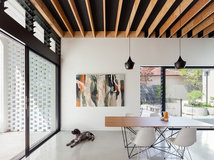
4. Try monochrome with a twist
If your scheme is an ode to monochrome restraint and you’re looking to liven it up, pastels can pack an effective punch. Small tweaks, such as the tiny touch of peach, hint of mint and splash of neon, lift this minimal black and white space, enabling it to take on a whole new personality.
If your scheme is an ode to monochrome restraint and you’re looking to liven it up, pastels can pack an effective punch. Small tweaks, such as the tiny touch of peach, hint of mint and splash of neon, lift this minimal black and white space, enabling it to take on a whole new personality.
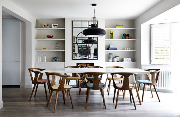
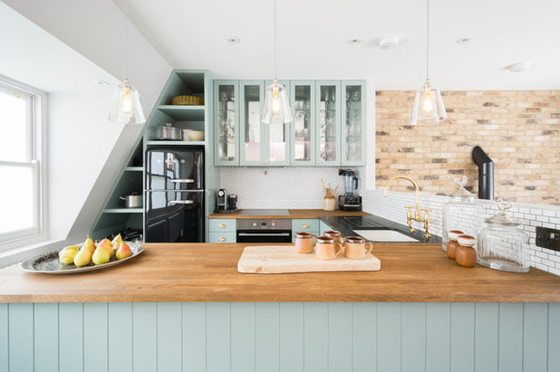
5. Switch onto industrial elements
The pastel shades appear balanced and contemporary in this dining room thanks to the darker, more masculine industrial elements and mid-century furniture. The statement dining chairs in faded orange, yellow and teal suggest lightness and frivolity, while the oversized black pendant light provides a no-nonsense counterpoint.
A black table lamp or a smattering of black accessories on the shelves would create the same effect as here. Similarly, for a subtle flash of pastel with a DIY element, consider colour-dipping your chair legs in complementary sherbet tones.
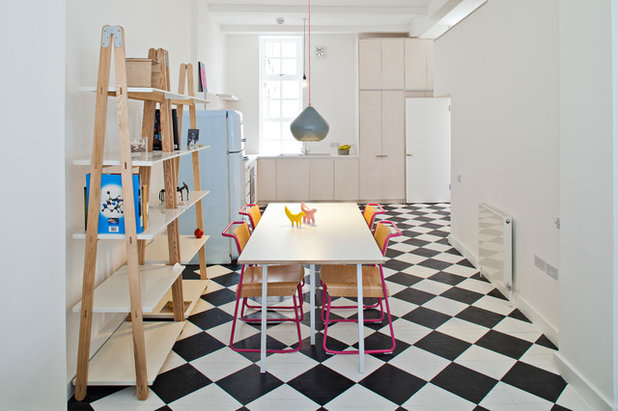
6. Play with pattern
There’s something endlessly pleasing about a graphic black and white floor, particularly when combined with icy pastels and a classic 1950s-style fridge. Keep the look from going full ‘American diner’ by opting for painted floorboards rather than vinyl tiles. More texture means less cold feet.
There’s something endlessly pleasing about a graphic black and white floor, particularly when combined with icy pastels and a classic 1950s-style fridge. Keep the look from going full ‘American diner’ by opting for painted floorboards rather than vinyl tiles. More texture means less cold feet.
7. Look beyond the obvious
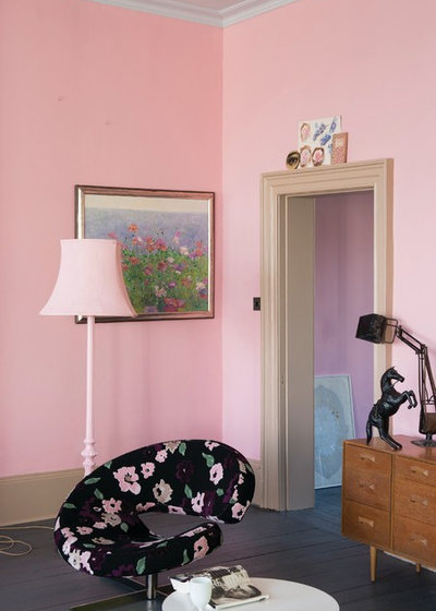
In this striking scheme, the pastel pink walls haven’t been paired with the usual bright white architrave and skirting boards, but with an unexpected nude tone instead. This clever combination plays down the pink’s vibrancy. Similarly, the floral-print chair has a black background for a further hint of subversion.
For an easier update along these lines, look out for cushion covers or wall art featuring black and the pastel shade of your choice, then build your decor around it.
Take a look around some more pink-toned spaces
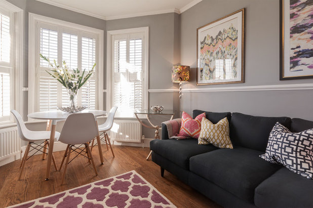
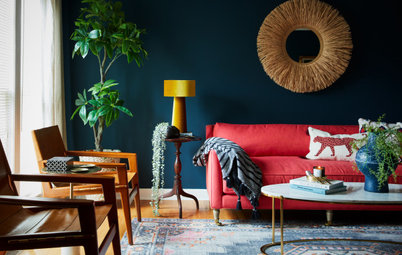
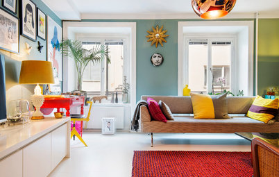
8. Accent with upholstery
A softer way to bring black elements alongside sugary shades is to use fabrics and upholstery. In this chic living room, a simple charcoal sofa offsets the lively mix of patterns and pastels on the cushions and rug, effectively helping to ground the scheme.
A softer way to bring black elements alongside sugary shades is to use fabrics and upholstery. In this chic living room, a simple charcoal sofa offsets the lively mix of patterns and pastels on the cushions and rug, effectively helping to ground the scheme.
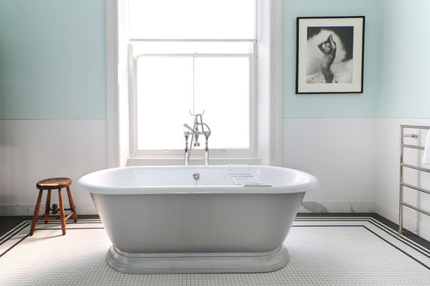
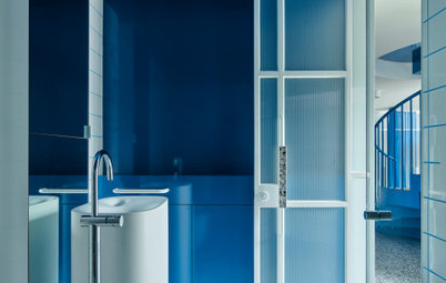
9. Frame your space
Even a small amount of black can introduce enough contrast to define paler colours and make them sing. This elegant bathroom features a border of black tiles on the floor, which outlines the space and is echoed in the black-framed print on the wall.
If dark tiles in the bathroom aren’t an option, try a washable cotton rug with a monochrome geometric pattern as a bathmat.
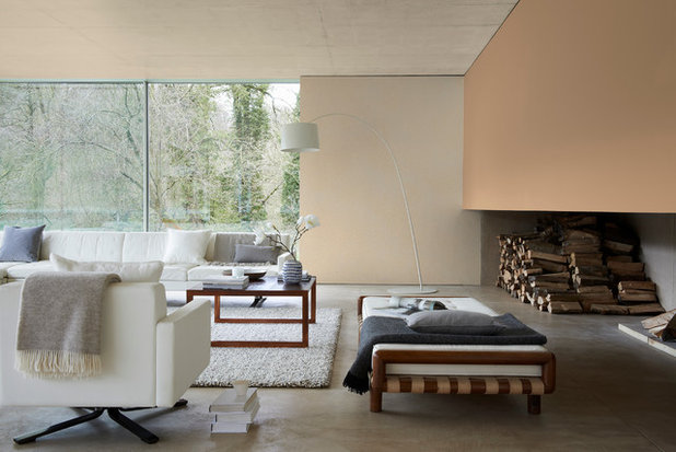
10. Use pastels as a neutral
You might not think it, but peachy pastels can appear almost neutral when used as a background to a subtle, sophisticated space such as this one. Wooden elements add warmth and mimic the greenery outside, while a black throw and grey cushions guard against uniformity.
TELL US
Do you like the combination of pastels with black – how would you choose to pair them? Share your tips in the Comments below.
MORE
Unleash Your Passion for Pastels
Why We’re Going Nuts for Black Tapware
How to Decorate With Pink (and Make a Space Look Grown-Up, Not Girly)
What are you working on?
Related Stories
Paint
How to Choose Your Perfect Paint Colours
By Erin Carlyle
Three USA designers share tips to pinpoint your style and mine memories to find the right paint palette for your home
Full Story
Renovating Advice
How to Choose Your Wall Colour to Complement Floors and Furniture
Which colour should I paint my room to suit the flooring and furniture? We've all asked it – and here are the answers
Full Story
Most Popular
How to Pick the Right Paint Colours for Your Federation House
By Joanna Tovia
Roof colour, wall materials and emerging trends all come into play for Federation paint schemes that work
Full Story
Colourful Homes
Suffering From White-Wall Syndrome? How to Add Colour Confidently
White walls are great... until they stop being inspiring. Five paint colour experts share how to transition to colour
Full Story
Expert Opinion
An Interior Designer Reveals How to Mix Colours and Make it Work
By tidgboutique
Don’t want to confine yourself to neutrals but lack the confidence to embrace colours? We have you covered
Full Story
Made Local
Made Local: How Dulux Colour Trends Are Born
Ever wondered how Dulux sees into the future to know the colours we'll be coveting in the year ahead? Here, we find out
Full Story
Houzz Tours
Queensland Houzz: A Cute Cottage Awash With Colour and Pattern
Bold colour, quirky prints and an abundance of art transformed this 1920s cottage into an inviting and relaxing gem
Full Story
Houzz Tours
My Houzz: A Moody, Modernised Home in Melbourne Regains its Charm
The original beauty of this Californian bungalow was lost to unsympathetic updates – see how a designer brought it back
Full Story
Interior Design
20 Honey-Hued Interiors That'll Make You Melt
Our coffee-break escape offers you five minutes' worth of images to inspire and delight. Jump right in...
Full Story
Awards
Paintbrushes Poised! 2023 Dulux Colour Awards Finalists Are In
Looking for interesting ways to add colour at home? Check out these shortlisted projects in the 2023 Dulux Colour Awards
Full Story
I see nothing wrong with #9. Art is in the eye of the beholder....