Stickybeak of the Week: A New United Front for a 1950s Kitchen
Before and after images show how three small, dated rooms have been united to create this fresh, modern, practical space

In the heart of a village in the Gard area of southern France, a more-than-60-year-old building is now the second home of a Belgium-based couple. The owners, hailing from this region, bought the almost-abandoned house several years ago and are gradually renovating it as finances allow. After having completed the living room last year, they recently got started on the kitchen and dining area, with the help of interior architect Anne-Astrid Chachignon of Maztri.
Together with the owners, Chachignon has created a sociable space, where the kitchen and the ‘dining library’ – as she likes to call it – echo each other. “The objective was simple: to include lots of practical solutions and enough areas where everyone could gather together. Being a holiday home, we had to create a friendly space, with a lot of storage,” she says.
Together with the owners, Chachignon has created a sociable space, where the kitchen and the ‘dining library’ – as she likes to call it – echo each other. “The objective was simple: to include lots of practical solutions and enough areas where everyone could gather together. Being a holiday home, we had to create a friendly space, with a lot of storage,” she says.
BEFORE
The original kitchen was very dark because the room faces north. Caught between the large, contemporary living room, renovated a year before, and a dark hallway, this space was nothing more than a tiny cell waiting to be opened.
The room still had its original style and outdated decor, such as the orange earthenware tiles and wooden cabinet doors. The cement floor tiles were very permeable and the owners wanted different flooring that would be easier to maintain.
The layout wasn’t practical, as the benchtops were very low. The single run of units along the wall wasn’t enough for the couple, who were obliged to store some of their items on the floor.
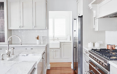
AFTER
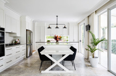
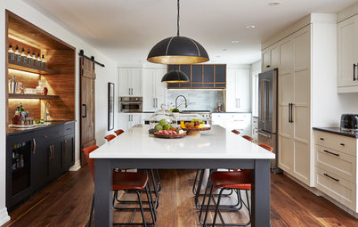
The partition that separated the kitchen from the hallway has now been demolished, letting light into the room and enlarging it. The use of white and blue on the walls, and sheer white curtains at the windows, enhances the brightness.
The layout has been completely revised. Only the stove and sink remain in their original location – Chachignon kept them in the same positions to avoid digging into the soil and increasing the cost of the work. “The sink wasn’t even, so we had to juggle the furniture around to integrate each piece into the space we chose for it. For example, the benchtop isn’t a perfect rectangle,” says Chachignon.
The owners were charmed by the idea of having a freestanding central island, which creates a big table where everyone can sit. “It was important for them to introduce the concept of conviviality,” says Chachignon. On the top of the island, the owners now have a small herb garden at their fingertips.
The architect also worked on a double lighting system. The ceiling-mounted spotlights illuminate the area dedicated to electrical appliances, while the island and table have their own pendant lamps.
Pendant lights: Hem
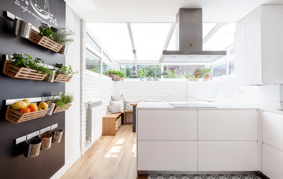
The position of the oven and stove was dictated by the layout of the house. Chachignon decided to install them in the unit against the wall facing the street, so the extractor duct could easily run to the outside. The niche in the wall to the left was repainted and redesigned to perfectly harmonise with the new space.
Today, the kitchen combines wood- and stone-look materials for a contemporary scheme. The furniture is laminated with a grey oxide finish to create the illusion of an anthracite stone. The benchtop around the stove is white to enhance the light, while the island benchtop is wood-effect laminate to avoid a ‘sanitary’ look.
Chachignon has chosen wood-imitation ceramic tiles for the flooring. This material is hard-wearing, easy to clean, and looks realistic. “You can almost see the wood grain,” she says. Finally, the electronic appliances and lighting are made of stainless steel to bring an industrial feel to the room.
BEFORE
Just like the original kitchen, the former living room was very outdated, with inadequate and unappealing storage. The owners never spent time in this dark, narrow room.
Just like the original kitchen, the former living room was very outdated, with inadequate and unappealing storage. The owners never spent time in this dark, narrow room.
AFTER
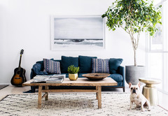
The original storage cupboard has been replaced by a large piece of furniture Chachignon likes to call ‘the dining library’. It provides vertical storage space right up to the ceiling, at odds with the other elements of the kitchen area, where the owners didn’t want any wall units.
“By varying the heights of the furniture, I created several zones according to the purposes of the new room,” says the architect. The dining library contains all the kitchen utensils, such as tableware, and unsightly appliances, such as the microwave. The open shelves house personal accessories.
The 3.4m-long dining table protrudes from the unit. It creates a friendly space around which the whole family can gather. “These elements allow for free movement and lingering,” says Chachignon.
The fireplace has been kept and repainted. In order to soften its final look, which could have taken away from the library, Chachignon painted it in white and the same dark grey used for the window frames.
“The light in the dining area comes from an LED strip installed in the library unit, and from the pendant lamps hanging above the table,” says the architect.
White pendant lamps: Tradition
“The light in the dining area comes from an LED strip installed in the library unit, and from the pendant lamps hanging above the table,” says the architect.
White pendant lamps: Tradition
“This image shows the sweetness of the composition, both in terms of materials and colours. The result isn’t flashy and has a minimalist character,” says Chachignon.
Chairs: Hay
Chairs: Hay
BEFORE
The central hallway separated the kitchen, on the right, and the living room, on the left. The floor wasn’t on the same level as the other two rooms. “It was sloping from the door, so we had to level it before installing the new flooring,” says Chachignon.
The house originally had a double-door entrance. Since it opened almost directly onto the street, the owners preferred to get rid of this entrance and create a new, more distant one. The area was used as a storeroom and its potential was unexploited.
AFTER
The old hall gave way to a blue-painted dropped ceiling. This adds interest to the space and helps to zone the kitchen and dining areas. “The room is about 35 square metres; it was necessary to restore proportions and recreate the segmentation between the kitchen and the dining room. Everything is highlighted by spotlights placed in a line, inviting you to the entrance,” says Chachignon.
Niches were embedded in the central island to break its solid appearance and make it lighter.
The old double-door entrance has been turned into an indoor garden, regaining its value. “The plants transform the room and make you want to linger in here,” Chachignon says.
The kitchen-diner, once a dead zone of the house, is now the place where the owners and their family spend most of their time.
The kitchen-diner, once a dead zone of the house, is now the place where the owners and their family spend most of their time.
Who lives here: A Belgian couple during their holidays
Location: A Provençal village, France
Size: 35 square metres
Budget: Around AU$55,000
Project completed: 2016
Interior architect: Anne-Astrid Chachignon of Maztri
Photos by Maztri
The owners knew how they wanted this kitchen-dining space to look. “They like contemporary design that remains very fresh,” says interior architect Anne-Astrid Chachignon. “The decor had to be fit for a holiday home and complement what they’d already done in the living room.”
For this, Chachignon combined three of the original rooms – the kitchen, the living room and the hallway between them, creating an airy, open space of about 35 square metres, which the designer then split into two zones – the kitchen and the dining area. This new space takes advantage of the natural light shining through from the old lobby.
One of the main obstacles Chachignon had to face during this project were the irregular walls of the building. “The house is old and a bit twisted. During the renovation, we noticed the floors and walls weren’t even. At that point, it was impossible to precisely follow the plans, and my presence on-site was indispensable for the project’s continuation,” she says.