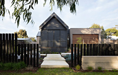
Stickybeak of the Week: A Tender Update for a Blended Family Home
Merging styles and possessions is not always an easy feat, though this family house embraces both with a fresh new look

Five years ago, this home in Sydney, NSW, was in need of a sensitive update when the owner’s partner and her children joined him and his teenagers under the one roof. The brief was not simply stylistic, it encompassed a refresh that reflected the different lifestyle of the newly blended family.
The hallway before works
“This meant being sympathetic to the items that each family brought with them, such as artwork and special pieces of furniture, and to find a way to bring them together in a cohesive, harmonious way to create a beautiful and functional home.”
The house was in good condition and met the family’s core needs when McMillan first stepped on-site, so the brief centred around refreshing the interior and creating an airy, light-soaked space.
The entrance after works, which still features the original black-framed mirror and pendant light that previously hung in the space
“The owner, by his own admission, hadn’t really given too much thought to design and styling when he moved in, however his partner had a keen eye for style and loved a more contemporary look,” says McMillan.
“The open flow of the house worked well to maximise indoor/outdoor living, however the colour scheme was quite masculine and dark with beige walls and heavy, chocolate linen curtains and blinds,” says McMillan.
Need help pulling your own scheme together? Find an interior designer near you on Houzz to create your dream home
The entrance before works
Those dated beige walls and chocolate-coloured window coverings were some of the first features to go. To take their place, McMillan specified a bright, neutral colour scheme.
“The walls were painted in Dulux Natural White to create a bright yet warm base, and I replaced all the dark heavy window treatments with light white blinds, painted bamboo, plantation shutters and white linen throughout the home,” says McMillan.
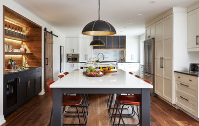
The kitchen before works
The project was as much a study in editing the couple’s collections as it was redesigning the interiors, so McMillan began by making those often-tough decisions. “Bringing my clients’ individual styles together was sometimes challenging, so being able to recommend what should stay, what needed to go, and what new acquisitions were required was an important step,” she says.
Much of the home’s existing furniture and features reapplied for their roles and were happily accepted into the new scheme.
The kitchen after works, with existing fixtures and fittings but a new colour scheme, furnishings and window treatments
In the kitchen, McMillan kept the original cabinetry and joinery, benchtops, wooden floors and black pendant lights above the island bench. “Managing cost by retaining existing joinery allowed us to maximise the budget and focus on high-impact items, such as window treatments, the ensuite, light fittings and artwork,” says McMillan.
In the kitchen, McMillan kept the original cabinetry and joinery, benchtops, wooden floors and black pendant lights above the island bench. “Managing cost by retaining existing joinery allowed us to maximise the budget and focus on high-impact items, such as window treatments, the ensuite, light fittings and artwork,” says McMillan.
The overriding style McMillan pursued was ‘relaxed coastal’, but McMillan was wary of resorting to clichés and tried to steer clear of predefined styles.
“I set about bringing together a more unique, eclectic and contemporary coastal feeling,” she says. “This was a key driver of the colour scheme I chose. It made sense to use a soft white base, warmed up with lots of natural textures and blue/green accessories.
“My clients were very open to new ideas to inject fresh life into their home and were keen to add a slightly more contemporary edge to the otherwise traditional space.”
The living room before works
In the living area, much of the joinery retained pride of place and seamlessly fitted into the home’s fresh new style.
In the living area, much of the joinery retained pride of place and seamlessly fitted into the home’s fresh new style.
The living room before works
McMillan is a big believer in the power of statement lighting, and prioritised contemporary “feature” lighting fixtures in the project budget.
McMillan is a big believer in the power of statement lighting, and prioritised contemporary “feature” lighting fixtures in the project budget.
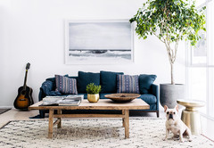
The living room after works, which mixes existing and introduced elements
“I was keen for the lighting to reflect a more relaxed, fresh coastal feeling, so I replaced the heavy metal chandelier lights with white clay-bead chandeliers,” says McMillan. “By lightening up the overhead colour scheme it helped add to the airy, light and open feeling.”
Pendant light: Zohi Interiors
As well as brightening the room, McMillan focused on its tactility. “I added lots of textural elements for interest – rattan blinds and furniture, linen-covered sofas and cushions, and loads of greenery to create a fresh airy feel,” she says.
The dining area before works
This approach of concentrating on the stylistic essentials and retaining the rest makes a strong case for waste not, want not. When facing a home that calls for a makeover but not a whole new identity, why not keep the fixtures and simply update them?
This approach of concentrating on the stylistic essentials and retaining the rest makes a strong case for waste not, want not. When facing a home that calls for a makeover but not a whole new identity, why not keep the fixtures and simply update them?
The dining area before works
“Some furniture items were reused from the couple’s existing furniture, including the large mirrors, dining chairs and other furniture pieces,” says McMillan. “I did not want it to feel like it had just been copied from a furniture showroom or magazine.”
“Some furniture items were reused from the couple’s existing furniture, including the large mirrors, dining chairs and other furniture pieces,” says McMillan. “I did not want it to feel like it had just been copied from a furniture showroom or magazine.”
The dining area after works, with new statement lighting and a blend of old and new furnishings
Here you can see the new white clay-bead chandeliers – the crowning features in the living and dining rooms. The existing dining chairs gained a fresh new look when McMillan teamed them with surrounding crisp white furnishings.
“My clients love the sense of light and openness that the new colour scheme has brought into the home,” says McMillan. “Being predominantly east-facing, it previously felt quite dull and drab, but the light now bounces around the internal spaces and creates a beautiful, bright and airy feeling.”
Pendant lights: Zohi Interiors
Too often, when homeowners decide to ditch a beige and greyscale colour scheme they instead increase the contrast, which can result in a flat black and white interior lacking in tonal depth. McMillan was careful not to strip the interior entirely of colour, and introduced pops of punchy hues through artwork and soft furnishings.
“The greatest highlight was a stunning piece of artwork by Conchita Carambano for the dining room,” she says. “It brings a sense of the water views into the home.”
The artwork in question, together with the pendant lights in the living and dining rooms, were ‘splurge’ items in the project’s budget. “In other rooms the budget was focussed on a fresh new colour scheme – including carpet, painting and window treatments,” says McMillan.
Dining room artwork ‘Lagoon’s Way’ by Conchita Carambano: Harvey Galleries
The master bedroom after works, with new furnishings and existing joinery
“The master suite, particularly the ensuite, received most of the budget,” says McMillan. “The previous master bedroom was a little dull with beige walls and very heavy dark curtains. New carpet, paint colours, window treatments and furniture gave it a fresh, contemporary feel and helped highlight the stunning view.”
To minimise costs, McMillan once again retained the existing joinery, which blends into the updated scheme without a hitch.
The master ensuite after works, which received a full renovation
“The layout and style of the master ensuite was not working well, so was ripe for a renovation and update,” says McMillan. “The floor plan was changed significantly to move and hide the toilet from view on entry. I also removed the bath to give more room to allow for a beautiful big walk-in shower and double vanity, plus I added a skylight to let in lots of natural sunlight.”
“The layout and style of the master ensuite was not working well, so was ripe for a renovation and update,” says McMillan. “The floor plan was changed significantly to move and hide the toilet from view on entry. I also removed the bath to give more room to allow for a beautiful big walk-in shower and double vanity, plus I added a skylight to let in lots of natural sunlight.”
The generous mirrors reflect and increase the natural light and McMillan replaced the original dark floor and wall tiles with lighter selections. Hexagonal Carrara marble mosaics infuse the walls with textural depth and prevent the monochromatic room from appearing two-dimensional.
Carrara marble mosaics, floor tiles, tapware and vanity: ColorTile Brookvale
Carrara marble mosaics, floor tiles, tapware and vanity: ColorTile Brookvale
“I believe a home tells a story of the people who live there – their interests, their travels and their family,” says McMillan. “For me, that means integrating items that have special meaning and adding layers of interest into the design to create a home that is personal and unique, rather than looking like a show home.” We couldn’t have said it better ourselves.
Your turn
What do you love most about this sensitive home makeover? Tell us in the Comments below, like this story, save the images for inspiration, and join the conversation.
More
Love home transformations? Check out this Before & After: An Angular Apartment Updated With Modern Storage
Your turn
What do you love most about this sensitive home makeover? Tell us in the Comments below, like this story, save the images for inspiration, and join the conversation.
More
Love home transformations? Check out this Before & After: An Angular Apartment Updated With Modern Storage

Sponsored
Who lives here: A couple and their blended family including three teenagers and two dogs
Location: Mosman, NSW
Size: Five bedrooms and three bathrooms on approximately 1,000 square metres
Budget: Approximately $100,000
Interior designer: Anna McMillan of McMillan Design
To help blend past and present, the couple called on interior designer Anna McMillan of McMillan Design. “It was important to them that they create a fresh look and feel to better reflect their new family set-up,” says McMillan.