


Stickybeak of the Week: Red Revs Up a Practical Kitchen
A homeowner's Dutch heritage and a love of the colour red delivers a kitchen revamp with a difference
Becky Harris
22 June 2015
Houzz Contributor. Hi there! I live in a 1940s cottage in Atlanta that I'll describe as "collected."
I got into design via Landscape Architecture, which I studied at the University of Virginia.
Houzz Contributor. Hi there! I live in a 1940s cottage in Atlanta that I'll describe... More
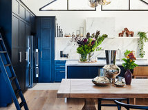
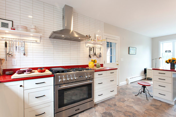
“My client’s main criteria for this kitchen was that it had to have red benchtops,” says interior designer Lorey Cavanaugh. While she’d never used red benchtops before, Cavanaugh is a big fan of the colour herself – in fact, it’s her signature colour. “Without having to even think about it, I told her, ‘I’m all-in!’” she says.
The homeowner’s family tree is rooted in the Netherlands, so the designer also wanted to bring a Scandinavian modern feel to this kitchen in a way that worked with the rest of her 1920s brick colonial-style home in Connecticut. With a mix of clean lines and white with warmer touches, the kitchen strikes a beautiful balance that suits the home and has modern European flair.
The homeowner’s family tree is rooted in the Netherlands, so the designer also wanted to bring a Scandinavian modern feel to this kitchen in a way that worked with the rest of her 1920s brick colonial-style home in Connecticut. With a mix of clean lines and white with warmer touches, the kitchen strikes a beautiful balance that suits the home and has modern European flair.
Photos by Chrissy Racho
Kitchen at a Glance
Who lives here: A couple of empty nesters
Location: Hartford, Connecticut, USA
Size: 26 square metres
Cavanaugh describes the ‘before’ situation as “a very plain-Jane renovation” complete with timber cabinets, white appliances and laminate benchtops. There were no signs of the original 1920s version of the kitchen, and the layout was awkward and clunky, without much convenient bench space near the stove.
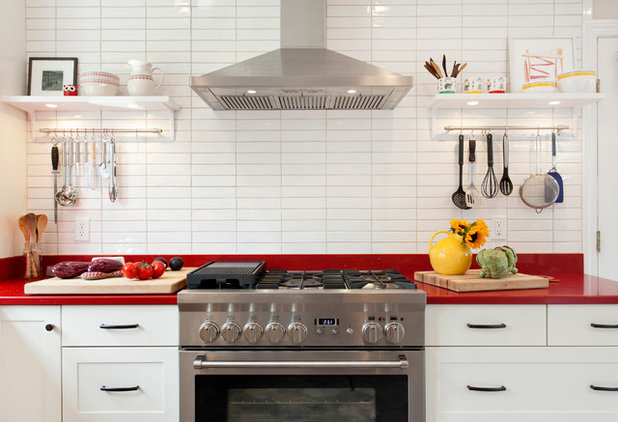
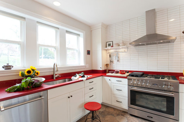
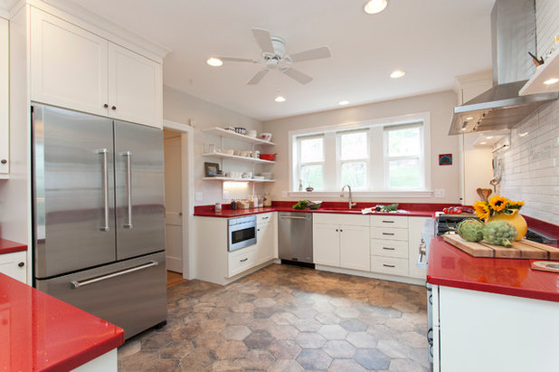
Previously, there had been a bulky refrigerator right next to the stove, which cut down on precious workspace. Now the new Aga stove and chimney-style rangehood are centred on the wall, with plenty of space on either side. Hanging rods keep cooking utensils handy.
Kitchen at a Glance
Who lives here: A couple of empty nesters
Location: Hartford, Connecticut, USA
Size: 26 square metres
Cavanaugh describes the ‘before’ situation as “a very plain-Jane renovation” complete with timber cabinets, white appliances and laminate benchtops. There were no signs of the original 1920s version of the kitchen, and the layout was awkward and clunky, without much convenient bench space near the stove.
Previously, there had been a bulky refrigerator right next to the stove, which cut down on precious workspace. Now the new Aga stove and chimney-style rangehood are centred on the wall, with plenty of space on either side. Hanging rods keep cooking utensils handy.
The clean lines, crisp white finishes and Aga stove lend a Scandinavian look. “This kitchen is a little bit of a stretch for a Connecticut colonial, but the Shaker cabinets and oil-rubbed-bronze hardware are more in keeping with it,” Cavanaugh says. “Using flat or no-panel cabinet fronts with more modern hardware would have made it more European but less fitting for the home.” This way, she’s mingled the best of both worlds.
Large hexagonal floor tiles help warm the space. They are porcelain, but their Chicago Brick finish gives them more of an old-world look that contrasts with all the crisp white.
Red Jewel benchtops: ColorQuartz; Suprema Gloss Crystal White tile: handcrafted in Mexico; Ultracraft Plainview cabinets in Maple, in Beach White colour; hardware: Top Knobs; Chicago ‘State Street’ Esagona hex floor tile; Venuto pull-down faucet: Brizo
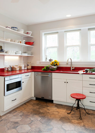
TIP: Install a benchtop cabinet where the bench space is not usable. The benchtop in the corner here is hard to reach and would not have been used for any work. So Cavanaugh gave her client a spot to store herbs, oils and other supplies she’ll need when cooking, within arm’s reach of the stove. The way it extends from benchtop to ceiling adds to the clean-lined architecture of the room.
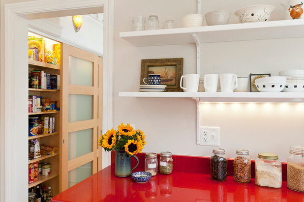
“The open shelves and the homeowner’s accessories also help to warm up the kitchen and soften all of the clean lines,” Cavanaugh says. Open shelves in lieu of cabinets keep an airy feeling in the kitchen; under-shelf lighting gives the room a happy glow.
Here you can see the new sliding pantry doors. Their fir wood is another element that adds warmth.
Here you can see the new sliding pantry doors. Their fir wood is another element that adds warmth.
Moving the refrigerator made the kitchen more comfortable and less jammed up. Double wall ovens used to be mounted in the fridge’s current spot. The new Aga stove eliminated the need for them.
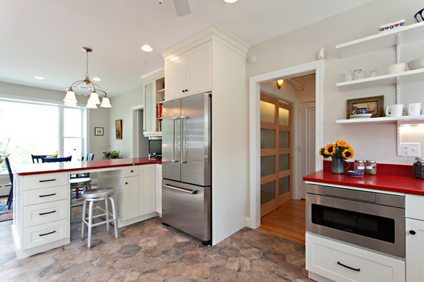
The pantry used to have two framed closet doors and was awkwardly placed and laid out. “The back hallway is a busy thoroughfare, and those doors swinging out made access challenging,” Cavanaugh explains. Now sliding doors with frosted glass make the pantry more accessible and organised. New lighting inside makes it easy to see the food, while frosted glass keeps it from looking cluttered.
Spin stool: Crate & Barrel; Simpson pantry doors in light fir with obscure satin etch glass: Brosco
Spin stool: Crate & Barrel; Simpson pantry doors in light fir with obscure satin etch glass: Brosco
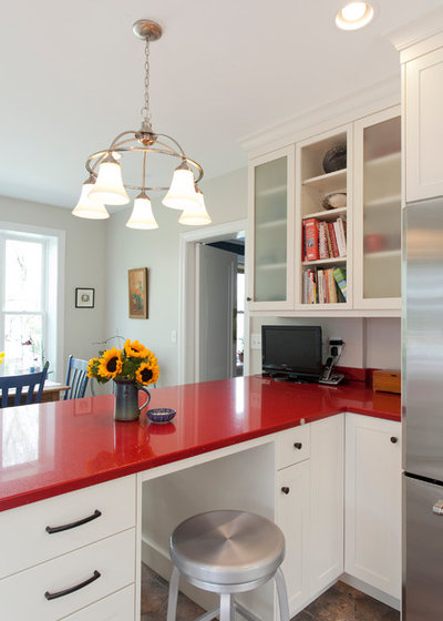
Cavanaugh repeated the frosted glass detail on these cabinets. They occupy a space between the working part of the kitchen and the eat-in part of the kitchen, and are great for storing cookbooks.
There was a peninsula in this spot before, but the new one is wider, with better storage and seating. Just across from it is the eat-in area. This area was existing, but everyone always sensed that something was off about it.
“I extended the window down 18 inches [45 centimetres],” Cavanaugh says. “It was in this awkwardly high spot; we assume the original kitchen had the sink underneath it and that someone flipped the room around years ago.” As it turned out, it was fortuitous that the designer was messing around with that window; during construction they discovered it had been installed incorrectly and was causing the exterior brick above it to crack. They were able to do the unexpected repair work and saved the house from really costly damage down the line.
The new kitchen is functional, cheerful, updated, warm and welcoming.
TELL US
Would you consider colourful benchtops? No consideration of home resale is allowed – this is all about you and not some fictional future buyers! Let us know in the Comments section.
TELL US
Would you consider colourful benchtops? No consideration of home resale is allowed – this is all about you and not some fictional future buyers! Let us know in the Comments section.
Related Stories
Stickybeak Of The Week
Stickybeak: How an Interior Designer Gave an Apartment 'Soul'
Matt black and crisp white surfaces are layered with texture and greenery to give this apartment heart and soul
Full Story
Contemporary Homes
Stickybeak: A Controversial Welcome for a Contemporary Home
Meet the brave new home that breaks the rules, and read the story of how the design came to fruition
Full Story
Houzz Tours
Stickybeak of the Week: Creative Rethink Welcomes a Family Home
Bespoke storage and a floor plan rejig created just the house this family needed when they swapped New York for Sydney
Full Story
Sustainable Homes
Stickybeak: A Designer's Sustainable Home for the Future
Energy efficiency and locally produced materials make a statement in this designer's family home
Full Story
Stickybeak Of The Week
Stickybeak of the Week: A Florist's Home Gets a Resort Makeover
A contemporary extension and pool-side pavilion give this Federation bungalow a holiday vibe year-round
Full Story
Storage
Stickybeak of the Week: A Small Apartment With Big Storage
Dual-purpose furniture was the key to making this compact living space a success for its busy professional owner
Full Story
Stickybeak Of The Week
Stickybeak of the Week: A Living Space Thought Out Inside the Box
Jules and Mick Moloney have thought outside the box to create their family living space, contained inside a box
Full Story
Stickybeak Of The Week
Stickybeak of the Week: A Tender Update for a Blended Family Home
Merging styles and possessions is not always an easy feat, though this family house embraces both with a fresh new look
Full Story
Architecture
Stickybeak of the Week: Connected Pavilions Create a Dynamic Home
A series of unique living pavilions are connected around a courtyard for a versatile layout that's intimate yet open
Full Story
Stickybeak Of The Week
Stickybeak: A Bit on the Side for a New Ensuite and Bedroom
A small addition in a side setback provides space for a new ensuite and an updated bedroom
Full Story
You are allowed to go 'bold' in 1 element of your new kitchen. It's important to use it wisely. If you are going to be daring in the countertop, we would recommend that you choose a material that will look rich, especially if it's bright, like red or green.
This homeowner always wanted granite so she chose to deviate in color to a green granite. THe tones were just right. When you pick a slab, many times there are scores of shades, so choose a slab that has alot of the 'tone you love'.
The rest of the tones are just to balance it and give it texture. Then bring in accessories in other locations of the room to pick up those tones. Now you have a kitchen that is pulled together. Have fun with it and enjoy the journey and you'll inevitibly enjoy your new kitchen that reflects your personal style!
Amazing article.