


Successfully Mix Timber Types (and Avoid the Ski Lodge Look)
How to make different timber tones work for you by using the rule of three, and considering texture and pattern
tidgboutique
16 September 2015
Toronto Interior Design Group is a trusted one-stop-shop residential interior design concierge boutique-style firm crafting timeless interiors.
Toronto Interior Design Group is a trusted one-stop-shop residential interior design... More
Timber is a timeless material, but lately it seems to be more popular than ever. There’s a species for every purpose and style. Need something durable? Want something rustic? Or exotic? How about cheap? There’s a timber for that. But having all those choices also makes many homeowners wonder, when is it too much? To help you coordinate multiple types of timber in your space without making it look like a timber yard or ski lodge, here are 11 things to consider when mixing timber types.
THE RULE OF THREE
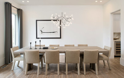
In general, it’s safest to stick to a maximum of just three timber tones in a space. This allows each to be distinct. By using a pale tone for the floor, a dark tone for major furnishings, such as cabinets, and a mid-tone for accents, you can keep the space structured.
In general, it’s safest to stick to a maximum of just three timber tones in a space. This allows each to be distinct. By using a pale tone for the floor, a dark tone for major furnishings, such as cabinets, and a mid-tone for accents, you can keep the space structured.
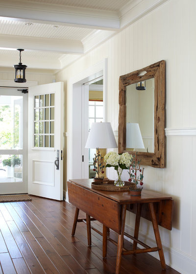
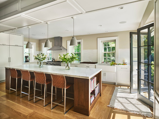
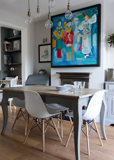
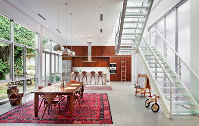
That being said, you can rearrange these three tones, or even break the rule completely, as was done in the home shown here. Notice that this space still includes distinct dark, mid and light tones, with the lightest tone matching throughout for a sense of consistency. The clear divisions between timbers make it obvious that the contrast is intentional and that the timbers are not mismatched.
Although the rule of three can be helpful, it’s not the only approach to mixing timbers. In fact, the exact opposite works well too. Notice how in this space the walls are multi-tonal, and none of the timbers are extremely dark. By using the walls or floor to establish a varied colour palette and then pulling from within it (like pulling paint colours from a fabric), you can ensure that the timbers blend together beautifully.
More: Rejoice in the Charm of Timber-Lined Walls
More: Rejoice in the Charm of Timber-Lined Walls
MONOTONE
Another approach to coordinating different timbers is to stick to one approximate tone and enjoy the beauty of the subtle differences between them. Just make sure to use several different varieties (and follow the next tip on texture) to firmly establish the palette,
Another approach to coordinating different timbers is to stick to one approximate tone and enjoy the beauty of the subtle differences between them. Just make sure to use several different varieties (and follow the next tip on texture) to firmly establish the palette,
TEXTURE
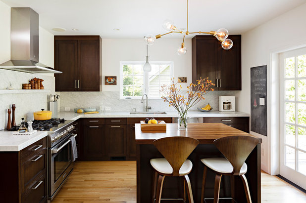
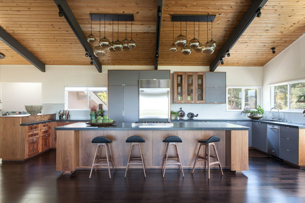
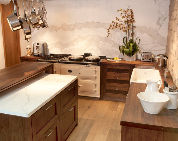
An important consideration when combining timbers is the texture of each surface. Contrasting rough and smooth finishes or wide and small planks will help disparate timbers work together. Here, the ceiling treatment and island are a similar tone, but the totally different installations give them their own identities so they don’t match or clash.
An important consideration when combining timbers is the texture of each surface. Contrasting rough and smooth finishes or wide and small planks will help disparate timbers work together. Here, the ceiling treatment and island are a similar tone, but the totally different installations give them their own identities so they don’t match or clash.
LIVE-EDGE SURFACES
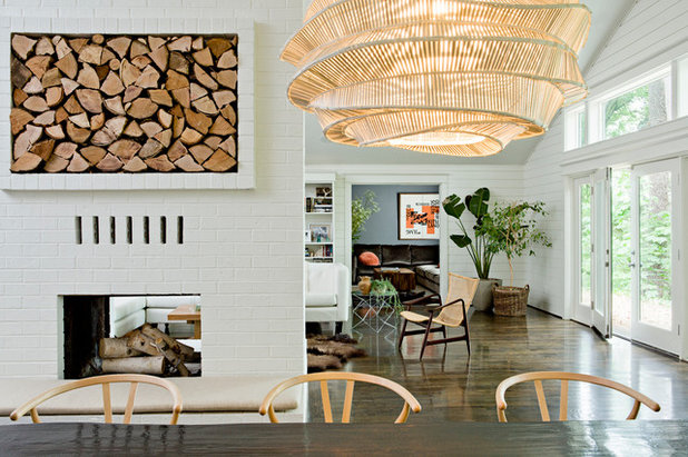
The textural quality of a live-edge timber surface, such as on the table and bench here, creates a beautiful contrast against a more ‘perfect’ timber, such as a sleek, glossy floor. Use this to help add dimension to a timber-heavy space, and to enjoy the unique beauty of a one-of-a-kind piece.
The textural quality of a live-edge timber surface, such as on the table and bench here, creates a beautiful contrast against a more ‘perfect’ timber, such as a sleek, glossy floor. Use this to help add dimension to a timber-heavy space, and to enjoy the unique beauty of a one-of-a-kind piece.
PATTERN
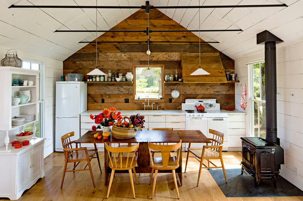
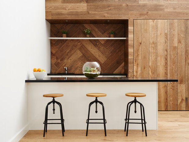
The designer of this kitchen used variety and obvious contrast by playing with the laying of the timber planks. The chevron layout in the splashback area creates a subtle feature while still allowing the wall to feel harmonious. The fact that the timber wall is multi-tonal also helps it connect to the floor and stools, so the palette is harmonious across all the surfaces.
16 timber kitchens to inspire you
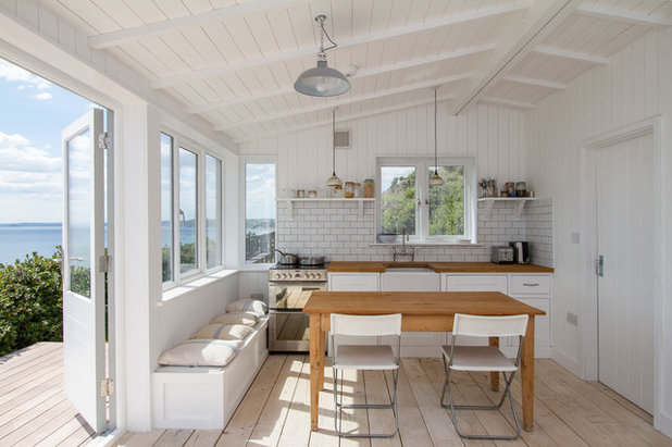
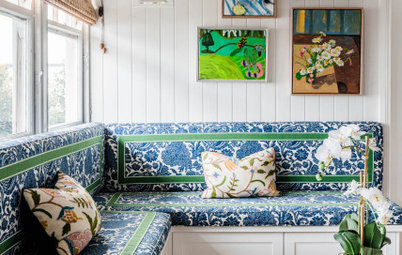
COTTAGE STYLE
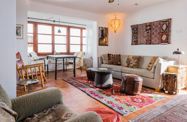
In this room, quite a few timber tones are present, but they’re all pale or painted and broken up by fabrics; for example, the rug separates the timber chairs from the floor. Sticking to these beachy tones mixed with classic blue is a safe bet, and you can always add a rug if it feels as though the timber is taking over.
In this room, quite a few timber tones are present, but they’re all pale or painted and broken up by fabrics; for example, the rug separates the timber chairs from the floor. Sticking to these beachy tones mixed with classic blue is a safe bet, and you can always add a rug if it feels as though the timber is taking over.
TIMBER-TONE ALTERNATIVES
If you love the look of timber but don’t want it to take over your whole home, you can ‘cheat’ with these alternative finishes.
Stone
Subtle stone with faint marbling is a perfect counterpoint to rich timbers, continuing the natural theme without fighting for attention. In this example, a colourful tile might have fought the timber, and a timber splashback could have been too much, but the subtle stone lets the timber speak for itself.
Leather
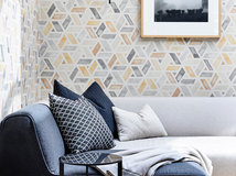
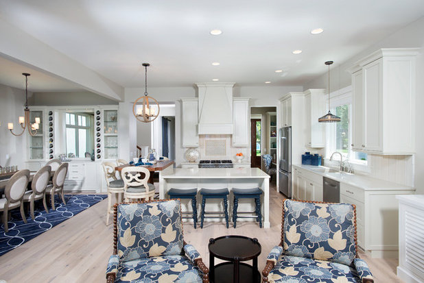
Leather has a similar colour palette to timber and a natural visual softness, making it a great alternative to adding a third timber tone – especially in a basket-weave pattern, like on these stools, or in another extra-textural finish, such as one with a quilted stitch.
Leather has a similar colour palette to timber and a natural visual softness, making it a great alternative to adding a third timber tone – especially in a basket-weave pattern, like on these stools, or in another extra-textural finish, such as one with a quilted stitch.
Terracotta
For a little Southern flavour, warm terracotta tiles can tie different timbers together while providing a totally different texture. Notice how this space also includes leather, as well as a mix of simple and carved timbers for a rich palette of textures.
For a little Southern flavour, warm terracotta tiles can tie different timbers together while providing a totally different texture. Notice how this space also includes leather, as well as a mix of simple and carved timbers for a rich palette of textures.
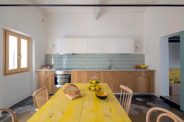
Colourful stains
A brightly coloured stain treatment is a great way to add timber to a space without worrying whether the tones match. The chairs, table and cabinets here are all different timbers, but the bright cheerful yellow obviously isn’t meant to ‘match’ any of them.
A brightly coloured stain treatment is a great way to add timber to a space without worrying whether the tones match. The chairs, table and cabinets here are all different timbers, but the bright cheerful yellow obviously isn’t meant to ‘match’ any of them.
White
The natural texture of whitewashed timber will still show through a coat of paint, making this treatment another great option for a cottage-inspired look without mismatched tones.
The natural texture of whitewashed timber will still show through a coat of paint, making this treatment another great option for a cottage-inspired look without mismatched tones.
Antiqued finishes
Rather than a solid white paint job, giving timber furnishings a worn finish preserves the raw character of the timber while still breaking up the look with some new tones. Try pale greys and green-greys for a timeless historical-home look that can suit traditional or modern schemes.
TELL US
Do you love to use timber? Let us know why and upload a picture in the Comments.
MORE
Why Wood Works So Brilliantly in the Bathroom
Kitchen Aid: 10 Ways Natural Timber Can Warm Up the Heart of Your Home
Houzz Tour: Recycled Timber Makes Room in the Family Nest
What are you working on?


Related Stories
Interior Design
The Golden Rules of Proportion: Decor Laws You Need to Know
An interior designer reveals the essential rules for achieving a perfectly balanced interior
Full Story
Most Popular
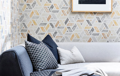
An Interior Designer's Guide to Arranging Cushions
By Anne Ellard
Get to grips with your ever-growing pile of cushions with these professional tips for choosing and arranging cushions in your home
Full Story
Decorating
The Power of Negative Space in Interior Design
By Janet Dunn
A design element that's not even there can forever change how you view your home
Full Story
Houzz Tours
Queensland Houzz: A Cute Cottage Awash With Colour and Pattern
Bold colour, quirky prints and an abundance of art transformed this 1920s cottage into an inviting and relaxing gem
Full Story
Project Of The Week
Before & After: A Cheap & Cheerful Makeover of a 1980s Caravan
Armed with an AU$1500 budget, a Melbourne couple rolled up their sleeves and transformed a caravan in just three months
Full Story
Most Popular
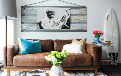
Ask the Experts: What Goes With Tan Leather?
Embrace this versatile material, colour and texture with inspirational ideas from designers in the know
Full Story
Most Popular
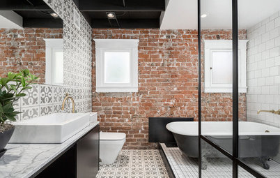
Masonry Magic: 15 Ways to Trick Out Your Exposed Brick Wall
Do you find exposed brick walls cold? Add contemporary warmth and interest with these 15 transformative ideas
Full Story
Projects Born on Houzz
Before & After: From Dump Zone to New 'Welcome Home' Living Area
Home office, yoga zone, dumping ground... this front room was having a serious identity crisis – but look at it now!
Full Story
Picture Perfect
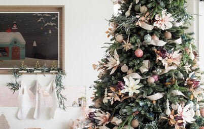
30 Christmas Schemes to Inspire and Delight
Our coffee-break escape offers you five minutes' worth of images to inspire and delight. Jump right in...
Full Story
Most Popular
16 Clever Ways to Create Zones in Open-Plan Spaces
Create distinct areas in large, open rooms with these creative design ideas – no walls or other fixed vertical structures required!
Full Story
Good article--thanks for the tips. Sad some of us want to be offended so badly.
If you're interested in this style of railing, check out Mountain Laurel Handrail
http://awoodrailing.com
Great article!