
The Case for Colour in the Bathroom
If you're contemplating using colour in the bathroom, you're making a wise choice for many different reasons. Here are some of the top ones

Choosing the right colour for what is often the smallest room in the house can be a daunting task. Whether you’re taking a quick shower before running off to work, bathing the kids or spending some quality time in the tub surrounded by bubbles, colour has an important role to play in the mood you want to create. Here are some things to keep in mind when deciding on a colour palette for your bathroom.
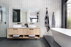
The right colours can highlight different spaces
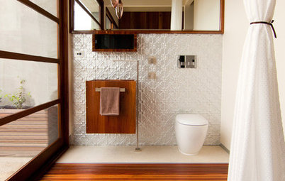
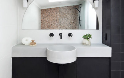
Using colour to highlight the bathtub, shower, toilet and sink is one of the best ways to provide orientation and differentiate between surfaces, particularly for children, the elderly and those with vision issues.
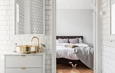
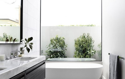
I’m not advising you to revisit the colourful bathrooms of the 1920s and 1930s (unless, of course, you’re a big fan). Instead, use bursts of colour or trim to contrast and highlight specific fixtures. Placing a white bathtub against brightly coloured tiles, laying a mid-toned to dark floor beneath a white toilet, or using a timber vanity to highlight a white sink, are some examples of this.
Using colour to highlight the bathtub, shower, toilet and sink is one of the best ways to provide orientation and differentiate between surfaces, particularly for children, the elderly and those with vision issues.
I’m not advising you to revisit the colourful bathrooms of the 1920s and 1930s (unless, of course, you’re a big fan). Instead, use bursts of colour or trim to contrast and highlight specific fixtures. Placing a white bathtub against brightly coloured tiles, laying a mid-toned to dark floor beneath a white toilet, or using a timber vanity to highlight a white sink, are some examples of this.
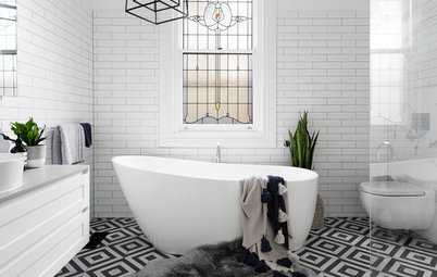
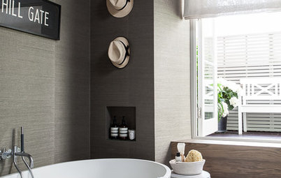
An absence of colour can be disorientating
An all-white palette can reinforce a sense of cleanliness, personal hygiene and space, but if your all-white bathroom has large mirrors, bright lights and glossy tiles, the room can become overly reflective and disorientating. If you’ve ever been caught in a whiteout, you should get the gist of what I’m saying.
If you insist on going with a mainly white palette, be sure to use at least two other colours, and always choose a darker tone for the floor, to ensure the room feels grounded and to keep danger at bay.
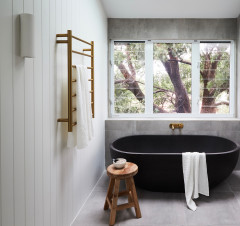
Add drama to a white bathroom
An all-white palette can reinforce a sense of cleanliness, personal hygiene and space, but if your all-white bathroom has large mirrors, bright lights and glossy tiles, the room can become overly reflective and disorientating. If you’ve ever been caught in a whiteout, you should get the gist of what I’m saying.
If you insist on going with a mainly white palette, be sure to use at least two other colours, and always choose a darker tone for the floor, to ensure the room feels grounded and to keep danger at bay.
Add drama to a white bathroom
Colour reflects and absorbs light
There are a few other things to keep in mind when choosing the colour palette for your bathroom:
There are a few other things to keep in mind when choosing the colour palette for your bathroom:
- Dark colours will close the bathroom in, swallow the light and may reflect on skin to produce a less than flattering tone. Be sure to test your chosen colours in the room’s light, both natural and artificial, before deciding on a dark tone. If renovating an existing space, use swatches of the coloured material under the proposed lighting. Alternatively, take advantage of the many paint suppliers or hardware stores that have small lighting booths to check out paint swatches.
- Too much colour will overload a small space, and remember that lots of visual patterning can have the same disorientating effect as an all-white bathroom.
- Light reflection becomes higher when using gloss or enamel on surfaces, resulting in glare so garish that it can cause eye strain.
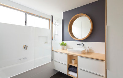
Colour can play by your style rules
The bathroom presents the perfect opportunity to be bold with colour. There are no hard or fast rules on colour choices – think about which colours you and your family like best and go from there.
The bathroom presents the perfect opportunity to be bold with colour. There are no hard or fast rules on colour choices – think about which colours you and your family like best and go from there.
One client of mine, who lived alone, just loved orange. Given that his small, cold bathroom was facing south and had only a tiny window, I was able to warm up the room with some bold orange and turquoise towels as accent colours. Not my personal choice, but he was ecstatic and it worked.
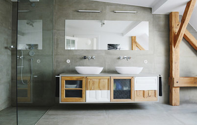
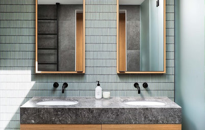
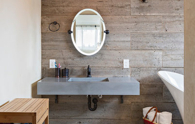
Natural timber and shades of grey can make a bathroom look contemporary and sophisticated.
Bold bathrooms for the colour shy
Bold bathrooms for the colour shy
Yellow and black can add wow factor to any bathroom or powder room, but be sure the light is bright enough to ensure the black doesn’t close in the space.
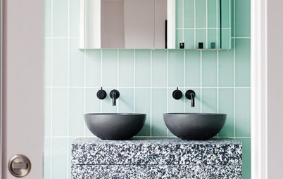
Blue in the bathroom can look cool and contemporary when brought into the space through the use of multi-toned tiles such as these.
Getting the colour balance right
A failsafe approach is to use the rule of three as a guiding principle when deciding on colours for your bathroom. Pick one neutral colour, one rich colour and one accent colour in a ratio of 7:2:1. Use the lightest colour in 70 per cent of the room, the second lightest at 20 per cent and the accent at 10 per cent. It’s a simple formula, but it works.
Make a splash with coloured bathware
Don’t forget the climate…
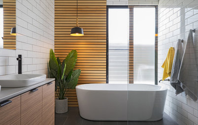
As in any room, colour can be used to compensate or complement things such as temperature. For example, cooling blue-green can be used to compensate a warm or humid bathroom or complement an already cold one. Alternatively, warm colours such as oranges, yellow and reds may warm things up a little in a cold bathroom.
As in any room, colour can be used to compensate or complement things such as temperature. For example, cooling blue-green can be used to compensate a warm or humid bathroom or complement an already cold one. Alternatively, warm colours such as oranges, yellow and reds may warm things up a little in a cold bathroom.
Finally, if you’re still stuck on choosing a colour palette, don’t be afraid to ask the advice of a professional. Many hardware and paint shops have in-house colour consultants who are only too willing to offer free advice.
TELL US
How have you used colour in your bathroom? Were you happy with the results? Share your thoughts and photos in the comments section below.
MORE
10 Bold Bathrooms for the Colour Shy
15 Bathroom Trends Splashing Down in 2016
Safety First: Look-Ahead Design Strategies for a Future-Proof Bathroom
Injuries in the bathroom are so common that every year thousands of people end up in hospital, whether because of burns and scalds, falls or poisoning. Splashes from showers and baths can make tiled surfaces slippery, as can condensation from warm, humid air.
Bring in electrical appliances such as shavers, heaters and hair dryers, and the hazards start to add up. The good news is that carefully considered colour choices can help prevent accidents, by grounding and differentiating spaces and surfaces within the room, making objects and obstacles more obvious.