

Trend Report: The Colour Schemes Set to Influence us in 2018
Green, beige, and terracotta are on everyone's lips after January's Maison & Objet – but how do we decorate with them?
Agnès Carpentier
14 February 2018
For the last two years midnight blue, curry yellow and burgundy have been the centre of attention at fairs and in Houzz users’ living rooms. Now, however, fir green, beige and terracotta are starting to steal the show. January’s Maison & Objet trade fair made it clear that an earth-tone universe is poised to take over our interiors as we fall more and more in love with everything to do with nature. So how do you use these new trends to put together dynamic and welcoming spaces?
The year of monochrome shades
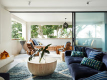
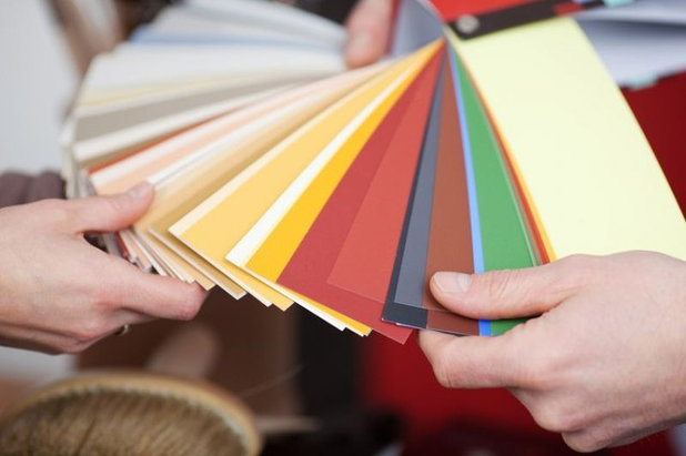
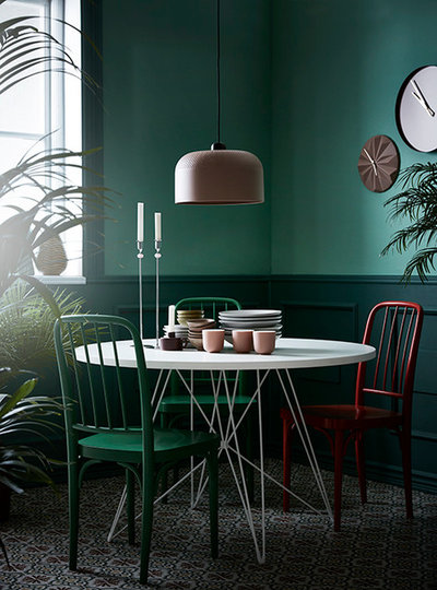
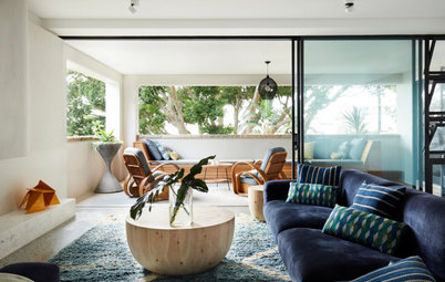
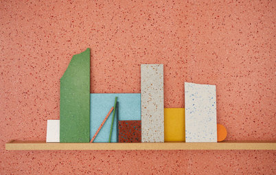
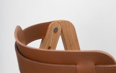
To really master the 2018 colour wheel, you will need to be a mix-and-match expert and have especially good command of the art of matching different shades. Pairs of shades of the same colour are especially on trend, showing up as both subtle variations on the same colour or, as here, a vivid hue being supported by a pastel cousin.
To really master the 2018 colour wheel, you will need to be a mix-and-match expert and have especially good command of the art of matching different shades. Pairs of shades of the same colour are especially on trend, showing up as both subtle variations on the same colour or, as here, a vivid hue being supported by a pastel cousin.
The year of contrasts
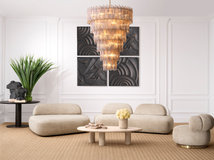
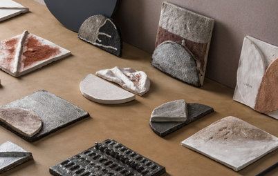
A strict colour scheme can create a soft and cosy feel, but it can also border on monotony. That’s why beautiful black and gold are appearing more and more as a way to enhance contrasts and brighten things up with understated touches.
Designers and stylists are also increasingly playing with textures: smooth and rough, matt and shiny, plain and ornamented. Patterns are also stepping to the fore. At the fair, geometric patterns were used to add liveliness to more conventional arrangements.
The combinations to master
The following monochrome schemes and colour contrasts revolve around a number of key hues that will start making their way into our homes in 2018.
The following monochrome schemes and colour contrasts revolve around a number of key hues that will start making their way into our homes in 2018.
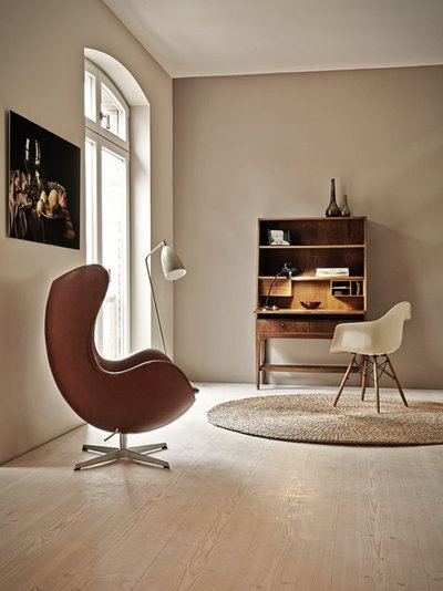
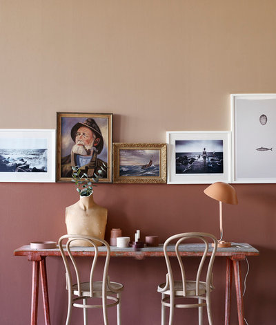
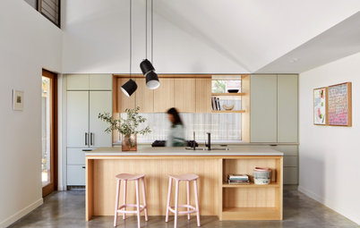
Beige to brown: Beige, the colour of raw, un-dyed wool, is a safe bet for 2018. We interpreted its resurgence at Maison & Objet as an allegiance to purity and authenticity, a desire to get back to nature. Beige has been making a foray into design trends for several years now, but this year it shines on its own, rather than as a background to other colours.
12 Beige Rooms That Are Anything but Boring
12 Beige Rooms That Are Anything but Boring
This new beige-to-brown colour palette includes oodles of ochre and chocolate. This is the perfect mineral base for the other two main colour trends of the year.
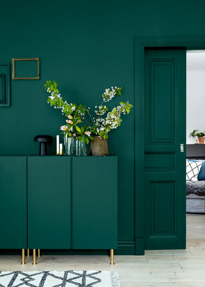
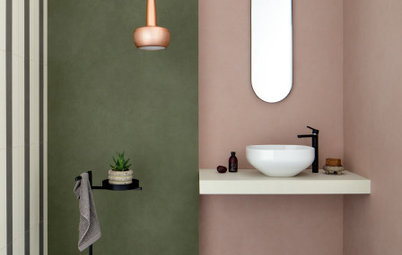
Fir green to sea green: Fir green is a vivid, dark, intense hue that brings to mind fir forests and the Amazon. This year, this green will be popular both on walls and in fashion. It is a logical progression of recent trends that brought nature indoors with monsteras, succulents and touches of tropical motifs.
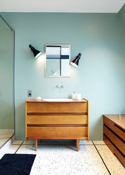
Its pastel cousins, celadon green, sea green and mint green, are pleasant matches. Khaki and sage green, both muted colours, are also a must.
See more green shades in the bathroom
See more green shades in the bathroom
Nude and powder pink bring some softness to this powerful and wild hue. Note that the 2018 version of pink tends to be closer to salmon than the dusty pink that prevailed in past years.
Peach and nude, pastel versions of this hue, are also a big hit.
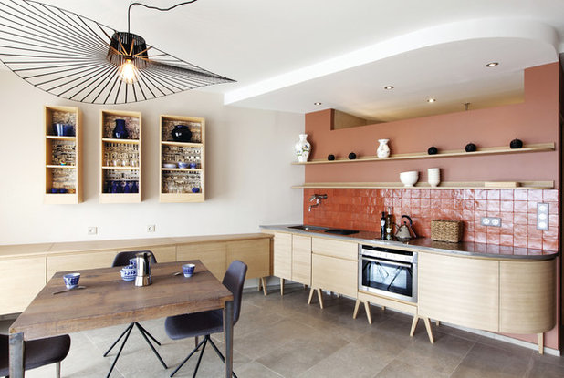
In this kitchen, in which a beige base is enhanced with touches of black, the terracotta-toned splashback adds warmth and originality. Note how the accent wall has been put together: a bright accent is created by the zellige tiles, while an ultra-matt paint was used for the top part of the wall. These subtle nuances will need to be mastered in 2018.
Get All Fired Up Over the Terracotta Trend
Get All Fired Up Over the Terracotta Trend
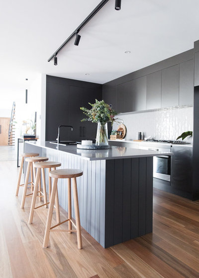
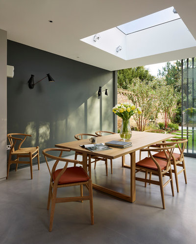
White, black, grey and muted colours: Nonetheless, black has not stepped back from its perpetual leading role. The only difference is that white, its usual pair and the basis of the Scandi trend, has been replaced by colours. Black itself, however, is still very prominent, distilled in touches to enhance contrasts and give rhythm to the coloured areas.
As for grey, it remains a safe bet. Still, it’s not all déjà vu, as a dark version tinged with a hint of colour, especially green, emerged this year. The resulting muted shades are the perfect background for a decor full of character.
Conclusion
The 2018 palette of earthy and green colours and floral accents will lead us to create veritable natural landscapes in our homes. It will find all its meaning in the current context of the vintage furniture revival and especially with the current love for the mid-century Scandinavian style.
Tell us
If you enjoyed this story, like it, save it, save the photos and share your thoughts below. Join the conversation.
More
Read more interior design stories


Related Stories
Interior Design
What's Next in Homes? 4 Design Experts Reveal
Do you know which colours, shapes and styles we'll be coveting in the year ahead? Four design pros give the inside scoop
Full Story
Trade Shows
10 Fresh Furniture and Decor Trends for 2023 From the USA
Greens and blues, art and artisanship, and mixed eras and textures filled the 2023 collections at High Point Market
Full Story
Interior Design
6 Trends From Salone de Mobile: The Stories Behind the Designs
See how the design industry is moving forward with one foot in tradition and the other in experimentation and innovation
Full Story
Kitchens
What Are the Popular Trends for Kitchen Renovations in 2023?
Find out this year's most coveted colours, styles, upgrades and added extras for kitchens from surveyed homeowners
Full Story
Trade Shows
6 Surface Materials Your Clients Will Crave in 2023 and Beyond
Discover the top six innovative materials that were on display at this year’s Surface Design Show in London, UK
Full Story
Architecture
Global Architecture Trends From the World Architecture Festival
By Houzz AU
Nicky Drobis, architect and partner at Fender Katsalidis, reports on the big ideas shaping the industry in 2023
Full Story
Trade Shows
7 Interiors Trends from the Maison&Objet 2023 Design Fair
By Houzz France
From tending to our own wellbeing to showing a greater respect for the planet, this year’s theme was Take Care
Full Story
Trade Shows
6 Future Trends in Design From Europe's 2022 Trade Fairs
Continuity, cosiness and crisis response are the big takeaways from the latest fair season in Europe
Full Story
Trade Shows
4 Interior Design Trends From Spain's Hábitat Valencia 2022
Texture, colour and oh so chic comfort were in the spotlight at Hábitat Valencia, with a good dose of designer optimism
Full Story
Trade Shows
8 Inspiring Ideas from 2022’s London Design Festival
With sensory surfaces and a focus on wellbeing and sustainability, a positive vibe permeated this year’s event
Full Story
Have to agree millthumpian, if you don't understand light and aspect choosing colours from photos or on websites can be a disaster, but with so many colours and brands of paints now, at least it is a starting point for people.