
UK Houzz Tour: A Designer's Converted Victorian Dairy Home
A derelict historical building has been saved and transformed into a beautifully calm family home

When London, UK-based interior designer Beth Dadswell and her husband first saw the Victorian dairy that would eventually become their home, it was damp, dangerous and inhabited by foxes. Despite the collapsed roof and broken glass, though, the couple could immediately see its potential.
“I was really excited when I saw the huge open courtyard at the front of the building,” says Dadswell. “It also had incredible steel girders that were covered in jasmine. It was like an industrial, urban version of Miss Havisham’s house,” she says of the character in Charles Dickens’ Great Expectations.
Dadswell quickly drew up a floor plan that would bring the dairy back to life, and asked her London-based architect friend, Takero Shimazaki, to help them with their planning application.
This ‘before’ photo shows the derelict building that inspired the couple’s renovation plans.
“The site is surrounded by neighbouring gardens on every boundary,” says Dadswell, “so we didn’t want to encroach on anyone’s privacy by adding windows that would overlook them.
“Our low-key approach was well received by our relieved neighbours, and we got planning permission fairly quickly,” she says.
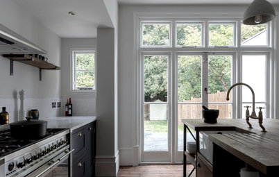
The living area connects to the courtyard through steel-framed glass doors, in keeping with the industrial feel of the building. “These were not the most energy-efficient option, so we had to over-compensate by adding a lot of insulation elsewhere, but they really are beautiful,” says Dadswell.
The walls were covered with a standard gypsum plaster and sealed with varnish. “They give the space a warm glow, and feel quite Mediterranean,” she says, “particularly in the summer, when all the doors and windows are open.”
The microcement floor was chosen as a cheaper alternative to polished concrete. “I was keen to avoid anything that looked too cold and hard, so I chose a finish that had a warm tone and that worked well with the warmth of the plaster,” she says.
Ready to renovate? Find an interior designer near you on Houzz to bring your vision to life
Dadswell designed plenty of storage for the house, ensuring it was integrated seamlessly into the building. “The coat, shoe and bag storage unit behind the sofa is tall enough to separate the front door from the living space, but not so tall that it blocks the view,” she explains.
A low storage unit topped in Belgian limestone in front of the sofa runs between the kitchen and the glass doors. “It’s the perfect height to put a TV on top, and is filled with art books,” says Dadswell.
She made sure the storage didn’t feel too heavy by including display areas where the couple could display their art, ceramics and plants.
She made sure the storage didn’t feel too heavy by including display areas where the couple could display their art, ceramics and plants.
“We wanted the kitchen and dining area to be the hub,” says Dadswell. “So the logical thing to do was to position a large dining table in the middle and build units around the perimeter of the room. This has kept the space feeling very open.”
Dadswell hired a trusted carpenter to make the MDF kitchen units. “We spent a lot of time together getting the proportions and details right,” she says. The kitchen cabinets were painted in Mole’s Breath by Farrow & Ball.
The cross-braced ceiling beams had been covered with a 30-centimetre layer of cork by a previous owner. “It was to keep the space really cold, as it had been used as an ice cream factory,” says Dadswell. “I wanted the space to feel light, so I decided to paint all of the ceilings throughout in a soft off-white.”
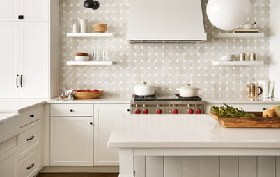
Dadswell chose handmade zellige tiles for the walls, which give a patchwork effect due to the individual imperfections of each tile. “They reflect the light beautifully, but are quite difficult to lay,” she says.
“I found the vintage shell pendant in a local antiques warehouse at the beginning of the build,” she adds. “It somehow survived nine months of being moved from rental house to building site – although I did spend a few hours reattaching shells once it was finally hung.”
“I found the vintage shell pendant in a local antiques warehouse at the beginning of the build,” she adds. “It somehow survived nine months of being moved from rental house to building site – although I did spend a few hours reattaching shells once it was finally hung.”
Two reeded glass sliding doors on metal runners (not pictured) separate this snug space from the kitchen. “They let light through from both ends of the house and create beautiful shadows at night,” says Dadswell.
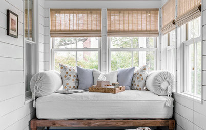
This area doubles up as a guest bedroom. Dadswell asked her upholsterer to attach arms to the bed, so it could also be used as a daybed to snuggle up on and watch films.
“Most of the time, it’s used as a music room, though, as the piano’s in here,” she says.
This area doubles up as a guest bedroom. Dadswell asked her upholsterer to attach arms to the bed, so it could also be used as a daybed to snuggle up on and watch films.
“Most of the time, it’s used as a music room, though, as the piano’s in here,” she says.
The staircase was designed to take up as little space as possible, while still complying with building regulations in terms of tread depth and riser height.
“I wanted the space underneath to be useful, so there are two hidden doors that conceal the underfloor heating controls and the electrical fuse box,” says Dadswell.
The simple, powder-coated steel balustrade ties in with the steel framing of the windows and doors.
“I wanted the space underneath to be useful, so there are two hidden doors that conceal the underfloor heating controls and the electrical fuse box,” says Dadswell.
The simple, powder-coated steel balustrade ties in with the steel framing of the windows and doors.
The music/guest room leads to Dadswell’s office at the rear of the house, which looks out onto the courtyard. She made the most of the view by placing the desk directly in front of the window, and the large skylight above makes the space even brighter. “It’s a really lovely, inspiring place to work,” she says.
Dadswell planned the storage carefully in this room. The tall cupboards behind the desk house her collection of tiles, paint samples, and stone and fabric swatches, while her client’s moodboards are displayed above the low units. Files, product catalogues and styling items are stored in the cabinets below.
Dadswell planned the storage carefully in this room. The tall cupboards behind the desk house her collection of tiles, paint samples, and stone and fabric swatches, while her client’s moodboards are displayed above the low units. Files, product catalogues and styling items are stored in the cabinets below.
The same grey-and-pink colour palette has been used throughout the house. In the master bedroom, some green-hued cushions complement the plants elsewhere.
“I wanted to reduce the palette as much as possible, and to use finishes that would get better over time and not need constant touching up,” she says.
Browse more beautiful and contemporary bedrooms
“I wanted to reduce the palette as much as possible, and to use finishes that would get better over time and not need constant touching up,” she says.
Browse more beautiful and contemporary bedrooms
In the bathroom, Dadswell used the same pink zellige tiles as in the kitchen and teamed them with floor tiles and vanity tops in a dark limestone.
The sloped roof made the bathroom feel very compact, but by positioning the toilet and sink along one wall, Dadswell could fit a large shower and plenty of storage along the other side.
“We’d found an old chemistry-lab sink at an antiques fair before the work started,” says Dadswell. “As this is small but very deep, it gave us more worktop space.”
In her son’s bedroom, Dadswell designed a run of units along the back wall. His clothes are hidden behind sliding doors at either side of the unit, while his books, toys and games are displayed on shelves in between.
Dadswell prefers sconces or wall lights and lamps to overhead pendants, and the same black wall lights feature throughout the house. “They create a lovely gentle light,” she says.
Dadswell prefers sconces or wall lights and lamps to overhead pendants, and the same black wall lights feature throughout the house. “They create a lovely gentle light,” she says.
At the end of the upstairs landing is a bathroom with a shower, used by the couple’s son son. “It’s four metres high at the tallest point, with a skylight above, so it’s quite an amazing space to shower in,” she says.
As the landing doesn’t have any natural light, Dadswell had a transom window or glazed panel fitted above the door to borrow light from the bathroom. “It also allows you to see the exposed rafters from the landing, which is interesting, particularly when it’s lit at night,” she says.
Most of the internal doors in the house are space-saving sliding pocket doors that disappear into the wall when open, which are painted in Setting Plaster by Farrow & Ball.
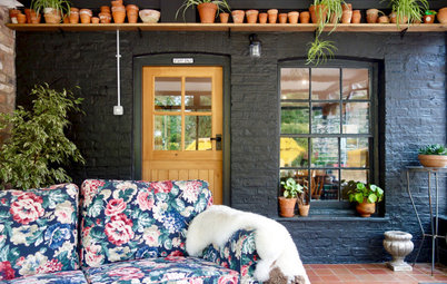
The couple kept the original scuffed concrete base in the front courtyard to retain its industrial feel. They also created a long dining bench with poured concrete.
“These doors were originally on the front of the dairy,” says Dadswell. “We restored them and installed reeded glass.” They’re now used to screen off the car park space behind, which is then separated from the street with black metal shutter gates.
“These doors were originally on the front of the dairy,” says Dadswell. “We restored them and installed reeded glass.” They’re now used to screen off the car park space behind, which is then separated from the street with black metal shutter gates.
“We painted all of the mouldy and previously painted brick walls in Mole’s Breath to unify the space,” she says. “That colour now flows through the house and out into the courtyard, which helps to blur the boundaries between inside and out.”
“We also planted trees and plants in huge black oil drums to create height,” says Dadswell. “We constructed privacy screens out of rusted metal that we positioned on top of the brick walls, then planted climbers to work their way up the metal girders to create drama.
“We all feel so comfortable here,” she says. “We’re a short walk from the [main] street, but all you can hear in the courtyard are birds singing. It’s really special and we feel very lucky that we stumbled across it before the developers knocked it down.”
Your turn
What do you like about this magical Victorian home and would you be willing to take on a project like this? Share your thoughts in the Comments below, like this story and save the images.
More
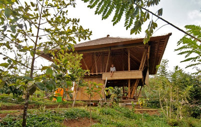
Want another dose of great international design? Don’t miss this India Houzz Tour: Vernacular Architecture Comes Alive in Nature
“We all feel so comfortable here,” she says. “We’re a short walk from the [main] street, but all you can hear in the courtyard are birds singing. It’s really special and we feel very lucky that we stumbled across it before the developers knocked it down.”
Your turn
What do you like about this magical Victorian home and would you be willing to take on a project like this? Share your thoughts in the Comments below, like this story and save the images.
More
Want another dose of great international design? Don’t miss this India Houzz Tour: Vernacular Architecture Comes Alive in Nature
House at a Glance
Who lives here: Interior designer Beth Dadswell with her husband and son
Location: London, UK
Property: A Victorian dairy converted into a home
Size: Three bedrooms and two bathrooms
Designer: Beth Dadswell of Imperfect Interiors
Architect: Takero Shimazaki
“We didn’t want to over-develop the site and lose the magical courtyard at the front,” says Dadswell. “So we simply added a modest, single-storey, glass-fronted extension to the front of the existing building [seen here], removed the collapsing flat roof at the back, and opened up the area to include a small courtyard at the rear [not shown].”