Houzz Tours

UK Houzz Tour: An Unusual Side Extension Reinvents a Tired House
The owners of this Scottish home had to push for approval for their bold extension idea, but the results are stunning

“It didn’t really have much kerb appeal,” says Dene Happell of the house he and his wife, Debbie, who run a design and building company together, bought 18 years ago in Scotland. Nevertheless, they loved the street and location, and added an extension to the back as their family grew. Nearly two decades later, though, the house got a much bigger upgrade – and a lot more kerb appeal.
…And here is their house prior to works, from almost the same angle.
The new, full-width, four-storey (including a storage basement) extension comes out from the cream-painted side wall seen here. The front of the house (where the steps are in this photo) is now to the right of the original entrance.
The new, full-width, four-storey (including a storage basement) extension comes out from the cream-painted side wall seen here. The front of the house (where the steps are in this photo) is now to the right of the original entrance.
A big challenge was how to connect the new part of the house to the old, architecturally. Rendering the whole house and painting it white, as well as changing all the doors and windows to match, was a big part of this.
Another key was the addition of a feature chimney for a new wood-burning stove. “We used that to ‘wrap’ the extension around the building,” says Dene. “This detail also echoes some of the older houses on the street.
“The whole house reads as a uniform property – you can’t see the extension,” he says. This was at the heart of the couple’s initial disagreement with their local planning department, which wanted the extension to be visually distinct from the original house. How did Dene and Debbie persuade them? “I made a couple of CGIs [computer generated images] to show them,” says Dene, “and it showed that the design they wanted would look awful.”
Looking for an architect? Find one near you, browse images of their work and read reviews from previous clients
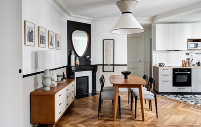
To the back of the house (on the left here) the original cedar-clad rear extension can just be seen. This is now a cosy dining room.
The new, open-plan attic space with triangular windows is one of the couple’s favourite additions. “The views are amazing and it’s a really flexible space,” says Dene. It’s variously been used as a homework spot for the girls, an office for Debbie, a place to socialise with friends, somewhere for kids’ sleepovers and a yoga studio.
The couple’s bedroom is on the floor below, to the right of the chimney. It has a large window at the front of the house and an ensuite and sauna at the back.
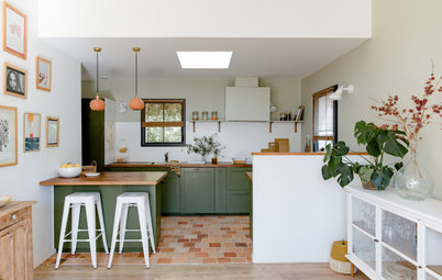
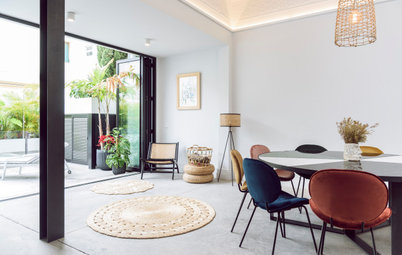
On the floor below is the kitchen/living space; the long ribbon window is the kitchen and the window at the front is the living space. There’s also a new laundry room, a powder room, a boot room, and some overflow kitchen storage.
The new, open-plan attic space with triangular windows is one of the couple’s favourite additions. “The views are amazing and it’s a really flexible space,” says Dene. It’s variously been used as a homework spot for the girls, an office for Debbie, a place to socialise with friends, somewhere for kids’ sleepovers and a yoga studio.
The couple’s bedroom is on the floor below, to the right of the chimney. It has a large window at the front of the house and an ensuite and sauna at the back.
On the floor below is the kitchen/living space; the long ribbon window is the kitchen and the window at the front is the living space. There’s also a new laundry room, a powder room, a boot room, and some overflow kitchen storage.
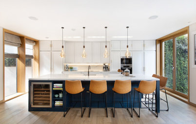
Inside the kitchen you can see the long window just mentioned on the left. The window at the back overlooks the garden.
White cabinetry and a concrete-effect laminate benchtop create a pale backdrop. Natural elements, such as the cork pendants, bleached grey oak parquet floor and cane chairs, add texture and warmth. A giant map of Scotland adorns the wall on the right.
“We love nature, and we love Scandinavian, mid-century modern and a lot of contemporary Scottish design, so our house is a real blend of all of the above,” says Dene.
This floor plan gives a clear picture of how the space fits together.
This long view of the kitchen shows a pocket door at the end, which leads to the new laundry.
Two more doors, level with the end of the benchtop, lead off to the left and right. To the left is the dining room, down some steps; to the right is the hall, separated by a sliding pocket door.
The kitchen features heaps of storage, including Dene’s ‘gadget area’ in the alcove at the far end, where blenders, juicers and appliances are kept. Just in front of this is a full-height, integrated freezer. The fridge is to the left of the oven.
If you were sitting on one of the bar stools and turned around 180 degrees, you’d look right out of these windows in the living area.
A bench seat with more storage wraps around the edge of the room, butting up to the new wood-burning stove.
A bench seat with more storage wraps around the edge of the room, butting up to the new wood-burning stove.
The living room is separated from the hallway by this black sliding pocket door. “This makes the whole space really flexible,” says Dene. “It can be cosy around the wood-burner in the winter with it closed, or open in the summer and lovely and light and bright.”
From the back end of the kitchen there are steps down to the dining room, situated in the original rear extension. Straight ahead is the hallway, leading past the living area and up to the front door. The moose head, made from fabric, is a fun touch.
Walls painted in Pavilion Gray: Farrow & Ball; chair, Timorous Beasties
Walls painted in Pavilion Gray: Farrow & Ball; chair, Timorous Beasties
The 16-seater table was made by a friend and has a Douglas fir top. There’s built-in banquette seating in black leatherette on one side and newly reupholstered vintage mid-century Scandinavian chairs on the other.
The dark wood storage at the back is for drinks and glasses.
Pendant lights: Tom Dixon
The dark wood storage at the back is for drinks and glasses.
Pendant lights: Tom Dixon
Here’s the hallway as seen from the front door. On the right there’s an entrance to a sitting room and, beyond that, a sliding door into the boot room and powder room.
Browse beautifully designed staircases for inspiration
Browse beautifully designed staircases for inspiration
The boot room and powder room continue the timber-and-white Scandi theme.
This sitting room at the front of the house is used as somewhere to relax and watch television (the open-plan living room has no TV).
Here’s the other end of the sitting room.
Framed print: Damien Hirst; wallpaper: Hay; AJ floor lamp designed by Arne Jacobsen
Framed print: Damien Hirst; wallpaper: Hay; AJ floor lamp designed by Arne Jacobsen
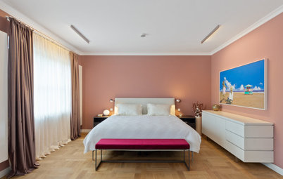
The couple’s bedroom in the extension features floor-to-ceiling Ikea storage opposite the bed. Bespoke cantilevered bedside tables save space.
Artwork by Claire Barclay
Artwork by Claire Barclay
At the right-hand end of the wardrobes is a bespoke dressing table with storage.
A plan of this floor clarifies the layout of the bedrooms and bathrooms.
This is the ensuite to the main bedroom, complete with a sauna. “We do a lot of sport and it’s great for aching muscles,” says Dene.
On the same floor is a twin guest bedroom.
The girls have bunk beds and a desk each.
Walls painted in St Giles Blue: Farrow & Ball
Walls painted in St Giles Blue: Farrow & Ball
This is the girls’ bathroom and features a reclaimed wood windowsill and matt brass fittings.
The new open-plan attic spans the old house and the new extension.
The enclosed staircase can be seen coming up to the left of the doorway; there are two skylights to flood it with light. It’s not clear in the photo, but there is a solid wall at the top of the steps; the other side of the stairwell has wide double doors (see next photo).
The enclosed staircase can be seen coming up to the left of the doorway; there are two skylights to flood it with light. It’s not clear in the photo, but there is a solid wall at the top of the steps; the other side of the stairwell has wide double doors (see next photo).
“The doors were the architect’s idea,” says Dene, “to make it easier to get furniture up here.”
The stunning views were largely what inspired the creation of this high-up room.
Eames Lounge chair; Eero Aarnio Egg Pod chair; Eames occasional table
Eames Lounge chair; Eero Aarnio Egg Pod chair; Eames occasional table
This photo of the back of the house, taken during construction of the extension, shows the layout more clearly.
This is the front of the house during construction… a far cry from what it’s like today.
Your turn
What’s your favourite part of this home extension? Tell us in the Comments. And if you liked this story, give it a thumbs up, save the images for inspiration and join the conversation.
More
Need another dose of design inspiration? Read this Houzz Tour: A New Floor Plan Creates Extra Space in a Small Home


Sponsored
Houzz at a Glance
Who lives here: Dene and Debbie Happell, directors of design and building company Nest, and their 12-year-old twin daughters
Location: Glasgow, Scotland
Property: A semi-detached 1950s house
Size: Four bedrooms and two bathrooms
Designer: Dene Happell of Nest in collaboration with Cameronwebster Architects
Dene explains that his family had outgrown the home they’d lived in for many years. “There was a lack of storage and a very small kitchen – and not enough space for everything as the kids got bigger and got more stuff,” he says.
Although that was the main driver for the project, Dene and Debbie were also tired of the look of their house. “We wanted to transform the exterior. I wasn’t a big fan of it aesthetically as it was,” Dene says.
And transform it they did. Above is the house as it looks now…