


UK Kitchen Tour: A Tiny Theatrical Galley Kitchen Takes the Stage
This designer’s theatrical past provided the inspiration for her colourf ‘jewel box’ of a kitchen in Edinburgh, Scotland
Kate Burt
27 May 2020
Houzz UK. I'm a journalist and editor, previously for the Independent, Guardian and various magazines. I'm now excited to part of the editorial team at Houzz UK & Ireland, bringing the best of British and Irish design, interiors and architecture to Houzz.com.
Houzz UK. I'm a journalist and editor, previously for the Independent, Guardian and... More
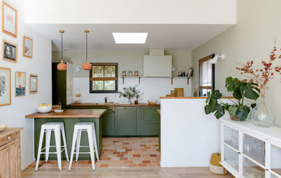
When Amy Shirlaw redesigned the small kitchen in her Edinburgh apartment in Scotland, she wanted enough storage, but not for the space to look too practical. “Endless wall cupboards or top shelves aren’t useful for me,” says Shirlaw, “especially when they’re not easily accessible. The less space you have, the more you use what you’ve got. So I don’t have stacks of kidney bean tins!”
She also drew on experience from her former career as a theatre designer to create the aesthetic. “It’s an open-plan kitchen on show to the living room,” says Shirlaw, “so I wanted it almost to look like a little jewel box or a set design, with a connection to the living room, but not matching it. I like the idea of contrast. I was aiming more for ‘distant cousins’ than ‘twins’.”
She also drew on experience from her former career as a theatre designer to create the aesthetic. “It’s an open-plan kitchen on show to the living room,” says Shirlaw, “so I wanted it almost to look like a little jewel box or a set design, with a connection to the living room, but not matching it. I like the idea of contrast. I was aiming more for ‘distant cousins’ than ‘twins’.”
Images by Alix McIntosh of Alix McIntosh Photography
Kitchen at a Glance
Who lives here: Interior designer Amy Shirlaw and her cat, Angustora Bitters (previously called Angus until Shirlaw realised ‘he’ was a ‘she’)
Location: Edinburgh, Scotland
Property: An 1850s Victorian ground-floor apartment
Size: 2.1 x 3.1 metres
Designer: Amy Shirlaw of Amy Shirlaw Interiors
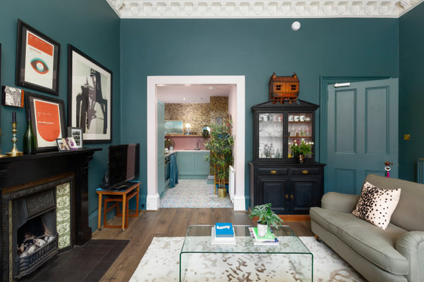
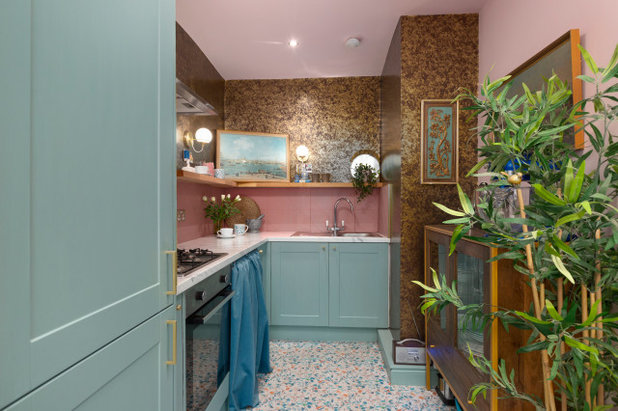
This is Shirlaw’s kitchen as seen from the living room. The ‘set design’ look she wanted to create is helped by the painted architrave around the arch, which frames the view; while the palette of colours – especially the golden wallpaper glimmering at the top of the kitchen – give a jewel-box effect. “I wanted it almost to be like a standalone box, beautiful and twinkly,” says Shirlaw.
Look closely and you’ll see the arch is painted in the same pink as the kitchen ceiling, with the skirting board in white. It’s a satin finish, so as well as being hardwearing, it has a slight reflectiveness to it. “I wanted it to be almost fake neo-classical,” she says.
To further link the two rooms, Amy custom-mixed the cabinet colour to complement – but not match – the living room wall colour. “The two blues and the pink connect very harmoniously.”
However, the two floor finishes are less carefully coordinated. “They have zero connection. I just loved the pink terrazzo-print vinyl we used in the kitchen [close-ups pictured below], though it has blues and oranges in it, too, and there are lots of each in the living room, so it ties in with the view of the kitchen.”
It’s really practical, too. “It comes in at 1.4-metre width so there were only two strips, which took about 40 minutes to fit,” says Shirlaw.
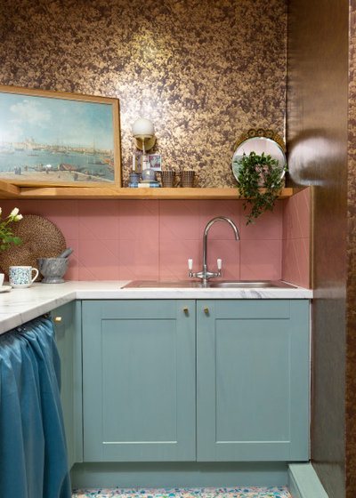
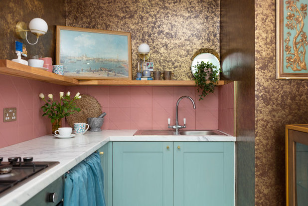
Click into this closer view of the room, which shows the palette – and that floor – more clearly.
Ready to refresh your home? Start the conversation with an interior designer in your area on Houzz
Ready to refresh your home? Start the conversation with an interior designer in your area on Houzz
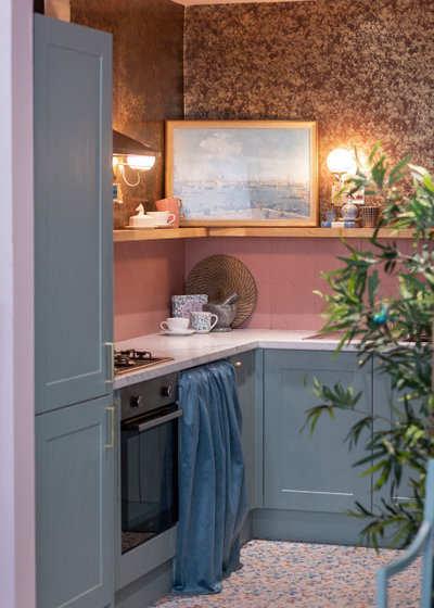
The L-shaped layout didn’t lend itself to too much change and Shirlaw kept the sink, oven, gas stove and washing machine in the same positions. “Because of the way the building is, to move pipes you’d be affecting what amounts to four properties in a neighbouring building.”
Shirlaw says people thought she was mad removing the wall cabinets, but the internal configuration of the new units is quite different. “They’re vastly changed to make them much more practical and to utilise every bit of space,” she says.
There’s a double-height, kidney-shaped pull-out corner rack behind the left-hand door under the sink, which Shirlaw uses as her pantry. Since it’s on the draining board side, it won’t get wet in the case of any leaks. The right-hand door conceals two pull-out shelves for pots and pans. There are two more slim pull-outs flanking the stove for oils and spices.
The tall unit in the foreground is the fridge-freezer. Shirlaw was careful to position the line between the doors at the same height as the benchtop. Look at the before photo (next image) and you’ll see the fridge was much higher. Visually, this wasn’t as pleasing; the lines are now continuous. “In a small space, this is especially important,” says Shirlaw.
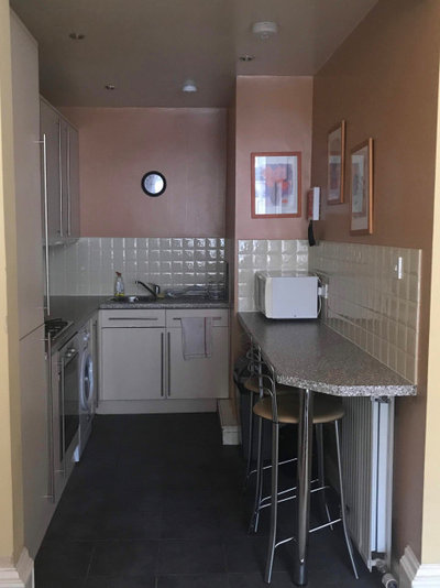
This is how the kitchen looked before the renovation. “It was a rental and had a peeling laminate benchtop as there was no draining board, and the cupboards were in a terrible state,” says Shirlaw. “Unfortunately, there was no salvaging to be done.”
Shirlaw wishes she’d had the radiator heater beneath the breakfast bar removed. “It’s never turned on,” she says. “It’s my only regret.”
Shirlaw wishes she’d had the radiator heater beneath the breakfast bar removed. “It’s never turned on,” she says. “It’s my only regret.”
Shirlaw opted for a slightly shallower benchtop on the left of the kitchen, because it was the only way she could fit in a decent-width cabinet on the back wall.
“The difference is only around five centimetres,” she says, “but if I’d had it standard size, I couldn’t have fitted in that double cupboard under the sink.”
It posed no problem for the oven, stove and fridge, but the washing machine juts out. That’s why it has a curtain hiding it, as there wasn’t the space for an integrated design.
“But I love my curtain,” says Shirlaw. “It adds a bit of softness. It’s teal velvet and matches the second sofa in the living room, and so it really works.” It’s on a dowelling rod fixed with Command hooks, so it can easily be taken off for frequent washing.
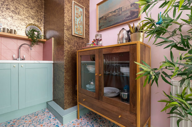
Instead of the breakfast bar, Amy found a mango wood glass-fronted cabinet to sit in the same spot. She didn’t need the space to eat, as there’s a dining table in the bay window in the living room.
“It adds warmth to the kitchen and houses all the crockery and glassware. It also has a large drawer for big utensils,” says Shirlaw. “Underneath, I can put recycling and Angus’ food. On top, I put my kettle and stuff, which means I can keep the work surface clearer. And it’s all hidden from the living room by the big plant.”
Amy picked up the slim artwork on the papered wall from a local reuse and recycle facility for less than AUD$10.
There is no dishwasher in this kitchen. “I’ve never had one and it’s not a busy household, so I don’t need one,” says Shirlaw.
The Canaletto prints (one seen here and the other in the previous photo), which depict scenes in Venice in Italy, were both gifts. This one was a present to Shirlaw’s parents on their engagement. “It has a lovely inscription for their wedding in June 1980 on the back,” she says. The other came from a friend who was clearing out her flat and passed it on to Amy.
“I chose to place the engagement present one on the back wall shelf facing the [living room] window as it’s glazed, so bounces light back into the kitchen,” she says.
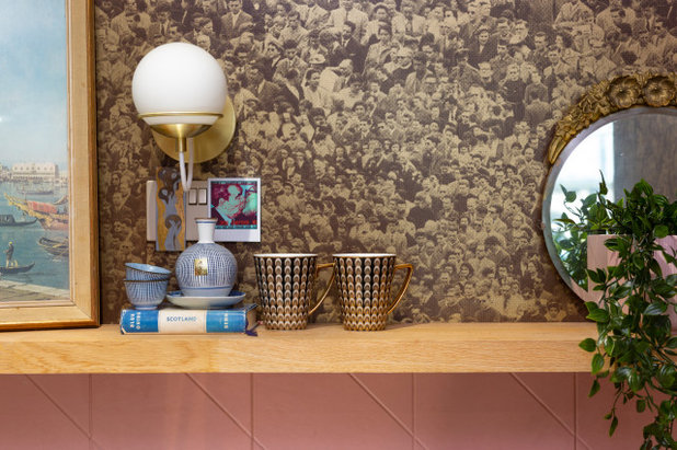
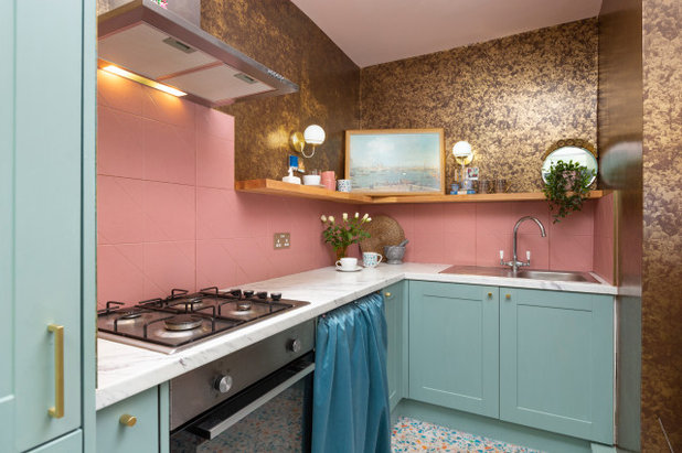
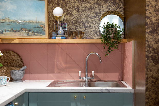
“The wallpaper was the starting point for the whole kitchen,” says Shirlaw. It’s from a Brooklyn-based company in the US that has the rights to Andy Warhol’s imagery. “It’s based on a Warhol image,” she says. “From afar, it looks like a shiny mottled gold, but it’s actually an abstraction of a crowd scene that features Warhol. If you look for long enough, you can find him…”
The paper is heavy and the design intricate. “The decorator hated it, but he was used to expensive finishings and did a great job,” says Shirlaw.
The globe wall lights add another layer of glamour. There are also LEDs in the ceiling, though Shirlaw removed two from the original kitchen, as she didn’t want the space to feel too brightly lit.
Shirlaw wanted a natural material to help ground the opulent wallpaper, so chose oak for this shelf. She admits it’s more decorative than practical and houses cups as well as the artwork. “I was going to use it for utensils, but ended up having enough space to put everything away.”
She also had ‘secret’ power points installed above it for phone charging and the like. She disguises these with decorative picture magnets. “They’re nice sockets,” she says, “but I still don’t want to look at one.”
To pay for the pricey wallpaper, Shirlaw compromised on not having the built-in extractor she would have preferred and on having laminate benchtops.
“The splashback was meant to match the counter,” says Shirlaw, “but the delivery failed and I just wanted it done. Luckily, I came across these at the same time.”
She chose a large-format tile with scores in it that make it look like a smaller design. “It’s cheaper and quicker than using smaller tiles,” she says.
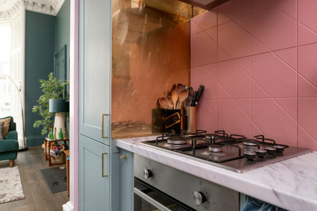
This view from the kitchen back out to the living room shows the gleaming golden panel Shirlaw chose for the side of the fridge to add a splash more glamour.
Your turn
Which ideas would you steal from this space and use in your own home? Tell us in the Comments below, like this story and save the images. Go on, join the conversation.
More
Want to see more great kitchen designs? Don’t miss A Kitchen and Living Area Makeover With a Sunset-Inspired Palette
She chose a large-format tile with scores in it that make it look like a smaller design. “It’s cheaper and quicker than using smaller tiles,” she says.
This view from the kitchen back out to the living room shows the gleaming golden panel Shirlaw chose for the side of the fridge to add a splash more glamour.
Your turn
Which ideas would you steal from this space and use in your own home? Tell us in the Comments below, like this story and save the images. Go on, join the conversation.
More
Want to see more great kitchen designs? Don’t miss A Kitchen and Living Area Makeover With a Sunset-Inspired Palette
Related Stories
Houzz Tours
France Houzz: A New Island Home With an Old Soul
Check out this young family's welcoming and characterful French island home on Île d’Yeu, which embraces local style
Full Story
Houzz Tours
Germany Houzz: A Small Cabin Transformed Into a Forest Retreat
In this secluded area in the Taunus mountains of Germany, a family enjoys their weekends in 29 square metres of space
Full Story
Houzz TV
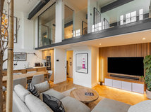
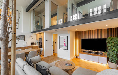
London Houzz: Tour a Contemporary Loft in an Old Victorian School
Watch and read how a design firm updated this light and airy apartment in an old block with sleek style and warm touches
Full Story
Garden Design
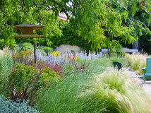
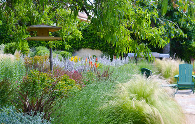
Spain Garden Tour: A Mediterranean Makeover With Colour & Texture
Once neglected, this naturalistic garden is now a series of outdoor rooms with idyllic spots to swim, dine and relax
Full Story
Houzz Tours
Berlin Houzz: A Touch of Japanese Forest Bathing in a German Home
Beloved memories of Japan come to life with the renovation of this 120-square-metre apartment in Berlin, Germany
Full Story
Houzz Tours
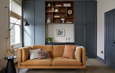
London Houzz: Daring Colour & Texture Transform a Victorian Home
By Kate Burt
The busy owners of this terrace sought help to design outside their decor comfort zone – the result is a cool classic
Full Story
Houzz Tours
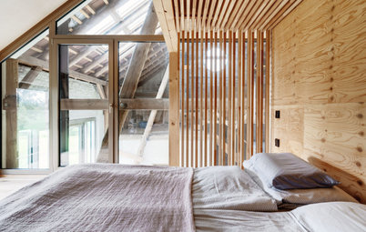
Germany Houzz: Creating Summer & Winter Homes in a Converted Barn
One barn, two homes – see how architects designed separate zones for summer and winter living in an old country barn
Full Story
Houzz Tours
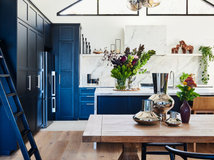
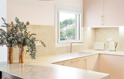
Before & After: Finding the Perfect Pink in a Barcelona Kitchen
Barely-there pink acts as a warm neutral in a new open-plan Spanish kitchen, replacing dark cabinets and drab finishes
Full Story
Houzz Tours
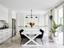
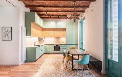
Before & After: Colour Blocking & Pattern Nod to Nature in Rome
Move and upsize or stay and renovate? This young family chose the latter in their small Italian apartment – here's why
Full Story
Houzz Tours
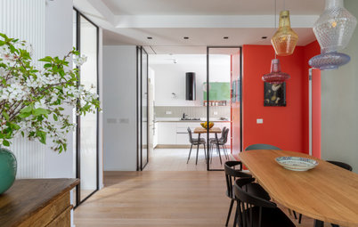
Barcelona Houzz: Style, Sustainability and Pattern in a Tiny Flat
Part-renovation, part-restoration, the owners of this Spanish apartment balanced historical style with forward thinking
Full Story
I love it - everything - the colours, wallpaper even the texture from the curtain and tiles! Ive never come across a design where I like everything - well done!
We love the boutique feel the new kitchen has. The wallpaper is so different but works so well.
A gem of a jewel box. Congratulations, Amy. It's just the sort of thing I love.