


USA Before & After: 3 Kitchens Ditch Upper Cabinets & Lighten Up
Thinking of doing away with wall-mounted kitchen cabinets? See how three pros replaced them with feature walls and views
Becky Harris
24 October 2021
Houzz Contributor. Hi there! I live in a 1940s cottage in Atlanta that I'll describe as "collected."
I got into design via Landscape Architecture, which I studied at the University of Virginia.
Houzz Contributor. Hi there! I live in a 1940s cottage in Atlanta that I'll describe... More
A current kitchen trend that looks like it has staying power is replacing upper cabinets with a beautiful splashback, display shelves or expansive windows. Kitchens gain a more open, airy feeling and opportunities to bring in views and natural light. Concentrated walls of cabinetry, pantries and smartly outfitted lower cabinets can often make up for the lost storage. Here’s a look at three USA kitchens’ before-and-after renovations, which each reconsidered traditional cabinetry layouts and ditched wall-mounted cabinetry.
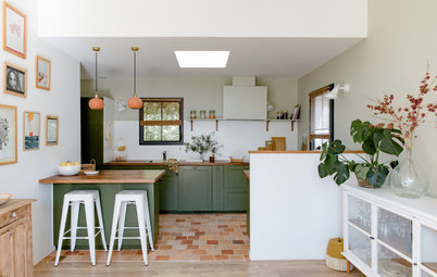
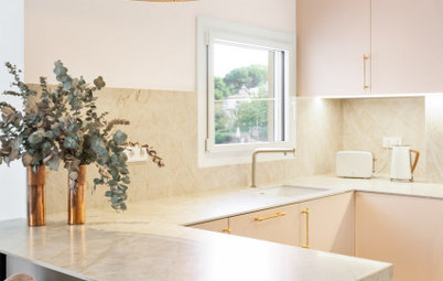
1. Marble Herringbone Walls and an Airy Vibe
Kitchen at a Glance
Who lives here: A couple with a child
Location: North Carolina, USA
Size: 28 square metres, including the walk-in pantry
Designer: Richard Ryder of Clearcut Construction
Kitchen at a Glance
Who lives here: A couple with a child
Location: North Carolina, USA
Size: 28 square metres, including the walk-in pantry
Designer: Richard Ryder of Clearcut Construction
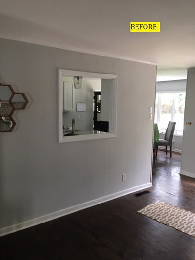
Before: This North Carolina couple wanted a bigger, airier, more functional kitchen suitable for raising a family and hosting large gatherings. And they disliked the low 2.4-metre ceilings so much that they considered moving. Instead, they found Richard Ryder and his design-build firm, Clearcut Construction, on Houzz and hired them to design and carry out their renovation.
Ryder opened up the floor plan, relocated the dining room, raised the kitchen ceiling and created more storage and prep space with a large kitchen island. He also improved the family’s access to a redesigned backyard to ease the flow between indoors and out.
Ryder opened up the floor plan, relocated the dining room, raised the kitchen ceiling and created more storage and prep space with a large kitchen island. He also improved the family’s access to a redesigned backyard to ease the flow between indoors and out.
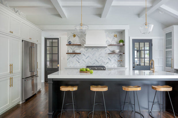
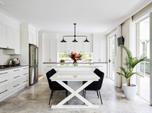
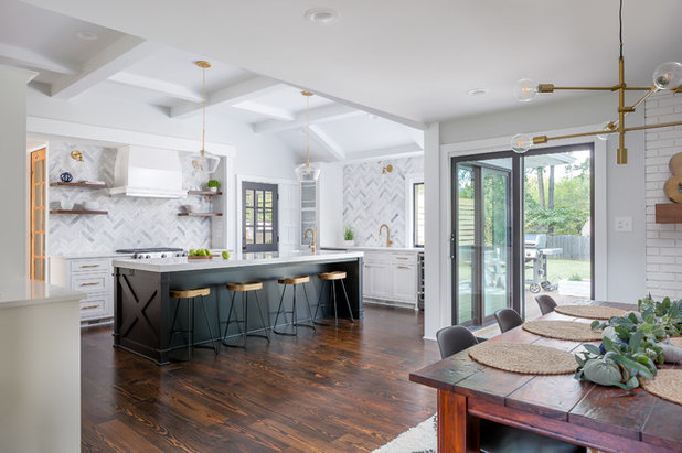
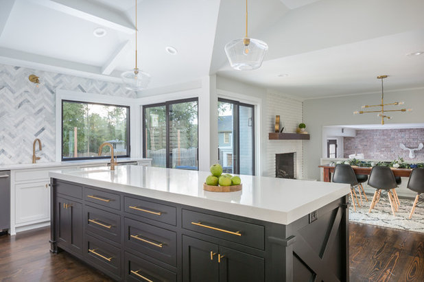
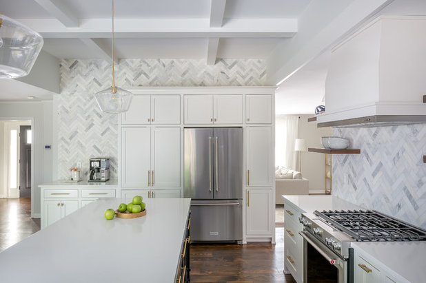
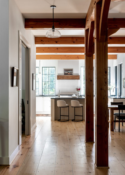
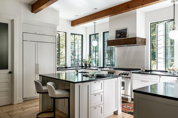
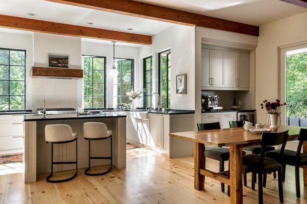
After: Ryder removed the wall that separated the kitchen from the rest of the first floor. An attic over the kitchen enabled him to raise the ceiling height to 3.6 metres.
By sacrificing upper cabinets on this wall, the family gained a wall that serves as a focal point. Instead of upper cabinets, there’s a beautiful herringbone marble splashback and custom range hood. Now that the kitchen is open to other first-floor spaces, creating a pretty view here was important.
Thinking of renovating your kitchen? Find specialised kitchen designers near you, browse images of their work and read reviews from previous clients
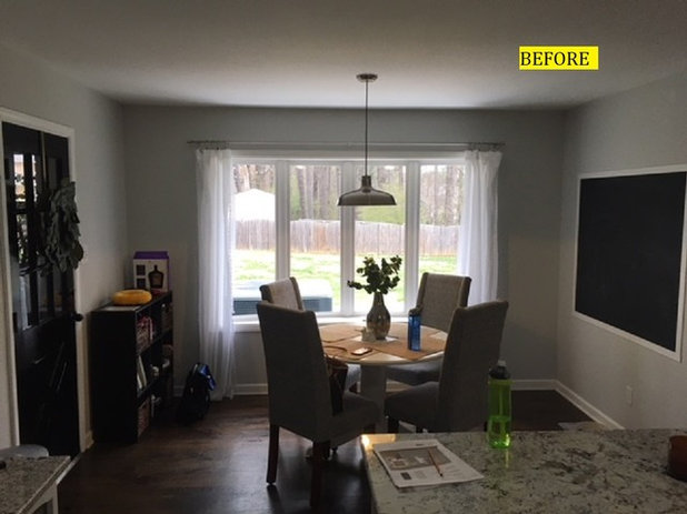
Before: Previously, the existing eat-in area of the kitchen looked out to the backyard. But the homeowners weren’t fond of the view of the air-conditioning unit.
After: The family gained another beautiful tiled wall and enjoys the view of the backyard through the large window over the sink. Ryder sized this new window to eliminate the view of the air conditioner. He also added new glass doors that provide additional views and access to the yard. Both sets of sliding doors seen here open to a new deck.
They made up for the loss of wall-mounted cabinets in several ways. The kitchen’s new island measures 2.8 x 1.1 metres and contains a mix of cabinets and drawers for storage, including deep drawers for pots and pans. Just past the island, Ryder packed an interior wall with more storage.
On this well, the designer treated the tall fridge in a similar way to the tall upper cabinets and recessed the full-depth fridge to make it flush with the surrounding cabinetry. This concentrated approach to storage also made room for a coffee bar on the left, with another elegant tiled expanse behind it.
On this well, the designer treated the tall fridge in a similar way to the tall upper cabinets and recessed the full-depth fridge to make it flush with the surrounding cabinetry. This concentrated approach to storage also made room for a coffee bar on the left, with another elegant tiled expanse behind it.
2. Celebrating Leafy Views
Kitchen at a Glance
Who lives here: A couple and their dog
Location: Washington, USA
Size: Approximately 16 square metres; 3.2 x 4.8 metres
Designer: Tamar Kestenbaum of Sienna & Sage Interior Design
Kitchen at a Glance
Who lives here: A couple and their dog
Location: Washington, USA
Size: Approximately 16 square metres; 3.2 x 4.8 metres
Designer: Tamar Kestenbaum of Sienna & Sage Interior Design
Before Photo
Before: “This home is nestled into the trees and was already gorgeous, except for the kitchen. It was this dark corner of the house,” interior designer Tamar Kestenbaum says.
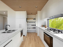
While the layout was functional and the size was adequate, extensive upper cabinets blocked any chance of maximising the leafy views. Kestenbaum removed the cabinets to make room for expansive windows, which opened up the kitchen to beautiful views of the trees.
While the layout was functional and the size was adequate, extensive upper cabinets blocked any chance of maximising the leafy views. Kestenbaum removed the cabinets to make room for expansive windows, which opened up the kitchen to beautiful views of the trees.
After: Now this kitchen is a tree hugger. This view from the front entry reveals the leafy backyard from the moment someone steps through the front door. The materials used are a wonderful complement to the vistas.
“These clients wanted to use as many natural elements and details as possible,” says Kestenbaum. This included timber details and solid wood cabinets. And the benchtops are soapstone, one of the homeowners’ favourite materials.
“These clients wanted to use as many natural elements and details as possible,” says Kestenbaum. This included timber details and solid wood cabinets. And the benchtops are soapstone, one of the homeowners’ favourite materials.
With no upper kitchen cabinets, Kestenbaum had plenty of room to line up beautiful casement windows around the room. Casement windows are easy to crank open when reaching across a benchtop. So in addition to the views and the natural light, the windows let in the cool Pacific Northwest breezes. The neutral colour palette and wood accents the designer suggested for the remodel complement the colours of nature.
Kestenbaum already had a head start on the storage issue. “My clients are minimalists who didn’t need a tonne of storage. Plus they already had a walk-in pantry,” she says. This left them plenty of storage space after she eliminated the upper cabinets to make room for the windows.
In the lower cabinets, she installed recycling, rubbish and compost pull-out bins near the sink. The integrated dishwasher is to the right of the sink and upholds the seamless look of the lower cabinetry. Kestenbaum also mixed in drawers for better and more ergonomic kitchen storage. And she used pull-out inserts on arms to take full advantage of the space in the corner cabinets.
Before Photo
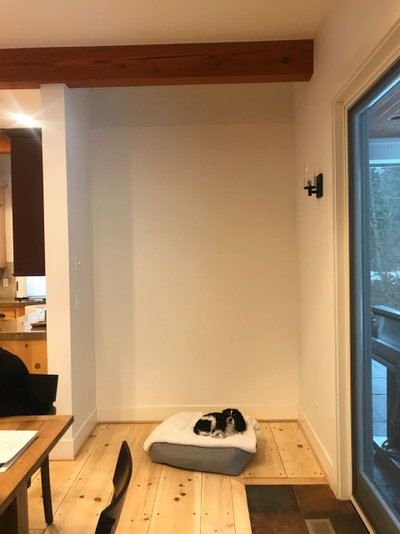
Before: This unused niche off the dining room presented an opportunity for more kitchen storage and better function.
After: Because the kitchen was open to the dining room, Kestenbaum designed a bar for the unused niche – the only part in the open-plan layout that includes wall-mounted cabinetry. “He is very passionate about coffee and she wanted to keep the benchtops clear of small appliances,” says the designer. “It was a really convenient spot for a coffee/wine bar, and he already had a beautiful espresso maker.”
The bar includes a wine fridge and storage space for glassware, and the cabinets hide the microwave. Because coffee grounds are great for composting, Kestenbaum added a second composting pull-out container here as well as a pull-out rubbish bin in the lower cabinetry of the bar. LED lighting under the upper cabinets illuminates the space. “The underlighting provides a beautiful glow at night,” says Kestenbaum.
Browse more beautiful kitchens
3. Expansive Bench Space With Big Views
Kitchen at a Glance
Who uses it: A chef and a baker
Location: California, USA
Size: 31 square metres, including the dining space
Architect: Craig O’Connell Architecture
Kitchen at a Glance
Who uses it: A chef and a baker
Location: California, USA
Size: 31 square metres, including the dining space
Architect: Craig O’Connell Architecture
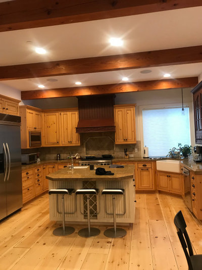
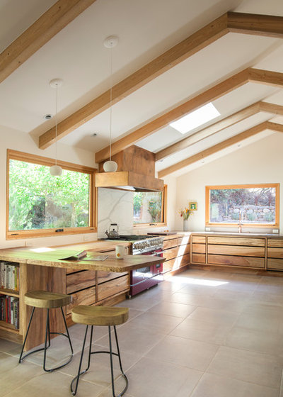
Before: This kitchen in California had low ceilings, little natural light and limited bench space. This was an issue, as the owners both need a lot of room to spread out and work, and they enjoy cooking in the kitchen at the same time.
Nick Giusto is a fourth-generation miller and baker and helps run the family business, which provides restaurants and bakeries with premium-quality flour and grains. “Nick needs a lot of room for rolling dough and flour and baking in general,” says the couple’s architect, Craig O’Connell. Giusto’s wife, Arielle Giusto, is a talented chef who caters and has helped open several popular restaurant kitchens in the area.
Nick Giusto is a fourth-generation miller and baker and helps run the family business, which provides restaurants and bakeries with premium-quality flour and grains. “Nick needs a lot of room for rolling dough and flour and baking in general,” says the couple’s architect, Craig O’Connell. Giusto’s wife, Arielle Giusto, is a talented chef who caters and has helped open several popular restaurant kitchens in the area.
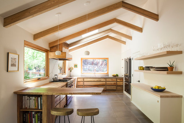
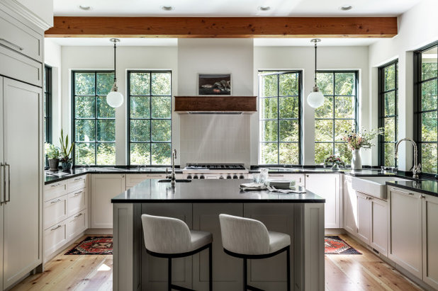
After: O’Connell designed a light-filled, airy space that connects to the outdoor area, reflects the couple’s tastes and gives them all the room they need to prepare delicious food together and entertain.
To achieve this, the architect expanded the kitchen’s footprint by taking over an adjacent office space and removed the 2.4-metre dropped ceiling to allow for a cathedral ceiling with reclaimed-timber beams. By expanding the space, he was able to add plenty of lower cabinetry and benchtop space. The couple also opted for floating shelves to the right to accommodate their everyday dishes and glassware.
It was important to the couple that the design be “of the place”. To achieve this, the architect used meaningful local materials and expert craftspeople. For example, the ceiling beams were milled from old piers that had been buried in San Francisco Bay. The reclaimed piers, the cypress benchtops and shelves, and the sycamore live-edge peninsula benchtop and cabinet came from a local reclaimed-timber dealer. “This was definitely a site to visit with the clients. We looked at all kinds of wood, and the homeowners found the ones that spoke to them,” says O’Connell.
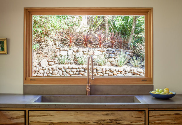
By forgoing upper cabinets on two sides of the kitchen, O’Connell was able to install three 1.8-metre-long windows, which provide picture-perfect views. And the colours in the landscape seen through the windows inspired the kitchen’s material and colour palettes. The concrete benchtops, copper tap and timber cabinetry and trim complement the hues found in the garden. San Francisco company RE Union Creative fabricated the custom-stained concrete benchtop and integrated sink.
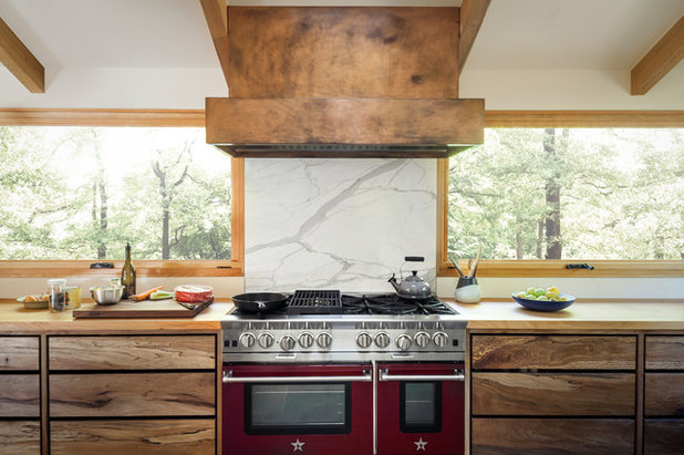
Because the home is on a hill, the 1.8-metre-wide awning windows that flank the range hood provide views of the tree canopy. With the kitchen expanded, there was also room for a 120-centimetre-wide red cooker from BlueStar.
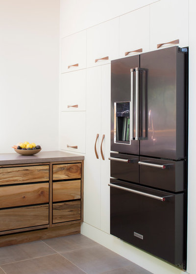
Because they had expanded the kitchen’s footprint, the amount of lower cabinets in the room made up for the loss of upper cabinets. Local craftsperson Cemil Hope of Hopebuilt made the sycamore cabinetry. Also, O’Connell devoted this interior wall to cabinetry and the fridge. A dedicated place for the owners’ coffeemaker and stand mixer was fitted next to the benchtop.
One detail to note is how the fridge appears to float. O’Connell used 20-centimetre-high kicks around the room to give everything a lighter, floating look. He warns that a high toe kick can cut into storage capacity, but says that in this kitchen, the copious amount of storage accommodated the choice.
One detail to note is how the fridge appears to float. O’Connell used 20-centimetre-high kicks around the room to give everything a lighter, floating look. He warns that a high toe kick can cut into storage capacity, but says that in this kitchen, the copious amount of storage accommodated the choice.
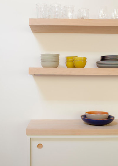
The floating shelves also serve as a substitute for upper cabinets.
Reasons to forgo some upper cabinets:
Your turn
Have you farewelled wall-mounted cabinetry in favour of base units in your kitchen? Share your tips in the Comments below. And while you’re at it, like this story, save the images and join the renovation conversation.
More
Love before-and-after transformations? Get your next fix here with this Before & After: A Zero-Character Bathroom Comes to Life
Reasons to forgo some upper cabinets:
- To create a focal wall.
- To extend a beautiful splashback up to the ceiling.
- To make room for windows.
- To provide a more open, breezy feel.
- Outfitting your kitchen with hardworking lower cabinetry inserts.
- Concentrating storage and some larger appliances on one wall.
- Installing open shelves.
- Moving functions such as a coffee or wine bar into an adjacent room.
- Working a pantry into the kitchen footprint.
- Doing a thorough kitchen declutter and purge. Seldom-used or seasonal items can often be moved to other storage areas in the house.
Your turn
Have you farewelled wall-mounted cabinetry in favour of base units in your kitchen? Share your tips in the Comments below. And while you’re at it, like this story, save the images and join the renovation conversation.
More
Love before-and-after transformations? Get your next fix here with this Before & After: A Zero-Character Bathroom Comes to Life
What are you working on?
Related Stories
Houzz Tours
France Houzz: A New Island Home With an Old Soul
Check out this young family's welcoming and characterful French island home on Île d’Yeu, which embraces local style
Full Story
Houzz Tours
Germany Houzz: A Small Cabin Transformed Into a Forest Retreat
In this secluded area in the Taunus mountains of Germany, a family enjoys their weekends in 29 square metres of space
Full Story
Houzz TV
London Houzz: Tour a Contemporary Loft in an Old Victorian School
Watch and read how a design firm updated this light and airy apartment in an old block with sleek style and warm touches
Full Story
Garden Design
Spain Garden Tour: A Mediterranean Makeover With Colour & Texture
Once neglected, this naturalistic garden is now a series of outdoor rooms with idyllic spots to swim, dine and relax
Full Story
Houzz Tours
Berlin Houzz: A Touch of Japanese Forest Bathing in a German Home
Beloved memories of Japan come to life with the renovation of this 120-square-metre apartment in Berlin, Germany
Full Story
Houzz Tours
London Houzz: Daring Colour & Texture Transform a Victorian Home
By Kate Burt
The busy owners of this terrace sought help to design outside their decor comfort zone – the result is a cool classic
Full Story
Houzz Tours
Germany Houzz: Creating Summer & Winter Homes in a Converted Barn
One barn, two homes – see how architects designed separate zones for summer and winter living in an old country barn
Full Story
Houzz Tours
Before & After: Finding the Perfect Pink in a Barcelona Kitchen
Barely-there pink acts as a warm neutral in a new open-plan Spanish kitchen, replacing dark cabinets and drab finishes
Full Story
Houzz Tours
Before & After: Colour Blocking & Pattern Nod to Nature in Rome
Move and upsize or stay and renovate? This young family chose the latter in their small Italian apartment – here's why
Full Story
Houzz Tours
Barcelona Houzz: Style, Sustainability and Pattern in a Tiny Flat
Part-renovation, part-restoration, the owners of this Spanish apartment balanced historical style with forward thinking
Full Story
I really hate upper cabinets - they produce a strong, almost physical response of claustrophobia, so for me, the number one thing I do with any kitchen is remove them. If I can’t incorporate more storage, I get rid of stuff. The ”haves” have way too much kitchen clobber anyway.
I have a tiny kitchen that leaves no scope for removing wall cabinets. There is a huge picture window (the kitchen was carved out of half of the dining room, and no, I didn't want open plan because I needed that wall!) Open shelves don't work. I have one, and it is perpetually greasy.
So I put in shallow wall cupboards with frosted glass shutters and in cabinet lighting. Everything is white. Deep cabinets at ground level have pull out drawers. It's the best I can do with a kitchen 10 x 8 ft.
So this lovely plan only works if you have enough space to play with. I like bare walls too, but not at the cost of storage.
we ditched the uppers 4 years ago for an open plan kitchen and have uppers in the butlers pantry, it's a much cleaner look and no more cleaning greasy tops of cabinets, my Husband thanks me for that. I agree with the other comment above cleaning shelves near the stove, it's bad enough cleaning the range hood. But we have Enjo for all that.