
Houzz Tours
USA Houzz Tour: An Architect Digs Down to Expand a Compact Home
An architect found on Houzz transformed a small, narrow San Francisco house into a light-filled, family-friendly home

As this San Francisco couple’s family grew from two to four, they needed their compact two-bedroom, one-bathroom home to grow with it. So they searched Houzz and found architect John Lum. Because of the city’s time-consuming planning process for additions, Lum recommended that they work within the space they had. This meant digging down to turn an unfinished basement and some of the garage into functional living space. The extensive renovation also included transforming the backyard into an inviting spot for the whole family.
Before: Lum preserved the front facade of the historical home but had more freedom to play around with the style of the back. A later kitchen addition ran along the back of the house. A deck and exterior stairs off the addition provided access to the sunny backyard, but it wasn’t very inviting.
After: Lum finished the lower level and fitted it out with three bedrooms, two bathrooms, a laundry room, a wine room, ample wardrobes, a mudroom off the garage and built-in storage. The room along the back of the house is the couple’s bedroom. Located just off it on the patio is a large spa. On the left side, the path leads to another exterior door off the laundry room.
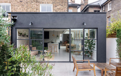
The neighbourhood inspired the style of the back facade. “The Haight didn’t burn after the 1906 earthquake, so the houses here are older. And it’s also very urban and slightly industrial,” says Lum. A living area on the patio and an upper deck off the kitchen allow the family to make the most of nice weather. Placing the staircase off to the right side keeps the view and access from the bedroom to the yard unobstructed.
Architect’s solutions to limited space can be so clever. Find a professional and reviewed architect to talk to on Houzz.
Before: “My clients had a lot of cool Midcentury Modern pieces. We wanted to find a way to work in their style while keeping the original soul and charm of the Victorian house alive,” says Lum. He brought some of that soul back by restoring the home’s original central hallway, which had been taken out during a previous renovation. “You basically walked into a wall after you walked in the front door,” he says. That renovation had created an awkward flow throughout this level.
The home’s two bedrooms were located down one side of the house, where the baby crib can be seen here. That room is now an office-cum-guestroom. The other side had a classic Victorian double parlour setup, with the living room at the front of the house and the dining room behind it. The later addition on the back contained the kitchen and a compact family room alcove.
Because the original central hallway had been filled in, there was an odd circulation pattern through the home. For example, the couple had to either walk through the front bedroom, the dining room or the home’s single bathroom to access their bedroom.
After: With the home’s Victorian soul in mind, Lum restored the central hallway through the main floor. He preserved the double-parlor layout and the original Victorian-era moldings. He also incorporated fine woodworking when adding mouldings, cabinetry and doors, in keeping with the spirit of Victorian-era building techniques.
Restoring the classic central entry hall meant the rooms would be narrow, some just three metres wide. “Simply accepting that some of the rooms were going to be narrow freed us up from losing the quirky, historical quality of the house. Sometimes you have to work with what you’ve got,” says Lum. “But while the existing house felt dark, the feeling of airiness and height in the house now is extraordinary. Embracing the high ceilings made up for the narrowness.”
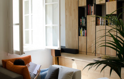
Using light colours on the walls and sheer curtains on the living room windows let in the light. The central hallway allows light from the front of the house to penetrate further inside. Lum also added a large skylight in the kitchen.
Restoring the classic central entry hall meant the rooms would be narrow, some just three metres wide. “Simply accepting that some of the rooms were going to be narrow freed us up from losing the quirky, historical quality of the house. Sometimes you have to work with what you’ve got,” says Lum. “But while the existing house felt dark, the feeling of airiness and height in the house now is extraordinary. Embracing the high ceilings made up for the narrowness.”
Using light colours on the walls and sheer curtains on the living room windows let in the light. The central hallway allows light from the front of the house to penetrate further inside. Lum also added a large skylight in the kitchen.
Before: Lum got rid of the awkward closet on the left when restoring the central hallway. This helped create a logical circulation with an easy flow. A new stairway to the finished lower level is located off the left side of the dining room.
After: The new dining room is bold and bright. A graphic wallpaper gives it a playful vibe. The new flooring throughout the house is white oak brushed with a custom matt finish.
Before: This tight family room alcove was located along the back of the house and was open to the kitchen.
After: Lum transformed the old family room alcove into a cosy eat-in area with a built-in banquette. “We decided the kitchen would serve as the main hangout and entertainment centre,” he says.
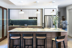
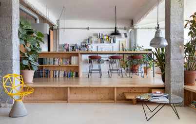
He carried the idea of the central hallway through the kitchen with this wide walkway. The area past the island on the left is the work area, and the area on the right is a beverage bar.
He carried the idea of the central hallway through the kitchen with this wide walkway. The area past the island on the left is the work area, and the area on the right is a beverage bar.
Before: “The kitchen had a nice style thanks to a more recent renovation. But it was kind of wonky,” says Lum. “For example, for some reason the floor was three inches [7.5cm] higher than the rest of the main level, which caused tripping on a daily basis.”
After: Lum fixed the floor level issue in the kitchen. He also added a large skylight that brings light not only into the kitchen, but down the new staircase to the lower level. The new white oak flooring also lightens up the space.
The bar area includes a beverage fridge, coffee machine and a bar sink. The countertops are Super White Pental quartz with a polished finish. Three windows along this wall bring light into the kitchen.
Before: The homeowners’ bedroom was behind the front bedroom and next to the dining room. The only bathroom in the house was located behind it.
After: Lum used some of the space from that back bedroom for the staircase and turned the rest into a playroom for the couple’s two young children. It has two entries. The first is off the central hallway. The second, seen here, has a sliding barn door that allows the couple to keep an eye on the kids while cooking or catching up in the kitchen.
Mansfield + O’Neil designed smart built-ins that provide plenty of space for books, toys and art supplies. The wood is plain sliced white oak.
Mansfield + O’Neil designed smart built-ins that provide plenty of space for books, toys and art supplies. The wood is plain sliced white oak.
Before: This tight bathroom served the entire house. There was access from the couple’s bedroom and off the kitchen.
After: Now the bathroom is accessible off the central hallway. It’s located between the playroom and the study-cum-guestroom. Light colours, a clear glass shower screen, a wall-mounted vanity and shelves make the compact bathroom feel more spacious. It serves as both powder room and full bathroom for overnight guests.
Before: This photo doesn’t match up very well to any of the ‘after’ photos but it shows the state the lower level was in. Lum dug down and had a new foundation poured to provide higher ceilings and proper structural support.
The existing home had no staircase between the main level and this level. There was access through the garage and the backyard. The renovation of this level took over much of the garage space.
The existing home had no staircase between the main level and this level. There was access through the garage and the backyard. The renovation of this level took over much of the garage space.
After: By digging down, Lum was able to gain 2.7-metre ceilings on the lower level. At the bottom of the new interior staircase is a mudroom-landing zone that serves the garage entry. White oak shelves, whimsical button-like hooks and a teal backdrop add playful touches to the space. Millwork and panelled doors nod to the Victorian soul of the house.
There’s also a central corridor on this level. In addition to the family’s three bedrooms and two bathrooms, there are two walk-in wardrobes, a laundry and a wine cellar down here. Lum concealed a long row of wardrobes and storage space along the central hallway underneath the stairs. Hidden hardware allows the family to simply push on the panels to open them.
The new laundry offers direct access to the yard. “One way we nodded to the spirit of the Victorian era in a contemporary way throughout the house was through finely crafted woodwork,” says Lum.
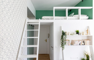
Another bold wallpaper and deep teal paint add a playful vibe to one of the children’s rooms. Mansfield + O’Neil custom-designed thoughtful built-ins to mitigate the room’s narrowness. For example, built-in shelving and dresser drawers take up less room and have a more streamlined look than freestanding furniture. Off the hallway, there’s a shared bathroom between this bedroom and the other child’s bedroom.
Before: The clients and Lum finally relented to the cumbersome neighbour notification process when they decided they needed to build out living space under the existing deck.
After: Navigating the planning process was well worth it. Finishing the space under the deck provided an airy bedroom for the homeowners. A wall of doors opens from their bedroom to the patio and spa.
The couple’s bathroom includes a freestanding bath and a generous separate shower stall. Hexagonal floor tiles suit their Midcentury Modern tastes, while tiles with gold bubble-like circles add a playful touch. There’s also a large window across from the bath.
Before: The backyard was a great asset, but the existing design wasn’t making the most of it.
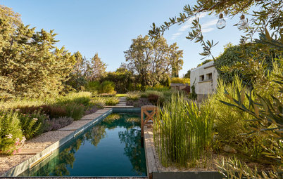
After: Beth Mullins of Growsgreen Landscape Design completed the backyard design. Each area flows into the next in an inviting way. “And the house and deck have such a great flow into the backyard,” says Lum. Now the backyard is a spot where everyone in the family enjoys spending time.
The spa is directly off the homeowners’ bedroom, a built-in bench defines the living area and a pergola adds architecture over the outdoor kitchen and dining area. Heaters and the shade-providing pergola over the table, a fire pit in the living area and the spa make the space pleasant year-round. A new concrete retaining wall will prevent the existing bamboo trees from spreading further into the yard.
Your turn
What do you love most about this thoughtful transformation? Share your thoughts in the Comments below, like this story, save the images for inspiration, and join the renovation conversation.
More
Do you love to see different countries’ approaches to heritage homes? Before & After: A Russian Flat Honours Valuable Family Memories


House at a Glance
Who lives here: A couple and their two kids
Location: Lower Haight neighbourhood of San Francisco
Size: 244 square metres; four bedrooms, three bathrooms
Designers: John Lum Architecture (architecture), Mansfield + O’Neil (interior design) and Beth Mullins of Growsgreen Landscape Design (landscape architecture)
Builder: Christopher Gate Construction
The main level of the house contained 113 square metres of living space. It had two bedrooms and one bathroom. The lower level was unfinished and included the garage. And the home wasn’t taking advantage of one of its greatest assets: a south-facing back facade and backyard.
“These clients were knowledgeable about design and had great ideas. Because they have bold style and kept their minds open, they were really fun to work with,” says Lum. He and the homeowners used Houzz images for inspiration and to share ideas. Interior designer Lisa O’Neil helped them with the furnishings and lighting and custom-designed built-ins to save space and enhance the design. She also notes that they had great ideas for colours and in particular loved aloe green and black mixed with light creams and other natural tones.