


Where Do Colour Trends Come From?
Colours go in and out of vogue. Here's how they make their way into our home decor
Елена Игумнова
25 April 2016
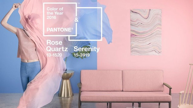
Each year, we’re showered with scores of forecasts telling us which colour palette will emerge as predominant in the near future. Already announced for 2016 are ‘Cherished Gold’, ‘Rose Quartz’, ‘Serenity’ blue and shades of off-white, as well as nuances of blue, green and grey.
But who decides which shades will be in vogue, and how do they come to their conclusions? Should we trust these forecasts, or simply choose what we feel is right for us instead? Read on to discover the thinking and research behind the colours of the year – then decide whether these shades are right for your home.
But who decides which shades will be in vogue, and how do they come to their conclusions? Should we trust these forecasts, or simply choose what we feel is right for us instead? Read on to discover the thinking and research behind the colours of the year – then decide whether these shades are right for your home.
The influence of Pantone and Dulux
Several institutions announce the colours of the year and general colour trends. The main ones are the Pantone Color Institute, AkzoNobel Global Aesthetic Center (Dulux), and four or five influential style agencies. In addition, several of the largest paint manufacturers also choose their main colours of the year.
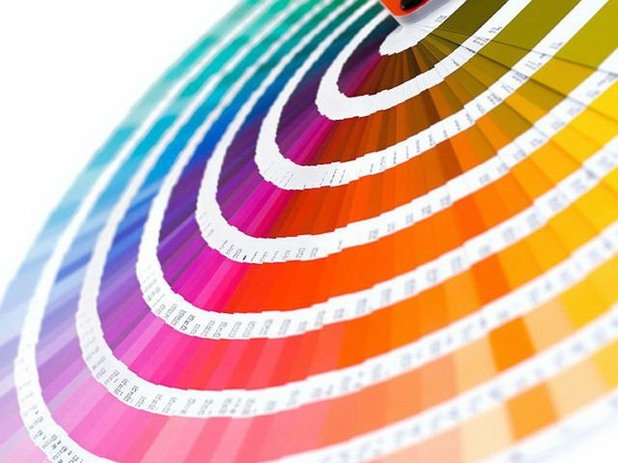
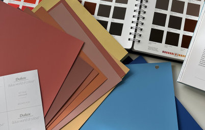
“Pantone Color Institute is the most authoritative organisation dealing with colour,” says independent designer-colourist Xenia Chupin. “The printing industry, the digital technologies sector, fashion, interior design, and other areas where colours are used all need their palette fandecks, such as the one shown here, featuring thousands of shades. In fact, Pantone creates a language for us, a language that all those who belong to the world of design can easily use to communicate with each other.
“The organisation doesn’t just assign numbers and names to countless shades, it also carries out profound analysis,” Chupina says. “It experiments with colours and, by virtue of its authority, even makes decisions for us. Each year, drawing on trends and sentiments around the world, the company selects the main colour of the year and several shades for the season.”
Several institutions announce the colours of the year and general colour trends. The main ones are the Pantone Color Institute, AkzoNobel Global Aesthetic Center (Dulux), and four or five influential style agencies. In addition, several of the largest paint manufacturers also choose their main colours of the year.
“Pantone Color Institute is the most authoritative organisation dealing with colour,” says independent designer-colourist Xenia Chupin. “The printing industry, the digital technologies sector, fashion, interior design, and other areas where colours are used all need their palette fandecks, such as the one shown here, featuring thousands of shades. In fact, Pantone creates a language for us, a language that all those who belong to the world of design can easily use to communicate with each other.
“The organisation doesn’t just assign numbers and names to countless shades, it also carries out profound analysis,” Chupina says. “It experiments with colours and, by virtue of its authority, even makes decisions for us. Each year, drawing on trends and sentiments around the world, the company selects the main colour of the year and several shades for the season.”
“Pantone Color Institute is a division of the Pantone company,” says Vasily Dozhdalev, product manager with Pantone Russia. “It’s a close-knit group of company experts and a large number of correspondents based all over the globe. The correspondents gather information pertaining to colour trends worldwide, and it’s not only fashion from the catwalks they focus on – they follow all aspects of life that one way or another relate to and influence colour.
“Information flows to the ‘nerve centre’ of the Institute, i.e., to experts who in the end decide on the key colours for the coming year. It’s worth noting that the colour of the year, while the most ‘hyped-up’ aspect, is not a thing in itself – it’s an integral part of the intense work underway in the Institute aimed at forecasting colour trends.
Pantone experts named two colours of the year for 2016 – Rose Quartz and pale blue Serenity – emphasising a blurring of the genders, with stereotypically male and female colours merging. “In many parts of the world we’re experiencing a gender blur as it relates to fashion, which has in turn impacted colour trends throughout all other areas of design,” says Leatrice Eiseman, executive director of the Pantone Color Institute.
“This more unilateral approach to colour is coinciding with societal movements toward gender equality and fluidity, the consumer’s increased comfort with using colour as a form of expression, a generation that has less concern about being typecast or judged, and an open exchange of digital information that has opened our eyes to different approaches to colour usage.”
Dulux’s 2016 colour of the year, Cherished Gold, is a soft, earthy shade.
Dulux and AkzoNobel Global Aesthetic Center release a research paper every year titled Colour Futures, which forecasts colour trends for the coming 12 months. This research brings together a group of international experts and trend watchers from across the globe and from various disciplines of design. The experts discuss what they think will be the major global developments in the coming years, based on global social and design trends. This process allows AkzoNobel to nominate a number of trends – with one overriding idea that captures the mood of the moment – and then consider how this will influence the consumer”.
The latest Colour Futures paper announced Cherished Gold as the key colour of 2016. It’s a soft, warm shade suggesting associations with gold and natural earth tones, and it references both the past and the future, experts say. It’s a smooth transition from copper-orange, the main colour of 2015, an AkzoNobel representative says.
Pantone declared Rose Quartz one of its two colours of the year for 2016.
Do product manufacturers know the colour of the year ahead of the general public? “I’m sure previews are held, otherwise scores of Pantone’s partners would not be able to start marketing a wide variety of products in the new year’s colours within a couple of weeks – or even days – of the announcement,” says Pantone product manager Dozhdalev.
“Pantone took the colours of the year from [its] Fashion, Home & Interiors palette,” Dozhdalev says. “Each colour has strictly defined colourimetric parameters, so it can be reproduced in virtually any material and media. Pantone’s website provides information on the closest colours from the popular Pantone Plus palette, as well as on RGB and CMYK values, which are the schemes colours for the professional.”
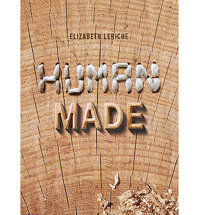
Elizabeth Leriche’s ‘Human Made’ looked at the trend in handmade objects for the lifestyle trade show Maison&Objet 2015.
The Role of style agencies
“All the things that make up our lifestyle are produced by a multitude of companies. These companies need to have some pointers showing them the direction to advance, so they remain trendy and in demand, and this is where style agencies come in, developing company concepts,” says Anna Evstigneeva, a style analyst in Russia. “They have been around for more than 50 years now, and the first to launch this business were the French,” she says.
“The first style agency was pioneered by Maïmé Arnodin. She started a column in Jardin des Modes fashion magazine, where she featured pieces she believed would become fashionable in the next season (colours, fabrics, etc.),” Evstigneeva says. “She began giving tips to the general public, and at some stage this work evolved into the concept of trend books, which eventually came to be used by style agencies. The first book put together by Maïmé Arnodin, called l’Alphabet des Couleurs, came out in 1963 and was dedicated exclusively to colour.”
Since the 1970s, style agencies have presented designs related to consumer life, in trend and inspiration books. These books offer colour schemes and feature the most fashionable decor motifs, fabric samples and sketches, and targeted texts that highlight the keywords of various trends.
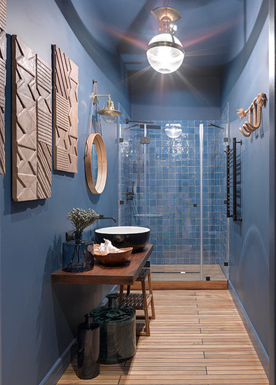
A design by Enjoy Home’s Nadya Zotova used an on-trend combination of wood and blue.
Today, several large agencies produce trend books that carry a lot of weight with professionals. One such agency is French company Nelly Rodi, whose experts (in addition to producing designs for large companies) carry out a substantial volume of work for the world-renowned Maison&Objet fair, which twice a year for more than 20 years has been presenting the latest interiors trends.
There’s also Peclers, Promostyl and Carlin International, market leaders whose forecasts are considered the most influential, fashionable and profound. Also important is trend forecaster Lidewij Edelkoort, whose company advises brand strategists, designers and marketers. Edelkoort’s agency also produces trend books for manufacturers.
“While fashion blogs, websites and magazines present trends that will become relevant in the next season, agencies produce forecasts for the next several years,” says style analyst Evstigneeva. “They classify trends as short-term [six to eight months], medium-term [up to three years] and longer-term [five to 10 years], which involves trends in the development of consumption culture and ideas from the field of futurology. The latter are of a more philosophical nature.
“These trend books are quite expensive,” Evstigneeva notes. “Should you become curious and feel like finding out what’s going to be fashionable two to three years from now, you wouldn’t be able to simply access these publications on the internet. Available in the public domain are usually only trends for the immediate future and the upcoming season.”
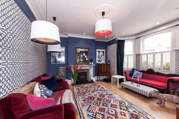
Contrasting bright colours are seen in a project by designer Lyudmila Krishtaleva.
How colours make it into our homes
Style agencies employ designers, artists, art historians, linguists and sociologists who search high and low for ideas floating in the air. They may be inspired to start designing and formulating by the most trivial of things: a scarf an elderly woman is wearing; a child insisting on having his way and wearing something in a ridiculously clumsy fashion.
Many manufacturers rely on these trend books produced by style agencies. But there are also trendsetting companies, such as Kartell, Flos and Moroso, that shape trends themselves, drawing on the work of their designers.
Market rules dictate the need to take into account the current mood, to develop a feel for the public and gain an understanding of what people will be receptive to. “The Première Vision exhibition in Paris, held twice a year, is dedicated to seasonal trends and features many aspects of style: fabrics and their texture, colour palettes, accessories, and silhouettes that will be fashionable,” Evstigneeva says. “The exhibition presents projections for the next two to three years. Companies need this time span to adjust their production capacities. The exhibition website also features the latest trends for the coming season, fall and winter of 2016-2017. This time it’s all about contrasts, a collision of expressive and time-honoured dusty colours; and silvery glitter is staging a comeback.”
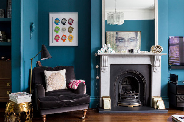
These walls are painted in Farrow & Ball‘s ‘Green Blue’.
Every year, the largest paint manufacturers announce their trendy colours, but each company chooses its own way to determine the key shades and comes up with its own colour palette based on available production capacities. So, how does this happen?
Charlotte Cosby, head of creative at British paint and wallpaper company Farrow & Ball, says, “Our paint colours are chosen from the best of the past. We don’t follow trends, but use different combinations of our colours to create both traditional and contemporary schemes.” When creating key looks for the year, “we reference external sources, such as colour trend books, as well as looking at the current trends in the design world. We also take into account what’s popular in our showrooms and gather insight from our colour experts,” she says.
“Our colour cards are heavily influenced by trends in both interior design and fashion,” says David Mottershead, managing director of British paint and wallpaper company Little Greene. “Our latest blue colour card was inspired by the rising popularity of the colour blue in high-end fashion. Denim in particular is a default blue shade that’s extremely popular, as it works with every skin tone. The blue collection was introduced to reflect the choices of our customers. People are becoming more confident in using bold, statement colours in their homes, particularly with powerful contemporary shades.”
Alabaster White from Sherwin-Williams, seen here, is an understated off-white paint.
“Every two to three years we update our palette to reflect the changing popularity of different colours,” says Farrow & Ball’s Cosby. “We take time to consider long-term trends in decorating and gain insight from our colour consultants before deciding which shades to develop.
“All of our colours are developed by our small team of creatives and each one has to really earn its place on the colour card, as any new shade will replace an existing one,” Cosby says. “Our colours are never discontinued; instead, they are retired to our archive, where they remain available to order.”
American paint company Sherwin-Williams used survey results, among other sources, to arrive at off-white Alabaster (SW 7008) as its 2016 colour of the year. “It provides an oasis of calm and ‘less is more’ visual relief,” says Jackie Jordan, director of colour marketing at the company. “Alabaster is neither stark nor overly warm, but rather an understated and alluring shade of white. Our recent National Home Design and Colour Survey [held in October 2015] stated that nearly three out of four [73%] prefer Alabaster’s naturally flattering, barely-there undertones to plain white when selecting neutral colours for their home.”
Mottershead of Little Greene says, “While the initial inspiration for our colours may come from nature or fashion, we then need to modify those shades to make them more suitable for the home. Selecting colour for your home is very different to choosing colours in fashion – for example, combining a skirt and blouse. Paint colours need to create an environment that can be lived in every day.”
Which sources influenced paint manufacturers’ colour choices for 2016?
“We gained insight from our colour experts, who spoke to our global colour consultants and showrooms, as well as considered social, economic and demographic trends, as we know they can affect people’s colour choices,” Cosby of Farrow & Ball says. “A big influence on this year’s colour choices was actually our 70th anniversary. We looked back and chose colours that reflect our heritage, yet retain a contemporary feel.”
Mottershead says, “At Little Greene, we’ve established a tradition for unearthing document designs and breathing new life into them. Oversized florals coupled with exotic birds are traditional, yet very much on-trend right now. Working closely with a team of experts, we’ve been able to re-create archive fragments in a contemporary yet enduring way, and have incorporated colours and scales to suit modern-day interiors.”
“When we develop new colours, we start to plan around two years in advance,” Cosby says. “If we’re choosing the colour picks for the year, we’ll plan just nine to 12 months ahead to ensure the choice is relevant to the year.”
Mottershead says, “We are currently in the process of creating a modified colour palette that will be available in the next 12 months. Since the release of our existing colour card, different colour combinations have been introduced and some shades have shifted in importance. This means there may be gaps in the palette that we can fill.”
Mottershead says, “We are currently in the process of creating a modified colour palette that will be available in the next 12 months. Since the release of our existing colour card, different colour combinations have been introduced and some shades have shifted in importance. This means there may be gaps in the palette that we can fill.”
Should you follow the trend forecasts?
Colour is what makes an interior look on-trend or not. You could use different furniture and mix various styles, but it’s the colour combinations the eye sees first. Paint turns a living room or kitchen into a living space, hides blemishes, raises or lowers the ceiling, and sets a room’s mood.
However, no professional colourist or designer will try to pressure the customer to choose a fashionable colour. They may suggest options, combinations and accents, but the final choice will rest with the homeowner.
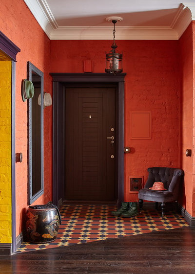
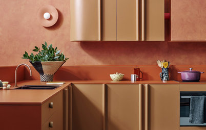
An copper-orange paint is used in this project by designer Ekaterina Vladimirova.
Russian Houzzer freedommm thinks that for the average person, such forecasts are a way of finding their own colours: “When you start home repairs or interior finishing, it’s incredibly difficult to choose a colour palette without assistance. Such trendy colour reviews offer us ordinary people ready-made solutions. This is exactly how I chose the tone for the walls last year when I decided to go ahead with home repairs. I chose a colour that, according to Dulux, was trendy in 2015 – copper-orange – but selected its lighter shade. As a result, I had a ready-made colour composition that I used to paint the walls.”
“It’s not a matter of faith, it’s a question of trust,” says style analyst Evstigneeva. “Any trend book or colour of the year is a reference mark, an ideal image that the professional world takes its bearings from. All trends do not manifest themselves in literal form. After the colour of the season or the colour of the year is announced, no one literally paints all the walls pink, say, or starts wearing only shades of blue. This is a set of tools that every person is free to use at his or her discretion and try out to the extent they need.”
“Interior design is still defined in terms of style, not fashion,” says Russian designer Lyudmila Krishtaleva. “Fashionable colours or trend announcements, if they are needed at all, are done more for communication purposes, to attract attention, to create a certain information environment. It follows, then, that fashion trends are needed as a reason to create an extra occasion to share emotions and ideas with colleagues.
“It’s true that designers like to think and talk colours, as they are fully aware of their power,” Krishtaleva says. “But we don’t suggest colours to customers from a fashion standpoint. Clients include people who are extremely sensitive to very subtle differences in shades or patterns. In one case, we had to repaint walls five times before our customer, who had chosen a pink-lilac tone, was satisfied. With another homeowner, we had to meticulously select off-white. These people, who have no specialised education, who do not professionally work with colour, remember the colour they chose perfectly well and are able to precisely pinpoint it when they see it later. They memorise the tone they liked just as they memorise a mood or a facial expression.”
“It’s true that designers like to think and talk colours, as they are fully aware of their power,” Krishtaleva says. “But we don’t suggest colours to customers from a fashion standpoint. Clients include people who are extremely sensitive to very subtle differences in shades or patterns. In one case, we had to repaint walls five times before our customer, who had chosen a pink-lilac tone, was satisfied. With another homeowner, we had to meticulously select off-white. These people, who have no specialised education, who do not professionally work with colour, remember the colour they chose perfectly well and are able to precisely pinpoint it when they see it later. They memorise the tone they liked just as they memorise a mood or a facial expression.”
“Any production is a lengthy process, and colour prediction is a complex and important task, which may even decide the fate of a factory,” says Alexey Eliseev, CEO of Russian interior design and decorating company Manders. “Planning the colour palette is a task that involves substantial responsibility. As you know, work to predict colours is underway in laboratories at NCS, Pantone and RAL. However, ‘Marsala’ [Pantone’s colour of the year 2015] never showed up in interiors, thus all design products coming out of these laboratories are tentative guidelines.
“Large textile and wallpaper brands, as well as paint manufacturers, have long been following developments in
the world of fashion and product design, rather than these publications [such as trend books],” Eliseev says. “A good example is the transfer of the grey palette from the world of fashion to the realm of interior design over the last two years. The palette immediately became popular in Europe and Russia, and in some senses it has replaced beige.”
“On average the architect works on a project longer (one to three years) than the lifespan of short colouristic trends announced for furniture and accessories manufacturers,” says Russian architect Daria Kharitonova. “There exists a trend of a more global nature – a transition of the colour palette from rich red, gold and warm tones to more restrained and cool shades. In my view, the key factor that caused this ‘cold snap’ in the interior palette was an evolution of lighting: the arrival of energy-efficient and LED bulbs brought to the forefront a new prima donna: grey.
“I think the interior will continue to evolve towards colder and more resonant tones,” Kharitonova says. “We are expecting blue, turquoise, malachite, lemon and carmine shades to emerge as new trends.“
TELL US
Will you be redecorating at home to incorporate these on-trend colours this year? Share your thoughts in the Comments
MORE
Raise Your Glass to Marsala, Pantone’s 2015 Colour of the Year
How to Work With Pantone’s Colours of 2016
Trend Forecast: Key Colours for 2016
Related Stories
Paint
How to Choose Your Perfect Paint Colours
By Erin Carlyle
Three USA designers share tips to pinpoint your style and mine memories to find the right paint palette for your home
Full Story
Renovating Advice
How to Choose Your Wall Colour to Complement Floors and Furniture
Which colour should I paint my room to suit the flooring and furniture? We've all asked it – and here are the answers
Full Story
Most Popular
How to Pick the Right Paint Colours for Your Federation House
By Joanna Tovia
Roof colour, wall materials and emerging trends all come into play for Federation paint schemes that work
Full Story
Colourful Homes
Suffering From White-Wall Syndrome? How to Add Colour Confidently
White walls are great... until they stop being inspiring. Five paint colour experts share how to transition to colour
Full Story
Expert Opinion
An Interior Designer Reveals How to Mix Colours and Make it Work
By tidgboutique
Don’t want to confine yourself to neutrals but lack the confidence to embrace colours? We have you covered
Full Story
Made Local
Made Local: How Dulux Colour Trends Are Born
Ever wondered how Dulux sees into the future to know the colours we'll be coveting in the year ahead? Here, we find out
Full Story
Houzz Tours
Queensland Houzz: A Cute Cottage Awash With Colour and Pattern
Bold colour, quirky prints and an abundance of art transformed this 1920s cottage into an inviting and relaxing gem
Full Story
Houzz Tours
My Houzz: A Moody, Modernised Home in Melbourne Regains its Charm
The original beauty of this Californian bungalow was lost to unsympathetic updates – see how a designer brought it back
Full Story
Interior Design
20 Honey-Hued Interiors That'll Make You Melt
Our coffee-break escape offers you five minutes' worth of images to inspire and delight. Jump right in...
Full Story
Awards
Paintbrushes Poised! 2023 Dulux Colour Awards Finalists Are In
Looking for interesting ways to add colour at home? Check out these shortlisted projects in the 2023 Dulux Colour Awards
Full Story
Horrors. When I took ballet as a child I had to wear one pink and one blue sock of those exact same shades.
Awesome!
PHEW!!! This is a long, old article and apparently it goes to demonstrate that color influences everybody in one way or another. I am an artist...or I suppose that's what I am since its what I do...funny that...and visa versa. My speciality or perhaps my obsession ever since I was in my late teens is every aspect of colour beginning with how it originates, how we see it, what effect it has on individuals and, as a maker of art how to produce colours that will absolutely not fail the test of whether or not they are genuine...Suppose that's not what we are discussing here but I find everyone's opinions extremely inteesting from the point of view that colour affects everybody's psyche.During my colour journey I've studied colour and music, colour and mood, colour and health ...and lots more and found that colour is intrinsic to being human...what we see and how we respond as opposed to what other creatures see and how they respond. I discovered that my cat sees only in RED and BLUE, so I gave him a RED food and a BLUE water bowl and he's eating and drinking more. I've discovered that light makes colour deceptive and that what we actually see as, say, yellow, is really purple and so on around the spectrum. What would it be like to see the plants and flowers.... and all the colours of manufactured and combined colours that go into making up a specific shade of/mixed paint just as they are... in their exact opposite? All of that science and more I think goes to the discussion that colour has an influence on man that man does not even realise.....we see the opposite to what is really there..and what are we seeing when we are presented with a mixed commercial shade of paint that is comprised of several coloured pigments suspended in a neutral base...if indeed even the subtle shade of that base has something to contribute to the deception? Bit philosophic? Mmmmm... but that's it really, colour as we see it does not exist and it is precisely this what makes each human psyche gravitate towards what stirrs us....like the little cat and his red and blue food bowls.. All living creatures are more moved by colour than we realise.
I've often questioned the use of green or blue in hospitals as a colour of serenity...for some people this would not be so....and then factor in any personal associations an individual may have with that particular shade.
Colour Trends...do not suit everybody! Many people who want to be "en trend" for trend's sake would be denying what they really would like just for the sake of 'trend'. Others may actually respond to the trendy shades. Some Greys and Blacks..( bearing in mind that there is no such shade as either of them since they are an admixture of many colours until these are annihilated)... Greys are are comprised of many shades with one or two predominating....so even Grey and Black may appeal to somebody who usually does not like these..probably because they've been exposed to shades of these that contained a large proportion of colour that they do not like..(for other associations)....and the opposite can also happen. Some Greys and some Blacks may even appeal...and its..."incomprehensible".
Trend is just another marketing game like clothing fashions, appealing to the need of many to "be seen to be"...you know the ones...Also very useful to decorators of residences to be placed on the market....but give me the predominantly white or cream place for sale in this instance and let the appeal be.."potential".
To the PRO...many posts above....in April 2016...for whose name I do not have the characters on my laptop.....who says that if they could see my and oskuaee's faces they could pick what colours we like.....Things will have changed I'd be willing to bet.
Extremely provocative article!