
Decorating

Winter Warmers: Colour Forecast 2015
If deep and mellow colours appeal to your decorating style, then you’ll fall in love with the latest colour palettes for winter

Nothing revamps your decor more than adding a new colour. Whether it’s just adding key trend tone by way of soft furnishings or a small decorative item or a complete coordinated wall painting effort, the injection of an on-trend hue or two can instantly transform a home’s look. This winter, designers and stylists are excited about the latest colour ranges and these include plenty of striking deep shades and pale subtle tints to choose from. Take advantage of the change of season to update a room with a new lick of paint, arguably the most impressive and cost effective way to add a new colour and achieve an unmistakable wow factor. Or, if you want to move things around, transform your space with the colourful addition of a designer rug, objet d’art or an unusual piece of furniture in one of the season’s new showstopper shades.
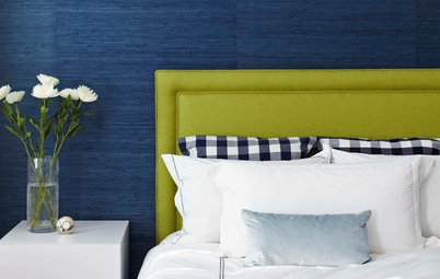
Jewel tones
Exotic shades on the deep blue spectrum include jewel colours such as aquamarine and sapphire. According to Jessica Bellef, head of styling for Temple and Webster: “There is going to be a lot of rich colours – in the world of blues especially. Deep tones that go into greens, jewellery tones will be popular, especially when teamed with metallics.”
She suggests that using blue in a bedroom or living room should be done with a little restraint. “You could look at beautiful velvet cushions, and highlights in a teal and just punches of colour throughout,” she says.
Grey days
Far from gloomy, interior designers can’t seem to get enough of this monochrome shade. “Another great trend is dark hues like grey and charcoal,” say Shaynna Blaze, TV personality and Taubmans colour consultant and brand ambassador. “They might sound too heavy a colour to introduce in winter but if you have a white couch and white artwork [or a white fireplace and bookcase, as above] it actually makes the white stand out and is a fresh contrast in an interior. Select a grey that has a slight blue base for its calming qualities and add bolder blues and indigo in a rug to bring the whole interior together.”
Fiona Parry-Jones, creative director of Von Haus Design Studio and Haymes Paint colour consultant, agrees. “‘Gunpowder Smoke’ is one of my favourites from the Haymes paint palette, creating the perfect base for the walls of any home in winter and throughout the year.”
Tangerine dream
There are a few key colour trends that should move us through the coldest parts of the year and into the summer. Some tap into our dark side but others are the polar opposite.
According to Blaze, one of the most luscious trends in decorating colours has come out of last year’s industry-wide love affair with coral. “Soft tangerines and pinks are hot. These both work really well for accessories but going bold with one of these shades in a hallway or living space is a simple way to add brightness to an interior,” says Blaze.
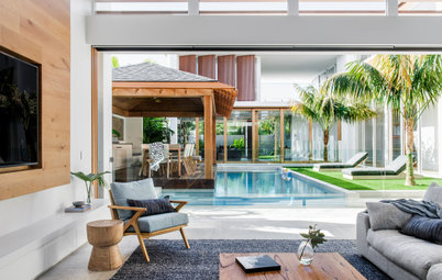
Another simple but effective way to add a new colour is by buying a set of plastic-moulded dining chairs, which come in a big variety of colours, to use around the dining table, as seen above, or through introducing the colours via soft furnishings, such as cushions and throws on a bed, pictured below.
There are a few key colour trends that should move us through the coldest parts of the year and into the summer. Some tap into our dark side but others are the polar opposite.
According to Blaze, one of the most luscious trends in decorating colours has come out of last year’s industry-wide love affair with coral. “Soft tangerines and pinks are hot. These both work really well for accessories but going bold with one of these shades in a hallway or living space is a simple way to add brightness to an interior,” says Blaze.
Another simple but effective way to add a new colour is by buying a set of plastic-moulded dining chairs, which come in a big variety of colours, to use around the dining table, as seen above, or through introducing the colours via soft furnishings, such as cushions and throws on a bed, pictured below.
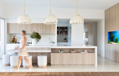
Gumtree green
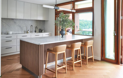
There’s a special green hue to watch out for this winter; look out for the powdery grey-green shade of gum trees and take your scheme back to nature.
“A soft green is such a beautiful colour alongside pale natural timber in living spaces, making it also the perfect colour for contemporary kitchens,” says Leech. “It’s a green to be combined with icy hues, such as wintery greys and whites. Pairing it with black adds a striking modern contrast while accenting with white keeps it feeling classic.”
Teamed with timber
Fiona Parry-Jones suggests pairing pastels with fiery oranges, purples and greens to create an exotic warmth that draws you in.
“This winter, interior colours embrace nature in a more vibrant way to create a sense of depth and opulence in the home,” she says. “Haymes have a beautiful palette of Exotic Botanic colours in their paint range for this year.”
Teamed with this year’s tangerine and some metallic accents, the gum-green shade is a winter winner, see below.
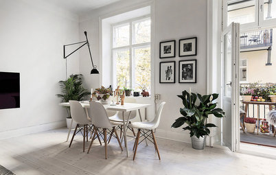
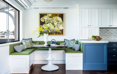
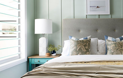
Dusty pastels
The pastel trend, which has been going strong for a few seasons now, is still one to watch, says Parry-Jones. “Look out for dusty greys and pinks and smokey charcoals and blues for walls and furniture,” she says.
Blaze suggests to pair pastels with timber finishes. “These colours work well on a main wall or side-wall work with plain white framed prints or black and white photos, but for a different look, pair pastel with light-coloured timbers like oak.”
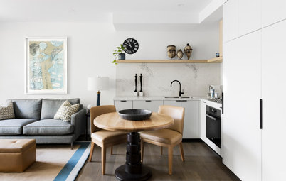
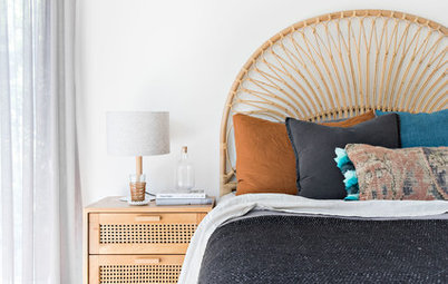
Pastels paired with light timber tones are one of Blaze’s interior trend predictions this winter. See a couple of examples below of how this can work: A timber feature wall complements the pastel shades in soft furnishings dressing a bed in an understated modern bedroom. Below that, pastel shades in a living room complement the adjoining taupe-coloured timber kitchen in a beach house overlooking the sea.
The pastel trend, which has been going strong for a few seasons now, is still one to watch, says Parry-Jones. “Look out for dusty greys and pinks and smokey charcoals and blues for walls and furniture,” she says.
Blaze suggests to pair pastels with timber finishes. “These colours work well on a main wall or side-wall work with plain white framed prints or black and white photos, but for a different look, pair pastel with light-coloured timbers like oak.”
Pastels paired with light timber tones are one of Blaze’s interior trend predictions this winter. See a couple of examples below of how this can work: A timber feature wall complements the pastel shades in soft furnishings dressing a bed in an understated modern bedroom. Below that, pastel shades in a living room complement the adjoining taupe-coloured timber kitchen in a beach house overlooking the sea.
Gold and glittery highlights
In the colder months of the year, there’s nothing cosier than sitting by the fire, but winter warmth can also be achieved with colour. Soft burnished browns and tans teamed with metallics, especially gold, are hot favourites with designers and canny home decorators.
“Warmth can be added with accents of copper or gold metallics and layers of texture – such as sheer drapes that let in the winter sun and fur throws or heavy knits,” says Leech.
Don’t be afraid to add a bit of bling either, says Parry-Jones. “Metallics are hot this winter so don’t be afraid to mix your metallic colours such as gold, silver, copper or brass with other homewares and lighting,” she says. “As far as natural stones and materials go, marble is still on trend to create a cool contrast with the warm earthy metallics and pastel tones.”
Brown brigade
There is a new brown in town that is a cross between mushroom and taupe. Leech says it’s a colour we instinctively find attractive. “Brown is one of those colours that most of us find nurturing and warming,” she says. “Combine it with blue greys and charcoals to create a modern scheme accented with lots of natural textures and neutral hues,” she says.
Walls painted in ‘Ceylonese’: Dulux
TELL US
What colour are you most excited about this winter? Tell us about your favourite colour and where you plan to use it at home in the comments section.
MORE
How to Be Truly Confident With Colour
7 Ways the Great Australian Landscape Can Inspire Your Colour Scheme
Decorating Trends to Embrace This Winter


Sponsored

Sponsored
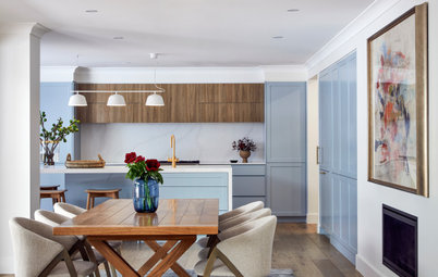
Indigo and navy are colours we have loved for seasons now, so it’s been a great relief to see that dark blue has not fallen foul of fashion but morphed into a slightly new shade this winter. With a tincture of grey, the dark blue of stormy seas is still the colour of the season, and for designers and stylists, it is set to become a firm favourite all year round – especially when teamed with exotic grained timber furniture.
“This winter, we are seeing the growing popularity of icy hues as well as inky blues,” says Bree Leech, creative consultant and stylist for Dulux Paint, whose new ‘Baltica’ palette was created to represent the dark hues of the ocean deep. “Create a cocooning space with this colour on all four walls of a bedroom or create a dramatic backdrop for art in a main living area,” she says.