Entryway Design Ideas with Porcelain Floors
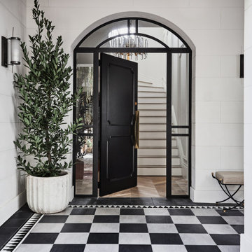
Inspiration for a large transitional foyer in Sydney with black walls, porcelain floors, a single front door, a black front door and black floor.
Kyle Caldwell
This is an example of a small traditional mudroom in Boston with beige walls and porcelain floors.
This is an example of a small traditional mudroom in Boston with beige walls and porcelain floors.
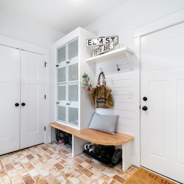
This is an example of a mid-sized traditional mudroom in Denver with white walls, porcelain floors, a single front door, a blue front door and multi-coloured floor.
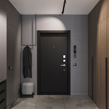
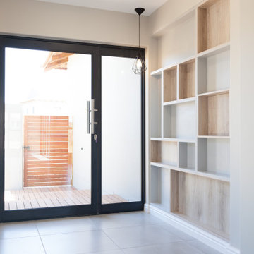
Design ideas for a small contemporary entry hall in Other with grey walls, porcelain floors, a single front door, a black front door and grey floor.

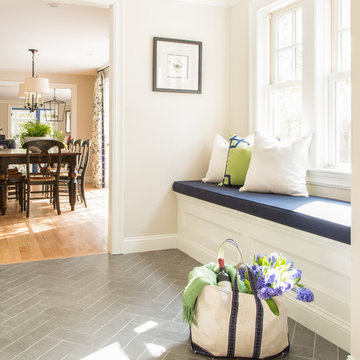
Mid-sized transitional mudroom in San Francisco with grey walls, grey floor, porcelain floors, a single front door and a white front door.
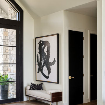
Double glass front doors at the home's foyer provide a welcoming glimpse into the home's living room and to the beautiful view beyond. A modern bench provides style and a handy place to put on shoes, a large abstract piece of art adds personality. The compact foyer does not feel small, as it is also open to the adjacent stairwell, two hallways and the home's living area.
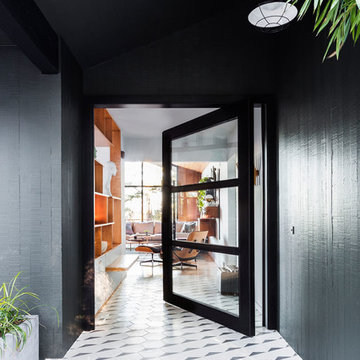
The architecture of this mid-century ranch in Portland’s West Hills oozes modernism’s core values. We wanted to focus on areas of the home that didn’t maximize the architectural beauty. The Client—a family of three, with Lucy the Great Dane, wanted to improve what was existing and update the kitchen and Jack and Jill Bathrooms, add some cool storage solutions and generally revamp the house.
We totally reimagined the entry to provide a “wow” moment for all to enjoy whilst entering the property. A giant pivot door was used to replace the dated solid wood door and side light.
We designed and built new open cabinetry in the kitchen allowing for more light in what was a dark spot. The kitchen got a makeover by reconfiguring the key elements and new concrete flooring, new stove, hood, bar, counter top, and a new lighting plan.
Our work on the Humphrey House was featured in Dwell Magazine.
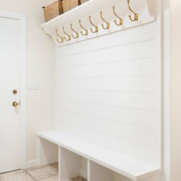
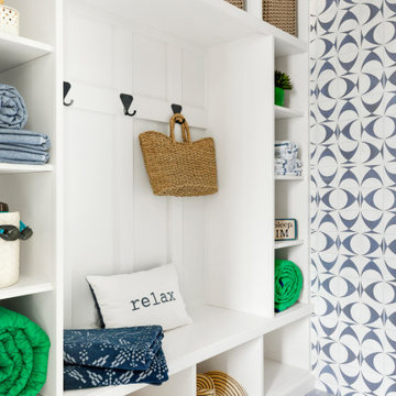
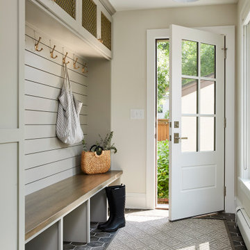
Mudroom Coat Hooks
Design ideas for a mid-sized transitional mudroom in Salt Lake City with white walls, porcelain floors, a single front door, a white front door and grey floor.
Design ideas for a mid-sized transitional mudroom in Salt Lake City with white walls, porcelain floors, a single front door, a white front door and grey floor.
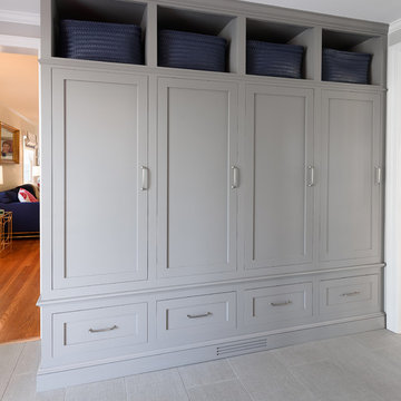
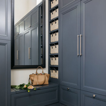
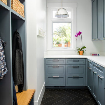
Gray lockers with navy baskets are the perfect solution to all storage issues
This is an example of a small transitional mudroom in New York with grey walls, porcelain floors, a single front door, a black front door and grey floor.
This is an example of a small transitional mudroom in New York with grey walls, porcelain floors, a single front door, a black front door and grey floor.
Reclaimed lockers refinished and built-in to frame.
Photo of a country mudroom in Chicago with porcelain floors, multi-coloured floor and planked wall panelling.
Photo of a country mudroom in Chicago with porcelain floors, multi-coloured floor and planked wall panelling.
Herringbone tiled entry
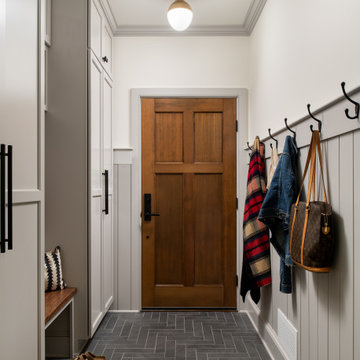
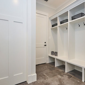
Photo of a mid-sized transitional mudroom in Burlington with grey walls, porcelain floors, a single front door, a dark wood front door, grey floor and decorative wall panelling.
Photo of a mid-sized transitional mudroom in Burlington with grey walls, porcelain floors, a single front door, a dark wood front door, grey floor and decorative wall panelling.
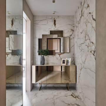
Квартира начинается с прихожей. Хотелось уже при входе создать впечатление о концепции жилья. Планировка от застройщика подразумевала дверной проем в спальню напротив входа в квартиру. Путем перепланировки мы закрыли проем в спальню из прихожей и создали красивую композицию напротив входной двери. Зеркало и буфет от итальянской фабрики Sovet представляют собой зеркальную композицию, заключенную в алюминиевую раму. Подобно абстрактной картине они завораживают с порога. Отсутствие в этом помещении естественного света решили за счет отражающих поверхностей и одинаковой фактуры материалов стен и пола. Это помогло визуально увеличить пространство, и сделать прихожую светлее. Дверь в гостиную - прозрачная из прихожей, полностью пропускает свет, но имеет зеркальное отражение из гостиной.
Выбор керамогранита для напольного покрытия в прихожей и гостиной не случаен. Семья проживает с собакой. Несмотря на то, что питомец послушный и дисциплинированный, помещения требуют тщательного ухода. Керамогранит же очень удобен в уборке.
Mudroom
Photo of a large country entryway in San Francisco with white walls, porcelain floors and black floor.
Photo of a large country entryway in San Francisco with white walls, porcelain floors and black floor.
Inspiration for a small beach style entryway in Minneapolis with blue walls, porcelain floors and blue floor.
Automated lighting greets you as you step into this mountain home. Keypads control specific lighting scenes and smart smoke detectors connect to your security system.
Photography: Alyssa Lee Photography
Design ideas for a mid-sized transitional mudroom in Minneapolis with beige walls and porcelain floors.
Design ideas for a mid-sized transitional mudroom in Minneapolis with beige walls and porcelain floors.
Expansive traditional mudroom in Other with grey walls, porcelain floors, a single front door and grey floor.
This is an example of a mid-sized front door in Other with grey walls, porcelain floors, a dutch front door, a gray front door and grey floor.
The mudroom leading from the garage includes built-in cubbies for backpacks and coats as well as a bench to put shoes on before heading out the door.
Framing metal doors with wood and stone pulls the design together.
Inspiration for a mid-sized country foyer in Phoenix with beige walls, porcelain floors, a single front door, a brown front door and beige floor.
Inspiration for a mid-sized country foyer in Phoenix with beige walls, porcelain floors, a single front door, a brown front door and beige floor.
Entryway Design Ideas with Porcelain Floors
1