Search results for "Corner block house brisbane" in Home Design Ideas
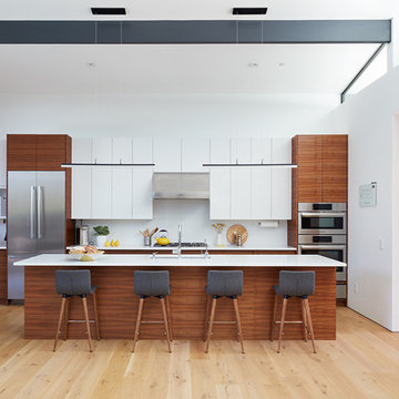
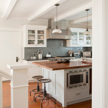
The owners of this kitchen had spent the money to upgrade the finishes in their kitchen upon building the home 12 years ago, but after living in the space for several years they realized how nonfunctional the layout really was. The (then) two preschool aged children had grown into busy, hungry teenagers with many friends who also liked to hang out at the house. So the family needed a more functional kitchen with better traffic flow, space for daily activities revolving around the kitchen at different times of day, and a kitchen that could accommodate cooking for and serving large groups. Furthermore, the dark, traditional finishes no longer reflected the homeowners’ style. They requested a brighter, more relaxed, coastal style that reflected their love of the seaside cities they like to visit.
Originally, the kitchen was U-shaped with a narrow island in the middle. The island created narrow aisles that bottle-necked at the dishwasher, refrigerator, and cooktop areas. There was a pass-through from the foyer into the kitchen, but the owners never liked that the pass-through was also located so close to the powder room. The awkward proximity was unappealing and made guests feel uncomfortable.
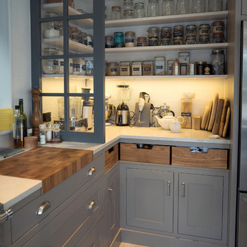
The kitchen’s storage was made up of lots of narrow cabinets, apothecary drawers, clipped corner units, and very few drawers. It lacked useful storage for the larger items the family used on a daily basis. And the kitchen’s only pantry was small closet that had only builder-grade, narrow shelving with no illumination to be able to see the contents inside.
Overall, the kitchen’s lighting plan was poorly executed. Only six recessed cans illuminated the entire kitchen and nook areas. The under cabinet lighting was not evenly distributed either. In fact, the builder had mis-placed the under cabinet lighting around the decorative pilasters which made for choppy, dark cubbies. Further, the builder didn’t include any lighting over the sink or the bar area, which meant whoever was doing the dishes was always in their own shadow. That, coupled with the steep overhang of the game room above made the bar area feel like a dim, cavernous space that wasn’t inviting or task oriented. The kitchen looked out into the main living space, but the raised bar and a narrow wall (which held the only large cabinet in the kitchen) created more of a barrier than a relationship to the living room or breakfast nook. In fact, one couldn’t even see the breakfast nook from the cooktop or sink areas due to its orientation. The raised bar top was too narrow to comfortably sit to either dine at or chat from due to the lack of knee space. The the homeowners confided that the kitchen felt more like a dark, dirty prison than place where the family, or their guests, wanted to gather and commune.
The clients' needs and desires were:
➢ to create a kitchen that would be a space the family loved to be in; to relate to the adjacent spaces all around, and to have better flow for entertaining large groups
➢ to remove the walls between the breakfast nook and living area and to be able to utilize the natural light from the windows in both those areas
➢ to incorporate a functional chopping block for prepping fresh food for home cooked meals, an island with a large sink and drain board, 2 pull out trash cans, and seating for at least the 2 teens to eat or do homework
➢ to design a kitchen and breakfast nook with an airy, coastal, relaxed vibe that blended with the rest of the house's coastal theme
➢ to integrate a layered lighting plan which would include ample general illumination, specific task lighting, decorative lighting, and lots of illuminated storage
➢ to design a kitchen with not only more storage for all the husband’s kitchen gadgets and collection of oils and spices, but smart storage, including a coffee/breakfast bar and a place to store and conceal the toaster oven and microwave
➢ to find a way to utilize the large open space between the kitchen, pantry area, and breakfast nook
Twelve Stones Designs achieved the owner's goals by:
➢ removing the walls between the kitchen and living room to allow the natural light to filter in from the adjacent rooms and to create a connection between the kitchen, nook, and living spaces for a sense of unity and communion
➢ removing the existing pantry and designing 3 large pantry style cabinets with LED tape lights and rollout drawers to house lots of kitchen appliances, gadgets, and tons of groceries. We also took the cabinets all the way up to the 9’ ceiling for additional storage for seasonal items and bulk storage.
➢ designing 2 islands - 1 with a gorgeous black walnut chopping block that houses a drawer for chopping and carving knives and a custom double pull out trash unit for point of use utilization - and 1 that houses the dishwasher, a large Blanco Gourmet sink with integrated drain board, woven baskets for fresh root vegetables and kitchen towels, plenty of drawer storage for kitchen items, and bar seating for up to 4 diners.
➢ closing off the space between the kitchen and the powder room to create a beautiful new private alcove for the powder room as well as adding some decorative storage. This also gave us space to include more tall storage near the new range for precision placement of the husband’s extensive oil and spice collection as well as a location for a combo-steam oven the wife wanted for baking and cooking healthy meals.
The project is enhanced functionally by:
➢ incorporated USB and standard receptacles for the kids’ laptops and phone charging in the large island
➢ designing the small island to include additional open shelving for items used on a daily basis such as a variety of bowls, plates, and colanders. This set up also works well for the husband who prefers to “plate” his dinners in restaurant-style fashion before presenting them to the table.
➢ the integration of specific storage units, such as double stacked cutlery drawers, a custom spice pull-out, a Kuerig coffee and tea pod drawer, and custom double stacked utensil drawers
➢ moving the refrigerator to the old oven location - this eliminated the bottle neck as well as created a better relationship to the eating table. It also utilizes the floor space between the pantry, nook, and kitchen
➢ creating a banquet style breakfast nook - this banquette seating not only doubles the amount of seating for large gatherings but it better utilizes the odd space between the kitchen and the previous nook area. It also helps to create a distinct pathway from the mudroom room through the pantry area, kitchen, nook, and living room.
➢ the coffee/breakfast bar area which includes the perfect location for the concealed microwave and toaster oven, convenient storage for the coffee pods and tea accoutrements. Roll-out drawers below also house the smoothie maker, hot water kettle, and a plethora of smoothie-making ingredients such as protein powders, smoothie additives, etc. Furthermore, the drawers below the Keurig house measuring utensil, cutlery, baking supplies and tupperware storage.
➢ incorporating lots of wide drawers and pullouts to accommodate large cookware.
➢ utilizing as much vertical space as possible by building storage to the ceiling which accommodates the family’s abundant amount of serving platters, baking sheets, bakeware, casserole dishes, and additional cutting boards.
The project is enhanced aesthetically by:
➢ new 5-piece Versailles pattern porcelain tile that now seamlessly joins the entire down stairs area together creating a bright, cohesiveness feeling instead of choppy separated spaces - it also adds a coastal feeling
➢ designing a cabinet to conceal the microwave and toaster oven
➢ the coastal influenced light fixtures over the nook table and island
➢ the sandy colors of the Langdon Cambria countertops. The swirling pattern and sparkling quartz pieces remind the homeowner of black-and-tan sandy beaches
➢ the striped banquet seating whose creamy white background and blue-green stripes were the inspiration for the cabinet and wall colors.
➢ All the interior doors were painted black to coordinate with the blacks and grays in the backsplash tile and countertop. This also adds a hint of tailored formality to an otherwise casual space.
➢ the use of WAC's Oculux small aperture LED units for the overhead lighting complimented with Diode LED strips for task lighting under the cabinets and inside the pantry and glass wall cabinets. All of the lighting applications are on separate dimmer switches.
Innovative uses of materials or construction methods by Realty Restoration LLC:
➢ Each 1-1/2” x 3” block of reclaimed end-grain black walnut that makes up the center island chopping block was hand milled and built in the shop. It was designed to look substantial and proportional to the surrounding elements, executed by creating the 4 inch tall top with a solid wood chamfered edge band.
➢ The metal doors on either side of the vent hood were also custom designed for this project and built in the Realty Restoration LLC shop. They are made 1x2, 11-gauge mild steel with ribbed glass. Weighing 60 lbs a piece, heavy duty cabinet hinges were added to support the weight of the door and keep them from sagging.
➢ Under-cabinet receptacles were added along the range wall in order to have a clean, uninterrupted backsplash.
Design obstacles to overcome:
➢ Because we were removing the demising walls between the kitchen and living room, we had to find a way to plumb and vent the new island. We did this by tunneling through the slab (the slab had post tension cables which prevented us from just trenching) to run a new wet vent through a nearby structural wall. We pulled the existing hot and cold lines between upper floor joists and ran them down the structural wall as well and up through a conduit in the tunnel.
➢ Since we were converting from wall overs to a gas range it allowed us to utilize the 220 feed for the wall ovens to provide a new sub panel for all the new kitchen circuits
➢ Due to framing deficiencies inherited from the original build there was a 1-1/2” differential in the floor-to-ceiling height over a 20 foot span; by utilizing the process of cutting and furring coupled with the crown moulding details on the cabinet elevations we were able to mask the problem and provide seamless transitions between the cabinet components.
Evidence of superior craftsmanship:
➢ uniquely designed, one-of-a-kind metal “X” end panels on the large island. The end panels were custom made in the Realty Restoration LLC shop and fitted to the exact dimensions of the island. The welding seams are completely indistinguishable - the posts look like they are cut from a single sheet of metal
➢ square metal posts on the small island were also custom made and designed to compliment and carry through the metal element s throughout the kitchen
➢ the beautiful, oversized end panels on the pantry cabinets which give the breakfast nook a tailored look
➢ integrating a large format 5 piece Versailles tile pattern to seamlessly flow from the existing spaces into the new kitchen space
➢ By constructing a custom cabinet that jogged around a corner we could not remodel (housing the entry way coat closet) we were able to camouflage the adjacent wall offset within the upper and lower cabinets. By designing around the existing jog in the structural walls we accomplished a few things: we were able to find the space to house, and hide, the microwave and toaster oven yet still have a clean cohesive appearance from the kitchen side. Additionally, the owners were able to keep their much needed coat closet and we didn’t have to increase the budget with unnecessary structural work.
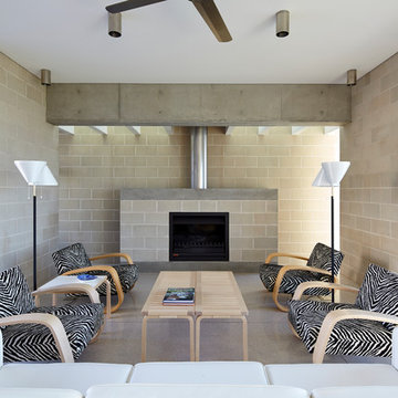
Porebski Architects, Beach House 2.
Concrete block walls and terrazzo floors are brought inside to accentuate the indoor outdoor fell. A skylight with baffles is located over the fireplace to bring light in a create a visual effect on the wall.
Hydronic underfloor heating is connected to the sea water geothermal regulation system designed into the house.
Photo: Conor Quinn
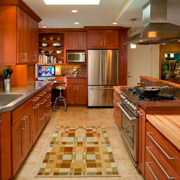
This house is owned by a couple of professional restaurateurs who were looking to replace their cramped old 50's kitchen. We began by removing a wall (in-line with the railing behind the range) separating the kitchen from the living room, allowing in spacious views of east Portland and Mt. Hood in the distance. In this cook's kitchen we designed a custom, restaurant grade stainless steel countertop with an integrated sink (left). Beautiful cherry cabinets with sleek brushed nickel hardware helped to take the space into the modern era. An integrated computer/office nook in the corner provides a place to look up the latest recipe. Photo By Nicks Photo Design
Find the right local pro for your project
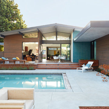
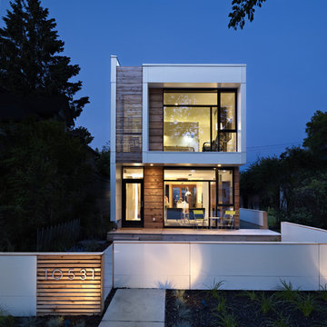
Klopf Architecture and Outer space Landscape Architects designed a new warm, modern, open, indoor-outdoor home in Los Altos, California. Inspired by mid-century modern homes but looking for something completely new and custom, the owners, a couple with two children, bought an older ranch style home with the intention of replacing it.
Created on a grid, the house is designed to be at rest with differentiated spaces for activities; living, playing, cooking, dining and a piano space. The low-sloping gable roof over the great room brings a grand feeling to the space. The clerestory windows at the high sloping roof make the grand space light and airy.
Upon entering the house, an open atrium entry in the middle of the house provides light and nature to the great room. The Heath tile wall at the back of the atrium blocks direct view of the rear yard from the entry door for privacy.
The bedrooms, bathrooms, play room and the sitting room are under flat wing-like roofs that balance on either side of the low sloping gable roof of the main space. Large sliding glass panels and pocketing glass doors foster openness to the front and back yards. In the front there is a fenced-in play space connected to the play room, creating an indoor-outdoor play space that could change in use over the years. The play room can also be closed off from the great room with a large pocketing door. In the rear, everything opens up to a deck overlooking a pool where the family can come together outdoors.
Wood siding travels from exterior to interior, accentuating the indoor-outdoor nature of the house. Where the exterior siding doesn’t come inside, a palette of white oak floors, white walls, walnut cabinetry, and dark window frames ties all the spaces together to create a uniform feeling and flow throughout the house. The custom cabinetry matches the minimal joinery of the rest of the house, a trim-less, minimal appearance. Wood siding was mitered in the corners, including where siding meets the interior drywall. Wall materials were held up off the floor with a minimal reveal. This tight detailing gives a sense of cleanliness to the house.
The garage door of the house is completely flush and of the same material as the garage wall, de-emphasizing the garage door and making the street presentation of the house kinder to the neighborhood.
The house is akin to a custom, modern-day Eichler home in many ways. Inspired by mid-century modern homes with today’s materials, approaches, standards, and technologies. The goals were to create an indoor-outdoor home that was energy-efficient, light and flexible for young children to grow. This 3,000 square foot, 3 bedroom, 2.5 bathroom new house is located in Los Altos in the heart of the Silicon Valley.
Klopf Architecture Project Team: John Klopf, AIA, and Chuang-Ming Liu
Landscape Architect: Outer space Landscape Architects
Structural Engineer: ZFA Structural Engineers
Staging: Da Lusso Design
Photography ©2018 Mariko Reed
Location: Los Altos, CA
Year completed: 2017
Hamza Eatwell
Photo of a traditional kitchen in Buckinghamshire with shaker cabinets and grey cabinets.
Photo of a traditional kitchen in Buckinghamshire with shaker cabinets and grey cabinets.
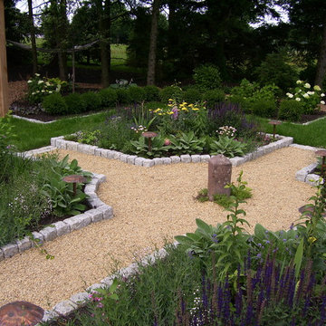
The property is one of the original farm houses located on the main street of a small town. It has been in the family for many years and our client just inherited the property. They were trying to have balance of preserving the old while realizing modern day living has its benefits too. The house had a large addition added using mostly old style materials, but designed with function and modern day luxuries. Our goal was to carry that theme to the outside.
Our first problem we had to address was how to transition between the first floor elevation changes. The lower room was the husband’s office. He stated in the future he may have clients over and it would be nice to have an area to sit outside. The wife’s main concern was to renew the four corner garden. She also felt it was very important to be able to see it from the kitchen area. Finally there was an old wishing well stuck right outside the kitchen. They both felt it would be neat to be able to incorporate this in some how. They wanted a patio area with a built in grill to accommodate there family and friends. They also wanted to keep a large play area for the kids.
We were able to pull this off successfully. We addressed the first issue by having a small lower level flagstone area. This area is large enough for 1 to 2 people to sit comfortably. It also provides a transition from his office to the larger patio area. We installed a simple small gravel sitting area opposite of the main patio. This provides our client a secluded place to relax or do business. Mrs.... told me she is amazed how much her and her husband enjoys this area. It is so peaceful looking at the small creek over a glass of wine.
We built a natural limestone retaining wall to create the patio terrace. The stone was chosen to extend the houses architectural elements into the landscape. Irregular broken flagstone was used to give it a more casual feel. We installed three Serviceberries into the patio terrace to replace some trees that were taken down during the remodeling. She was very concern that they would block the view of the four corner garden. We new they were crucial to nestle in the terrace, so we placed them for a couple days for her to decide. Fortunately she agreed they not only kept the view open, but helped frame the garden.
The four corner garden was designed to be viewed from afar and experienced up close. We wanted the space to have some formal structure while keeping with the casual farm house feel. Another natural limestone retaining wall was created. This leveled the garden terrace and helped associate it with the rest of the property. The four corner garden is nestled into the existing woods edge. This provides three distinct experiences to entering the garden; a more formal from the driveway, an open feel from the lower lawn, and a more natural / casual experience from the wooded area. The Plymouth brown gravel was used for the center of the garden. This helped highlight the stone post that was found during construction. The gravel also brings the sense of sound into the garden space. Lamb’s ear was chosen as a fun way to get kids interest in horticulture.
The balance of using the new to create the old feel is what makes this project a success. The property has already hosted a local historical society event and won an award for its preservation efforts. When Mrs.... can’t find her husband, she knows he is either reading the newspaper by the grill or resting in the hammock along the wood’s path.
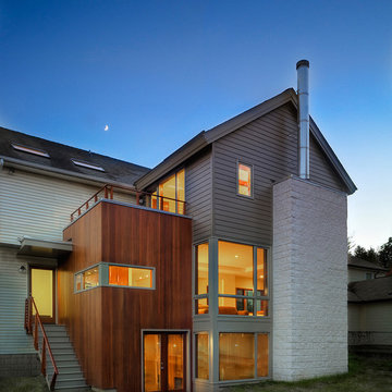
Adding onto an existing house, the Owners wanted to push the house more modern. The new "boxes" were clad in compatible material, with accents of concrete block and mahogany. Corner windows open the views.
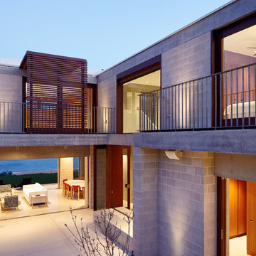
Porebski Architects, Beach House 2.
The client brief asked for a private sanctuary to escape their city home. Aside from capturing the beach and ocean views, the house needed to afford protection against the coastal environment including the daily onshore winds, sand and salt spray and at the same time be low-key and low maintenance; the sort of place you can walk bare-foot throughout the entire year. It achieves this via an open plan, with free-flowing spaces from inside to out, allowing summer and winter solar access within a protective barrier to the on-shore winds.
Photo: Conor Quinn
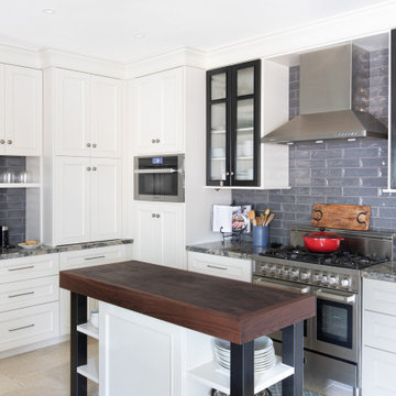
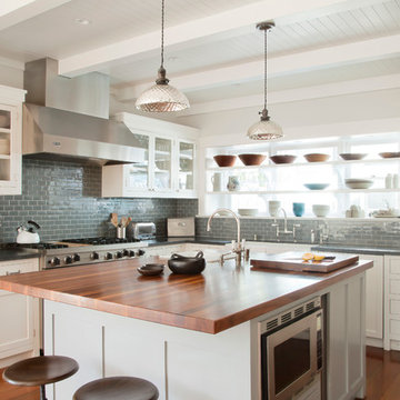
Santa Monica Beach House, Evens Architects - Kitchen
Photo by Manolo Langis
Beach style kitchen in Los Angeles with glass-front cabinets, white cabinets, wood benchtops, blue splashback, subway tile splashback and stainless steel appliances.
Beach style kitchen in Los Angeles with glass-front cabinets, white cabinets, wood benchtops, blue splashback, subway tile splashback and stainless steel appliances.
LG House (Edmonton
Design :: thirdstone inc. [^]
Photography :: Merle Prosofsky
Modern exterior in Edmonton with wood siding.
Modern exterior in Edmonton with wood siding.
Darren Kerr photography
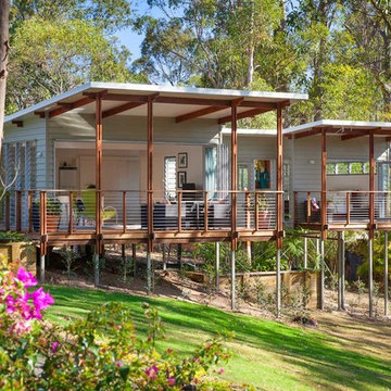
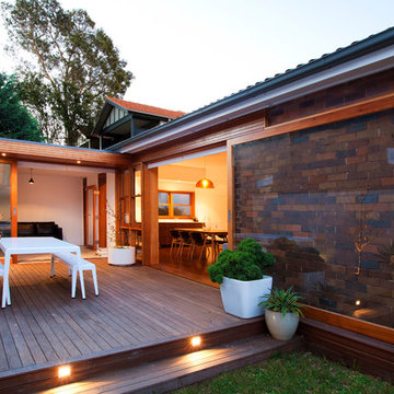
Small contemporary exterior in Brisbane with a shed roof.
Small contemporary exterior in Brisbane with a shed roof.
Adding onto an existing house, the Owners wanted to push the house more modern. The new "boxes" were clad in compatible material, with accents of concrete block and mahogany. Corner windows open the views.
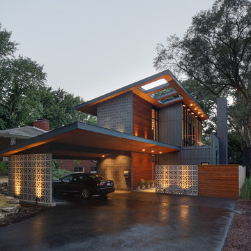
The house was originally a single story face brick home, which was ‘cut in half’ to make two smaller residences. It is on a triangular corner site, and is nestled in between a unit block to the South, and large renovated two storey homes to the West. The owners loved the original character of the house, and were keen to retain this with the new proposal, but felt that the internal plan was disjointed, had no relationship to the paved outdoor area, and above all was very cold in Winter, with virtually no natural light entering the house.
The existing plan had the bedrooms and bathrooms on the side facing the outdoor area, with the living area on the other side of the hallway. We swapped this to have an open plan living room opening out onto a new deck area. An added bonus through the design stage was adding a rumpus room, which was built to the boundary on two sides, and also leads out onto the new deck area. Two large light wells open into the roof, and natural light floods into the house through the skylights above. The automated skylights really help with airflow, and keeping the house cool in the Summer. Warm timber finishes, including cedar windows and doors have been used throughout, and are a low key inclusion into the existing fabric of the house.
Photography by Sarah Braden
Tricia Shay Photography
Mid-sized contemporary two-storey grey house exterior in Milwaukee with a shed roof and mixed siding.
Mid-sized contemporary two-storey grey house exterior in Milwaukee with a shed roof and mixed siding.
The house was originally a single story face brick home, which was ‘cut in half’ to make two smaller residences. It is on a triangular corner site, and is nestled in between a unit block to the South, and large renovated two storey homes to the West. The owners loved the original character of the house, and were keen to retain this with the new proposal, but felt that the internal plan was disjointed, had no relationship to the paved outdoor area, and above all was very cold in Winter, with virtually no natural light entering the house.
The existing plan had the bedrooms and bathrooms on the side facing the outdoor area, with the living area on the other side of the hallway. We swapped this to have an open plan living room opening out onto a new deck area. An added bonus through the design stage was adding a rumpus room, which was built to the boundary on two sides, and also leads out onto the new deck area. Two large light wells open into the roof, and natural light floods into the house through the skylights above. The automated skylights really help with airflow, and keeping the house cool in the Summer. Warm timber finishes, including cedar windows and doors have been used throughout, and are a low key inclusion into the existing fabric of the house.
Photography by Sarah Braden
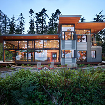
The Port Ludlow Residence is a compact, 2400 SF modern house located on a wooded waterfront property at the north end of the Hood Canal, a long, fjord-like arm of western Puget Sound. The house creates a simple glazed living space that opens up to become a front porch to the beautiful Hood Canal.
The east-facing house is sited along a high bank, with a wonderful view of the water. The main living volume is completely glazed, with 12-ft. high glass walls facing the view and large, 8-ft.x8-ft. sliding glass doors that open to a slightly raised wood deck, creating a seamless indoor-outdoor space. During the warm summer months, the living area feels like a large, open porch. Anchoring the north end of the living space is a two-story building volume containing several bedrooms and separate his/her office spaces.
The interior finishes are simple and elegant, with IPE wood flooring, zebrawood cabinet doors with mahogany end panels, quartz and limestone countertops, and Douglas Fir trim and doors. Exterior materials are completely maintenance-free: metal siding and aluminum windows and doors. The metal siding has an alternating pattern using two different siding profiles.
The house has a number of sustainable or “green” building features, including 2x8 construction (40% greater insulation value); generous glass areas to provide natural lighting and ventilation; large overhangs for sun and rain protection; metal siding (recycled steel) for maximum durability, and a heat pump mechanical system for maximum energy efficiency. Sustainable interior finish materials include wood cabinets, linoleum floors, low-VOC paints, and natural wool carpet.
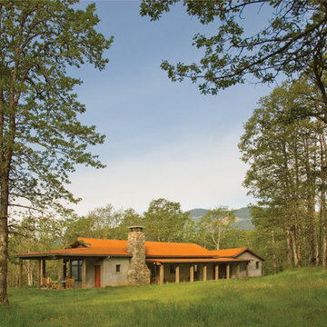
Positioned on a bluff this house looks out to the Columbia Gorge National Scenic Area and to Mount Hood beyond. It provides a year-round gathering place for a mid-west couple, their dispersed families and friends.
Attention was given to views and balancing openness and privacy. Common spaces are generous and allow for the interactions of multiple groups. These areas take in the long, dramatic views and open to exterior porches and terraces. Bedrooms are intimate but are open to natural light and ventilation.
The materials are basic: salvaged barn timber from the early 1900’s, stucco on Rastra Block, stone fireplace & garden walls and concrete counter tops & radiant concrete floors. Generous porches are open to the breeze and provide protection from rain and summer heat.
Bruce Forster Photography
Corner Block House Brisbane - Photos & Ideas | Houzz
Santa Monica Beach House, Evens Architects - Kitchen
Photo by Manolo Langis
This is an example of a beach style kitchen in Los Angeles with glass-front cabinets, white cabinets, wood benchtops, grey splashback, subway tile splashback and stainless steel appliances.
This is an example of a beach style kitchen in Los Angeles with glass-front cabinets, white cabinets, wood benchtops, grey splashback, subway tile splashback and stainless steel appliances.
1