Search results for "Exterior wall cladding" in Home Design Ideas
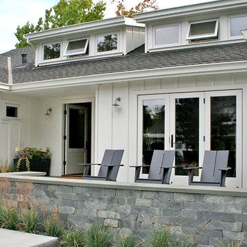
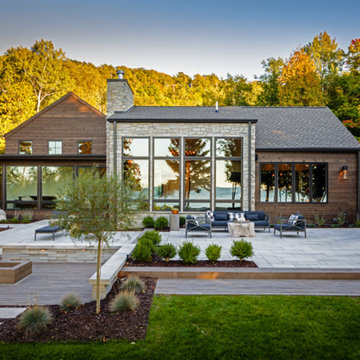
An existing mid-century ranch house is renovated and expanded to accommodate the client's preference for a modern style of living. The extent of the renovation included a reworked floor plan, new kitchen, a large, open great room with indoor/outdoor space and an expended and reconfigured bedroom wing. Newly vaulted ceilings with shed dormers bring substantial daylight into the living spaces of the home. The exterior of the home is reinterpreted as a modern take on the traditional farmhouse.
Interior Design: Lillie Design
Photographer: Caroline Johnson
Photography by Derek Robinson
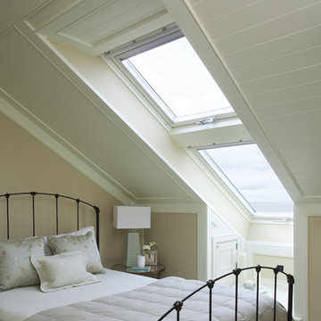
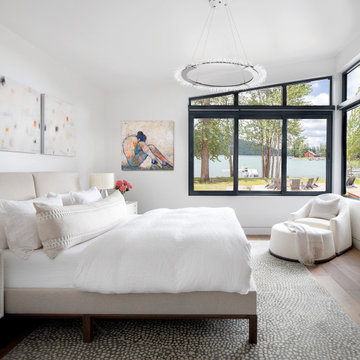
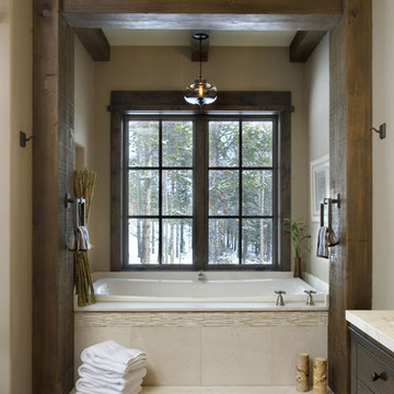
This is an example of a traditional bedroom in Dublin with beige walls.
This is an example of a traditional bedroom in Dublin with beige walls.
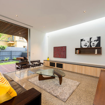
View over the living area to the backyard.
Light washing down the wall form the roof windows.
Stacking sliding glass panels retract into the cavity, blurring the boundary between interior + exterior.
Photography by Rachel Lewis.
Find the right local pro for your project
This project was designed with a custom patio using Blu Grande stones in shale grey to create a spacious outdoor seating area, a lounging area and a fire pit to gather around to enjoy warm evenings.
Terreal North America NeXclad wall cladding
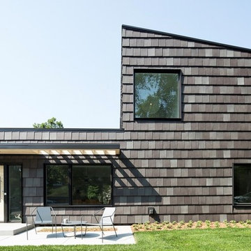
Design ideas for a contemporary two-storey grey house exterior in Minneapolis with a flat roof and a tile roof.
Design ideas for a contemporary two-storey grey house exterior in Minneapolis with a flat roof and a tile roof.
Windows reaching a grand 12’ in height fully capture the allurement of the area, bringing the outdoors into each space. Furthermore, the large 16’ multi-paneled doors provide the constant awareness of forest life just beyond. The unique roof lines are mimicked throughout the home with trapezoid transom windows, ensuring optimal daylighting and design interest. A standing-seam metal, clads the multi-tiered shed-roof line. The dark aesthetic of the roof anchors the home and brings a cohesion to the exterior design. The contemporary exterior is comprised of cedar shake, horizontal and vertical wood siding, and aluminum clad panels creating dimension while remaining true to the natural environment.
The Glo A5 double pane windows and doors were utilized for their cost-effective durability and efficiency. The A5 Series provides a thermally-broken aluminum frame with multiple air seals, low iron glass, argon filled glazing, and low-e coating. These features create an unparalleled double-pane product equipped for the variant northern temperatures of the region. With u-values as low as 0.280, these windows ensure year-round comfort.
Reload the page to not see this specific ad anymore
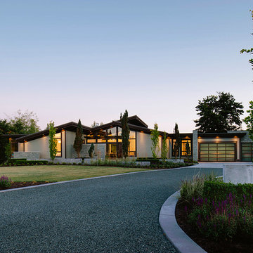
The family for Yellowstone Club #1 had several requests to be implemented in their design:
• A place for gathering
• solar gain
• simplicity of construction
• integration into the hillside
• upper level to have the feel of an attic
• views beyond the site
The concept of solar gain is a simple one. They wanted to maximize the amount of sunlight heating their home in the winter months. In response to this request we oriented their home to face south and planned the layout of the home around solar angles and thermal masses to naturally warm the home as much as possible. This was accomplished without making the layout less functional or significantly increasing the cost of the home. The process of solar orientation for the home was aided by the natural orientation and attributes of the site. The benefits of utilizing solar gain include a lower heating cost, and an increased level of natural light in the home.
The home was designed as a simple ninety degree angle for ease of construction. The upper level is reduced in size from the lower level; however the overall plan is based upon simple geometric shapes with the garage angling off.
The home is to be integrated into the hillside for visual, cost and environmental reasons. Visually, embedding the home into the hillside is significant because it reduces the profile of the building. By selecting a location where we can both cut and fill to place the building on the site we will be reducing the final construction cost of the home. Environmentally, embedding the buildings lower level into the hillside is important because of the significant insulating qualities of earth. This was facilitated through careful selection of the location of the home on the site and the fortune of having a south-facing slope on the site for the solar gain.
The attic is a finished space designed to have low walls that slope inward. Per the client’s request, the attic has walls roughly five feet tall and a sloped interior roof matching the slope of the roof on the exterior. By placing cabinets and built in units along portions of the walls, we are able to utilize this space for storage while providing for the client’s request for an attic that feels like an attic.
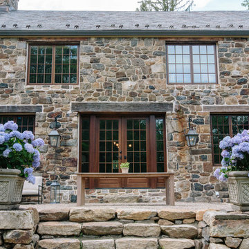
The style will be a mountain theme but the client’s background will be brought into play for certain details throughout the residence. The exterior will be clad with the stone that is available on site, cedar siding and accented historic wood trim. An immense amount of glazing will be introduced throughout the design to articulate the exterior and to blend with the number of gable and dormer roof elements. The structure will at possible locations be brought down to be crouching on the site rather than looming as a “tower”.
(photos by Shelly Saunders)
Karl Neumann
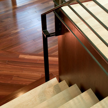
Design ideas for a country wood l-shaped staircase in Denver with wood risers.
Design ideas for a country wood l-shaped staircase in Denver with wood risers.
Cabinets: Frameless Cabinets; Door Style: Slab Door Wood: Lyptus Finish: Java
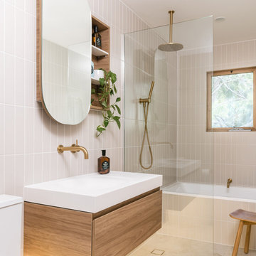
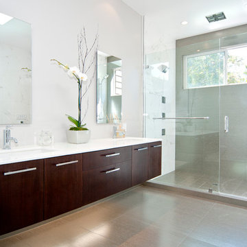
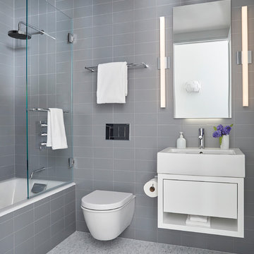
Photo of a contemporary bathroom in San Francisco with flat-panel cabinets, dark wood cabinets and an alcove shower.
Photo of a contemporary bathroom in San Francisco with flat-panel cabinets, dark wood cabinets and an alcove shower.
Chicago, IL Exterior Siding Remodel. This Chicago, IL Dutch Colonial Style Home was remodeled by Siding & Windows Group with James HardiePlank Select Cedarmill Lap Siding and HardieTrim Smooth Boards in ColorPlus Technology Color Arctic White plus Hardie Soffit. Also re-did Arched Front Entry, installed Vinyl Fypon Shutters in Black with crossheads, top and bottom frieze boards.
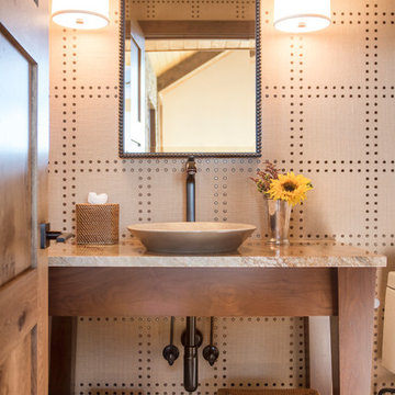
a powder room was created by eliminating the existing hall closet and stealing a little space from the existing bedroom behind. a linen wall covering was added with a nail head detail giving the powder room a polished look.
WoodStone Inc, General Contractor
Home Interiors, Cortney McDougal, Interior Design
Draper White Photography

The 1,750-square foot Manhattan Beach bungalow is home to two humans and three dogs. Originally built in 1929, the bungalow had undergone various renovations that convoluted its original Moorish style. We gutted the home and completely updated both the interior and exterior. We opened the floor plan, rebuilt the ceiling with reclaimed hand-hewn oak beams and created hand-troweled plaster walls that mimicked the construction and look of the original walls. We also rebuilt the living room fireplace by hand, brick-by-brick, and replaced the generic roof tiles with antique handmade clay tiles.
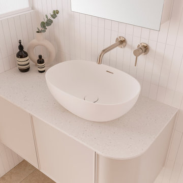
We returned much of this 3-bed, 2-bath home to a more authentic aesthetic, while adding modern touches of luxury, like radiant-heated floors, bi-fold doors that open from the kitchen/dining area to a large deck, and a custom steam shower, with Moroccan-inspired tile and an antique mirror. The end result is evocative luxury in a compact space.
Reload the page to not see this specific ad anymore
Coastal Luxe interior design by Lindye Galloway Design. Exterior beach house style.
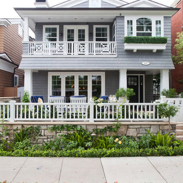
Inspiration for a large beach style two-storey grey exterior in Orange County with wood siding and a gable roof.
Inspiration for a large beach style two-storey grey exterior in Orange County with wood siding and a gable roof.
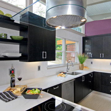
This mid century modern home was beginning to resemble more of a “shabby chic” personality than the vibrant retro vision the homeowners desired. The budget was not large and we had to be creative in the approach to solving some of this kitchen’s style challenges. The client wanted a sleek modern look. Ok, that was half of the client! The other half, the wife, preferred more a kitschy colorful palette. To get the kitchen to harmonize as well as the two clients, ( after I informed them I charge extra for marital counseling!) we melded sleek lines with a colorful backdrop on the walls. The darker stained walnut cabinets were chosen to counterbalance the intensity of the eggplant wall paint. We chose blizzard ceasarstone to provide a stark contrast to the dark cabinets and coordinated the backsplash with an iridescent white porcelain cut into large squares. Instead of a stainless “table” for the electric cooktop, we opted for a less expensive laminated metal material to fabricate the legs of the cooking island. The opposite side houses the refrigerator, oven/microwave and two pantries. One a good sized pantry with pullouts and the other a shallower pantry that is home to food and overflow dishware. The glass in the doors mirrors the cubist glass in the front door and the handles are classically retro in design. All in all, this small kitchen has a powerful presence and the clients are happily cooking in harmony!
Complete interior renovation of a 1980s split level house in the Virginia suburbs. Main level includes reading room, dining, kitchen, living and master bedroom suite. New front elevation at entry, new rear deck and complete re-cladding of the house. Interior: The prototypical layout of the split level home tends to separate the entrance, and any other associated space, from the rest of the living spaces one half level up. In this home the lower level "living" room off the entry was physically isolated from the dining, kitchen and family rooms above, and was only connected visually by a railing at dining room level. The owner desired a stronger integration of the lower and upper levels, in addition to an open flow between the major spaces on the upper level where they spend most of their time. ExteriorThe exterior entry of the house was a fragmented composition of disparate elements. The rear of the home was blocked off from views due to small windows, and had a difficult to use multi leveled deck. The owners requested an updated treatment of the entry, a more uniform exterior cladding, and an integration between the interior and exterior spaces. SOLUTIONS The overriding strategy was to create a spatial sequence allowing a seamless flow from the front of the house through the living spaces and to the exterior, in addition to unifying the upper and lower spaces. This was accomplished by creating a "reading room" at the entry level that responds to the front garden with a series of interior contours that are both steps as well as seating zones, while the orthogonal layout of the main level and deck reflects the pragmatic daily activities of cooking, eating and relaxing. The stairs between levels were moved so that the visitor could enter the new reading room, experiencing it as a place, before moving up to the main level. The upper level dining room floor was "pushed" out into the reading room space, thus creating a balcony over and into the space below. At the entry, the second floor landing was opened up to create a double height space, with enlarged windows. The rear wall of the house was opened up with continuous glass windows and doors to maximize the views and light. A new simplified single level deck replaced the old one.
The family for Yellowstone Club #1 had several requests to be implemented in their design:
• A place for gathering
• solar gain
• simplicity of construction
• integration into the hillside
• upper level to have the feel of an attic
• views beyond the site
The concept of solar gain is a simple one. They wanted to maximize the amount of sunlight heating their home in the winter months. In response to this request we oriented their home to face south and planned the layout of the home around solar angles and thermal masses to naturally warm the home as much as possible. This was accomplished without making the layout less functional or significantly increasing the cost of the home. The process of solar orientation for the home was aided by the natural orientation and attributes of the site. The benefits of utilizing solar gain include a lower heating cost, and an increased level of natural light in the home.
The home was designed as a simple ninety degree angle for ease of construction. The upper level is reduced in size from the lower level; however the overall plan is based upon simple geometric shapes with the garage angling off.
The home is to be integrated into the hillside for visual, cost and environmental reasons. Visually, embedding the home into the hillside is significant because it reduces the profile of the building. By selecting a location where we can both cut and fill to place the building on the site we will be reducing the final construction cost of the home. Environmentally, embedding the buildings lower level into the hillside is important because of the significant insulating qualities of earth. This was facilitated through careful selection of the location of the home on the site and the fortune of having a south-facing slope on the site for the solar gain.
The attic is a finished space designed to have low walls that slope inward. Per the client’s request, the attic has walls roughly five feet tall and a sloped interior roof matching the slope of the roof on the exterior. By placing cabinets and built in units along portions of the walls, we are able to utilize this space for storage while providing for the client’s request for an attic that feels like an attic.
The style will be a mountain theme but the client’s background will be brought into play for certain details throughout the residence. The exterior will be clad with the stone that is available on site, cedar siding and accented historic wood trim. An immense amount of glazing will be introduced throughout the design to articulate the exterior and to blend with the number of gable and dormer roof elements. The structure will at possible locations be brought down to be crouching on the site rather than looming as a “tower”.
(photos by Shelly Saunders)
Exterior Wall Cladding - Photos & Ideas | Houzz
Reload the page to not see this specific ad anymore

Free ebook, Creating the Ideal Kitchen. DOWNLOAD NOW
My husband and I had the opportunity to completely gut and remodel a very tired 1950’s Garrison colonial. We knew that the idea of a semi-open floor plan would be ideal for our family. Space saving solutions started with the design of a banquet in the kitchen. The banquet’s focal point is the two stained glass windows on either end that help to capture daylight from the adjoining spaces.
Material selections for the kitchen were driven by the desire for a bright, casual and uncomplicated look. The plan began with 3 large windows centered over a white farmhouse sink and overlooking the backyard. A large island acts as the kitchen’s work center and rounds out seating options in the room. White inset cabinetry is offset with a mix of materials including soapstone, cherry butcher block, stainless appliances, oak flooring and rustic white tiles that rise to the ceiling creating a dramatic backdrop for an arched range hood. Multiple mullioned glass doors keep the kitchen open, bright and airy.
A palette of grayish greens and blues throughout the house helps to meld the white kitchen and trim detail with existing furnishings. In-cabinet lighting as well as task and undercabinet lighting complements the recessed can lights and help to complete the light and airy look of the space.
Designed by: Susan Klimala, CKD, CBD
For more information on kitchen and bath design ideas go to: www.kitchenstudio-ge.com
We completely gut renovated this pre-war Tribeca apartment but kept some of it's charm and history in tact! The building, which was built in the early 1900's, was home to different executive office operations and the original hallways had a beautiful and intricate mosaic floor pattern. To that point we decided to preserve the existing mosaic flooring and incorporate it into the new design. The open concept kitchen with cantilevered dining table top keeps the area feeling light and bright, casual and not stuffy. Additionally, the custom designed swing arm pendant light helps marry the dining table top area to that of the island.
---
Our interior design service area is all of New York City including the Upper East Side and Upper West Side, as well as the Hamptons, Scarsdale, Mamaroneck, Rye, Rye City, Edgemont, Harrison, Bronxville, and Greenwich CT.
For more about Darci Hether, click here: https://darcihether.com/
To learn more about this project, click here:
https://darcihether.com/portfolio/pre-war-tribeca-apartment-made-modern/
160