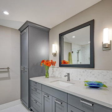
Search results for "Popular exterior house colours" in Home Design Ideas
The existing 3000 square foot colonial home was expanded to more than double its original size.
The end result was an open floor plan with high ceilings, perfect for entertaining, bathroom for every bedroom, closet space, mudroom, and unique details ~ all of which were high priorities for the homeowner.
Photos-Peter Rymwid Photography
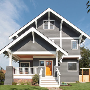
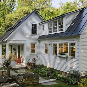
This Greenlake area home is the result of an extensive collaboration with the owners to recapture the architectural character of the 1920’s and 30’s era craftsman homes built in the neighborhood. Deep overhangs, notched rafter tails, and timber brackets are among the architectural elements that communicate this goal.
Given its modest 2800 sf size, the home sits comfortably on its corner lot and leaves enough room for an ample back patio and yard. An open floor plan on the main level and a centrally located stair maximize space efficiency, something that is key for a construction budget that values intimate detailing and character over size.
Exterior Painting: This massive two story home takes on a very traditional feel with the yellow exterior paint and black shutters. Ivory exterior paint for the pillars, balcony and window trim compliment the look nicely.
Find the right local pro for your project
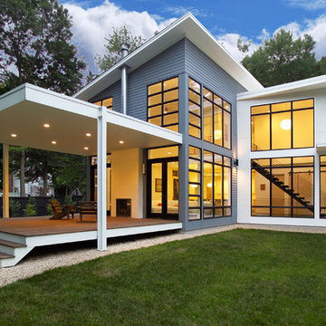
The new house sits back from the suburban road, a pipe-stem lot hidden in the trees. The owner/building had requested a modern, clean statement of his residence. A single rectangular volume houses the main program: living, dining, kitchen to the north, garage, private bedrooms and baths to the south. Secondary building blocks attached to the west and east faces contain special places: entry, stair, music room and master bath. The modern vocabulary of the house is a careful delineation of the parts - cantilevering roofs lift and extend beyond the planar stucco, siding and glazed wall surfaces. Where the house meets ground, crushed stone along the perimeter base mimics the roof lines above, the sharply defined edges of lawn held away from the foundation. It's the movement through the volumes of space, along surfaces, and out into the landscape, that unifies the house.
ProArc Photography
This home remodel is a celebration of curves and light. Starting from humble beginnings as a basic builder ranch style house, the design challenge was maximizing natural light throughout and providing the unique contemporary style the client’s craved.
The Entry offers a spectacular first impression and sets the tone with a large skylight and an illuminated curved wall covered in a wavy pattern Porcelanosa tile.
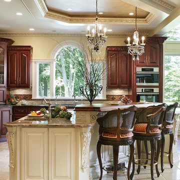
The chic entertaining kitchen was designed to celebrate a public lifestyle and plenty of entertaining. Celebrating height with a robust amount of interior architectural details, this dynamic kitchen still gives one that cozy feeling of home sweet home. The large “L” shaped island accommodates 7 for seating. Large pendants over the kitchen table and sink provide additional task lighting and whimsy. The Dekton “puzzle” countertop connection was designed to aid the transition between the two color countertops and is one of the homeowner’s favorite details. The built-in bistro table provides additional seating and flows easily into the Living Room.
A curved wall in the Living Room showcases a contemporary linear fireplace and tv which is tucked away in a niche. Placing the fireplace and furniture arrangement at an angle allowed for more natural walkway areas that communicated with the exterior doors and the kitchen working areas.
The dining room’s open plan is perfect for small groups and expands easily for larger events. Raising the ceiling created visual interest and bringing the pop of teal from the Kitchen cabinets ties the space together. A built-in buffet provides ample storage and display.
The Sitting Room (also called the Piano room for its previous life as such) is adjacent to the Kitchen and allows for easy conversation between chef and guests. It captures the homeowner’s chic sense of style and joie de vivre.
Exterior of Historic Multi-Family Home
Photos by: Will Crocker Photography
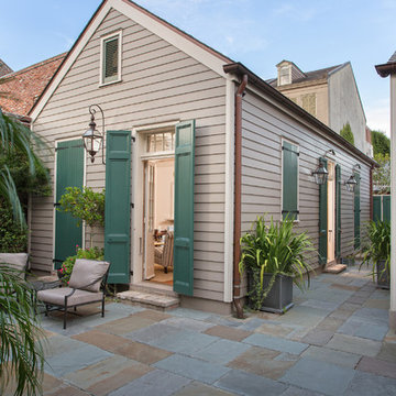
Design ideas for a traditional exterior in New Orleans with wood siding.
Design ideas for a traditional exterior in New Orleans with wood siding.
Superior Exterior 713 785-6926
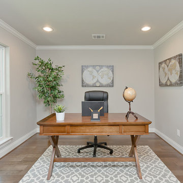
Inspiration for a traditional study room in Houston with grey walls, medium hardwood floors and a freestanding desk.
Inspiration for a traditional study room in Houston with grey walls, medium hardwood floors and a freestanding desk.


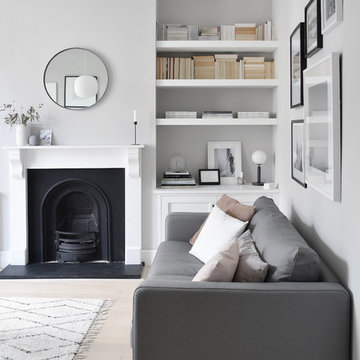
Popular Scandinavian-style interiors blog 'These Four Walls' has collaborated with Kährs for a scandi-inspired, soft and minimalist living room makeover. Kährs worked with founder Abi Dare to find the perfect hard wearing and stylish floor to work alongside minimalist decor. Kährs' ultra matt 'Oak Sky' engineered wood floor design was the perfect fit.
"I was keen on the idea of pale Nordic oak and ordered all sorts of samples, but none seemed quite right – until a package arrived from Swedish brand Kährs, that is. As soon as I took a peek at ‘Oak Sky’ ultra matt lacquered boards I knew they were the right choice – light but not overly so, with a balance of ashen and warmer tones and a beautiful grain. It creates the light, Scandinavian vibe that I love, but it doesn’t look out of place in our Victorian house; it also works brilliantly with the grey walls. I also love the matte finish, which is very hard wearing but has
none of the shininess normally associated with lacquer" says Abi.
Oak Sky is the lightest oak design from the Kährs Lux collection of one-strip ultra matt lacquer floors. The semi-transparent white stain and light and dark contrasts in the wood makes the floor ideal for a scandi-chic inspired interior. The innovative surface treatment is non-reflective; enhancing the colour of the floor while giving it a silky, yet strong shield against wear and tear. Kährs' Lux collection won 'Best Flooring' at the House Beautiful Awards 2017.
Kährs have collaborated with These Four Walls and feature in two blog posts; My soft, minimalist
living room makeover reveal and How to choose wooden flooring.
All photography by Abi Dare, Founder of These Four Walls
Exterior and landscaping.
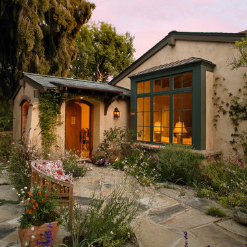
Inspiration for a mediterranean one-storey exterior in Santa Barbara.
Inspiration for a mediterranean one-storey exterior in Santa Barbara.
Exterior painting by Warline Painting Ltd. of Vancouver, BC. Photo credits to Ina Van Tonder.
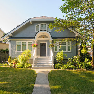
Inspiration for a small country two-storey stucco blue house exterior in Vancouver with a clipped gable roof and a shingle roof.
Inspiration for a small country two-storey stucco blue house exterior in Vancouver with a clipped gable roof and a shingle roof.
Mid-Century Remodel on Tabor Hill
This sensitively sited house was designed by Robert Coolidge, a renowned architect and grandson of President Calvin Coolidge. The house features a symmetrical gable roof and beautiful floor to ceiling glass facing due south, smartly oriented for passive solar heating. Situated on a steep lot, the house is primarily a single story that steps down to a family room. This lower level opens to a New England exterior. Our goals for this project were to maintain the integrity of the original design while creating more modern spaces. Our design team worked to envision what Coolidge himself might have designed if he'd had access to modern materials and fixtures.
With the aim of creating a signature space that ties together the living, dining, and kitchen areas, we designed a variation on the 1950's "floating kitchen." In this inviting assembly, the kitchen is located away from exterior walls, which allows views from the floor-to-ceiling glass to remain uninterrupted by cabinetry.
We updated rooms throughout the house; installing modern features that pay homage to the fine, sleek lines of the original design. Finally, we opened the family room to a terrace featuring a fire pit. Since a hallmark of our design is the diminishment of the hard line between interior and exterior, we were especially pleased for the opportunity to update this classic work.
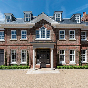
This magnificent 10,000 sq ft new build house situated on one of Roehampton’s most desirable streets had been beautifully designed and built to an extremely high specification. Milc were asked to furnish the interior in preparation for the property to be marketed for sale. Due to the scale, finish and location, the property had to appeal to a refined and affluent target market. The client wanted to ensure that the furnishings enhanced and worked harmoniously with the features and meticulous finish of the house. So as not to detract from the fantastic features of the property, Milc opted for clean lines and sophisticated neutral colour schemes throughout. Attention to detail was paramount in order to complement and enhance the luxurious finishes.
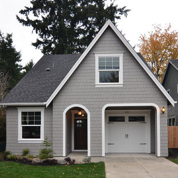
The Morrison house plan by Renaissance Homes comes in two exterior finishes. This is the Morrison Cottage elevation.
Mid-sized traditional two-storey exterior in Portland with wood siding.
Mid-sized traditional two-storey exterior in Portland with wood siding.


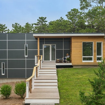
This modern green home offers both a vacation destination on Cape Cod near local family members and an opportunity for rental income.
FAMILY ROOTS. A West Coast couple living in the San Francisco Bay Area sought a permanent East Coast vacation home near family members living on Cape Cod. As academic professionals focused on sustainability, they sought a green, energy efficient home that was well-aligned with their values. With no green homes available for sale on Cape Cod, they decided to purchase land near their family and build their own.
SLOPED SITE. Comprised of a 3/4 acre lot nestled in the pines, the steeply sloping terrain called for a plan that embraced and took advantage of the slope. Of equal priority was optimizing solar exposure, preserving privacy from abutters, and creating outdoor living space. The design accomplished these goals with a simple, rectilinear form, offering living space on the both entry and lower/basement levels. The stepped foundation allows for a walk-out basement level with light-filled living space on the down-hill side of the home. The traditional basement on the eastern, up-hill side houses mechanical equipment and a home gym. The house welcomes natural light throughout, captures views of the forest, and delivers entertainment space that connects indoor living space to outdoor deck and dining patio.
MODERN VISION. The clean building form and uncomplicated finishes pay homage to the modern architectural legacy on the outer Cape. Durable and economical fiber cement panels, fixed with aluminum channels, clad the primary form. Cedar clapboards provide a visual accent at the south-facing living room, which extends a single roof plane to cover the entry porch.
SMART USE OF SPACE. On the entry level, the “L”-shaped living, dining, and kitchen space connects to the exterior living, dining, and grilling spaces to effectively double the home’s summertime entertainment area. Placed at the western end of the entry level (where it can retain privacy but still claim expansive downhill views) is the master suite with a built-in study. The lower level has two guest bedrooms, a second full bathroom, and laundry. The flexibility of the space—crucial in a house with a modest footprint—emerges in one of the guest bedrooms, which doubles as home office by opening the barn-style double doors to connect it to the bright, airy open stair leading up to the entry level. Thoughtful design, generous ceiling heights and large windows transform the modest 1,100 sf* footprint into a well-lit, spacious home. *(total finished space is 1800 sf)
RENTAL INCOME. The property works for its owners by netting rental income when the owners are home in San Francisco. The house especially caters to vacationers bound for nearby Mayo Beach and includes an outdoor shower adjacent to the lower level entry door. In contrast to the bare bones cottages that are typically available on the Cape, this home offers prospective tenants a modern aesthetic, paired with luxurious and green features. Durable finishes inside and out will ensure longevity with the heavier use that comes with a rental property.
COMFORT YEAR-ROUND. The home is super-insulated and air-tight, with mechanical ventilation to provide continuous fresh air from the outside. High performance triple-paned windows complement the building enclosure and maximize passive solar gain while ensuring a warm, draft-free winter, even when sitting close to the glass. A properly sized air source heat pump offers efficient heating & cooling, and includes a carefully designed the duct distribution system to provide even comfort throughout the house. The super-insulated envelope allows us to significantly reduce the equipment capacity, duct size, and airflow quantities, while maintaining unparalleled thermal comfort.
ENERGY EFFICIENT. The building’s shell and mechanical systems play instrumental roles in the home’s exceptional performance. The building enclosure reduces the most significant energy glutton: heating. Continuous super-insulation, thorough air sealing, triple-pane windows, and passive solar gain work together to yield a miniscule heating load. All active energy consumers are extremely efficient: an air source heat pump for heating and cooling, a heat pump hot water heater, LED lighting, energy recovery ventilation (ERV), and high efficiency appliances. The result is a home that uses 70% less energy than a similar new home built to code requirements.
OVERALL. The home embodies the owners’ goals and values while comprehensively enabling thermal comfort, energy efficiency, a vacation respite, and supplementary income.
PROJECT TEAM
ZeroEnergy Design - Architect & Mechanical Designer
A.F. Hultin & Co. - Contractor
Pamet Valley Landscape Design - Landscape & Masonry
Lisa Finch - Original Artwork
European Architectural Supply - Windows
Eric Roth Photography - Photography
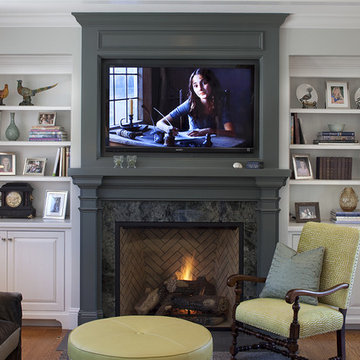
Family room adjacent to kitchen. Paint color on fireplace mantel is Benjamin Moore #1568 Quarry Rock. The trim is Benjamin Moore OC-21. The bookcases are prefinished by the cabinet manufacturer, white with a pewter glaze. Designed by Julie Williams Design, Photo by Eric Rorer Photgraphy, Justin Construction
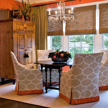
This lovely breakfast room, overlooking the garden, is an inviting place to start your day lingering over Sunday morning coffee. I had the walls painted in a soft coral, contrasting with various wood tones in the armoire, table and shades. It is all tied together by keeping the chair covers and rug light in color. The crystal chandelier is an unexpected element in a breakfast room, yet, your not compelled to pull out the china and silver.
This is an example of a large country two-storey red exterior in Minneapolis with mixed siding.
Popular Exterior House Colours - Photos & Ideas | Houzz
ON-TREND SCALES
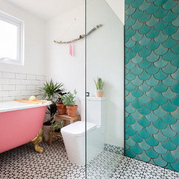
Move over metro tiles and line a wall with fabulously funky Fish Scale designs. Also known as scallop, fun or mermaid tiles, this pleasing-to-the-eye shape is a Moroccan tile classic that's trending hard right now and offers a sophisticated alternative to metro/subway designs. Mermaids tiles are this year's unicorns (so they say) and Fish Scale tiles are how to take the trend to a far more grown-up level. Especially striking across a whole wall or in a shower room, make the surface pop in vivid shades of blue and green for an oceanic vibe that'll refresh and invigorate.
If colour doesn't float your boat, just exchange the bold hues for neutral shades and use a dark grout to highlight the pattern. Alternatively, go to www.tiledesire.com there are more than 40 colours to choose and mix!!
Photo Credits: http://iortz-photo.com/
This exterior image shows how the original three-window shed dormer was extended to allow access to the upstairs addition. The carved out porch provides a beautiful connection to the newly renovated landscape.
Renovation/Addition. Rob Karosis Photography
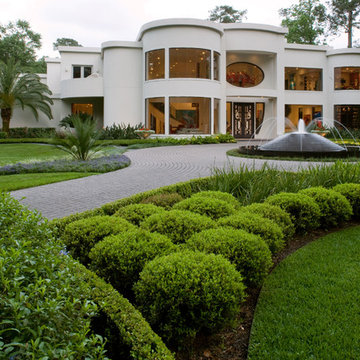
A Memorial-area art collector residing in a chic modern home wanted his house to be more visible from the street. His yard was full of trees, and he asked us to consider removing them and developing a more modern landscape design that would fully complement the exterior of his home. He was a personal friend of ours as well, and he understood that our policy is to preserve as many trees as possible whenever we undertake a project. However, we decided to make an exception in his case for two reasons. For one thing, he was a very close friend to many people in our company. Secondly, large trees simply would not work with a landscape reflective of the modern architecture that his house featured.
The house had been built as story structure that was formed around a blend of unique curves and angles very reminiscent of the geometric patterns common in modern sculpture and art. The windows had been built deliberately large, so that visitors driving up to the house could have a lighted glimpse into the interior, where many sculptures and works of modern art were showcased. The entire residence, in fact, was meant to showcase the eclectic diversity of his artistic tastes, and provide a glimpse at the elegant contents within the home.
He asked us to create more modern look to the landscape that would complement the residence with patterns in vegetation, ornamentation, and a new lighted water fountain that would act like a mirror-image of the home. He also wanted us to sculpt the features we created in such a way as to center the eye of the viewer and draw it up and over the landscape to focus on the house itself.
The challenge was to develop a truly sophisticated modern landscaping design that would compliment, but in no way overpower the façade of the home. In order to do this, we had to focus very carefully on the geometric appearance of the planting areas first. Since the vegetation would be surrounding a very large, circular stone drive, we took advantage of the contours and created a sense of flowing perspective. We were then very careful to plant vegetation that could be maintained at a very low growth height. This was to prevent vegetation from behaving like the previous trees which had blocked the view of the house. Small hedges, ferns, and flowers were planted in winding rows that followed the course of the circular stone driveway that surrounded the fountain.
We then centered this new modern landscape plan with a very sophisticated contemporary fountain. We chose a circular shape for the fountain both to center the eye and to work as a compliment to the curved elements in the home’s exterior design. We selected black granite as the building material, partly because granite speaks to the monumental, and partly because it is a very common material for modern architecture and outdoor contemporary sculpture. We placed the fountain in the very center of the driveway as well, which had the effect of making the entire landscape appear to converge toward the middle of the home’s façade. To add a sense of eclectic refinement to the fountain, we then polished the granite so that anyone driving or walking up to the fountain would see a reflection of the home in the base. To maintain consistency of the circular shape, we radius cut all of the coping around the fountain was all radius cut from polished limestone. The lighter color of the limestone created an archetypal contrast of light and darkness, further contributing to the modern theme of the landscape design, and providing a surface for illumination so the fountain would remain an established keynote on the landscape during the night.
20