

Recent Activity
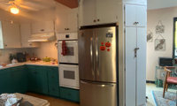

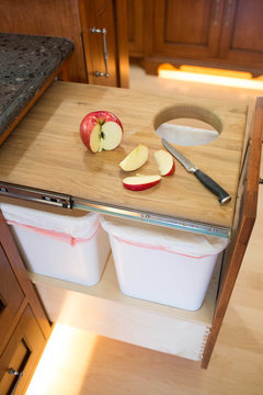
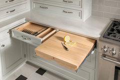
You can probably get a pull-out cutting board, for extra counter space. It won't work for storage, but it will for prep.
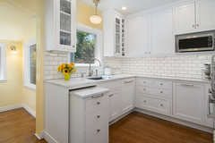

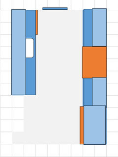
I kept thinking about your great little house and scribbled down the changes I had in mind per my earlier comment. Each box = six inches.
If your measurements are fairly accurate on your pencil sketch, you should be able to do it. Lots of natural light is like pure happiness to me so I am all for trying ways to put in a second, better window.
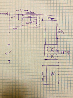

I know you said "keep the same foot print" and "not moving plumbing" to reduce costs, but then you talk about adding a window.
For a small kitchen to function well you need to optimize counter and storage space. I am renovating my own kitchen and trying to keep as much of the footprint the same and moving as little as possible to save $$$, but to get the counter space I need I have to move a doorway and move the plumbing for my laundry to the wall beside the washer. The cost for the plumbing wasn't nearly as expensive as I thought it would be ($1500). In the big scheme of things it is well worth the $$$ to gain the counterspace and storage space and eliminate the useless corner cabinet.
This is what I would be thinking about doing in your kitchen if it were mine. . .
Better lighting can be achieved with a better ceiling fixture and under counter lighting.

I'd go with a very warm cream, like SW Creme or a very pale color like SW Glimmer. A very light tan like River's Edge would work with your windows, too. You don't want to look too much like your neighbor. Then, pick a bright color for your door. A dark green or blue with Glimmer, a red or brown, like Jalapeno for River's edge.
I'm an avid gardener and I never recommend window boxes. They are very hard to keep looking good and a straggly or empty window box detracts, rather than enhances.

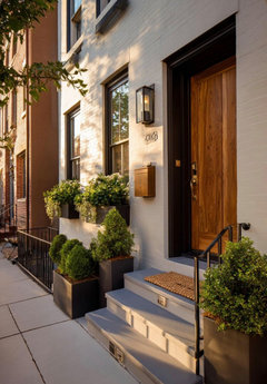
Emily’s AI pic looks amazing
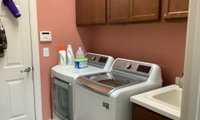
I note that your current storage is very shallow. You could have a lot more storage space --- and more accessible space by replacing the cabinets with deeper one or shelves that are deeper.
Here's one more idea. Instead of lowering the cabinets keep them where they are and add a shelf underneath them for easy access of the things you use often.
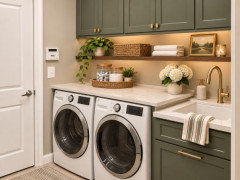

Our laundry room has higher cabinets and a shelf below like Emily shows; it is nearly identical in size and layout. We keep the detergent, dryer balls, and things needed at the sink there. Very handy, keeps things off the machines (mostly).
I love my laundry sink, not just for laundry but for cleaning things I don’t want to clean in the kitchen.
But, I hear you on drawers! I wish we had a bank of drawers. I’m torn as to whether I want drawers and a laundry machine tower — I find them a little, well well, BIG especially in a small space — or the status quo.
Beware of pedestals. Our dryer is on a pedestal, and it makes it hard to reach over it to get things down from the cupboard above. I keep a small stepstool in the laundry room, but it fits neatly in front of the laundry tub (one of those free-standing types, not as deep as the machines), and our laundry room is not a busy walkway/entryway as yours is.
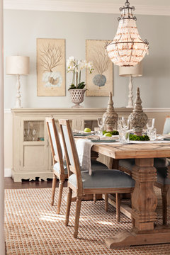
I'd have a rectangular table, have narrower dining chairs and and pay a lot of attention to where the legs are. This is particularly important if you get an expandable table.
You notice these chairs
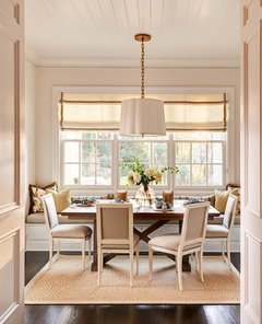
are much narrower than these
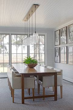
This table has thin legs, not likely to be a problem in seating
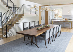
This one has big, bulky legs limiting seating space

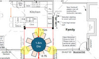
Of the drawn options, I would favor the 180 × 120 cm soft oval. It keeps eight chair positions while the plan shows 1.3 m and 1 m front-to-back clearances, compared with 1.15 m and 0.75 m around the 160 cm round table. Its curved corners should also make the highlighted side pinch points feel less abrupt than those of a rectangle, while retaining much of a round table’s conversational quality.
A 150 cm round would be very tight for eight: it provides only about 59 cm of perimeter per person before accounting for how the chairs meet around the circle. The 160 cm round is more sociable, but its footprint presses harder on the passage in your drawing. The soft oval therefore looks like the best balance of capacity, circulation and visual lightness. I would mark out its full footprint on the floor and place eight chairs around it before committing, because the chair backs and occupied seats—not just the tabletop—will determine whether those side routes work comfortably.
Here's a sculptural dining table design from our GREYGE.com collection, just as a visual reference. KAI uses a rounded-square geometry and can be custom-sized, illustrating another middle ground between round sociability and rectangular capacity: https://www.greyge.com/product/kai-living-room-table/. Its capacity for eight is not documented, so it should not be treated as a proven fit for that requirement.
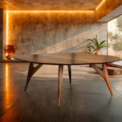

The 59th China International Furniture Fair (CIFF Guangzhou) will be held in March 2027. It remains one of Asia’s largest and most significant furniture fairs.
🗓️Event Dates:
▪️Home Furniture: 18‑21 March 2027
▪️Office and Commercial Space / CIFM/interzum guangzhou: 28‑31 March 2027
Exhibit scope covers furniture & decorative materials, dining‑living collections, outdoor furniture, home decorations, smart home products, office solutions, hotel & public‑space furniture, hardware products, raw materials, as well as woodworking machinery and equipment.
👉Pre‑registration Portal: https://xt.ciff-gz.com/ciffen/index.html?ly=59H00043
Overseas traders, importers, retailers, interior and commercial designers may complete visitor pre‑registration in advance. Overseas visitors are required to submit valid passport information to finish registration. Upon full completion of pre‑registration in the system, you may apply for the official electronic invitation letter. This official document supports you in applying for a Chinese business visa at the Chinese Embassy or Consulate in your home country.
We look forward to meeting suppliers and industry peers in Guangzhou.
Best regards,
Mingye
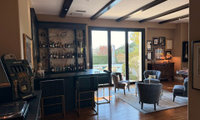
I'd go with a lighter blue. You can do a lighter, slatey blue, like windy blue.
What a marvelous space. We had a billiard table in our living room for many years. It kept guests busy while I put the finishing touches on dinner, and all generations can play together, so we knew our teenagers’ friends. I would encourage wipeable and scrubbable surfaces throughout the room because cue chalk goes everywhere. The beautiful hardwood and incredible backlit onyx give all the pattern needed. So: eggshell (at least) paint for the walls; don’t use wallpaper because a cue on a forceful backstroke can tear or streak it. I agree with Jill about wanting a velvety contrast with the onyx, but you might consider eggshell in the bar area and satin everywhere else. I think the room needs a cue rack. And I know you didn’t ask, but I’d say a room this spacious deserves a really grand Christmas tree, perhaps on the other side of the fireplace, for visual balance and to avoid pool cues.

Thank you! There is a cue rack on the opposite wall of fireplace. It’s a fun room!
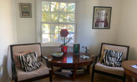
If you're picking the fabric, go on-line. Onlinefabricstore.com or fabricwarehouse.com. Be sure to put "upholstery" in the filter, pick the colors you want and then sort by price, low-to-high. Often, you can put in a print, such as animal prints, as well. You should probably contact the upholsterer for an estimate of how many yards you'll need, so you can budget.
There are more on-line fabric stores, but you want to look at ones with a large choice in upholstery fabrics.

Go with a fun animal print!
You have a lovely space.
All suggestions have merit,and give you a plethora of choices.
If you need to reposition the art over the sofa,consider adjusting the hanging set up length at back of the picture.
Why drill a new hole in the wall?
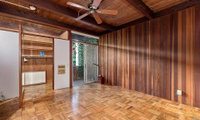
I think as long as any wooden furniture matches one of the many tones in your panelling --- not tough --- you'll be fine. Just avoid all ash, birch and other light-colored furniture.

What a room! With wood on the walls, ceiling and floor, I'd make the furniture the quiet layer instead of adding yet another wood tone. Think an upholstered bed in oatmeal or olive boucle, and nightstands that either match your darkest wood exactly or skip wood altogether (painted, lacquered or cane).
A large wool rug in cream or rust will break up the floor so it doesn't run straight into the paneling. Then add contrast with black or brass: a pair of mid-century sconces, a globe pendant, a black metal lamp. Bedding in mustard, rust or teal keeps the period feel without looking themed.
If you ever want a full layout and shopping list for it, that's the kind of plan I put together for people online.

What a room — I'd be slow to paint any of that paneling, and not just for the look. Original mid-century woodwork like that is one of the things buyers actually notice and pay for, and once it's painted there's no going back to it. I'd let the panel wall be the pattern in the room and keep everything else quiet and solid — plain oatmeal or olive bedding, no busy print, so the grain isn't competing with the textiles. And choose a low headboard, upholstered, rather than a tall wooden one: a tall headboard will just hide the best wall in the room, and a low one lets the paneling do the work. Live in it furnished for a few months before you decide about painting — I think the room will feel very different once there's a big rug and soft furniture in it.
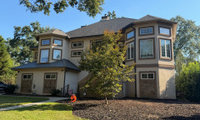

i'm with the folks saying tie the trim and windows together first. with urbane bronze on the roof, i'd keep stucco in a warm greige, one or two shades off the stone so it reads like one palette. trim a touch lighter than the stucco, not stark white. then do the front door in a deep color like oxblood or dark green to pop. get big samples on the actual wall and check them morning and evening before you commit.
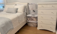
It looks like there's limited space to walk around the bed. I'd use the furniture that's across from the foot of the bed as the night stand. If the Dresser doesn't fit, I'd move it to be on the wall to the right.

Space looks lovely. The bulkier base lamp is better fitting.
Thank you SF Interiors! appreciate your opinion!!
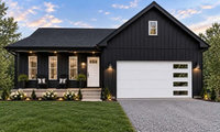
#2 and #3 look pretty run-of-the-mill modern farmhouse, but maybe that's what you mean by "traditional modern farmhouse," which frankly, is an oxymoron. Dark houses look awful in real life, most of the time. Often, as shown in the bottom picture, windows are dark, not lit golden as in your AI pic #1. The result is just a dark, depressing blob. If you do go in that direction, the white of the garage door is too stark a contrast.
If you wanted to do something that still reads as "traditional, timeless and modern," but not as generic, I might do #2 with a dark navy for the trim and garage door and a medium blue for the front door.
I like the cream picture, but I'll note that AI changed the proportions of your garage.
That said, I think your house as is is crying out for more and better landscaping, not a new paint job. You'll notice that all of the AI pictures fixed the brown spot on the lawn, either gave you a defined path to the door or removed it, and most gave you some foundation plantings.
How abpout a sage green. Certainly timeless.
The front porch needs a post at the left end. The modern garage door should go, replace with paneled white, or blue, or wood. Can the driveway be changed, so that it isn’t leading straight to the garage door, but rather approaching from the left? Don’t make the garage the first (or only) thing you see as you approach. If you can, there could even be a row of shrubbery, or a gated fence, separating the garage from the left side.
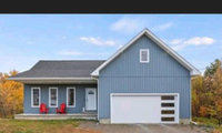

Why two posts on the same subject? Paint the garage door the same color as the siding and the front door a brighter color leave it alone. Landscaping is the key.
I'd make the front door and garage door a medium natural wood and leave the rest the same.

I'd widen the center path and put some relatively low-growing shrubs (I like reblooming azaleas) to either side at the road edge. I'd put a small, flowering tree in the middle of the yard, off to the right hand side.
Paint as much of the gas meter you can brown.
Mixed foundation plantings are prettier than a hedge of all one thing. Is this a year-round home? That means you need a mix with evergreens. But if it's a summer house, you can do all flowering shrubs. Azaleas are often evergreen, but I have no idea if your site is suitable for them.
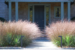
Grasses often look beachy. In Z9 you can do pink muhly.

This is little bluestem
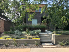
Tracefloyd, I love these. Tying in the black from the garage is a challenging idea but it looks good. The Flagstone walkway juxtaposed with the gravel and river rock is so attractive. And the plantings of course pull it all together beautifully. Thank you so much. I will definitely incorporate these elements into my final layout. I just posted a picture of the property next to my garage. It’s a vacant lot and I expect it will remain that way for a long time.
The lot next to my garage

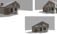
I don't understand the wood screen. I'm not sure it's going to be high-performance.
I'd stick to a very simple siding, probably just cream stucco. The wood screen thing is the feature of your facade.
The AI seemed to show gray roofing on one side of the second floor. That looks awful, IMO. Again, I'd stick to one siding. I'd enhance the house with landscaping.
Topla Hisa, this iteration feels more resolved. The low retaining wall and planting can give you privacy without making the street edge feel like another facade. Keep the fence and roof/window frames in one dark tone, and reserve wood for the recess; that contrast keeps the palette focused. Leave clear sight lines at the driveway and corner, and verify local fence/retaining-wall height and drainage requirements before finalizing.
Thanks for all your advice, and now I can see the secondary warts that I need to work on but I feel the base is at a good starting point. Alongside those points you highlighted, I'm noticing things like the thermowood screen board spacing and size all make a notable difference on the big picture...lots still do.

You're going to need to replace or patch the ceiling, so I'd tear it out so you can see what's going on and take a look while the shower is on. Remember that water will run downhill, so a tiny, imperceptible slope in the floor, pipes or underfloor may mean the water appears pretty far from where it originated.
I had an imperceptible slope in a bathroom floor in a former house and any leak/overflow from the toilet showed up right under the sink and the area around the toilet never had any puddles. Often, the problem is quite clear if you see it while it is happening, rather than waiting to notice a leak after the shower is off.
The other thing is that if you have a pinhole leak in the pipe, it might show up with higher water pressure from a shower, rather than lower pressure filling a tub.
Yes, i plan on keeping it open for a few weeks. The ceiling looks good so far, pretty dry. The pipe drip has stopped after replacing things. However, my plan is leave the cutouts open for a few more weeks just to be sure. ty!

That's a sensible plan. Leaving the cutouts open is the right call, and a reading on the joists that keeps falling is the best sign. Run a full shower, then check the ceiling and the cutout the next morning, since a slow leak often only shows after the cavity has been wet for hours. If a stain or a damp reading comes back, that's the point to have the pipe and drain checked before you close it up.
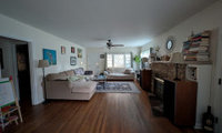
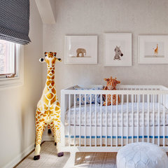
I notice you have room between the sofa and the door. Could you put a bookcase or credenza there? And if you put a giant stuffed animal, like a giraffe, that would become the focal point.
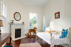
Or an elegant rocking horse.
A long room can feel much less like a corridor if you break it into two smaller zones, even with just a rug and a low bookcase. I would also check the viewing height if the TV goes over the fireplace, as that can be tiring for everyday watching. Try marking the layout on the floor with tape first, it is far easier to adjust than moving a heavy sectional twice.
@bibleblessings Exactly. Furniture pushed against the walls is what turns a long room into a hallway. Pulling colors from the rug into throws and pillows is a great move too, it ties the pale sofa into the room instead of letting it float. If you want it even cozier, add a lamp in each zone so you're not relying on overhead light at night. Low, warm light does more for cozy than any accessory.

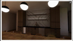
Your problem is you're designing an empty space. If you actually use the bar area, the shelves will be filled with bottles and glassware, so the marble backsplash will read as visual clutter. I'd just paint the wall behind the bar.
Your feature wall looks shoved into a corner and it competes with the shiny black column. I'd have one thing, either the shiny black column or the niche with the mirror.
As for the office, it really needs furniture, not more built-in "features". Here are some very different home offices, with a wood built-in.
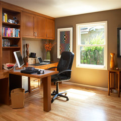
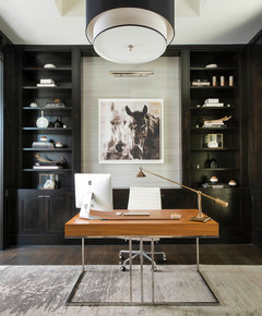
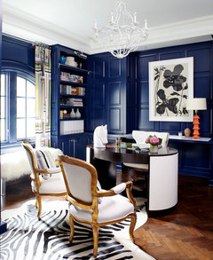
Rather than go to AI, which is going to give you very generic pictures, I'd create an ideabook for your office and collect pictures you like. Tag it if, say, you like the desk in the pic above, but hate the rug and the gilded chairs.
Ditto for a fireplace. There are a gazillion fireplace photos. Here's one with a lot of texture to the wall.
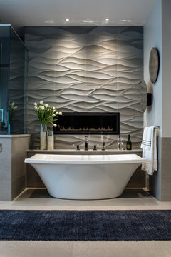
This one is definitely unique
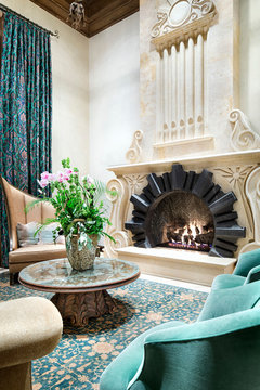
A fairly traditional one with some texture
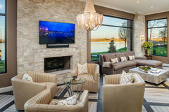
Here's one that maxes the rustic look.
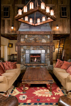
For the feature wall, a warm wood slat or textured plaster finish could add depth without competing with the black column, while a single large piece of art would help fill the empty space. At the bar, leaving the back simple and letting glassware and a few statement bottles do the work may keep it from feeling busy. For the fireplace, a natural stone or limewashed surround could add the warmth and character you want while still fitting the modern mountain look.

Your builder is not your designer,
You're building a massive home, we can not even read the plan.You get a pro kitchen designer, an interior designer, the builder/architect and all of you are now the TEAM.
That is the single best way to ensure continuity, form function, et all.
No crowd source here will be as valuable, will only lead to a thousand suggestions you can not digest.
Is this great? No......: )
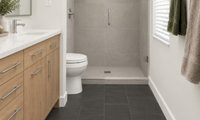
I like niches, but it needs to be big enough for the stuff you'll put there. Most have enough for one bottle of shampoo and some soap, which doesn't work if you share the bathroom with someone who doesn't share your taste in shampoo or you use conditioner.
Getting a corner stool for your shower is not hard.
cgs, a niche on the control wall may stay drier if it’s outside the direct spray, but I wouldn’t assume that wall will stay dry; hand-shower angle and splash matter. Mock the niche and ledge with tape and your actual bottles before settling on a height. With just 29 inches at the entry, check how a 4-inch ledge affects the clear opening. Have the installer follow Wedi’s waterproofing details, and ask Wedi or a licensed tile pro before changing the assembly.
Is this an actual photo of exactly what your bathroom will look like? Assume those are 12 x 24” floor tiles? When our tiling contractor did a very similar floor in our kitchen, he said tiles should be layed in a pattern that is 1/3rd offset vs. 1/2 offset as shown here - for proper stability.
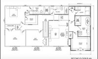
I like #2 better. #1 limits the light in the bedroom and wastes a wall which could have windows in it on a closet.
I think it’s always good for at least one secondary bedroom to have an ensuite bathroom. It’s better for house guests and essential if you ever need to house an au pair or a grandparent. If fairness is a concern, each child can take a smaller bedroom and the ensuite can be a combination home office/guest room or tv room. I like plan no. 2 because you don’t have to walk through the bathroom to reach the clothes closet. That would really matter to me.
Plan 2 for me too — the hall-access laundry and the primary windows on two sides are the big wins, and a private primary toilet just works better day to day. Since you said you don't need more than one walk-in, I'd use that second walk-in space differently: a small homework/study nook or extra linen and storage would get used every day by a 12- and 14-year-old, where a second walk-in mostly wouldn't. I'd also try to balance the kids' rooms rather than giving one a full ensuite suite and the other a much smaller setup — for example, the larger bedroom or better closet for the child without the ensuite. That balance tends to matter more over time, both for living there and if you ever sell, than a second walk-in.
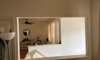
Why is the stairwell cold? Do you have a leaky door at the bottom of it? In general, hot air rises, so you'd expect a colder lower floor not to cause the cold air to be a problem.

In addition, the drapes won’t do anything for sound. You need to think about soundproofing.
OP - has not responded to any of the suggestions!
Expect most professionals you deal with, rental agents, real estate agents, mortgage lenders, bankers, whoever to have no clue about any of the details of your visa status or what it means in legal terms. I'd start with the assumption that no one you deal with has ever heard of an O-1 visa.
You may need an immigration service or lawyer, I don't know. But, unlike in Europe where people seem to move to other countries easily, that's not the general rule in America. Again, it depends on where you are moving from and to. From London to a major city, possibly you'll find people who are have some familiarity with your issues. From New Zealand to the suburbs of a minor city, not so much. And if you're moving from a non-English-speaking country with documents in another language, that's another layer of stuff to deal with. Don't expect anyone you are dealing with to be competent in any foreign language, not even Spanish (with the possible exception of some heavily Hispanic parts of the country).
We once asked our American bank how to wire Euros to a landlord in Europe. They replied that most people take dollars. We shouldn't bother with Euros. You're going to get a lot of stuff like that.

@Alex Greene, I worked in mortgages as a loan officer for 5 years. In order to get a mortgage in the U.S., you need to be a permanent resident alien or citizen. This can take anywhere from 8 months to 10 years. Renting makes sense. Lenders also require 2 years of tax returns and employment at the same job before you can be considered for a mortgage.
Renting first sounds like a really sensible call, especially for a first move to a new city. Living in an area for a few months tells you so much you can't get from listings — commute, noise, how the neighborhood feels in different seasons, and which streets you'd actually want to be on long term. With a 1960s ranch, I'd also want to live in it before deciding on big work. Kitchens and baths usually matter most, but condition, layout, and things like plumbing and electrical can change the priorities fast, and those are hard to judge from abroad. Waiting until you're on the ground to pick a contractor and walk the house together should make the whole process a lot less stressful.

Re-reading the OP, it stands out that she needed less than half a tank. I’m curious how many gallons were delivered. Looking at my COD suplier, their price differential for less than 100 gallons is almost a dollar higher than the next tier, and the differential is fall smaller between subsequent tiers. With automatic delivery, someone may be subject to that high price, depending on their contract. It sounds like perhaps an early delivery triggered a smaller delivery at a high price. I would definitely balk at that, but even if they adjust it I’d compare their regular rates against others, and consider switching service..
Talk to your local government ombudsman or other such authority. The fastest way to get a refund or credit on your account is to have an authority on your side.
Many people have fridges that provide chilled water. That's the most common way of getting cold water in the US. If you have an ice maker, which the majority of fridges so, it's the same line, which is tapped into your plumbing.
How hot your hot water is often depends on the setting on your hot water tank and how far it is from your kitchen.
There's a company I recommend due to their very helpful humans, iSpring. I've had one of their systems for about 3 years (undersink filter & RO). They make counter top models and have 8 models on the linked page. At a glance, they're more sophisicated than I expected. Starting price is $449 but that one only chills to 50 degrees (some are only room temp but some appear to be programmable). If there's something that interests you, you will likely be able to speak with someone during reg business hours to answer any questions - located in Georgia. If you go this route, check the RO membrame specs. I chose my under sink model based on the lowest waste water made.
We got used to having water and ice in the door in our former home, but not anymore. For cold filtered water we just keep a full Brita pitcher in the fridge now.

You need to simplify and unify your highlights, so they are all the same and go with the wood in your gable. If I did anything, I'd put vertical wood in the red area and horizontal wood in the green area, all to match the gable.
While I don't happen to love your siding on the balcony, your house would look better if you replaced the striped stuff around the window to the left of the door with the same as the balcony and replaced the black marble under it with the same.

All the windows shuold be the same color. If the reats are dark brionze or black, that window should be as well. No teak wood alu profile.
I think your problem is you have too many different feature sidings. You have the beige and reddish striped ones to the left of the door. You have the black marble below that window. You have the brown and beige on the balcony and the wood in the gable. None of the beiges go with your white siding. I'd simplify and unify. Personally, I think your house is elegant enough without any highlighting, but if you want something, pick one that goes with the wood in the gable.
Also, we don't know what you mean by "highlight wall" since the balcony and the first floor window are not the same walls.
You look like you live in place where it's easy to grow a lush garden and you have a lot of paved area. I'd pull up some pavers on the left and plant some lovely flowering shrubs. I might put a kidney-shaped garden island in the middle of your paver ocean, if you have the room.
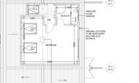
Most woods go in most rooms. Pick what you love and don't fuss over it.
Wide planks in a bedroom are totally fine, even a smaller one. Fewer seams actually make a space feel calmer and bigger, not smaller, and being half covered by a bed doesn't change that. The bigger thing in a loft is the subfloor and the direction. Run the boards along the longest wall or toward the main window so the room stretches visually. And since it's an extension, confirm with your builder that the subfloor and moisture levels suit engineered boards that wide. If that checks out, go for the floor you fell in love with.
If you have little space for a door to open and you don't access the water heater often, I'd go with a piece of thin plywood (which you can paint) held in place by magnets. Make it a bit shorter than the opening for a natural vent.
Hi, Just an idea, How about a louvered door? They are liight and easy to install. You may want to frame it out with a 1x4. Good Luck Woodbutcher

Since yours is electric, I would not worry about a vent for combustion, but I would still build it so you can get at everything fast. A light louvered door on a simple 1x4 frame works well, and I would keep it easy to lift off or swing fully open. Just leave clear room for the shutoff, the relief valve pipe, and the drain if you have one, and do not box it in tight. That way a swap later is a lot less painful.
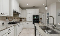
The island is huge and there's little space between the sink and the cabinets is what is a very large kitchen. I'd consider shrinking the island. The kitchen is very white and beige. You could punch is put by painting the walls a bright color r painting the bottom cabs. Or just bringing in color with chairs and other furnishings. I knew someone who had everything red in a rental with a white kitchen --- a red stand mizer, a red toaster, a red coffee maker. It added a pop of color without touching the kitchen.
If the former owners don't take those stupid signs, I'd ditch those, too.
Given that changing the island might be a big investment, I'd live with the kitchen for a while to figure out if the island's size is as awful as it looks. You might find the narrow distance convenient.
I want to warm it up. Replace backsplash and paint island and cabinets and replace hardware just
Love all the suggestions here. Also would like to replace kitchen table, chairs and table in sitting area and portrait
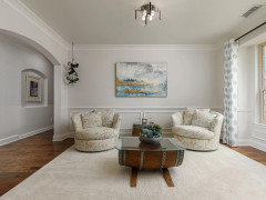
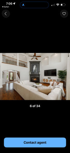

I get why you don't like it, but really, it's fine for your house and not worth bothering with. Focus on what you love about your house, not what you hate.
Wow thank you. Very interesting idea!
Hi everyone - I’m new to Houzz so I’m still learning how to use this. THANK YOU all for your ideas. I could never have made this progress on my own!

When a mansard roof covers half of the house, as yours does, you shouldn't put asphalt shingles on it. None of them are attractive. I'd treat it as siding and put cedar shingles on the vertical part. Around here, there are lots of Italianate houses with mansards that were once decorative slate with patterns made with color or scalloped slate shingles. The ones with the original slate look great. The ones with asphalt shingles look bad. The ones with some form of siding look good.

Your contractor is right that lighter shingles show dirt, so I'd stay with a medium gray like Pewter. On a steep roof you see the shingles head-on, so the less patterned ones look calmer and closer to slate. Ask your supplier for a few full-size sample shingles and tape them to a wall outside, then look at them in the morning and in late afternoon sun before you order.
I lean the same way as Lyn and Tovizy here — the medium slate/pewter direction. On a mansard the roof is such a big part of the front of the house that a calmer, less patterned shingle reads more refined in person and in photos, and it lets the brick and stone do the talking. The busier blends can look great up close as a sample but tend to read a little restless across that much steep slope. If you can, prop a few full-size samples up on the roof itself and look at them in morning and late-afternoon light before you commit — that view is very different from a small swatch indoors.
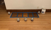
I'd do clear. It's a great floor.
@freedomplace1 im referring to the light strip in the border surrounded by the 2 darker strips, its maple and it doesnt take stain well....that why it looks blotchy rest of wood take it fine! and i agree the border too nice to kill it with stain

Thanks for clarifying, Billy. I thought maybe there were some damaged floor areas out of the camera view. As far as I can see, the floor is pristine... looks to be in amazing condition. And the light strip on the border issue you mention is something I would have never noticed, had you not pointed it out; and to tell you the truth, I still don’t see the blotchiness you mention, it must be very minor. In any case, I just see the beautiful border. I’m glad you’re not going to cover it up!
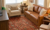
Blue goes well with tan. Charcoal not so much.
I plan on getting an 8 by 10. My room is 10 by 14.

An 8 × 10 can be a sensible starting size in a 10 × 14 room. If the 10-foot side runs with the room’s 14-foot length, it leaves roughly 1 foot of bare floor on the two short sides and about 2 feet at each end before furniture changes that balance. The more important check is the seating footprint: tape out the full 8 × 10 and make sure the sofa and both chair front legs sit comfortably on it without narrowing the main walkway or interfering with the movable poufs. What is the sofa length, and how much clear passage do you need beside the seating group? A straight-on photo of the taped outline with the sample would make the final proportion much easier to judge.

It's very tough to find the closet in that plan. That said, I like the idea of a centered door and clothes racks on either side. That lets you have one half for one spouse and the other half for the other. It saves arguments. My spouse crams his side in what looks to me like an utter mess (although he'd argue it isn't). My side is organized.

It's a major consideration in renting or owning in Ontario where it was legalized under Katy Perry's boyfriend.
We considered buying a condo for our daughter in a university town. One walk down a hall was enough to nix that idea. Barking dawgs--you can't prohibit pets--and pot smoke. Wonderful!
Before legalization, one of our rental properties morphed into a grow op. WE found out when the tenants left--having ruined the basement kitchen with flooding, stuffed the drain lines with cuttings.
I was tempted to call the coppers, til an electrician friend advised the consequences: "So, Mr. Worthy, your deal with your tenants didn't work out so well?" Then an inspection by an electrician and registering the property as a former grow op, damaging resale.
...
Now we only worry about equalizers.
Garrett, if you are still around, I totally disagree with Rachiele custom sinks. Leave the sink where it is to have a large island with no interruptions. Great for parties, a large serving service, craft projects, games, etc. Love my large island work surface.

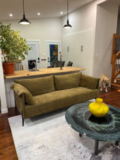

You need to start with measurements. AI is really great at pretty pictures, but it has no sense of proportion and will happily expand a space to get the right look. Can you actually fit something in that space? Particularly, what distance does a firepit have to be from buildings, plants and other flammables?
For privacy, you may want a tree on the other side of the path. We need a picture of the whole house from the road.
Shade in morning implies beating sun in afternoon/evening. Pavers might reflect light and heat into front windows. Removing existing shade would probably intensify the western exposure on that area of the house. South Florida, right?
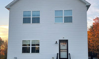
I recommended dark navy for the foundation, but you could coordinate it with the door. For example, if you do sage (which another poster suggested, but I don't endorse with your cool, white house) you might go with a dark olive for the foundation. A dark forest green will be most likely to disappear into your landscaping when you have some. That said, a dark navy won't stand out.

Thank you, wonderful ideas! I am saving these!
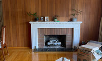
The panelling is beautiful and with those windows, it doesn't make the room dark. I would not paint it. I might paint the fireplace surround a warm cream instead of that stark white.
You need to start with furniture. I lived in rental homes for years and putting my furniture in them made the place seem like mine. I've lived in my current house for 10 years and we painted only one room when we bought it --- the two-tones of purple plus fuschia tween-dream bedroom. I used to be a fan of warm white walls, but my house's strong colors seem like home, now.
I'd start with the furniture and curtains and leave the wood alone for now. It's in good shape, and once a sofa and rug are in you'll know if it still bothers you. Paint can't be undone on wood, so waiting a few months costs you nothing.
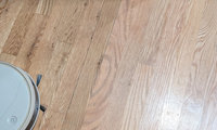
Don't worry about cohesiveness. No one will focus on your floors anyway. So much of this is just terms dreamed up by HGTV because they needed to say something.
I'd lean into the variation rather than fight it — homes from that era almost always have mixed woods, and it looks fine when one wood clearly leads. Let the hickory be the main one upstairs, and for the lower level I'd pick a wood-look tile that's clearly lighter or darker than the hickory, not close enough to look like a miss. Same upstairs: a painted vanity would break up the honey oak better than another oak vanity trying to match it. Repeating a warm tone in rugs, textiles, or a few wood accents helps tie the levels together without everything having to match.
Since the levels are separated by stairs, you have a natural break to change materials, so I would treat the stair nosing and landing as the transition point rather than trying to blend the floors. A wood-look tile downstairs works well in a humid area, and because it is a different material, the honey oak trim can stay without looking like a failed match. The thing I would keep consistent across all three levels is one trim color and one metal finish, since that repetition is what makes the different woods feel intentional.
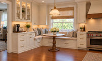
They don't belong to the same house. The window is much wider in one pic than the other. Further, where is the oven in the pic with the built-in bench. A realistic kitchen layout will have a floor plan with measurements of both your space and the cabinets and appliances. The AI thing you did is absolutely useless for figuring out what you can actually do with the space you have.
" Return to sender, address unknown. No such number, no such zone". Elvis

Option 1 is our selection but as others have said, the option 2 does not match dimensions. A floor plan should be provided to give proper assistance.
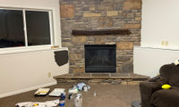
That brown doesn't go with the fireplace rocks. I'd keep it all the same color.
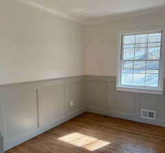
I have 8’ walls in a house that has wainscotting snd in ‘80’s was painted two colors- light on top and darker on lower. In early 2000’s, we left the wainscotting but painted upper lower and wainscotting same light neutral color. Id suggest same for your room. Use a neutral color like BM Edgecombe gray or similar color which will never go out of style. Id go A lighter wood as in Provincial stain color
If you haven’t started…a couple of thoughts:
Assume it’s a highly used room; have you looked into the cost of LVP? Its upkeep/durability vs carpeting (especially if it‘s on the light side) would be a better choice.
If you haven’t decided to paint one or two shades, maybe paint the entire room one color and if you don’t like, just paint the lower half (not dark)… complement/tie in the fireplace and flooring. The key is considering the big picture.
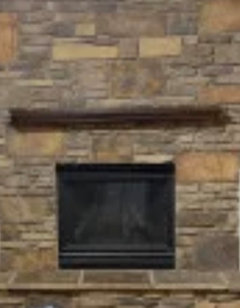
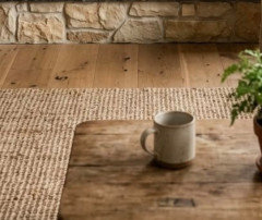


You could have poured concrete walls and a stone veneer. That said, most egress windows are barely visible, so it's not a place I'd spend a lot of money.
^^^, or really at the end if the day a design element. You typically do not want to draw any attention to it other than being sure no one falls into it.

I am guessing the curved preformed wells are made so there is no seam for possible leakage...
I've used only the ribbed style, but suggest you do an integrated step ladder style for easier escape when needed.
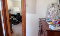
Gray is dreary. I'd stick with your current wall color.
Yes- and several didnt work great. To gray or too much contrast- i know my dh wouldnt care for a drastic change.
One thing is for sure, the Houzz community gives direct feedback. lol I appreciate that.

I’d try ivory bedding with a muted burgundy throw and cushions to bring some contrast while relating to the blush carpet. Before replacing the curtains, hold a larger fabric sample beside the bedding and wall to see the whole combination.
Our video shows one bedroom in three different decorative schemes and might help you picture how colour, lighting and accessories can work together: https://youtu.be/nEcPGozCbFY

It looks like a milkweed to me. There are lots of them, so you should find a site that IDs them.

There are 3 tuberosa varietes that I know of, tuberosa, interior and rolphsii. There may be more. Flower color ranges from red to yellow with some beautiful 2 toned, colored flowers. Some tuberosa varieties can handle growing in heavy clay




I believe the Dutch were hybridizig Asclepiaa tuberosa in hopes of developing an attractive cut flower.



Asclepias tuberosa subsecies interior

Asclepias tuberosa subspecies rolphsii
There may be more tuberosa entities, but I lost my online flora, I need to reinstall it.
Mine are all orange so likely Asclepias tuberosa subsecies interior (https://plants.sc.egov.usda.gov/plant-profile/ASTU/subordinate-taxa). They have bloomed for at least 3-4 years but never produced any seed pod heads. Maybe they need just the right temp and rainfall to go to seed. Oddly, none of my common milkweed (Asclepias syriaca) flowered or produced seed pods this year.

I know nothing about Texas, except that it is hot.
Your $50 to 100K number will not change much as honestly the labor and equipment will be the bulk of that. I would go with the original plan with the perf metal and suck it up, that's why planning on the front end is key.
Sorry to hear about your builder — that makes an already complicated finish a lot harder to pick back up.
Since the frame is already up, I'd try to shrink the scope before you price it as one big job. Ask an architectural metals / fabrication shop (rather than a general contractor) to bid just fabricating and fixing panels to the existing frame, and get two prices: the original perforated aluminum, and a simpler flat perforated panel in the same finish. The labor and lift time will still be a big share, as millworkman said, but a panel-only bid will show you exactly where the money is going.
Two things I'd settle before ordering anything: first, keep that downtown view slit open exactly as planned — a screen that preserves the view will read much better in person than one that closes the house off. And second, make sure the LED halo wiring and any mounting for it is run before the panels go on; adding it afterward is the kind of thing that gets expensive fast.
If the full screen still comes in too high, phasing it — the most visible / most-needed privacy section first, the rest later — is a reasonable middle ground, and it lets you live with the light and airflow for a while before you commit to closing more of it in.
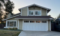
I like white with medium blue trim. It gives the place a pop of color.

Thank you so much for the great advice. can uou recommend any warm creamy greige or putty colors that you have used and look good? i am leanimg toward DE pewter patter for siding and trim, charcoal sletch for facia and eves and stone craft for font door. I am leaning tward keeping all trim tonal with siding color.as well as garage door. the house has a lot going on with the wiod siding (back half is all stucco). i want to create a more calm feel. thank you!

A house on my street is SW Tony Taupe - its a bit warmer so doesnt go purple like a lot of griege houses (one on my morning walk is lilac till about 10am) - color is very personal, but for me it’s a nice natural linen color

Any real life tips for transplanting saplings? I’ve googled but real life tips and tricks can be helpful.
I’m used to clay dirt from up north but the dirt in my new state of AR is clay that is so compacted, plus hasn’t rained in literally months, and it’s rocky. This dirt gets sticky when I add water to it. Planting in this area will be challenging for sure but we’ll prep dirt and do the best we can.
I'm not sure my advice will be worth much. Dry, compacted clay isn't a soil I've ever dealt with and I'm not clear on where you are in fall. In Maine, we've already had our first frost. I've found the local extension to be very helpful, answering emails promptly. You might try them.
My summer place has very rocky soil and I plant small, bareroot trees and plugs. I've transplanted very small saplings successfully. The smaller the transplant, the less digging and the less likely I'll hit a very big rock.
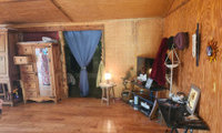
With those low ceilings, I think a color-drenched deep green would be awful. You have no overhead lighting that I can see and not a lot of windows and natural light. I'd go with a warm cream.

Another thought- a kitchen table - rectangular - could double as dining seating and added preparation area. The above proposed floor plan seems to devote a lot of space to a dining area, at the expense of a living area with space for art studio.
I would lean into the color drench, but in a softer mid-tone green rather than the deepest shade, so the small space still feels cozy instead of closed in. Keeping the trim the same color will help the low ceiling feel less choppy, and warm layered lighting will matter even more with only one small window. Since your paintings will be the focal point, a muted green should let them stand out beautifully for Thanksgiving.
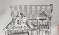
I don't think the facade is too busy, I think some of it is the line drawings and the shakes. That said, if I were to change your facade, I'd replace the nested gables with just the larger one. That will allow you to have a bigger window. While in the second elevation, the nested gable looks to me mostly in what I assume is the attic and more light might not matter much, in the first elevation, the nested gable is in the second floor and the line between the board and batton and shakes is also taking up room that could be a window.
For those saying the facade is too busy
Can you show the side elevations, or better, 3D renderings? Seeing the floor plans would also help.
The exterior is largely a reflection of the interior.
One change I can suggest is shown below.
Appreciate the input, all. We do not yet have 3d or side elevation renderings. Very early in the process. Classic long narrow lake lot, so sides will most certainly be straight and boring.