Calming Classic
Our client was going through several major life events including a change of relationship status and a health crisis in the months prior to the 2020 Covid-19 lockdown.
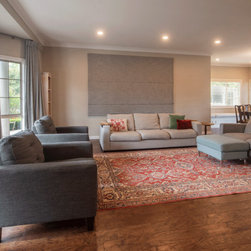
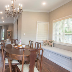
This influenced our design proposal to focus on creating a warm, nurturing, and homely environment, while remaining practical and timeless, and suited to family life. We wanted to support physical and emotional wellbeing.
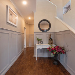
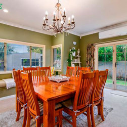
The ceilings are painted a warm undertone “Pebble Quarter” as opposed to a stark white which creates a glow throughout the home.
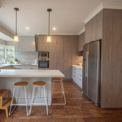
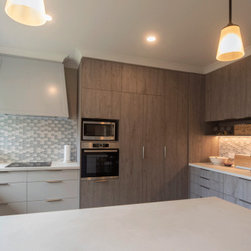
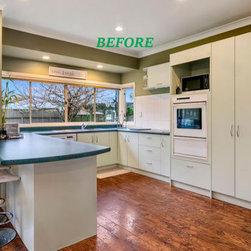
As our client loves to bake and decorate cakes for her family and friends, which is also a form of self-care, we combined multiple colours, featuring “Bretz” on the island and rangehood, and textures in this open-plan kitchen so the heart of the home encourages creativity.
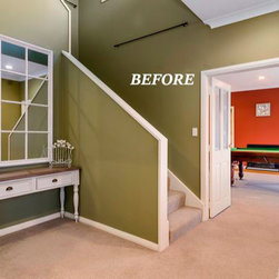
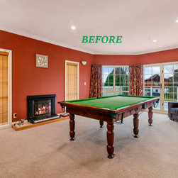
We used “Porters – Polo” in the games room knowing that shades of blue represent strength, reliability, and dependability, as this room is where family and friends come together to make new memories in this challenging time.
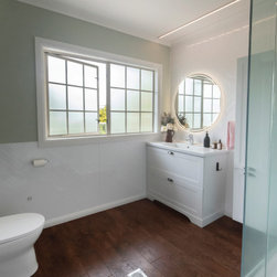
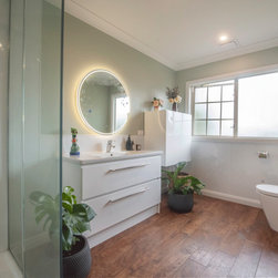
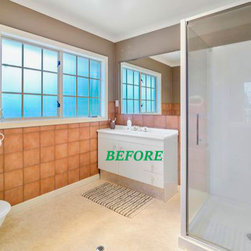
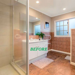
“Khalil” was chosen for the bathrooms to reflect the main colour seen in nature. The colour green evokes a feeling of abundance, balance and harmony, resonating with this family’s journey and focus for health between the body and mind.
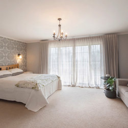
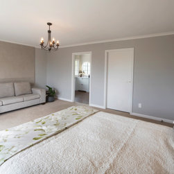
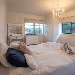
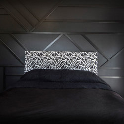
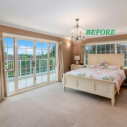
In the bedrooms, we sought to create a nurturing oasis for each person and balance between light and shade. The teenage boy’s room utilises the colour “Black” to create a masculine male haven, while the teenage girl’s room utilises warm white and soft textures to create a peaceful and feminine retreat. In the master bedroom, we combined patterns, fabrics, and neutral colours to create a zen, calming space.
The overall effect is a nurturing and calming home tailored to the bespoke needs of this family, while remaining timeless and elegant.
This influenced our design proposal to focus on creating a warm, nurturing, and homely environment, while remaining practical and timeless, and suited to family life. We wanted to support physical and emotional wellbeing.
The ceilings are painted a warm undertone “Pebble Quarter” as opposed to a stark white which creates a glow throughout the home.
As our client loves to bake and decorate cakes for her family and friends, which is also a form of self-care, we combined multiple colours, featuring “Bretz” on the island and rangehood, and textures in this open-plan kitchen so the heart of the home encourages creativity.
We used “Porters – Polo” in the games room knowing that shades of blue represent strength, reliability, and dependability, as this room is where family and friends come together to make new memories in this challenging time.
“Khalil” was chosen for the bathrooms to reflect the main colour seen in nature. The colour green evokes a feeling of abundance, balance and harmony, resonating with this family’s journey and focus for health between the body and mind.
In the bedrooms, we sought to create a nurturing oasis for each person and balance between light and shade. The teenage boy’s room utilises the colour “Black” to create a masculine male haven, while the teenage girl’s room utilises warm white and soft textures to create a peaceful and feminine retreat. In the master bedroom, we combined patterns, fabrics, and neutral colours to create a zen, calming space.
The overall effect is a nurturing and calming home tailored to the bespoke needs of this family, while remaining timeless and elegant.
Project Year: 2021
Project Cost: NZD 200,001 - NZD 500,000
Country: New Zealand
Postcode: 3010