

Norman Park - Renovation and Interior Project
This project started off as a colour consultation, and quickly evolved into a total renovation, including restumping the house, gutting bathrooms and kitchen, redesigning the lighting plan, refinishing timber floors, replacing carpets, repainting the interior, furnishing & redecorating the entire house.
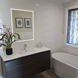
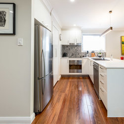
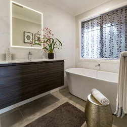
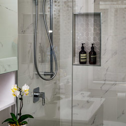
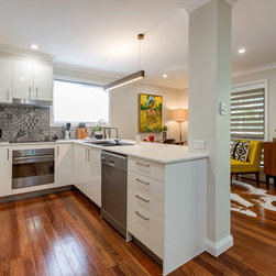
It is a rare occurrence when a client gives you this kind of brief: “Give us a grown up house. Keep it earthy, elegant, private and comfortable, make the downstairs powder room pretty, the bathrooms need to feel generous and luxurious, make the downstairs area feel less dark, and we would like a wider kitchen bench.”
Specific Challenges/Limitations:
It truly was the ugliest house on the best street – undoubtedly a smart investment - as the median house price for the area has increased significantly (doubled) from when it was first purchased some 10 years ago – but as it was, nothing worked.
Although the property is a relatively new build (early 90’s), it quickly became clear that the structural integrity of the house had to be addressed before anything could be done i.e. not properly supported through the centre of the structure, which was carrying most the load. This resulted in the house “twisting” – which impacted on floor levels (visibly sloping), and the doors and windows (large gaps), had also been directly impacted by the movement of the property over the years.
Because the budget was relatively tight given the extent of the scope of works, I kept the overall footprint of the home as it was – particularly the kitchen and bathrooms – so that the plumbing and electrical requirements did not require very much in the way of moving positions. Only the main bathroom required some adjustments to move plumbing and power points from its original position, to the opposite wall.
A builder was appointed (King Builders Pty Ltd), to take care of the construction requirements under a builder’s license, and the kitchen, bathrooms, powder rooms and laundry were demolished.
The house was restumped to create a near as level structure to work with, and the work on the kitchen, bathrooms etc. began in earnest.
Innovation, liveability and/or adaptability of Space:
The overall challenge with this project was that even though it was a relatively new build, everything was dated, no thought had gone into how the spaces would be used – particularly the living spaces downstairs.
The lighting, ceiling fans and power points were badly positioned.
The downstairs section of the house was dark (the original sponge effect yellow tone walls didn’t help), and needed a way of maximizing natural light.
The original dining space next to the kitchen was too small to accommodate a decent size dining table, but there was a large ”unused” area leading out to the outdoor deck where the client had placed a desk for a home office. The concern with the dining area was that if we moved it from the space originally intended for the dining area, to the space leading to the outdoor deck it would impact on egress, and not feel right.
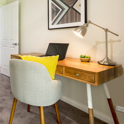
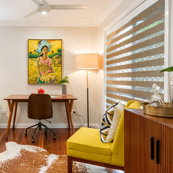
Instead of using the space originally intended for the dining area, we selected an oval shaped glass top dining table, and placed it where the desk for the home office was originally placed. The glass top, and the oval shape of the table, aided with the space concern. In the words of the client - “I never thought it would work, but it is perfect”. The home office space was moved over to where the dining space originally was, and the proportions were greatly improved.
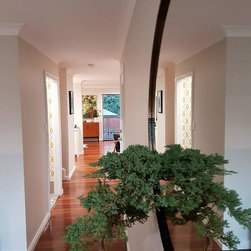
To address the natural light challenge, a Solatube skylight was added to help direct natural light into the downstairs area. Two solid doors that were restricting natural light from filtering through, were changed to doors with opaque glass to allow natural light into the space.
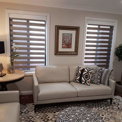
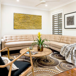
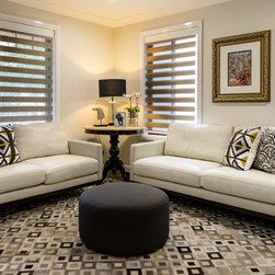
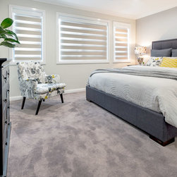
The original window treatments were all dark timber venetian blinds, which also made the space feel darker than it was. These were replaced with a product from the Vision range which serves a dual purpose of creating privacy and a block-out feature when required.
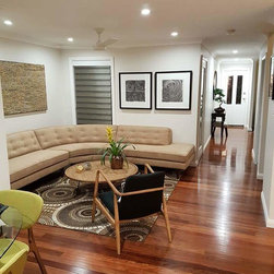
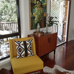
The paint colours we chose for the project instantly made the house feel lighter and brighter.
It is a rare occurrence when a client gives you this kind of brief: “Give us a grown up house. Keep it earthy, elegant, private and comfortable, make the downstairs powder room pretty, the bathrooms need to feel generous and luxurious, make the downstairs area feel less dark, and we would like a wider kitchen bench.”
Specific Challenges/Limitations:
It truly was the ugliest house on the best street – undoubtedly a smart investment - as the median house price for the area has increased significantly (doubled) from when it was first purchased some 10 years ago – but as it was, nothing worked.
Although the property is a relatively new build (early 90’s), it quickly became clear that the structural integrity of the house had to be addressed before anything could be done i.e. not properly supported through the centre of the structure, which was carrying most the load. This resulted in the house “twisting” – which impacted on floor levels (visibly sloping), and the doors and windows (large gaps), had also been directly impacted by the movement of the property over the years.
Because the budget was relatively tight given the extent of the scope of works, I kept the overall footprint of the home as it was – particularly the kitchen and bathrooms – so that the plumbing and electrical requirements did not require very much in the way of moving positions. Only the main bathroom required some adjustments to move plumbing and power points from its original position, to the opposite wall.
A builder was appointed (King Builders Pty Ltd), to take care of the construction requirements under a builder’s license, and the kitchen, bathrooms, powder rooms and laundry were demolished.
The house was restumped to create a near as level structure to work with, and the work on the kitchen, bathrooms etc. began in earnest.
Innovation, liveability and/or adaptability of Space:
The overall challenge with this project was that even though it was a relatively new build, everything was dated, no thought had gone into how the spaces would be used – particularly the living spaces downstairs.
The lighting, ceiling fans and power points were badly positioned.
The downstairs section of the house was dark (the original sponge effect yellow tone walls didn’t help), and needed a way of maximizing natural light.
The original dining space next to the kitchen was too small to accommodate a decent size dining table, but there was a large ”unused” area leading out to the outdoor deck where the client had placed a desk for a home office. The concern with the dining area was that if we moved it from the space originally intended for the dining area, to the space leading to the outdoor deck it would impact on egress, and not feel right.
Instead of using the space originally intended for the dining area, we selected an oval shaped glass top dining table, and placed it where the desk for the home office was originally placed. The glass top, and the oval shape of the table, aided with the space concern. In the words of the client - “I never thought it would work, but it is perfect”. The home office space was moved over to where the dining space originally was, and the proportions were greatly improved.
To address the natural light challenge, a Solatube skylight was added to help direct natural light into the downstairs area. Two solid doors that were restricting natural light from filtering through, were changed to doors with opaque glass to allow natural light into the space.
The original window treatments were all dark timber venetian blinds, which also made the space feel darker than it was. These were replaced with a product from the Vision range which serves a dual purpose of creating privacy and a block-out feature when required.
The paint colours we chose for the project instantly made the house feel lighter and brighter.
Project Year: 2016
Project Cost: $100,001 AUD - $150,000 AUD
Country: Australia
Postcode: 4170