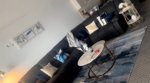
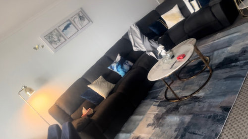
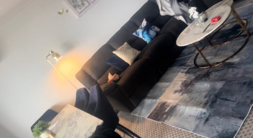
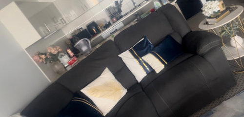
Need some assistance with interior designing
Q S
10 months ago
Featured Answer
Sort by:Oldest
Comments (7)

Q S
10 months agoRelated Discussions
Changing the face of Interior Design - we need your feedback!
Comments (14)A great concept, I've often considered doing so myself. Whats great about your bodo boards, and the schemes put together on this poll, is that they are quite adaptive with a neutral foundation. They can be easilyapplied to everyone. I love an emphasis on tone and texture, and in place of colour, visual interest is really added by accents, architecture and artwork. The australian bush scheme is very textural, although I think the palette could explore some of the more chromatic tones in our bush, some organic notes of green and taupes, but perhaps with vibrant yellows or deep indigos for example introduced. as for the romantic industrial, lovely, but it is only so because of the rose pink. A feminine take on industrial would to me be softened with humanised accents. Please explain, industry is mechanical, and romance or femininity is softness, so perhaps signage featuring lettering, or bespoke handicrafts which show the connection between industry, and loved spaces created out of collecting. Almost a way of feathering our nest. waterfont is cool, calm and yes collected. Literally. I love coastal schemes, but they can become a little predictable when they are literal interpretations of sea and sand. Coastal can easily be adapted to a relaxed style and I feel many colours can be applied to demonstrate this costal palette. . The key is in muting the scheme and enhancing the textures from nature. Tha grand! Oh the grand. I love it. Who doesn't really. Its very now, but the drama and edge is lost in applying same old collaborations. The geometric tile, chevron, hexagonal or penny rounds are gorgeous, and befitting the current style, but more so appropriate in specific architectural styles, not everyone an have a warehouse or loft, or grand 1920s residence, although we all try to use these same materials and formats. Precious metals and stones are the height of popularity and luxury, brass, marble and glass, are all in favour, actually have never been out of it. What I want is to see the used in a contemporary fashion. It is my pick, because it actually does respond to my own homes architecture, so I'm always on a hunt and gather of images and ideas to develop this gorgeous and luxe style. Whats next? Usually in an effort to be new and different, we move away from what's in front of us, but ever so gradually. I think the appreciation for industry, form and function, man made objects, formats, collaborations will be in favour for some time, so to in an effort to be different, organic will evolve. Colour notes, timbers, sustainability and natural form will emerge. Not to say literall greens or Browns, but more so, soft geometry, tactile materials and surfaces, perhaps a focus on light and shade over shimmer and style. bespoke practices, so things if stone and wood, and one off designs, as in using products that can't be replicated in process, like bricks, every ones different, veneers, grained materials, and unpretentious designs. Hand scribed lines, patterns or prints, I think will favour. Thestyle of now is definitely one we aspire to, as in luxe and indulgent, the monochromatic scheme which is actually ACHROMATIC people is overdone, but will never be out of favour. It is classic. When done right, it is the epitome of style, only the definition of that is what changes! love what you do....I can't articulate the value of conceptualising your style in finishes and fittings, design is often felt not learnt, and we respond to our environments, so it makes sense that seeing your style emerge from a collective consciousness in the form of a board, will literally transform your ideas in reality. As a designer myself, I'm constantly creating them. My own home is a work in progress, which I've created many concepts for. I'm very interested in seeing your perspective on it though, and I'd be very grateful for a bodo board from your design perspective. ml...See MoreSplash back design/colour assistance
Comments (25)Susan, we installed our wonderful new kitchen just over a year ago and still we find the tiled wall/splashback the best feature. The kitchen colour is charcoal and depending on the light of the time of day it looks dark grey or blue.....so our choice of splashback had to be rather neutral. we decided on a clear glass subway tile and the most wonderful part of this is that the natural glass colour (faint green tinge) comes out and this is most complimentaryto the cabinetry colour........See MoreI am doing an Interior design course and need advice..
Comments (6)Kelli, Quite a few of the 70s and 80s houses (and earlier) that people are seeking to renovate seem to have this issue, so may be worth a quick scroll through "dilemmas" focusing on exterior revamp/improved street appeal of these? cheers...See Morehi there, Im an interior design student and I need contractors
Comments (3)Best of luck finding a friendly builder who is prepared to do that amount of work for you for no chance of it ever being built. Whether it is fictitious, or not, there is still the same amount of work involved. Perhaps you could make a contra deal, with an offer to assist with selections and colours for their next job, to make it more appealing. To make it easier you could prepare a breakdown of the elements needed, like a shopping list. Bathroom design and costings is actually a bit complex when you get into it properly with lots of different trades needed, with a lot of the work inter-related. Best of luck, Dr Retro of Dr Retro House Calls...See MoreQ S
10 months agoQ S
9 months ago
Kate
9 months agoKate
9 months agoQ S
9 months ago


bigreader